
Gold & Precious Metals
Gold and gold stocks finally showed a bit of weakness during the holiday shortened week. Gold had its biggest weekly loss in months, losing 3% to $1217/oz while the miners (GDX, GDXJ) declined about 5%. Silver lost 4%. If weakness in Gold and gold stocks continues then we should turn our attention to technical support and see if it will hold. Gold and gold stocks are trading above the 400-day moving average which has been key resistance since 2011. Holding that support in the days or weeks ahead would offer confirmation that a new bull has started.
The following chart plots the daily candles for GDXJ and GDX. GDXJ, which is showing more strength has initial support at $26 followed by strong support near $24 and $23. Note that the 50-day moving average, 400-day moving average and 38% retracement of the rebound figure to coincide in the low $24s. Meanwhile, GDX has initial support at $19 with strong support in mid $17s and at $17. The confluence of support in GDX is in the mid $17s.

Gold’s support is at $1190 to $1200/oz followed by the 400-day moving average at $1175/oz…..larger charts HERE

The 400-day moving average is important because it contained every rally in the precious metals complex from 2012 to 2015. During that period GDX tested and failed at the 400-day moving average three times. GDXJ tested and failed there once (in summer 2014). Gold spent a few days above its 400-day moving average in early 2015 but that proved to be an aberration. Silver, which has remained below its 400-day moving average since late 2012 failed to exceed it in recent days.
Turning to the fundamental picture, real interest rates (the major driver for Gold) have recently turned in favor of precious metals. As the picture shows, the real fed funds rate is negative again while the real 5-year yield has declined from nearly 2% to near 0%. The fundamental underpinning that precious metals lacked in recent years is now in place.

With respect to the miners, their fundamentals have been improving for over a year. The energy crash has reduced operating costs for many miners by a considerable margin. Furthermore, weakness in many local currencies has also reduced operating costs.
If Gold and gold stocks are in a new bull market then they will hold above their 400-day moving averages and rebound in the weeks ahead. Meanwhile, Silver would vault above its 400-day moving average. Given the forever bear of 2011-2015, there is now widespread fear and consternation about a correction or major rollover in precious metals. It is only natural to feel that after a sharp and persistent downtrend. We would be buyers on pullbacks to the 400-day moving average.
Consider learning more about our premium service including our favorite junior miners which we expect to outperform in 2016.

Global Currencies Madness:
When central banks and politicians “manage” global currencies, we can expect:
- Exponentially increasing debt and currency devaluations
- Massive inflations and deflationary crashes.
- Transfer of wealth from the many to the few.
- Derivatives exceeding $1,000 Trillion and eventually a crash.
- A mathematically inevitable financial collapse.
- Monetary and fiscal madness.
- Booms and busts.
- Much higher gold and silver prices.
It has happened before and it will happen again…
Last Century Madness:
- Weimar inflation in Germany 1921-1923: The exchange rate for Marks changed from 90 Marks to the US dollar in 1921 to over 4 Trillion Marks to the US dollar in about 2 years.
- Argentina devalued their peso and exponentially expanded the currency in circulation so rapidly that Argentina lopped off 13 zeros since 1950.
- Zimbabwe printed so many trillions of Z-dollars that inflation, according to Wikipedia, exceeded 200 million percent in 2008.
Current Monetary Madness:
Japan has created a national debt that exceeds 1,000 Trillion yen, about 250% of their GDP. According to the IMF, Japan’s debt is “unsustainable.”
The US national debt (official only) currently exceeds $19 Trillion, up from $398 Billion in 1971, $5.6 Trillion in 2000, and $10.1 Trillion in October 2008. National debt has increased at a compounded (exponential) annual rate of about 9% per year since 1971.
Does anyone expect the debt will be repaid, reduced, or even stabilized? I think it is clear that the debt will be rolled over and increased until it must be inflated away or defaulted. This is political and central bank supported monetary madness. Exponential increases inevitably end badly.

(The U.S. version of monetary madness.)
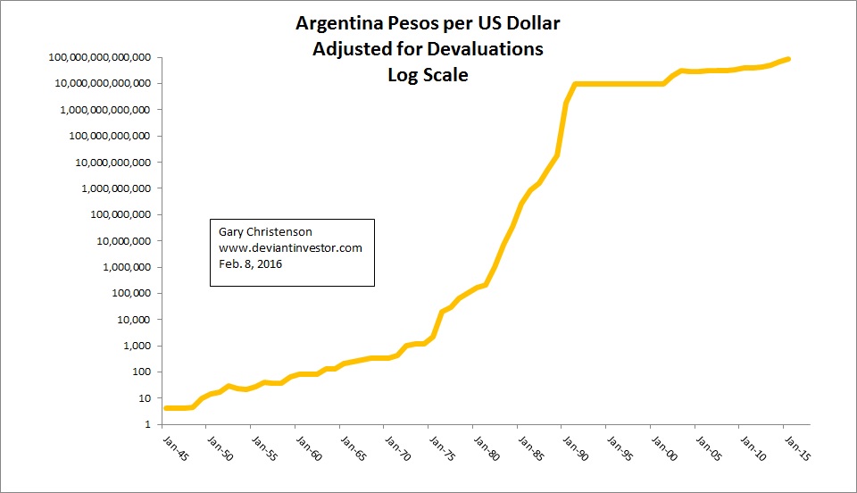 (The Argentina version of monetary madness.)
Central Bank Monetary Madness:
Exponential debt increases appear normal in a central bank controlled financial world that benefits the political and financial elite at the expense of the middle and lower classes. QE, ZIRP, and NIRP (negative interest rates) are recent examples of central bank responses to their self-created problems of debt based fiat currencies, exponential increases in debt, and uncontrolled deficit spending by governments. Fiscal and monetary madness prevails!
Ambrose Evans-Pritchard on the DANGERS of negative interest rates:
“Huw Van Seenis, from Morgan Stanley, calls negative rates (NIRP) a “dangerous experiment” that undermines the mechanism of quantitative easing rather than enforcing it…”
“Narayana Kocherlakota, ex-head of the Minneapolis federal Reserve, reluctantly backs NIRP as deep as -3% but calls it a “gigantic fiscal policy failure” that central banks must resort to such absurdities.”
“Morgan Stanley said that once negative rates fall below 0.2%, the damage to bank earnings goes “exponential” and ultimately endangers the whole system of free banking in Europe that we take for granted.”
My comment: The financial world is descending into an abyss of monetary madness as indicated by:
- Negative interest rates are a “dangerous experiment” and NOT a solution. ($7 Trillion and counting…)
- “gigantic fiscal policy failure” – (They address the consequences of bad policy with worse policy!)
- “damage to bank earnings goes exponential” – (And then what? Bail-ins and bail-outs? More QE and even more negative interest rates? Banking collapse?)
- the debt will never be repaid – (It looks like a safe bet.)
- “helicopter money” – (When all else fails…)
CONCLUSIONS:
- A world of fiat currencies “managed” by central banks descends into the trap of exponentially increasing debt that leads, slowly or rapidly, toward monetary madness and … Train wreck ahead!
- QE has morphed into $7 Trillion of global sovereign debt “paying” negative interest rates. Think “gigantic fiscal policy failure.” At almost any other time in history negative interest rates would have been viewed as insane policy. Monetary madness or … desperate to do something?
- Gold and silver are better solutions and are antidotes to central bank devaluations. One might object to gold for many reasons but those reasons seem minor or irrelevant in the face of exponentially increasing (unpayable) debt, negative interest rates, and ongoing monetary madness.
We have been warned!
Gary Christenson
The Deviant Investor


We were saddened this week to hear that at least 30 people were killed and many dozens more injured in ISIS-related suicide bombings that targeted an airport and train station in Brussels. The Belgian and European Union capital joins Paris, San Bernardino, Ankara, Jakarta and too many other cities in the past year alone that have come under fire from the Islamic terrorist group.
I was in Brussels most recently three years ago for an International Crisis Group meeting, and I was stunned by its beauty and elegance, highlighted with gold-trimmed architecture and vibrant flowers. In August, the city will celebrate the 20th anniversary of its Flower Carpet, which makes jaw-dropping use of over 600,000 begonias.

The Dow Jones Transportation Average (DJT) and Dow Jones Utility Average (DJU) indexes are often seen as leading indicator of the overall stock market. With that in mind, let’s analyse the technicals of each index.
The Dow Jones Transportation Average (DJT) is a stock market index of the American transportation sector. Price last traded at $7957.
Let’s review just the bigger picture using the quarterly and monthly charts.
DJT Quarterly Chart
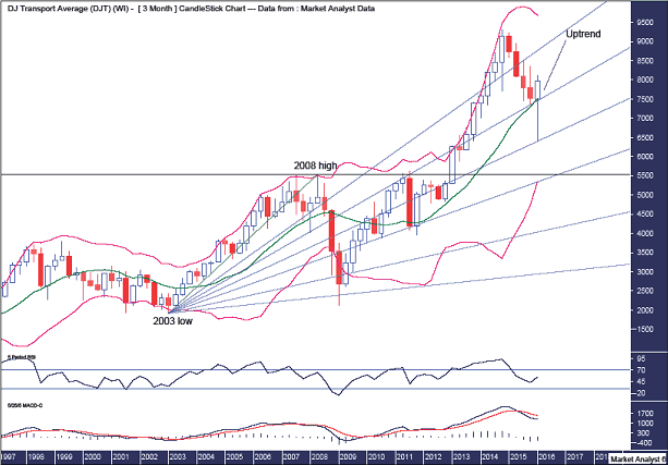
The horizontal line denotes the 2008 high and the recent low came in well above that level indicating strength in the uptrend.
The Bollinger Bands show the middle band providing support. Price dipped a bit below this band but immediately reversed back up bullishly. There may be a bit more work to do around this middle band before price heads back up to the upper band and new price highs.
I have drawn a Fibonacci Fan from the 2003 low to 2008 high. And we can see the recent low was bang on support from the 50% angle. I now expect the uptrend to make its way up to the 23.6% angle and price may end up just crawling along that angle into the final high. Let’s see.
The RSI showed a new high at the previous price high and I now expect new price highs to set up a bearish divergence here.
The MACD indicator is bearish so caution needs to be heeded.
DJT Monthly Chart

The Bollinger Bands show the recent low traded well below the lower band which is often seen at important lows. Price is now back at the middle band and I am looking for resistance to come in here and send price back to the lower band to set up a higher low.
I have drawn a Fibonacci Fan from the 2009 low. It shows the 2014 high at resistance from the 50% angle. Price subsequently traded back down breaking below support from the 61.8% angle with the recent low just above the 76.4% angle. The next challenge will be to get back up to the 61.8% angle which will now act as resistance.
I have added Fibonacci retracement levels of the move up from 2009 low to 2014 high and the recent low clipped the 38.2% level which keeps the overall bull trend in a strong position.
The RSI is zoomed up out of oversold territory while the MACD indicator looks to be threatening a bullish crossover.
Summing up, a new bull trend looks to be in its infancy with a higher low now needed to confirm that.
Let’s move on to the Dow Jones Utility Average.
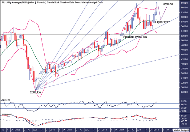
The Dow Jones Utility Average (DJU) is a stock index that keeps track of 15 prominent utility companies. Price last traded at $658.83.
Let’s take a top down approach beginning with the quarterly chart.
DJU Quarterly Chart

Anyone see a bear market currently in play? Not me. On the contrary, price is setting new record highs. The long term bull market remains steady and sure.
The horizontal line denotes the 2008 high and the recent low was right around support from the level. There isn’t a better example of old tops often providing support in the future.
The Bollinger Bands show the recent low was just above the middle band and price is now already back up at the middle band. Price may encounter some small resistance at the first time back but should then swoop higher as it clings to the upper band.
I have drawn a Fibonacci Fan from the 2002 low to 2008 high. It shows the majority of the bull market crawled up along the 61.8% angle before launching up to the 50% angle which has been providing some resistance. I now favour price moving even higher and the only question I have is does price now crawl along the 50% angle or explode even higher up to the 38.2% angle. Time will tell.
The RSI is looking reasonably strong while the MACD indicator is back in bullish mode.
DJU Monthly Chart
The horizontal line denotes the previous swing low which was not breached so the overall bull trend remains intact.
I have drawn a Fibonacci Fan from the 2009 low to first new swing high and it shows the bull market being contained within the 61.8% and 76.4% angles. The 2015 high was right around resistance from the 61.8% angle while the subsequent low was around support from the 61.8% angle. Nice.
The Bollinger Bands show the recent low was at support from the lower band and price is already back up at the upper band. I believe some further consolidation is needed before the uptrend really gets going again and hence I am looking for a move back to around the middle band to put in another higher low. The middle band is currently around 588.
The RSI is looking strong while the MACD indicator is bullish.
DJU Weekly Chart

The Bollinger Bands show the recent move higher climbing higher along the upper band. I expect a correction imminently and will be looking for the higher low to be back at the lower band.
I have drawn two Fibonacci Fans. Let’s run through them both.
The bearish fan drawn from the 2015 high shows the 2015 low at support from the 76.4% angle while reactions higher were held by resistance from the 88.6% angle. This resistance eventually gave way which ultimately led to new price highs.
The Bullish fan drawn from the 2015 low shows the first higher low dipped marginally below the 88.6% angle and it is this angle where I suspect the next major higher low will form. Let’s see.
The RSI is looking very strong while the MACD is looking very bullish. Both indicator look in need of a break and a correction shortly will provide just that.
So, everything looks decidedly bullish for both the Dow Jones Utility Average and Dow Jones Transportation Average. This would suggest those expecting a big, bear market are completely off base and the bull is back!
About Austin Galt
Austin Galt is The Voodoo Analyst. I have studied charts for over 20 years and am currently a private trader. Several years ago I worked as a licensed advisor with a well known Australian stock broker. While there was an abundance of fundamental analysts, there seemed to be a dearth of technical analysts. My aim here is to provide my view of technical analysis that is both intriguing and misunderstood by many. I like to refer to it as the black magic of stock market analysis.

Rogers said that he bought the ruble bonds because they have a much higher yield than Eurobonds denominated in dollars or euros; he declined to say how many of the bonds he bought.
in addition to Russia, he is also seeking to invest in Kazakhstan, Iran and China, if there is a fall in China’s stock market.

-
I know Mike is a very solid investor and respect his opinions very much. So if he says pay attention to this or that - I will.
~ Dale G.
-
I've started managing my own investments so view Michael's site as a one-stop shop from which to get information and perspectives.
~ Dave E.
-
Michael offers easy reading, honest, common sense information that anyone can use in a practical manner.
~ der_al.
-
A sane voice in a scrambled investment world.
~ Ed R.
Inside Edge Pro Contributors

Greg Weldon

Josef Schachter

Tyler Bollhorn

Ryan Irvine

Paul Beattie

Martin Straith

Patrick Ceresna

Mark Leibovit

James Thorne

Victor Adair