
Daily Updates
With Gold Making Record High’s, Silver above $20, the original Gold Bug James Dines gives his views to Michael Campbell on Money Talks radio tomorrow morning. Show begins @ 8:35 am PST. You can listen live on the net HERE
The Dines Letter encompasses a vast variety of material based on years of observation and study, encompassing and including these four main areas that combined are called DIQUIN (The Dines Quintet Method of Investing):
Fundamental – what we invest in and why.
Visual (Technical) – Don’t tell me what to buy tell me when to buy it!
Mass Psychology – How to resist being influenced by the crowd. By the time you see a parade it’s too late to join. Learn how to “drink upstream from The Herd.”
The Secrets of High States – How to handle your personal baggage of relationships to money, and how they affect your investment choices.
Those who’ve looked for the key to stock market investing are missing the secret that there are four keys, and you need all four:
1) knowledge of the company itself,
2) trends of stock prices,
3) how the Mass Psychology of others affects your investment choices and
4) how our internal personal baggage affects our choices, (High and Low States). Let
Mr Dines share what he’s learned, not only to help you profit, but also perhaps for personal development.
“Fundamentals” is the study of the company, or property itself, the balance sheet for example, once the only way to analyze stocks, and there is so much literature available on each company we have little to add, other than that it is very important to discover a new field, to be there first, in which the Dines Letter (TDL) specializes. Mr Dines was first to recommend gold at $35/ oz, and was also “The Original Internet Bug,” “The Original China Bug,” “The Original Uranium Bug” and now “The Original Rare Earth Bug.”
But Mr Dines was the frustrated by the absence of timing when investing by Fundamentals, so he pioneered the study stock prices themselves, charting trends , called “Visual or Technical Analysis,” staying with uptrends to make money. Now it’s an acceptable and popular discipline. His original book on this subject is sold out, is out of print and goes for over $1,000 a copy on the Internet. However Visual Analysis is covered in The Dines Letter.
Still unsatisfied, and suspected that there had to be more, Mr Dines decided that psychology had to be part of investing decisions also, still a radical idea, and his third book Mass Psychology pioneered that arena. Two whole chapters of his Mass Psychology book are devoted to “The Secret Desire of All Gamblers to Lose,” which is how the Las Vegas casinos got rich, and psychoanalytically why they never have windows or clocks. (Receive The Dines Letter’s special report “Why all Gamblers Secretly Want to Lose – Mass Psychology for Investors” with your subscription order.)
Individual psychology is vertical, genes plus experience, so when Mass Psychology ripples through a crowd, or a Mass, and the gamblers are all stampeding in one direction, replete with the excitement of pulsating adrenal glands, is usually the time to sell. For example, the Internet, or real estate manias.
When The Dines Letter (TDL) issued a “Buy” signal for the market on 2 Mar 09 (within four days of the low), the Mass Fear was more intense than Mr Dines had ever experienced in the stock market and even he had to struggle to resist it. TDL’s theory is that all stocks cycle through Mass Greed and Mass Fear, The Dines Greed/Fear Oscillator which we call DIGFOI.
The Dines Letter will introduce you to what Mr Dines has discovered regarding “internal baggage” from each individual’s financial past and how High States and Low States, as described in his fifth book, The Secrets of High States, have a direct impact on our investing success and personal growth. Become a subscriber to The Dines Letter to take advantage of this encompassing investment strategy as laid out by Mr Dines in each individual issue. Each issue is filled with incredible profit-building benefits:
Benefit from TDL’s six investment “Supervised Lists” in each issue, separated by investment strategy (ie high risk, high potential capital gains, or moderate capital gains, moderate risk, moderate income, good long-term fundamentals and his “core holdings”).
You get specific “Buy” and “Sell” advice.
You’ll get the buy price and current value in every single issue of TDL until a specific “Sell” is advised, so their advice to you is 100% accountable.
In each issue, Mr Dines provides his take on stock matters, and what you learn will easily separate your thinking from the masses, and you’ll discover the impact of current events beyond what you may be reading the mainstream media regarding political, health, scientific and social events that have always has major effects on the market.
Mr Dines’ general market commentary gives you the lowdown on what’s happening in stocks, bonds, gold, silver, Rare Earths, uranium, interest rates and much more.
Subscribe to the Dines Letter HERE
Several weeks ago, subscribers went long gold with my low risk trade setup and we have recently cashed in for profits. This weeks free report shows you where gold is trading and why you need to tighten your protective stops ASAP. While I share my general analysis of the market with you in this free newsletter, my updates and alerts are reserved for paying subscribers only. Below is this weeks free trend analysis:
The Gold, Silver, Oil & SP500 Trading Charts
We are at the tail of another light volume choppy options expiry week and a big move is brewing… So I thought I would do a mid-week update on what I think is about to unfold in the coming days.
First off I will touch on gold. Everyone is in love with this shiny metal. But as I mentioned last week I think we are nearing a sharp correction. Previously I pointed out that we needed gold to make a new high to the $1275- 1285 area before everyone piles in and gets married to it, only then will the market reverse… Remember the market is out to take money from the masses and the gold trade is getting a little crowded in my opinion.
There are fundamentals which can be taken into account… but when has any investment moved perfectly inline with the underlying fundaments? I’ve seen investments lead fundaments by years, and other times lag the fundamentals by years, not to mention manipulation… but that’s a whole different subject. That being said I don’t hold gold long term for the simple reason I don’t believe much in the buy and hold strategy, nor do I like to watch investments go much more than a few percent against me… I would rather sit in cash jumping in and out when things look ripe for the picking.
Ok let’s jump into the analysis…
Gold Futures Price – Daily Chart
As you can see gold is forming another rising bearish wedge. The last one lead to a $100 drop in gold earlier this year. The part that I find exciting is that this recent run up has been on relatively light volume and without any decent pullbacks along the way. What does that mean? It means fewer people are willing to pay top dollar for it and the big money is riding this train up until they feel its getting exhausted then they will start unloading large amounts at a premium. We also just saw another new high on Thursday which happened on light volume tells me this rally just may have the herd all rounded up before the slaughter.

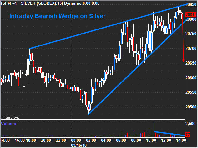
Silver Futures Price – 15 Minute Intraday Chart
While I don’t trade silver as much as gold due to the added volatility/whipsaw action, this intraday chart is starting to show signs of weakness with a rising bearish wedge today. This is just an intraday chart but these short term patterns tend to lead the longer term charts pointing out exhaustion is starting to creep into the market. Both gold and silver could still have a blow off top and shot up, which is why I have been saying to stay long metals (if you have a position) and to keep raising stop as it could continue higher for some time if a new wave of buyers step in.
Crude Oil – 4 Hour Chart
Oil has been choppy recently making it difficult to get a good read off the chart. Currently it is testing support and looks to be forming a possible right shoulder. It could have some good potential to the down side if we get a neckline break. I’m keeping my eye on it for another low risk entry point.

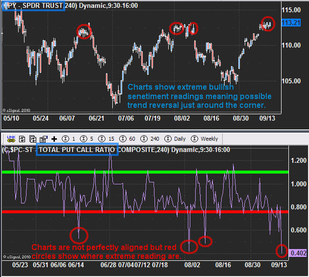
SP500 ETF – Daily Chart
This chart clearly shows some extreme bullish sentiment levels in the market. The bottom indicator is the total put/call ratio and when it is below 0.80 in an environment like this, it means there are too many people bullish on the market. So with todays spike low its easy to tell that the majority of traders/investors are bullish as they buy all the call options they can.
That being said, we generally get a serious shake out before the market reverses. What I mean by that, we should see the market gap substantially higher or spike up intraday as key resistance is broken. This forces all the shorts to cover their positions just before the market rolls over and sells back down. That’s what I am looking for to take action.
Mid-Week Trading Conclusion:
In short, gold and silver are looking and feeling toppy here. While I am bullish on them long term, we could see sharp pullback which could take months to regain these prices. I am not short metals yet but very close to taking a short counter trend trade.
Oil continues to looks bearish but is taking a long time to play out. This is a 4 hour chart and if we do get this neckline breakdown, it would still take 1-2 months to pay off. That being said, it looks like it will go lower.
SP500, I think the chart gets the point across. The important part to know is that it should go another 0.5% – 2% higher before it goes lower as that would make for a perfect pop & drop reversal pattern which I will alert members to when the time comes to short.
You can get my ETF and Commodity Trading Signals if you become a subscriber of my newsletter. These free reports will continue to come on a weekly basis; however, instead of covering 2-4 investments at a time, I’ll be covering only 1. Newsletter subscribers will be getting more analysis that’s actionable. I’ve also decided to add video analysis per customer’s request, and I’ll be covering more of the market to include currencies, bonds and sectors. Before everyone’s emails were answered personally, but now my focus is on building a strong group of traders and they will receive direct personal responses regarding trade ideas and analysis going forward.
Let the volatility and volume return!
Chris Vermeulen
www.TheGoldAndOilGuy.com
09/16/10 Las Vegas, Nevada – We’re not exactly in Las Vegas. Not yet. But we’re on our way. Yesterday, we had a funeral in Paris. Today, we have a speech to give in Las Vegas.
This is not the way we planned it. It’s just the way things work out.
Yesterday was a bit of a letdown. After having hit a new record high on Tuesday, gold decided to take it easy on Wednesday. The price slid $3.
Stocks, meanwhile, showed a little progress. Not much.
So we still have no clear trend. We wait. We wait.
For a while it looks like the next leg down has finally begun. Then, it looks like we’re in for another rally.
The only sure thing, so far, is that gold goes up. Even that is not really sure…but it is surer than just about everything else.
Our dear readers who bought gold back in 1999 have made about 4 times their money. This year alone it is up 15% – a very respectable return. Most of that has come as a result of paper currencies going down. Investors are buying gold to protect themselves.
They may also be getting a little insurance from a much more serious level of inflation which many think is coming. We think it is coming too. But in our view it looked like it would be awhile before it showed up. We’re in a major de-leveraging. You don’t get the normal cost-push or demand-pull inflation in a de-leveraging cycle. You get something else…something much more violent and dangerous.
But, heck, we wouldn’t rule out anything.
We made money on gold over the last 10 years simply because gold was cheap when we bought it. We were betting on regression to the mean. Nine times out of ten, when you bet on regression to the mean, you’ll make money.
Can you make money buying gold now? Yes, but now you’re betting on a different phenomenon. Actually, to hear the analysts tell the story, you’ve still got a good chance of making money. If the economy picks up, inflation will likely pick up too – ergo, higher gold prices.
If the economy sinks into deflation, gold still goes up. Why? Because deflation is sure to bring worry, doubt, and trouble.
Then, there are those who think we’re headed to hyperinflation. If so, you ain’t seen nothing yet as far as gold is concerned. The price could get to $5,000 an ounce…and beyond.
What do we think? Well, we agree with them all, more or less. The best bet is probably that we’ll stay in a Japan-like trance for a while longer. This is not necessarily good for gold. And not necessarily bad. Most likely, the yellow metal will meander around…generally headed upwards.
On the other hand, who knows?
The trouble with this market is that there are too many people who think they know. Many are saying that gold is a “can’t lose” investment. Maybe they’re right. But we don’t like the sound of it.
Bill Bonner
for The Daily Reckoning
It’s hard to believe that more than ten years have gone by since we began writing The Daily Reckoning out of a Paris office back in July of 1999…
Since then, a lot has changed. We have seen the dot com boom and bust…a massive expansion of credit…real estate mania and meltdown…and epic highs and lows in the markets.
Nothing about the past ten years has been boring. And we have been there throughout, trying to help readers make some sense out of our global economy. And hopefully providing a few laughs along the way.
In short, we pen The Daily Reckoning each day – for free — to show you how to live well in uncertain times. We aim to make each article the most entertaining 15-minute read of your day.
If you haven’t signed up yet, I urge you to do so right here. And don’t worry. It’s 100% free – no credit card is required.
How High Can Gold Go During the Current Upleg?
Click the chart or HERE for a Big Chart
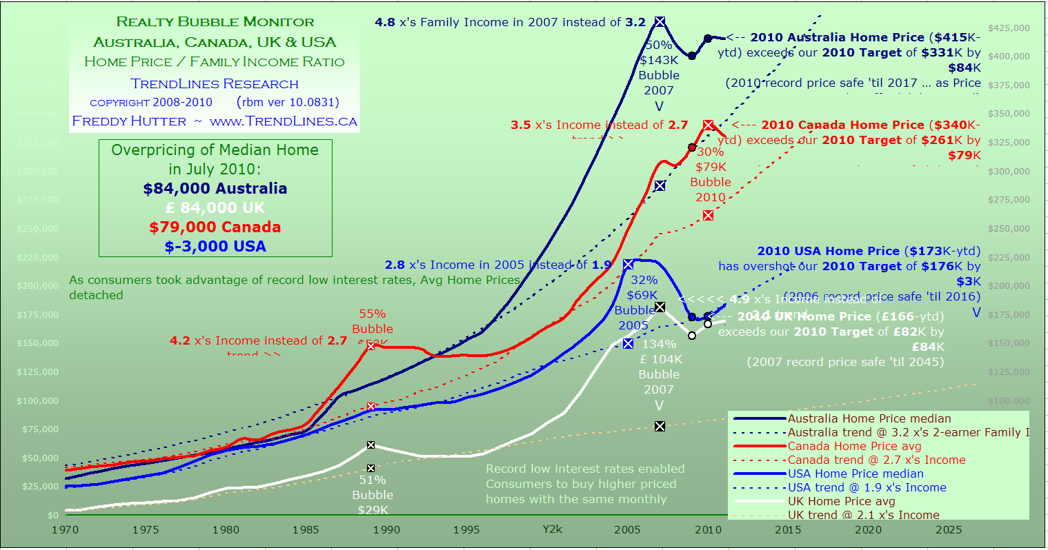
The Canadian average home price detached from the long term Price/Family-Income ratio of 2.7 way back in 2001. The onset of record low interest rates shortly thereafter enabled consumers to buy more expensive homes w/o increasing their mortgage payments. Subsequent irrational exuberance has swept the P/I ratio to an unsustainable bubble high of 3.5 in 2010.
The year-to-date annual price of $340k is 30% ($79k) above the trend line. As shown by the trajectory in chart#1, and assuming a 2010 Peak, it is probable new highs for the annual price will not be set ’til 2017. Unlike Australia, the UK & USA, Canada’s real estate sector only just recently commenced its inevitable correction. In comparison, the USA Housing Bubble was 32% ($69k) above the P/I ratio trend at its peak in 2005. We are observing the peak in real time!
With an annual avg price of $340k vs $173k in the USA, this was second month where Canadian homes were a tad short of being double the price of a similar home in America. In summary, the Canadian Realty Bubble has transitioned from $67k (27% above trend) in December 2009 to $79k (30% above trend & 3.5 ratio) in July. Using monthly data, July’s average national price was down $17k from the peak in May.
Canada Backgrounder ~ (rev 2010/8/31) TrendLines Research first drew attention to the topic of Canadian Housing Bubbles in 1989. Although that particular Bubble was only $53k, it was actually a more severe event as the average price of the time was an unprecedented 55% above the Price/Income ratio long term trend … almost double the current episode (30%). Families were paying an astonishing 4.2 x’s their Income.
Rather than the recent rapid 3-year correction (-22%) witnessed in the USA (annual figures), average home price fell a mere 6% in our first realty bubble. It took ten long years for the Canadian average price to surpass the 1989 high. Considering the momentum in play within the present economic Recovery, it is not unreasonable to expect a repeat of that long-term sideways correction … with perhaps an absence of new highs ’til 2017. It would be prudent for CMHC to temporarily increase its down-payment requirements for high-ratio insured mortgages to 10% (from 5%) until the downside risk dissipates.
This recommended action may be difficult in an environment where economists for four of Canada’s largest banks have been unequivocal in recent weeks that “there is no real estate bubble in Canada”. They join the Gov’t of Canada and the Bank of Canada (see our Wall of Shame below) in their reassuring albeit misrepresentative rhetoric. We heard their same chorus of rationalizations in 1989 & from their counterparts south of the 49th in 2005! Both events posed an assault on the Disposable Income of consumers, and wealth effect ramifications resulted in imminent Recessions within twenty-four months in both instances. As elaborated in our Canadian Recession Meter, failure by the Bank of Canada & CMHC to address a winding down of the Canadian Housing Bubble could easily turn the expected 2012Q2 economic downturn into a full fledged Recession.
Australian median home prices had already detached from the long term Price/Family-Income ratio of 3.2 way back in 1997. The onset of record low interest rates shortly thereafter enabled consumers to buy more expensive Existing Homes w/o increasing their mortgage payments. Subsequent irrational exuberance swept the P/I ratio to an unsustainable bubble high of 4.8 in 2007.
The year-to-date annualized price for 2010 of is $415,000. 2007 is considered the Bubble Peak as price in that year was 50% ($143k) above the trend line. The 2010 trend target is $331k. As shown by trajectory in the chart, it is probable new highs for median Home Price will not be set ’til 2017. In summary, the Australian Realty Bubble has transitioned from $82k (26% above trend) in December 2009 to $84k (25% above trend & 4.0 P/I ratio) in July. Using monthly data July’s median national price is down $15k from the high three years ago.
UK average home price had already detached from the long term Price/Family-Income ratio of 2.0 way back in 1997. The onset of record low interest rates shortly thereafter enabled consumers to buy more expensive Existing Homes w/o increasing their mortgage payments. Subsequent irrational exuberance swept the P/I ratio to an unsustainable bubble high of 4.9 in 2007.
When the annual price peaked in 2007 @ $181k, it was £104k (134%) above the trend line. In its third year of correction, average Price still exceeds the long term trend line by £84k (103%). As shown by the trajectory in chart#1, it is probable that new highs for the annual price will not be set ’til 2045. In summary, the UK Realty Bubble has transitioned from $76k (94% over trend) in December 2009 to $84k (103% over trend & 4.3 P/I ratio) in July. Using monthly data, July’s average national price was down $11k from the peak in 2007.
-
I know Mike is a very solid investor and respect his opinions very much. So if he says pay attention to this or that - I will.
~ Dale G.
-
I've started managing my own investments so view Michael's site as a one-stop shop from which to get information and perspectives.
~ Dave E.
-
Michael offers easy reading, honest, common sense information that anyone can use in a practical manner.
~ der_al.
-
A sane voice in a scrambled investment world.
~ Ed R.
Inside Edge Pro Contributors

Greg Weldon

Josef Schachter

Tyler Bollhorn

Ryan Irvine

Paul Beattie

Martin Straith

Patrick Ceresna

Mark Leibovit

James Thorne

Victor Adair