
Stocks & Equities
Gold and silver are down again today, but the mining stocks are up big. One day does not a trend make, but this is still a possible indicator of several things:
1) The plunge in mining shares has finally gotten the attention of investors who understand that most of these companies are viable and profitable, and that they won’t go to zero. So at some point the downtrend will stop, and though today might or might not be that day, it’s definitely coming. Downside risk, in other words, is now smaller than upside potential.
2) Share buyers are watching the mess in Europe and concluding that austerity is being replaced with monetary and fiscal ease. The European Central Bank will have no choice but to buy up trillions of euros of peripheral country debt to keep the eurozone together — or the currency union will fall apart and former members will go back to their old currencies and devalue aggressively. Either outcome is inflationary and therefore great for precious metals.
CLICK HERE for the 3rd Reason


The New York Times dredges up the open secret that no one is in the stock market anymore. Nathaniel Popper plaintively lays out the statistics and then consults a handful of sources to understand what’s going on…
Trading in the United States stock market has not only failed to recover since the 2008 financial crisis, it has continued to fall. In April, the average daily trades in American stocks on all exchanges stood at nearly half of its peak in 2008: 6.5 billion compared with 12.1 billion, according to Credit Suisse Trading Strategy.
The decline stands in marked contrast to past economic recoveries, when Americans regained their taste for stock trading within two years of economic shocks in 1987 and 2001.
Allow me to be of assistance as to why there’s no recovery in stock trading like there was after past recessions and crashes:
They sold us out. The NYSE and Nasdaq decided to go for-profit under the auspices of raising the money necessary to compete with foreign exchanges and other upstart trading pools. They needed to revamp the machinery of trading and modernize their systems. Apparently, this meant opening the back door to a host of ghouls and goblins who pay extra for the right to co-locate their servers and see the orders of the public in a speed that is somehow faster than real-time. This has enabled them to pick the pockets of mom and pop on every single transaction they make. And they do this under the guise of the dubious “liquidity” their activities are adding to the market. These thieves are the number one revenue source for the NYSE, after the snack bar, the gift shop and whatever concession they can command from the television studios that have set themselves up on the premises to capture all the inaction of the floor and its dwindling trader population. Why the exchanges couldn’t just be a public institution serving the well-being of the country I’ll never understand. They are now set up as a pimp, selling us and our orders to the most salacious and active johns they can find. This is how a high frequency trading robot based in Kansas, far from regulatory scrutiny, can drive a million “normal investors” away each month.
To Read More CLICK HERE


A friend sends me the following chart to support his conclusion that another round of QE is coming from the Fed sometime in June. The chart tracks the ten-year bond and the performance of the S&P since 2009.
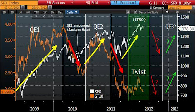
Some thoughts on the info provided in this graph:
+While both QE1 & 2 were ending, the S&P fell.
+Operation Twist appears to have successfully restrained any increase in long-term interest rates.
+The European Long Term Financing Operation (LTRO) liquidity operations had a significant positive impact on US equity prices.
+As of today, the spread between LT interest rates and the S&P is the widest it has been in three and a half years.
+ The current level of the ten-year bond is the same as it was during the height of the recession/depression during the 1Q of 2009.
My observations:
– Tyler Durden at Zero Hedge (among others) has been pounding the table with the thesis that what drives markets today is not the size of the Central Bank balance sheets, it is the daily/weekly flow of additional monetary easing that matters. I think the chart confirms this.
– Twist and LTRO are finished for the time being. Bond yields are reacting to the economic slowdown that comes with the ending of these monetary jolts. Stock markets around the world have flattened out; there is good evidence that an equity market correction is underway.
– The huge gap in the current spread between bonds and stocks is scary. Notice that the orange and white lines have crossed numerous times in the past. If the lines were to cross again, it would imply that either interest rates have to shoot up, or the stock market is looking at a very sizable adjustment. I see little chance for interest rates to move higher in the current environment. This sets up the possibility for an out-sized down move in stocks.
– Everyone (most importantly Bernanke) is aware of the information that is contained in this chart. Bernanke is also aware of Durden’s point: you have to feed the beast every week, and you have to commit to weekly feedings far into the future, or markets will get grumpy.
– The expectation from all directions is that the Fed and the ECB will (once again) rise to the occasion (June is the popular time frame), and when they act, stocks will go “green” again.
– That the market is so convinced that the Fed will bail it out (or prevent any significant decline) allows for the very high spread between stock prices and interest rates that exists today. There is a high degree of complacency in the market. It believes the Fed is the backstop, and it will always be there when markets flutter.
To Read More CLICK HERE
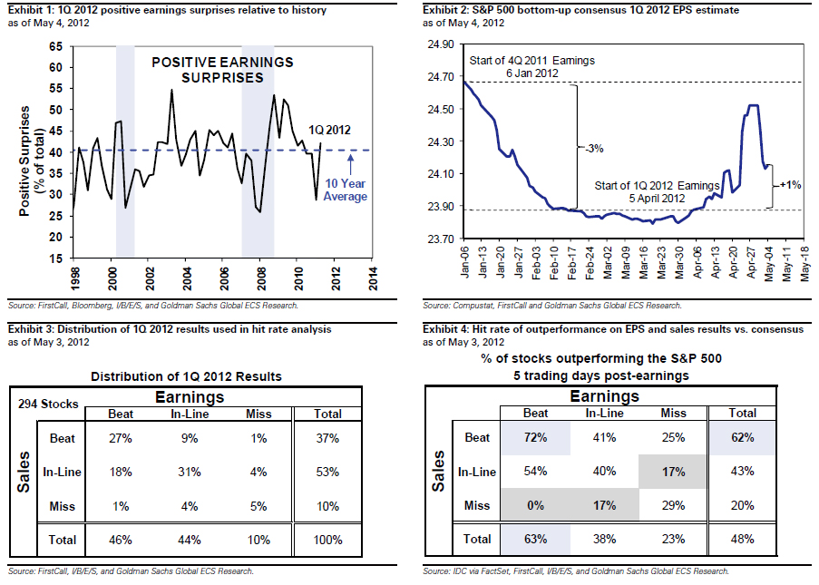
With earnings season now virtually over, it is time to ask why, despite a majority of the companies beating expectations, is the S&P inline with where it was when earnings season started. There are two main reasons why the market has not been impressed: the percentage of “beaters” is nothing spectacular on a historical basis as was shown previously, especially in the aftermath of aggressive cuts to Q1 top and bottom line forecasts heading into earnings reports; more importantly, even with Q1 earning coming out as they did, the bulk of the legwork still remains in the “hockeystick” boost to the bottom line that is completely Q4 2012 loaded, as bottom up consensus revisions to the rest of 2012 are negative despite Q1 beats. As Goldman summarizes: “1Q 2012 will establish a new earnings peak of $98 on a trailing-four-quarter basis. With 88% of S&P 500 market cap reported, 1Q EPS is tracking at $24.10, 1% above consensus estimates at the start of reporting season and reflecting 7% year/year growth.” So far, so good. And yet, “Despite the positive surprises, full-year 2012 EPS estimates are unchanged relative to the start of earnings season, and currently stand at $105 vs. our top-down forecast of $100. Over half of consensus 2012 earnings growth is attributed to 4Q. Margins at 8.8% have hovered near peak levels for a year, but consensus expects a sudden jump in 4Q to a new peak of 9.1%. We forecast a further decline to 8.7%.”
As a reminder Q4 is when all the unanswered questions are expected to clash violently: to NEW QE or not to NEW QE, the “5% of GDP” fiscal cliff, US elections and the 18th National Congress of China, the debt ceiling, and not to mention Europe which will be there all along. And let’s not forget Apple: “Apple is likely to be the top contributor to S&P 500 EPS this quarter. Exxon (XOM) had been the top S&P 500 EPS contributor since 2003, but Apple surpassed it last quarter.” If something happens to the coolness factor of AAPL, watch out below. Hopefully margins will somehow find a way to boost themselves to all time records among all this uncertainty.
Going back to Goldman, here are the firm’s nine takeaways from Earnings Season:
A total of 421 firms in the S&P 500 have now released 1Q 2012 results representing 88% of the equity cap. Below we highlight 9 takeaways:
1. More surprises than average. The percentage of firms beating consensus EPS expectations by more than one standard deviation (our definition of a positive surprise) exceeds the historical average. The number of firms missing by more than one standard deviation is in-line with the average. Of the 421 firms that have announced results this quarter, 42% of firms beat expectations and 13% have missed. The ten year historical average of beat and misses equals 40% and 13%, respectively (see Exhibit 1).
2. Earnings above expectations. 1Q EPS is tracking 1% above the consensus estimate at the start of reporting season, $24.10 vs. $23.88 (see Exhibit 2). The median surprise over the past ten years has been 1.8%. The 1Q estimate fell by 3% between the start of the 4Q 2011 reporting season in mid-January and the start of the 1Q 2012 season in early April, which aided the level of surprise. Accounting differences between adjusted and operating results for PRU and PFE reduced aggregate earnings level.
To Read More CLICK HERE
One of the questions that we receive on a regular basis is whether one should invest in junior or senior mining stocks. The answer is that diversification is the way to go, but that’s not the full reply as weights in the diversified portfolio can still favor either juniors or senior stocks.
The reply to this question depends on when the question is asked – there are times when juniors outperform and there are times when they underperform the senior mining stocks. Before providing you with a chart of the junior-senior ratio, let’s take a closer look at the situation in the general stock market, ale the latter is highly correlated with juniors in the long term (charts courtesy by http://stockcharts.com.)
$SPX (S&P 500 Large Cap Index) INDX
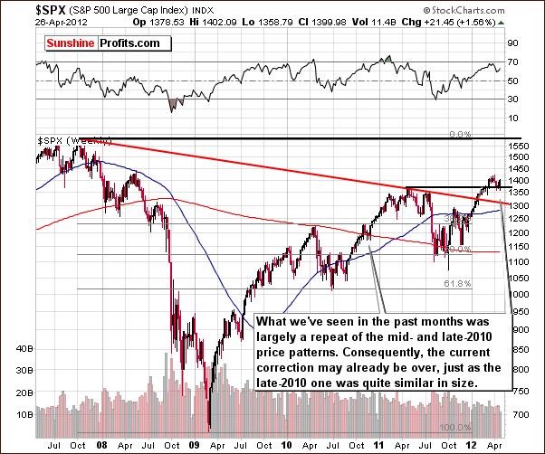
In the long-term S&P 500 Index chart, we have much the same outlook as we saw last week. The recent correction appears quite similar to the one of 2010 and the consolidation seen in RSI levels is also similar. Back then, prices rose nearly 15% in about three months following the small correction. Self-similar patterns (like this one) are quite reliable, so at this point, stocks appear ready to move higher.
To Read More CLICK HERE

-
I know Mike is a very solid investor and respect his opinions very much. So if he says pay attention to this or that - I will.
~ Dale G.
-
I've started managing my own investments so view Michael's site as a one-stop shop from which to get information and perspectives.
~ Dave E.
-
Michael offers easy reading, honest, common sense information that anyone can use in a practical manner.
~ der_al.
-
A sane voice in a scrambled investment world.
~ Ed R.
Inside Edge Pro Contributors

Greg Weldon

Josef Schachter

Tyler Bollhorn

Ryan Irvine

Paul Beattie

Martin Straith

Patrick Ceresna

Mark Leibovit

James Thorne

Victor Adair