
Personal Finance
History confirms when when this happens prices that when up will come down. “See California, Florida, Japan, Dubai, Greece, Ireland, Spain et al”

VANCOUVER average single family detached prices in July 2013 ticked down 0.1% M/M and remain 13.6% ($144,300) below their peak set last April 2012 (Vancouver Chart). Vancouver combined residential prices are down 2.3% Y/Y (Scorecard) on booming sales up 40.5% Y/Y. Average strata units continue to trade at 3Q 2007 prices which drifted lower M/M on bullish sales. Prime location inventory remains static (see the Bubble Deflator)
If you are thinking of buying a Vancouver Condo as an Investment, see my Vancouver Condo Yield Case Study and now that you have the July data, where do you think Vancouver SFD prices will be one year hence? VOTE HERE.
CALGARY average detached house prices in July 2013 met with resistance and ticked down 0.4% M/M after the June peak (Calgary Chart) while townhouse prices dropped 4.1% M/M and condo prices ticked up 0.3% M/M. Combined residential sales slumped M/M but remain elevated Y/Y especially in the condo sector and with red ink all over the inventory levels (Scorecard) as migrant workers and flood victims compete for housing. Alberta remains a different country with respect to earnings that continue break record highs per capita.
The sentiment in Calgary is the least bearish of the 3 markets polled with only 22% of the survey thinking Calgary SFD prices will be 20% lower in 12 months. What do you think? VOTE HERE.
EDMONTON average detached house prices in July 2013 continue to be held back at resistance (Canada Chart), while townhouse and condo prices dropped 2.5% and 7.4% M/M. While Calgary has negative combined M/M residential sales, Edmonton sales remain in an uptrend (Scorecard). But bidders have yet to break the May 2007 peak SFD price (Plunge-O-Meter) which remains 3.7% below the high.
TORONTO average detached house prices for the GTA in July 2013 dropped 3.2% M/M and are 4.8% below the trifecta breakout highs set in May (Toronto Chart). Combined residential sales are off 5.7% M/M with average SFD sales plunging 9.2% M/M. The gap between Vancouver and Toronto housing prices (Vancouver vs Toronto) widened to 43% more expensive in Vancouver. The GTA may have appeal to the HNWI as a “safe” haven but the media does not rate Toronto as investment grade.
Polled sentiment here continues to suggest that prices will be down another 20% in 12 months. What do you think? VOTE HERE.
OTTAWA average detached house prices are not available, instead the chart on this site reflects Ottawa’s average combined residential prices. OREB’s report is sparse and opaque and the CMHC, records for Ottawa inventory remain one month lagging. In July 2013 Ottawa combined residential prices ticked up 0.1% M/M but remain 3.2% below the peak price set in April (Scorecard). Sales plunged 16% M/M and are down 2% Y/Y.
MONTREAL median (not average) detached house prices in July 2013 ticked down 0.7% M/M and are that much below the record high set in May-June (Canada Chart). Prices are being held back by ever decreasing sales and thinning participants with combined residential sales down 20% M/M and 3% Y/Y. Condo sales plunged 24.4% M/M and are down 13.9% Y/Y (Scorecard). In the 2011 Census, Montreal added 6.4% more dwelling units while only adding 5.2% more people. There is no shortage of housing, but there is a shortage of earnings; the Province of Quebec ranks 6th in Canada’s 10 provinces for earnings and printed an unemployment rate of 7.7% in May (0.4% above Ontario’s).
About Brian Ripley’s Canadian Housing Price Charts
If you want to be notified when I update this site, go to: twitter.com/Brian_Ripley and click ‘Follow’
Thousands of Unique Visitors and Tens of Thousands of Page Views Every Month Details Here
OR COMPARE A POTENTIAL NEW PURCHASE AGAINST A 10 YEAR GOVERNMENT BOND
OR DETERMINE THE IDEAL MORTGAGE SIZE TO GET THE BEST RETURN ON YOUR INVESTMENT


It’s still sum… sum… summertime.
Still lazy hazy. Still crazy. And still not much action in the financial markets.
The Dow sold off a little on Friday. Gold went nowhere.
You’ve already heard our guess: Investors are marking time… waiting… procrastinating… maybe even thinking things over. The serious action won’t begin until summer ends. Then investors will return to their desks… and PANIC.
Panics are rare. Crashes are rare. And we’re not going predict something with small odds. Most likely, it won’t happen.
But sometimes you’re better off expecting something that never comes to pass. Because the importance of an event is a feature not just of its frequency… but also of its gravity.
You might, for example, feel like sending out photos of your crotch… or taking up with a beautiful young woman (a soul mate!) from Buenos Aires.
Can any dear reader honestly say he’s never considered doing such a thing? The odds of getting caught may be slim. It’s still better to think there’s a rat hiding behind every bush.
Because if you get nabbed, it can be a major bummer. Especially if you’re running for elective office. The newspapers might get ahold of it and make a big deal of it.
And think about this: You only die once. On any given day, the odds of dying are probably pretty low. Still, you never know. And when you do die, it’s a real game changer. So clean the porn off your computer now, just in case.
The Straight and Narrow
There are times for “out of the box” thinking and times to stay in the box. Most of the time, you’re better off in the box, keeping to the straight and narrow. That’s where most of life takes place.
And most of the time, the markets stay in the box too. No panics. No crashes. No bubbles.
BUT (and this is an all-caps “BUT”) as you get older, the odds of dying on any particular day increase. We checked the Social Security tables. A person born in 1948 has about 20 years to live – on average. But a person born in 1913 has barely 740 days to look forward to.
(So, too, do the odds of dying increase if you have a habit of drinking and driving – at the same time.)
And by the way, this market has a long history of behavioral problems. It’s addicted to easy credit. It hit bottom in 2000… and probably would have straightened up eventually. But the feds came in with more junk credit. In 2008 the market went into rehab. But the feds went to work on it again. They gave it even more credit on even easier terms.
At the time, investors, businessmen and householders all seemed to want to do the prudent thing – to cut back on their expenses and clean up their balance sheets. The feds put in place their zero interest rate policy in order to encourage them to take more risks.
Mom and Pop Dive In
The pros saw what was happening in 2009 and 2010. They knew the feds were ready to do “whatever it takes” to boost stock prices.
Stocks had fallen hard in the deleveraging crisis. The pros saw that (1) stocks weren’t expensive, and (2) the feds were determined to get prices up. So the pros bought.
Mom and Pop investors were slow to join the party… as always. They were burnt in 2000… and again in 2008. They were wary… cautious…
But now they’re back, says MarketWatch:
Data shows that the ordinary retail public – Mom and Pop – are back on Wall Street, and how! According to the Investment Company Institute, the Great American Public has poured $92 billion into the stock market via stock mutual funds since the start of the year.
To put that in context, in the first seven months of last year – when the market was much lower – they withdrew $180 billion. The last time the investing public jumped into the Wall Street pool with both feet like this was in 2007. And they are investing even more this time around. In the first seven months of 2007 they invested $85 billion into stock funds.
Mom and Pop are great parents. They go to Little League games. They vote. They separate their trash and wear their seatbelts.
But good investors they ain’t. The idea is to buy low and sell high. Poor old Mom and Pop can’t seem to get it right. They buy high and sell low.
Dalbar, an outfit that tracks investment performance, calculates that $100,000 invested 20 years ago would have grown to $484,000 if you had just left it in the S&P 500. But the typical investor… Mom and Pop… waited too long to buy and then sold out when stocks went down. At the end of 2012, they had only $230,000.
And now that stocks have been run up – by the Fed’s easy money policies – for five years, Mom and Pop can’t help themselves. They’re back in the stock market… ready to be skinned again.
Watch out below!
Regards,
Bill
Market Insight:
What Are the Chances of Another Market Crash?
From the Desk of Chris Hunter
The S&P 500 is up 20% for the year. That makes it the tenth strongest start to a year ever.
The only stronger years were in 1933, 1987, 1975, 1997, 1954, 1989, 1995, 1929, 1955.
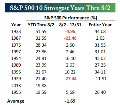
In only three years – 1933, 1987 and 1929 – did the market see losses for the 8/2 to 12/31 period.
And on all but on occasion – in 1929 – the market saw gains for the calendar year.
Of course, the market didn’t have the tailwind of a $3.5 trillion Fed balance sheet in these previous nine bull runs.
The S&P 500 has shown a roughly 90% correlation since the March 2009 low with increases in the Fed bond buying. That’s more than the correlation between stocks and earnings – which have historically determined prices… and which will someday determine prices again.
In a world where the end of Fed bond buying is now being openly discussed, a market that has moved dollar for dollar with Fed policy is vulnerable to say the least.
There’s no guarantee that 2013 will see a repeat of 1929 and 1987. But as Bill says, “The importance of an event is not a just feature of its frequency… but also of its gravity.”
Keep some cash onboard. It may come in handy soon.

Mom and Pop investors are back on Wall Street, and how! According to the Investment Company Institute, the Great American Public has poured $92 billion into the stock market via stock mutual funds since the start of the year.
To put that in context, in the first seven months of last year — when the market was much lower — they withdrew $180 billion.
The last time the investing public jumped into the Wall Street pool with both feet like this was in 2007.
…read it all HERE
As the markets are propelled higher by the successive interventions of the Federal Reserve it is hard not to think that the current rise will continue indefinitely. The most common belief is currently that even if the Fed begins to “taper” their purchases the resurgence of economic growth will continue to propel stocks higher even in the face of higher interest rates. The financial world has finally achieved a “utopian” state where there is no longer investment risk in any asset class -because if it stumbles the central banks of the world will be there to catch them.
1) You are a speculator – not an investor
2) Asset allocation is the key to winning the “long game”
3) You can’t “buy low” if you don’t “sell high”
4) No investment discipline works all the time – however, sticking to discipline works always
5) Losing capital is destructive. Missing an opportunity is not.
6) You most valuable, and irreplaceable commodity, is “time.”
7) Don’t mistake a “cyclical trend” as an “infinite direction”
8) If you think you have it figured out – sell everything.
9) Being a contrarian is tough, lonely and generally right.
10) Benchmarking performance only benefits Wall Street
About Lance Roberts
Lance Roberts, the host of “StreetTalkLive”, has a unique ability to bring the complex world of economics, investing and personal financial wealth building to you in simple, easy and informative ways but also makes it entertaining to listen to at the same time. Lance brings fundamental, technical and economic perspectives, combined with a unique focus, to the day’s news helping listeners understand how it impacts their money.
After having been in the investing world for more than 25 years from private banking and investment management to private and venture capital; Lance has pretty much “been there and done that” at one point or another. His common sense approach has appealed to audiences for over a decade and continues to grow each and every week.
Making money is not hard. Learning how to keep it has been the trick. Lance’s teachings are fairly basic. Conservation of principal, a disciplined approach and living on less than you make and carrying little or no debt is the only way to build wealth. His advice is more of the “chicken soup” variety as there is no magic “black box” to build wealth – just time, hard work and sacrifice.
Lance is also the Chief Editor of the X-Report, a weekly subscriber based-newsletter that is distributed nationwide. The newsletter covers economic, political and market topics as they relate to the management portfolios. A daily financial blog, audio and video’s also keep members informed of the day’s events and how it impacts your money.
Lance’s investment strategies and knowledge have been featured on Fox 26, CNBC, Fox Business News and Fox News. He has been quoted by a litany of publications from the Wall Street Journal, Reuters, The Washington Post all the way to TheStreet.com as well as on several of the nation’s biggest financial blogs such as the Pragmatic Capitalist, Zero Hedge and Seeking Alpha.
After all it is “All About You And Your Money”


-
I know Mike is a very solid investor and respect his opinions very much. So if he says pay attention to this or that - I will.
~ Dale G.
-
I've started managing my own investments so view Michael's site as a one-stop shop from which to get information and perspectives.
~ Dave E.
-
Michael offers easy reading, honest, common sense information that anyone can use in a practical manner.
~ der_al.
-
A sane voice in a scrambled investment world.
~ Ed R.
Inside Edge Pro Contributors

Greg Weldon

Josef Schachter

Tyler Bollhorn

Ryan Irvine

Paul Beattie

Martin Straith

Patrick Ceresna

Mark Leibovit

James Thorne

Victor Adair