
Bonds & Interest Rates
One of the most disagreeable traits in a man is modesty.
He hesitates to commit himself.
“I don’t know…” he says. “I guess…” he begins. “Maybe,” he qualifies.
“Don’t you know anything?” his annoyed wife asks over dinner.
“Probably not,” he replies. “But I’m not sure.”
Uncertain Certainties
 Markets teach modesty…
Young investors can be confident. Old ones rarely are. Instead, they remember all the decisions that went wrong… and all the certainties that turned out to be uncertain.
For every dollar they made because they were sure a stock would rise… they remember the dollar they lost when it didn’t go up at all. And they can never forget the “friend” who offered them a “very special opportunity.”
A young investor finishes off every sentence with an emphatic period. An old one uses so many question marks, he wears the surface off the “?” on his keyboard.
And so… in the spirit of irritating humility… we question our own outlook….
What’s really going on, we wonder?
But first, a quick look at the markets.
A Fatal Flaw
As expected, trading was light yesterday.
U.S. stocks weren’t doing much. Analysts and investors weren’t much on the ball. Commentators and newscasters were mostly away from their desks.
Even the flow of reader feedback is slow.
So, back to our question marks…
We try to spend this quiet time between Christmas and New Year’s Day thinking more deeply, so let’s begin with an uncomfortable thought: Maybe we’re wrong.
Yes, but about what?
The money created post-1971 has a serious flaw: Unlike the gold-backed money that existed before then, this new money lacks natural limits.
The banks that control it can create almost as much as they want. The only constraints are imposed by banking regulators and the central bank – the Fed.
Bankers, being human, are prone to error… especially when it puts money in their own pockets.
They make profits by lending money out of thin air. The new system, as it evolved, allowed them to lend more than ever… including trillions of dollars that no one earned. And no one saved.
That’s why they no longer give out toaster ovens to people who open new accounts. They don’t care so much about depositors.
What they want are borrowers… and the entire industry has put its shoulder to the task of inventing ways to lend fictitious money to people who can’t pay it back.
Result?
About 45 times more debt today than when the new money system began.
And this huge buildup of debt has funded much of the world that we know today…
…the “financialization” of the U.S. economy.
…the rise of the “Deep State.”
…the fast development of China and $10 trillion of U.S. trade deficits. The run-up of the Dow from under 1,000 in 1982 to over 17,000 today. The loss of U.S. manufacturing… the decline of the middle class… and the enrichment of Wall Street.
All these things are consequences of a credit boom, made possible by the post-1971 “paper”-dollar monetary system.
Forever Blowing Bubbles
Good?
Bad?
We don’t know.
But our hypothesis is that, to continue living in the style to which we’ve become accustomed, this credit bubble has to expand further.
The economy that we now take for granted is one that depends on it. Credit has allowed people to spend more than they earn – year after year.
Median household earnings – when adjusted for inflation – are down so far this century. The typical man is less likely to have a full-time job than ever before in history.
Without more credit, the whole system shrivels up like a desiccated slug. But here’s the rub: Debt cannot grow forever.
The problem was discussed long ago by Austrian School economists. They maintained that a boom driven by “credit in excess of real savings” was phony… that it was merely taking resources from the future… and that eventually there would be an equal and opposite bust.
Loans must be repaid. When they are, the money that came into existence when it was borrowed goes back whence it came. The boom turns into a bust.
We’re waiting for the bust. We saw it coming in 2007, as debt levels in the housing sector reached a peak.
And we anticipated the Fed’s reaction to it – more EZ credit.
Student debt, auto debt, energy debt, corporate debt, stock buybacks, mergers and acquisitions – the economy staggers under the weight of it all.
And now, we’re still waiting, modestly wondering how much more the system can take.
Are we wrong?
To be continued…
Regards,
Bill
Market Insight
by Chris Lowe
Investors spent most of 2015 preparing for “lift-off” on interest rates.
This month, the Fed finally raised short-term rates by a quarter of a percentage point to 0.5%.
But as today’s chart shows, the yield on the 10-year Treasury note is almost exactly where it was at the start of the year – at just over 2%.
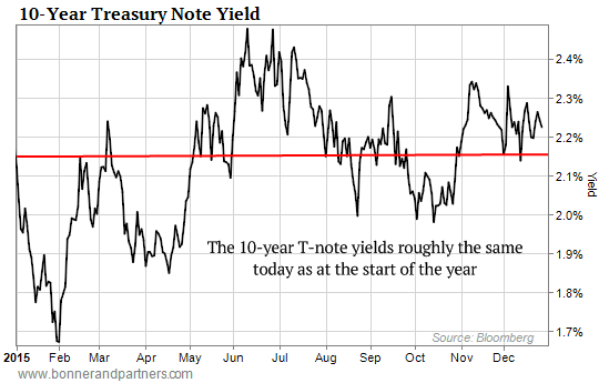
The approximately 2% yield on the T-Note represents the interest the federal government pays for borrowing money over 10 years.
It’s also a key benchmark for other important lending rates, such as mortgage rates.
So much for the end of ultra-easy money…
Further Reading: As Bill’s research shows, the system is already saddled with nearly $60 trillion of debt. So if we get “the equal and opposite bust” the Austrians warned about, it’ll be the greatest economic collapse in history.
In his latest investor presentation, Bill examines how we got to this dangerous point, what’s going to happen next, and how you can protect yourself – and even prosper – during the inevitable financial meltdown. Watch here now.

“Do you play the market?”. The answer should be a resounding no as the market is not a game. In fact it’s quite scientific. A trio of nobel prize winning economists each have created a model that better helps us to understand the science behind the market. Let’s see what Harry Markowitz, William F. Sharpe and Eugene Fama can teach us about the science of the stock market and of modern portfolio theory. Let’s watch….
“Someone is sitting in the shade today because someone planted a tree a long time ago” – Warren Buffett
![]() Paul Philip, CLU, CFP
Paul Philip, CLU, CFP
Financial Wealth Builders Inc.
220 Duncan Mill Rd., Suite 605 | Toronto, ON | M3B 3J5
Phone: 416-497-0008 x225 | Fax: 416-497-2967
Website: www.fwb-inc.com

 Charts Help Us With Fundamental Perceptions
A properly conducted poll can help us better understand the net aggregate opinion of a general population. Using similar logic, stock market charts can help us monitor the net aggregate opinion of all market participants.
When the interpretation of all the relevant factors (earnings, valuations, Fed policy, future expectations, etc.) produces a net bullish opinion, stocks tend to perform well. When the net opinion is mixed, stocks tend to go sideways. During the early stages of a new bear market, the net aggregate opinion shifts from mixed to net bearish.
What Are The Stock Market Polls Telling Us Now?
2015 has, for the most part, been a sideways year for stocks, which tells us the present day net aggregate opinion of all market participants is mixed. From a mixed profile, eventually one of two things can happen to break the stalemate:
- The net aggregate opinion continues to roll over and stocks eventually drop.
- The net aggregate opinion improves and the market’s resolution is to the upside
This week’s stock market video uses a historical perspective to demonstrate why the stock market may be near a major inflection point. The general concepts outlined in the video are captured in the three stock market charts covered in the remainder of this article (below the video player).

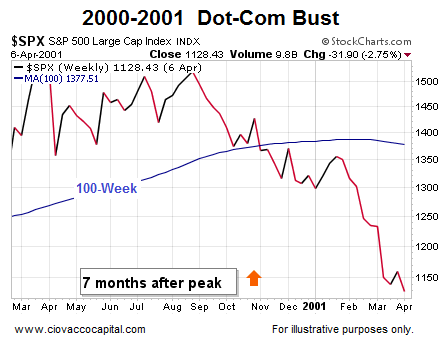
Net Aggregate Opinion Rolls Over In 2000-2001
Our market model looks at a wide array of market data using multiple timeframes. The 100-week moving average does a good job summarizing the present state of the observable facts. On the left side of the S&P 500 chart below, the net aggregate opinion still had a bullish bias (see slope of 100-week moving average in blue). The net aggregate opinion flipped to a mixed state as the slope of the 100-week moving average flattened out. Early in 2001, the market poll started returning bearish results.
Orange Arrows and Apples-to-Apples
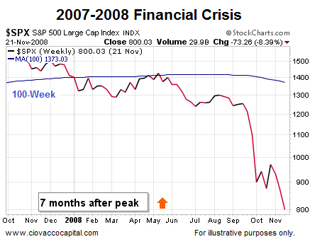
In 2015, the S&P 500 peaked in May, or seven months ago. Therefore, the most relevant point in the 2000-2001 chart above and 2007-2008 chart below is denoted by the orange arrows (seven months after the S&P 500 peaked).
2007-2008: Net Aggregate Opinion Turns Bearish
Is there anything magical about the 100-week moving average? No; remember we are using the 100-week moving average as an illustrative proxy for numerous other forms of hard evidence that are painting a similar picture as the stock market calendar prepares to flip into 2016. A similar “the net aggregate opinion rolled over” look was evident as stocks flipped from a bull market to a bear market in 2007-2008 (see below).
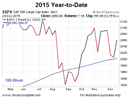
2015: Looks A Bit Better, But Still Vulnerable
This video clip compares the three charts (2000, 2007, & 2015) head-to-head. The key takeaway is the bulls have not thrown in the towel yet (price is still above the 100-week and the slope is still bullish in the 2015 chart below), but the margin of bullish error is getting very thin (price could easily drop below the 100-week and the slope could flatten out and roll over as it did in 2001 and 2008).
How Much Additional Damage Was Done in 2001 and 2008?
Since the S&P 500 peaked seven months ago, our analysis above focuses on seven months after the peak in 2000 and 2007. How much pain was inflicted on retirement plans and stock portfolios from seven months after the peaks in the S&P 500 to the end of the bear markets? The answers are not pretty. In 2001, stocks lost an additional 54%. In 2008, stocks lost an additional 48%, meaning it makes sense from a probability perspective to respect that big moves can follow possible inflection points in investor perceptions.
Flexibility Key Near Possible Inflection Points
As noted in the video, big moves following possible inflection points can be bearish (2000 & 2007) or bullish (1987, 1994, 2011). Therefore, it is prudent to have both bullish and bearish contingency plans in place as we prepare for 2016.
This chart from RBC Capital Markets Research shows that non-precious metal mining shares are almost as cheap as they were at the depths of the 2008 Global Financial Crisis market crash:
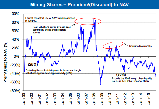
According to RBC non-precious metal mining shares are currently trading at a ~47% discount to net asset value (NAV). At the depths of the 2008 market crash mining shares briefly fell to a ~65% discount before sharply rebounding to fair value within 6 months.
The current bear market decline has been less of a crash and more of a slow bleed with a steady trend of investors becoming disillusioned with the mining space and pulling their capital out of the sector. Will 2016 be the year that shrewd investors begin to put money to work in this much maligned market sector and the valuation gap begins to narrow?
…related:

‘The close of the paradigm’
The irony in this year’s batch of outrageous predictions is that some of them are “outrageous” merely because they run counter to overwhelming market consensus. In fact, many would not look particularly outrageous at all in more “normal” times – if there even is such a thing!
In other words, it has become outrageous to suggest that emerging markets will outperform, that the Russian rouble will be the best-performing currency of 2016, and that the credit market will collapse under the weight of yet more issuance. We have been stuck in a zero-bound, forward-guidance lowering state for so long that there exists a whole generation of traders who have never seen a rate hike from the Federal Reserve. As we close out 2015, it has been nearly 12 years (early 2004) since the US economy was seen as recovering strongly enough to warrant starting a series of hikes – and that series ended in early 2006, nearly ten years ago…..continue reading HERE

-
I know Mike is a very solid investor and respect his opinions very much. So if he says pay attention to this or that - I will.
~ Dale G.
-
I've started managing my own investments so view Michael's site as a one-stop shop from which to get information and perspectives.
~ Dave E.
-
Michael offers easy reading, honest, common sense information that anyone can use in a practical manner.
~ der_al.
-
A sane voice in a scrambled investment world.
~ Ed R.
Inside Edge Pro Contributors

Greg Weldon

Josef Schachter

Tyler Bollhorn

Ryan Irvine

Paul Beattie

Martin Straith

Patrick Ceresna

Mark Leibovit

James Thorne

Victor Adair