
Daily Updates
….click on the link for a larger view and the article
WHO’S IN DEBT THE MOST?: The US debt problems are obvious and the debate regarding taxes and deficits will be the focus of the upcoming Congressional elections. However, when we look at which nation is the most indebted it is clearly not the US, even if we compare the plain sum of outstanding debt just to that of other nation’s not even as a percentage of GDP. Which nation is the world’s most indebted? Actually it is the Eurozone + the UK with just over $7.7 trillion. Next is Japan with $7.5 trillion in outstanding debt. The US has just a bit over $5 trillion and from there it drops materially to Canada with just a bit more than $0.5 trillion; Sweden’s there with less than $0.2 trillion; China’s next with a bit less than Sweden’s and by the time we get down to Norway and Australia it barely registers on the graph. Dennis Gartman For a Trial Subscription go to The Gartman Letter)
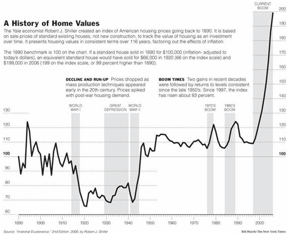
Canadian Housing: Another Debt-Fueled Bubble?
There is currently widespread debate in Canada about whether the country is experiencing a speculative housing bubble or asset inflation based upon sound fundamentals. Last week, two opposing think tanks – The Canadian Centre for Policy Alternatives (CCPA) and the C.D. Howe Institute – released papers on the Canadian housing market. The CCPA paper warns that bubble-like conditions have developed in some of Canada’s key housing markets and attempts to model the potential fallout if the bubble bursts under a number of scenarios. By contrast, the C.D. Howe Institute paper argues that a US-style housing bust is highly unlikely due to Canada’s more sensible housing policies and, instead, predicts only a modest decline in Canadian house prices.
So which think tank is right? Is Canada’s housing market and economy at risk of a US-style housing crash, or would Canada’s ‘strong’ banking system, supposedly tight lending standards, and solid economic fundamentals prevent significant house price falls from occurring? Let’s examine the arguments and data.
Uneven house price growth:
….read more HERE
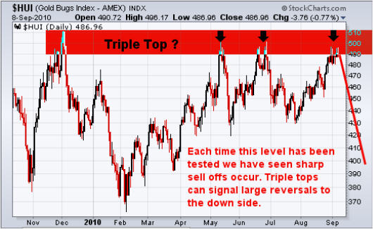
Precious Metals Equity Index Form a Triple Top, What’s Next?
I am going to step out on a limb in this report and cover what I think to be an intermediate top in the precious metals sector. Everyone I speak with and from the hundreds of emails I get I would say the vast majority are bullish on gold and silver. That being said, I feel we are 3-8 days away from a pop and drop in the price of gold.
Below are my explanation and charts of what I think is unfolding.
HUI – Gold Bugs Index
This chart tracks a basket of gold companies and can be used as a leading indicator for gold bullion at times. This index tends to lead the price of gold before rallies and also during declines. I have seen this lead by a few hours and even up to 7 days. I find it out perform when gold is about to rally, and under perform when gold is topping or about to start another move down.
It looks as though we are forming a triple top which also happens to be at a previous 2009 resistance level. Each time this level has been reached sellers take control and send the market sharply lower. There have been several long upper wicks formed in the past few sessions telling me that buyers are pushing the price up, but sellers hit the sell button pulling the market right back down. If this triple tops plays out, I would expect a multi month correction to take place.
UUP – US Dollar ETF
The US Dollar looks to have found support at the March/April lows and has put in a very solid rally. If the chart pattern is correct then it looks as though the dollar will breakout to the upside and run to $24.75 area. The relationship between the dollar and the precious metals sector is generally inverse, meaning if the dollar rallies both gold and stocks should fall.

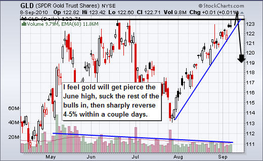
GLD – Gold Bullion ETF
The chart of gold has identical patterns no matter if it’s this ETF or spot gold price. So this analysis goes for both ETF and gold bullion prices. Anyways, the past two times gold rallied for this length of time without any sizable pauses we saw the price of gold drop $70 per ounce, and $140 per ounce which is equivalent to $7-$10 drop on this GLD fund which is a decent size move.
The chart is screaming of a nasty correction to occur any day now. With gold testing the June highs I feel its only days away. What I am looking for is a pierce of the June high. That will suck in the rest of the bulls as they jump on the band, and cause all the shorts to cover their positions. This causes a pop, and once buying starts to dry up, the big money will start to sell down the price to trigger the stops and start a multi day waterfall sell off.
With the declining volume as the price grinds its way higher it tells me fewer individuals want to buy in at these high prices. Once the price starts to slide it will cause the stops to triggered. And because there have not been any substantial pullbacks along the way, there is a larger number of stops sitting in the market waiting to get hit.
Mid-Week Precious Metals Trading Report:
In short, I feel precious metals are on the verge of a sharp correction which may only last a few days, but the drop will be substantial. I still think we could see a few more up days or sideways session before this happens as the June high for gold bullion should be penetrated before the market truly reverses back down.
Anyone long gold, silver or PM stocks should be thinking of tightening their stops and for the gold bugs to mentally prepare them selves for a correction.
I hope my bi-weekly trend reports helps shed some light on the market for you. My trading alerts and frequent updates are reserved only for subscribers, so if you would like more trading analysis, updates and trades please join me at: www.TheGoldAndOilGuy.com
Chris Vermeulen
Quotable
“Security is the chief enemy of mortals.” – William Shakespeare
FX Trading – Gold is telling us something … as usual
In our webinar yesterday, we showed a chart comparing gold and the US dollar index, as you can see below:
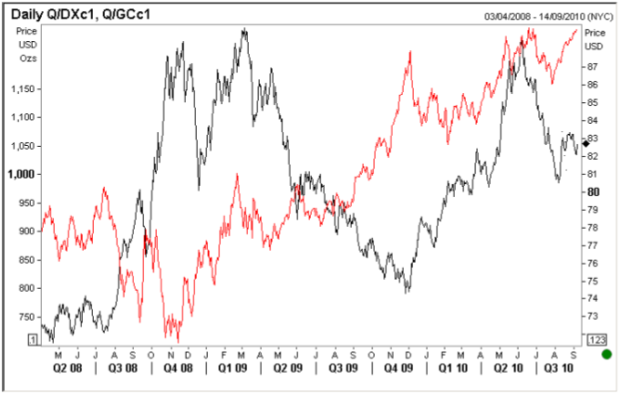
We said what is interesting about this chart is the fact gold and the US dollar have moved in a positive correlation lately. We’ve highlighted the area on the chart roughly where you can see the two price series started moving together. This isn’t usually the case as you well know.
In fact, we usually see a very tight negative correlation, i.e. gold strength and dollar weakness and vice versa. That makes some economic sense, because as gold is priced in dollars, and gold must maintain global purchasing power as an international standard, a……
……read pages 2- 4 HERE
A reliable technical indicator for determining North American equity index trends during the past two years has been the 50-day moving average.
The indicator for equity markets is a momentum trend indicator for North American equity indices such as the Dow Jones Industrial Average and S&P 500 Index based on the average of its closing levels during the past 50 trading days.
Equity indices are considered to be in an uptrend when they are trading above their 50-day moving average and their 50-day moving average is moving higher. Conversely, they would be in a downtrend when they are trading below their 50-day moving average and their 50-day moving average is moving lower.
The indicator has provided reliable buy and sell signals during the past two years. Buying opportunities have been presented when an index falls to just below its 50-day moving average and the 50-day moving average is trending up and selling when it slightly exceeds the average and is trending down.
….read more HERE
-
I know Mike is a very solid investor and respect his opinions very much. So if he says pay attention to this or that - I will.
~ Dale G.
-
I've started managing my own investments so view Michael's site as a one-stop shop from which to get information and perspectives.
~ Dave E.
-
Michael offers easy reading, honest, common sense information that anyone can use in a practical manner.
~ der_al.
-
A sane voice in a scrambled investment world.
~ Ed R.
Inside Edge Pro Contributors

Greg Weldon

Josef Schachter

Tyler Bollhorn

Ryan Irvine

Paul Beattie

Martin Straith

Patrick Ceresna

Mark Leibovit

James Thorne

Victor Adair