
Personal Finance
 From the inside of the Federal Reserve’s gold vault (where we are told one quarter of the world’s bullion resides) to NYC’s diamond district and the gold-dealers on the streets, this NatGeo documentary is a fascinating walk through the reality of trust, money, and gold. As the narrator notes, “the Fed’s discretion is so trusted that few depositors have ever asked to see if their gold is still here,” except of course Germany now that is, adding (from the exact opposite perspective to the man that runs the building) that, “for thousands of years people used gold as money… it’s the perfect recyclable money….” The must-watch video then progresses to the reality of our financial world where he explains, the trillions in money that is transacted every day “used to be backed gold, but is now supported by the promise of our government… The fact that it all works based on trust alone is simply taken for granted,” leaving the ominous question of “who is in charge” of that ‘trust’? Cue Ben Bernanke – who answers the question of what the world would look like without a Fed… bank runs, stock market crashes, and financial chaos.

Todd Market Forecast for Tuesday June 11, 2013
Available Mon- Friday after 6:00 P.M. Eastern, 3:00 Pacific (for a list of servicers go HERE)
DOW – 117 on 2150 net declines
NASDAQ COMP – 37 on 1150 net declines
SHORT TERM TREND Bullish
INTERMEDIATE TERM TREND Bearish
STOCKS:
A sense that the World’s central banks are going to cut back on money printing keeps affecting the stock markets. Today, there was disappointment that the Bank of Japan left things unchanged and this caused heavy selling in Europe that spread to our shores.
Some are saying that when the Fed takes its foot off the accommodation pedal, it will be bullish because that would suggest a better economy. We disagree. In the past, when the Fed stopped easing, stocks have had a tendency to drop.
GOLD:
Gold was down sharply in the early going, but fought its way back. It was still down $9. Rising rates seem to be the catalyst for pushing gold down. We’ll stay in the bullish camp until and unless support is broken.
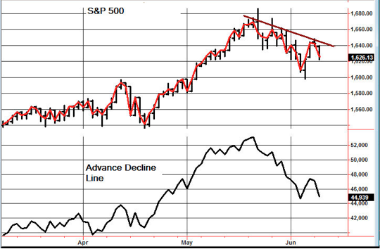
CHART:
Yesterday, we showed you a chart indicating that the S&P 500 had bested a previous high. But, there is another methodology that sends out a less bullish message. Note that there is a descending peaks pattern that still needs to be bested. We don’t like this methodology as well as the one described yesterday, but it does have a place. Also, note that the advance decline line is closer to its previous low than the index is. This can be a problem.
TORONTO EXCHANGE: Toronto was down 159.
S&P\TSX Venture Comp: The Venture Comp lost 9.
BONDS: Bonds were early, but managed to reverse.
THE REST: The dollar got whacked pretty good. Silver, crude and copper were all down.
BOTTOM LINE:
Our intermediate term systems are on a sell signal as of June 4, 2013.
System 2 traders We had a signal. Buy the E-mini S&P 500 futures contract and/ or the SSO. The E-mini trades all night. The SSO trades until 8 p.m. EST. We’ll assume the price for both at that time.
System 7 traders We are in cash. Stay there on Wednesday.
Stock investors We are long Intel from 21.61 with a stop at 22.50.
NEWS AND FUNDAMENTALS:
There were no important economic releases on Tuesday and there are none on Wednesday. Obviously a very slow week.
————————————————————————————
We’re on a sell on bonds as of June 10.
We’re on a sell for the dollar and a buy for the euro as of May 20.
We’re on a buy for gold as of May 20.
We’re on a sell for silver as of May 15.
We’re on a sell for crude oil as of May 29.
We’re on a buy for copper as of May 3.
We’re on a sell for the Toronto Stock exchange TSX as of June 5.
We are on a sell for the S&P\TSX Venture Comp. as of Jan. 29.
 INDICATOR PARAMETERS
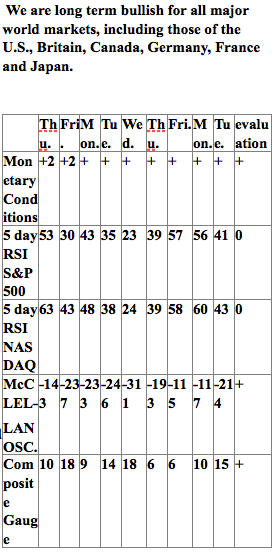
Monetary conditions (+2 means the Fed is actively dropping rates; +1 means a bias toward easing. 0 means neutral, -1 means a bias toward tightening, -2 means actively raising rates). RSI (30 or below is oversold, 80 or above is overbought). McClellan Oscillator ( minus 100 is oversold. Plus 100 is overbought). Composite Gauge (5 or below is negative, 13 or above is positive). Composite Gauge five day m.a. (8.0 or below is overbought. 13.0 or above is oversold). CBOE Put Call Ratio ( Below .80 is a negative. Above 1.00 is a positive). Volatility Index, VIX (low teens bearish, high twenties bullish), VIX % single day change. + 5 or greater bullish. -5 or less, bearish. VIX % change 5 day m.a. +3.0 or above bullish, -3.0 or below, bearish. Advances minus declines three day m.a.( +500 is bearish. – 500 is bullish). Supply Demand 5 day m.a. (.45 or below is a positive. .80 or above is a negative).
No guarantees are made. Traders can and do lose money. The publisher may take positions in recommended securities.
Ed Note: For a complete list of Stephen Todd’s services go HERE
RANKED # 1 BY TIMER DIGEST
Timer Digest of Greenwich, CT monitors and ranks over 100 of the nation’s best known stock market advisory services.
Once per year in January, Timer Digest publishes the rankings of all services monitored for multiple time frames.
For the years 2003, 2004 and 2005, The Todd Market Forecast was rated # 1 for the preceding ten years. For the year 2006, we slipped to # 3 and in 2007, we were ranked # 5.
Our bond timing was rated # 1 for the years 1997, 2007 and 2008.
Gold timing was rated # 1 for 1997 and # 2 for 2006. Late word! We were rated # 1 for 2011.
We were # 1 in long term stock market timing for the years 1998 and 2004 and # 4 in 2010.
To subscribe go to Contact Us.

![]()
The market has pulled back over the past two weeks taking many strong, dividend paying stocks back to their upward trends lines where they should bounce. To find stocks that are suitable for buying at their upward trend line, scan for stock using the following characteristics:
Sentiment Stockscore > 50 < 70
Short term moving average – bearish
Medium term moving average – bullish
Long term moving average – bullish
Pays Dividends filter turned on
I did this on the Canadian market with a minimum number of trades set to 500 and the Market Scan found 26 stocks. I inspected the charts and found the following to be in linear upward trends and at or near their upward trend lines where they should bounce:
![]()
1. T.WCP

2. T.CIX

3. T.MX

Ed Note: the Trading Lesson below explains the methodolgy that Tyler used to select the Dividend Stocks above, specifically :
Sentiment Stockscore > 50 < 70
Short term moving average – bearish
Medium term moving average – bullish
Long term moving average – bullish
Pays Dividends filter turned on
Trading the Channel
Perspectives for the week ending June 11, 2013
![]()
This week’s Market Minutes video show the simplicity of evaluating charts with rising bottoms and falling tops. Watch it on YouTube by clicking here.
This Week’s Trading Lesson
The majority of strong price trends will begin with abnormal price action. A catalyst for a positive shift in the market’s perception of fundamentals ignites buyer interest and starts the stock higher. As the trend develops, improving fundamentals and the law of upticks help the trend to continue moving from the lower left to the upper right of the chart. An uptrend is in place.
It’s inevitable that the upward move will see pullbacks against the trend. There will be shareholders who want to take profits as the stock’s price climbs, and this causes shorter downward moves inside the upward trend. There is an increased chance of these pullbacks early in the trend because investors tend to doubt strength when it’s just getting started. As the trend progresses, stock owners grow more confident, believing that the upward climb legitimizes the company’s story.
The pullbacks are healthy. They work to shake out weak owners and build a more solid base of shareowners who will be committed to holding the stock. It’s the pullbacks that allow us to buy strong companies when they are on sale-the one time it makes sense to buy weakness.
Defining a Trend
To take advantage of the opportunity that trends provide requires the ability to define the trend. This is as simple as drawing a line across at least two inflection points in the trend. Typically, the first is the low before the trend starts, and the second is the low of the first pullback. Once defined, it is quite remarkable how well trend lines act as support and resistance for a stock.
There is a bit of an art to defining a trend line. You begin by highlighting the inflection points and then look for a line that best fits as many of those inflection points as possible. For an upward trend, the focus is on the inflection point lows, which will be rising over time. Downward trends will have a line that cuts across the inflection point tops as they fall from left to right.
Price trends usually develop as a company goes through a period of improving fundamentals. This is what carries the general rise higher in the stock, allowing it to outperform the overall market. In upward trends the tendency is for stocks to run away from their trend line and then come back to them. These fluctuations are primarily attributed to emotion. As investors feel greed and excitement about the improving fundamentals, they chase the stock higher, causing it to go up too fast. At some point, the sellers step in and limit the enthusiasm of the buyers by acting with strength, causing the stock to pull back through a round of profit-taking.
These pullbacks are shorter than the trend that came into them, allowing the stock to maintain its cycle of rising bottoms. It’s the pullbacks, and the resulting rising bottoms, that define the trend line. As chart watchers, we just have to pick out the lows of the rising bottoms and connect the dots, drawing a straight line that best fits the trend.
References
- Get the Stockscore on any of over 20,000 North American stocks.
- Background on the theories used by Stockscores.
- Strategies that can help you find new opportunities.
- Scan the market using extensive filter criteria.
- Build a portfolio of stocks and view a slide show of their charts.
- See which sectors are leading the market, and their components.
Disclaimer
This is not an investment advisory, and should not be used to make investment decisions. Information in Stockscores Perspectives is often opinionated and should be considered for information purposes only. No stock exchange anywhere has approved or disapproved of the information contained herein. There is no express or implied solicitation to buy or sell securities. The writers and editors of Perspectives may have positions in the stocks discussed above and may trade in the stocks mentioned. Don’t consider buying or selling any stock without conducting your own due diligence.

 Wall Street’s biggest disaster was largely due to high-risk deals by one 32-year-old, who lived large and bet crazy
In the summer of 2005, hotshot Amaranth Advisors LLC trader Brian Hunter spied a bargain.
Natural gas supplies nationally were plentiful, gas production was unusually high, and by midsummer storage facilities were brimming with the stuff. Prices were low, hovering between $6 and $8 per MMBtu. Since investors didn’t expect any reason for prices to shoot up, nobody was very interested in options that gave them the right to buy natural gas well above that. The options were going for bargain-basement prices. So Hunter swooped in, scooping up millions of dollars of options on the cheap.
Energy was a growing colossus in Amaranth, and by August 2005 energy investments were tying up 36 percent of Amaranth’s money. Hunter was taking a huge gamble when he bought up his millions of dollars of options. He would profit only if natural gas prices rose dramatically. And that didn’t seem likely to happen.
Then Mother Nature came roaring in to Hunter’s rescue.
…..read more HERE
June 11. 2013
1. The saying, “Close, but no cigar!” could probably be used now, to describe gold & silver investors trying to call a turn in the market.
2. Bank analysts are more bearish. UBS technical strategist Richard Adcock says,“The next leg of the bear trend is to be seen down to the long-term 50 percent retracement point at $1,303, which we would set as our objective.”
3. The action of my gold market stokeillator (14,7,7 Stochastics series on the daily chart) suggests that Adcock could be correct. Please click here now . Double-click to enlarge. In the short term, gold has broken down from a small but bearish rising wedge pattern.
4. The $1300 – $1320 area seems like a reasonable short term possibility, and it’s important to note that banks are rumoured to be aggressive gold buyers now.
5. Only gamblers (anyone using leverage is a gambler) should hedge now, to avoid further price declines. Everyone else should be engaged in very light buying.
6. In a super-crisis, severe account drawdowns are just part of the “great gold game”. You can’t avoid them anymore than you can avoid breathing air. What matters is being able to carry your head high, regardless of where gold is priced.
7. The action of bond prices has a lot to do with how the gold market moves. In the late 1970s, inflation began to spike, and the Fed started aggressively raising rates.
8. Banks then shorted gold aggressively, and bought bonds.
9. From 1980 – 2000, gold collapsed and stayed down, while bond prices moved steadily higher.
10. Are there parallels between that period and today? Well, bond prices stalled out in September of 2011, and so did gold.
11. There is now a large head and shoulders top pattern on the weekly T-bond chart. Please click here now . The technical target of that top pattern is roughly 126.
12. If interest rates are starting to rise now, shouldn’t the banks be shorting gold now, like they did in 1979 – 1980?
13. In fact, the opposite appears to be happening; the COT reports show the banks are buying gold aggressively, and here’s why they would do that: By 1980, interest rates on long term bonds were near 20%.
14. Today, those interest rates are only about 3%.
15. A decline in bond prices to the 126 area, or even to par (100), would hurt bond market investors who bought in 2008 and 2009, but it wouldn’t drive interest rates to anywhere near the levels that existed in 1979 – 1980.
16. What the current decline in bond prices suggests is that global quantitative easing policy, combined with the lightly strengthening economy, is creating inflation.
17. At this point, that inflation is very moderate. Everyone in the gold community knows that prices of what people really need are rising, while governments issue reports that seem to be “massaged”.
18. It would appear that banks are buying gold, rather than shorting it, because they believe the deflation cycle is ending, and a cycle of rising inflation is beginning.The action of the T-bond suggests they are correct.
19. The Fed believes the business cycle is approximately 8 years long. This would suggest the global economy that peaked in 2007 will peak again, in 2015. In the meantime, if the economy continues to strengthen and interest rates continue to rise, there will be more price inflation, but it should still be quite moderate.
20. After 2015, as the Fed’s business cycle transitions from “up” to “down”, substantial stagflation is likely to begin, because central banks may feel compelled to print vast amounts of fiat currency, to counter the downturn.
21. This could cause institutions to panic, and buy gold. At the same time, new Asian gold ETFs should be well-established, enabling hundreds of millions of Chindian (China & India) citizens to buy gold easily, “likely without” affecting the current account deficit of their country.
22. In contrast to almost every other gold analyst, I do not believe that physical gold markets will overwhelm paper gold markets. The price-setting mechanism will remain with paper gold markets, but it will be overwhelmingly bigger Asian paper gold markets that set the price. Not the comex! The comex is akin to a rotary phone, in a world of iPhones. The comex won’t blow up, but it will become irrelevant.
23. Silver doesn’t do very well in a deflationary super-crisis, as most of the silver community found out, the hard way. It couldn’t even rise above the 1980 highs, while gold soared. In a “stagflationary” crisis, which is likely to happen in the post-2015 period, silver could really shine. Please click here now or view below. That’s the monthly silver chart. I like to keep things simple (the KIS principle). Silver touched the lower Keltner demand line at the 2008 lows, and then staged a huge rally. It recently touched that same Keltner line again.

Jun 11, 2013
Stewart Thomson
Graceland Updates
website: www.gracelandupdates.com
email for questions: stewart@gracelandupdates.com
email to request the free reports: freereports@gracelandupdates.com

-
I know Mike is a very solid investor and respect his opinions very much. So if he says pay attention to this or that - I will.
~ Dale G.
-
I've started managing my own investments so view Michael's site as a one-stop shop from which to get information and perspectives.
~ Dave E.
-
Michael offers easy reading, honest, common sense information that anyone can use in a practical manner.
~ der_al.
-
A sane voice in a scrambled investment world.
~ Ed R.
Inside Edge Pro Contributors

Greg Weldon

Josef Schachter

Tyler Bollhorn

Ryan Irvine

Paul Beattie

Martin Straith

Patrick Ceresna

Mark Leibovit

James Thorne

Victor Adair