
Energy & Commodities
Crude continues to surge on a follow through after breaking through a weekly resistance level last friday.
“Everything is going for the market right now,” said John Kilduff, a partner at Again Capital LLC, a New York hedge fund that focuses on energy. “Refineries are operating at higher rates, which is increasing demand for crude. At the same time, gasoline demand is up above 9 million barrels a day for the first time in a long while.”
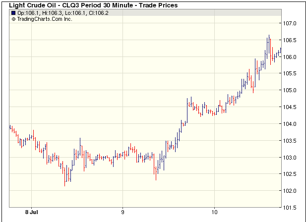 The U.S. benchmark oil extended its rally after breaching a technical resistance level on the weekly chart, according to data compiled by Bloomberg. Futures settled above $103.39 a barrel, the 61.8 percent Fibonacci retracement of the decline to $32.40 in December 2008 from an intraday record high of $147.27 in July that year. Investors typically buy contracts when prices exceed technical resistance.
……..get the whole crude picture HERE

 Has Vancouver Island Bottomed? Well, if it hasn’t it is not far away
Salt Spring Island – some Gulf Island prices are back at 2003 levels!
Five years ago, it would have been hard to find a waterfront house on the largest Gulf Island for less than $800,000.
This summer the typical price for a three-bedroom oceanfront house is $559,000.
Vancouver Island. Prices at Ucluelet and Tofino on the western coast reflect perhaps the biggest price drops on the Island since the days when Jack Nicklaus and European investors tried to launch an expensive and elite golf resort. (That 360-acre resort property, Wynandsea, was listed for sale after its collapse in 2008 for $35 million. Sotheby’s now has it listed for less than $10 million.)
Average price of a 3-bedroom waterfront house in Ucluelet is now $549,000. Non-waterfront 1-bdrm condos are selling for $150,000. It is tough to get financing in the area, however. All sales must be accompanied by an appraisal and properties with on-site rental programs (i.e., fractionals and hotel-condos) are very difficult to finance. In the Comox Valley, waterfront prices are 50% below the 2008-2009 peak. Examples include a 3 bedroom oceanfront home on 1.77 acres for $559,000.
Average house prices in the Comox Valley this May, at $340,000, are the same as in 2011.
Ozzie’s interview with Mike where they discuss, amongst other things, the drop in ocean front real estate prices and some huge real estate price reductions in general that have surfaced. The interview begins at the 24:17 mark:
{mp3}mtjuly6hour1{/mp3}

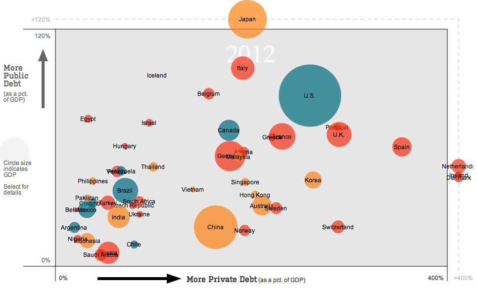
Raising interest rates is a blunt but effective weapon against financial bubbles. Central banks now are experimenting with more targeted “macroprudential” tools. Watch how debt-to-GDP ratios have moved in countries trying such tools by clicking the buttons.
One of the most important pieces of data last week was Friday’s U.S. non-farm payrolls report. U.S. employers added 195,000 new jobs to their payrolls last month, exceeding expectations of 165,000, the Labor Department said on Friday, cementing expectations the Fed will start winding down its $85 billion monthly bond purchases.
It was a very bearish factor for gold which resulted in its fast decline. The yellow metal dropped to $1,208 per ounce on Friday.
“We’re predicting gold will continue to drop year after year roughly by $100 on average each year,” Michael Haigh, managing director at Societe Generale, told reporters at a briefing in Singapore. Haigh sees gold prices hovering around $1,200 toward the end of the year and falling further to an average of $1,150 in 2014. He also said that as prices fell below $1,200, some gold miners would start hedging, adding to the bearish momentum.
Is he right? Will gold revisit its June 28 low at $1,180.71 per ounce and then decline below this level? Will it trigger further declines in mining stocks? Let’s check what happened and what did not happen during the last several days and find out where the precious metals market is likely to move next.
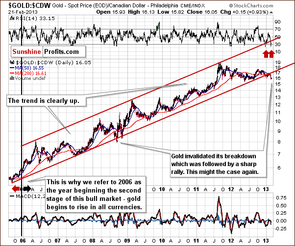
At the beginning let’s take a look at the long-term gold chart and check the current situation in gold (charts courtesy by http://stockcharts.com.).
Click on image or HERE for larger view

In recent days, the price of gold has been trading sideways below an important resistance line, the first Fibonacci retracement level, verifying the breakdown. With a verified breakdown and the declining trend channel in place, we still have a bearish outlook. The most important support level for gold is slightly below $1,100 where two major support lines intersect. These are the very long-term support lines and, at the same time, the 50% Fibonacci retracement level for the entire bull market.
Despite Friday’s data and a bearish outlook, Monday and Tuesday sessions were quite good for gold bulls and the yellow metal climbed up to over $1,260 per ounce. Today (at least at the moment these words are written) we also see a positive sentiment. Has gold already bottomed?
At times, gold stocks can tell a lot about the situation on the entire precious metals market. Let’s take a look at the gold stocks index – the HUI.
Click on image or HERE for larger view

In this week’s very long-term HUI index chart, we can see that not much changed last week and declines remain in place. The downtrend will continue as long as the index is below the 250 level. At this time, we should pay attention to Monday’s and Tuesday’s declines, which pushed the index below 220. From this point of view we may consider that the final bottom will probably form close to or slightly above the 2008 low as indicated by our red ellipse (which also includes the 61.8% Fibonacci retracement level).
Once we know the current situation in the most followed commodity stock indices, let’s take a look at the gold-stocks-to-gold ratio, which is one of the more interesting ratios there are on the precious metals market. After all, gold stocks used to lead gold both higher and lower for years.
The ratio moved lower last week, which has bearish implications.
As we wrote in our essay on gold, stocks and the dollar on June 26,2013:
“ the trading channel and the next horizontal support intersect at a point much lower than where this ratio is today. (…)The ratio might move to its target level – the 2000 low – close to the 0.135 level, which is a quite clear forecast as far as direction of the next move is concerned.”
From this perspective the downtrend remains in place here and we haven’t seen any significant bullish indications.
Our final chart today is the short-term GDX ETF, which confirms the bearish outlook.
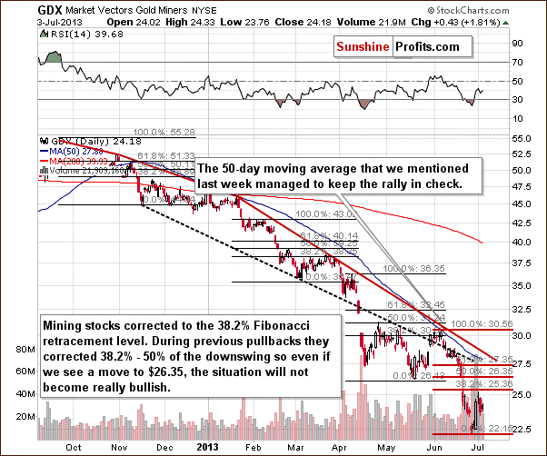
In this chart, we see that the pullback at the end of June was only to the first Fibonacci retracement level. Prices are quite close to this level now and at times approached the 50% level. With this tendency in place, a bigger move lower is still probable even though we could see some very-short-term strength first. As long as GDX remains below $26.35, the downtrend will remain in place. Perhaps the next move to the downside will be the final one.
Summing up, the recent move higher in gold has not been validated yet, and the outlook remains bearish. The charts of gold suggest that the recent rally is nothing more than a pullback. Gold stocks declined despite a rally in gold and the general stock market. These declines in mining stocks are bearish signs for the entire precious metals market for the coming weeks. Naturally, gold and gold stocks don’t have to move as low as described on the above charts – there is a specific price level at which it might be a good idea to open a long position in gold even before these downside targets are reached.

It wasn’t just “credit-boosted phony growth” that caused the big spurt in growth…
A demographic “sweet spot” also provided a highly favorable tailwind.
According to a recent study in the Financial Analysts Journal:
Favorable trends in the size and composition of populations have helped to fuel the rapid economic growth experienced in the developed world over the past 60 years, and their reversal plays a crucial part in the current rapid deceleration in developed world growth.
The problem, say authors Rob Arnott and Denis Chaves, is that these tailwinds are about to turn into headwinds. This will push growth rates into negative territory in 12 of the world’s biggest economies: the US, Canada, Australia, Britain, France, Germany, Italy, Japan, India, Russia, China, Brazil
The problem is aging populations…
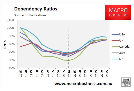
More specifically, something called the “dependency ratio.” This measures the non-working age population compared with the working-age population.
Dependency ratios of the world’s major economies (both emerging and emerged) are spiking, as you can see from the chart below, which looks at the US, Britain, Canada, Australia and New Zealand.
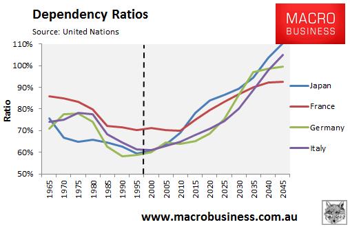
And as you can see from the chart below, the situation is worse in the other major developed markets, Japan, France, Germany and Italy.
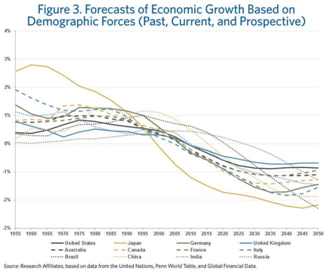
And here are the growth projections of the study, based on this big demographic shift.
This is a major structural headwind facing the US economy. And the Fed is acting as though it didn’t exist. It is pumping stimulus to bring growth back to its “normal” 3-4% range. But “normal” ain’t coming back.
It was a fluke. A one-off. A happy coincidence.
Why Growth Must Fall
Fertility rates in the major global economies simply aren’t keeping up with replacement levels (roughly 2.1 children per woman of childbearing age).
GDP growth is mainly a function of two things: productivity and output. And since output growth is basically a function of population growth (unless the new workers are highly unproductive), population growth is a huge boost to economic growth.
When you break it down, countries with older populations and lower fertility rates tend to grow slower than countries with expanding workforces and higher productivity rates.
This is why, for instance, Japan grew so swiftly in the 1960s-1980s… and why it started to slow in the 1990s, as legions of Japan’s boomer population hit retirement age and started to become a negative influence on GDP.
It’s also the major reason why we got a burst of growth from the 1980s onward. The fall of the Iron Curtain opened up massive new labor markets as well as consumer markets… and millions of new workers joined the labor forces of the world’s emerging markets. And in the US, the population grew from about 200 million at the end of the 1970s to about 300 million today.
These powerful demographic forces shape the world… and long-term asset prices. But as investors, we sometimes don’t see them. That’s because we are vulnerable to something called “recency bias.” We’re inclined to use our recent experience as our template for what will happen in the future.
When it comes to investing, this is a disaster. Because instead of thinking about the trends shaping the future, we extrapolate past trends out into the future. This is one of the biggest mistakes you can make as an investor, because markets are cyclical… and often follow a boom-bust pattern.
Stimulus has a powerful effect on US stock prices. We’ve seen a nearly 90% correlation between the rise in the S&P 500 and the expansion of the Fed’s balance sheet. But long term, fundamentals matter.
Combine these demographic headwinds with current valuations, and the major US indexes look overpriced. I am certainly not a buyer at today’s levels.

Chris Hunter
Investment Director
Bonner & Partners Family Office


-
I know Mike is a very solid investor and respect his opinions very much. So if he says pay attention to this or that - I will.
~ Dale G.
-
I've started managing my own investments so view Michael's site as a one-stop shop from which to get information and perspectives.
~ Dave E.
-
Michael offers easy reading, honest, common sense information that anyone can use in a practical manner.
~ der_al.
-
A sane voice in a scrambled investment world.
~ Ed R.
Inside Edge Pro Contributors

Greg Weldon

Josef Schachter

Tyler Bollhorn

Ryan Irvine

Paul Beattie

Martin Straith

Patrick Ceresna

Mark Leibovit

James Thorne

Victor Adair