
Gold & Precious Metals
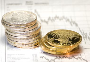 Everyone knows that gold (COMEX:GCZ13) and silver (COMEX:SIZ13) have value, but few people understand their real value. Some people say that the current price of gold and silver is too high after rising 12 years. Is that true? If we know the real value of gold and silver, we will have a clear answer to the question. In this article, I will decode the three main components of the value of gold and silver: Monetary value, commercial value and cultural value. Then we will know if it is worth to buy gold and silver at the current price and what to buy. This article is for all people no matter whether you own gold and silver or not.
1. Gold and silver have monetary value
The principle to estimate the monetary value of gold and silver is based on the fact that gold and silver are money. Many people account paper currency as money. That is wrong. Paper currency is just a kind of fiat currency. “The average life expectancy for a fiat currency is twenty-seven years” (Chris Mack, president of Trade Placer). Gold and silver are real money and have been used as money for 5,000 years by all countries. You can easily learn the difference between money and currency on the internet. I don’t need to reiterate here. Just remember that a currency loses its purchasing power as the currency issuer, the central bank, prints more currency. But money (such as gold and silver) will never lose its purchasing power though it may fluctuate during some short periods. No one can print one ounce of gold or silver.
The method to estimate gold’s monetary value in a specific currency is that the money supply should be backed by the total gold reserve in that country. There is money supply data such as monetary base, M1, M2, M3 and gold reserve data such as central bank gold reserve, private gold reserve, tradable gold, aboveground gold and underground gold. Different money supply data should be paired to different gold reserve data (monetary base and central bank gold reserves are a pair, aboveground gold and M2 are another pair). The results derived by different pairs should be coincident or approximately the same value. I will use the monetary base and the gold reserve by the Fed as an example to estimate gold’s monetary value in USD. We know that the Fed reserves 261 million ounces of gold (World Gold Council) and the current monetary base is $3,398,930 millions in August, 2013 (FED). Therefore, the gold’s monetary value is $13,022 / ounce (3,398,930 / 261). There are some countries such as China and Canada who don’t have enough gold reserve at present to back their currencies. For those countries, we use the global total monetary base and total gold reserve by all central banks to estimate gold’s monetary value as a reference. Fortunately, the result is almost the same as the value we got in the USA. It is about 80,000 yuan / ounce in RMB or $13,000 / ounce in CAD.
Regarding silver’s monetary value, the result is terribly high, which few people can accept it today if we use the silver reserve to divide the monetary base. The reason why silver’s monetary value is higher than gold’s monetary value is that silver is rarer than gold for almost all kinds of reserve data. According to Silver Institute and CPM Group, current government stocks of silver are close to zero compared to 350 million ounces in 1970, more than 95% of silver dug by human beings has been consumed by industry. However, we can estimate silver’s monetary value with an alternative method by dividing gold’s monetary value by gold silver price ratio (GSPR). In another paper, The Beginning of the Silver Age, I discussed GSPR and suggest that it will reach the area between 9 and 16 in about five to ten years and will continue to go down in the long term. Let’s use the medium number of 12.5 as a possible GSPR, we can get the current monetary value of silver as $1,041 / ounce in USD and as 6,400 yuan / ounce in RMB.
2. Gold and silver have commercial and cultural value
The cultural value of gold and silver is really difficult to estimate because people with different cultures have different value standards. In addition, some items have added value beyond the materials. For example, a gold dish or chair used by a king or a hierarch, an amulet given by a relative, ancient silver coins and so on, all of them have added value and the value is hard to estimate. The commercial value of gold and silver is mainly decided by their supply and demand. It’s also hard to estimate the exact value. To make it easy, I will use statistical methods with historical data spanning 70 years to estimate the gold’s commercial and cultural value (GCCV) together in terms of monetary value.
Using the historic data of monetary base and gold reserve in the United States, we can calculate gold’s monetary value in USD during the last 70 years after Bretton Wood System (July, 1944). Then we divide gold price by monetary value to get a chart of the ratio of price to monetary value of gold (RPMV-Gold) in the United States over the last 70 years as in Figure 1.
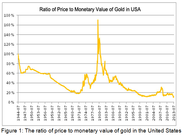
From figure 1, we can see that RPMV-Gold reached 170% in 1980. Most people in North America and west Europe then expected gold would be money again soon. The 70% more above its monetary value was the maximum RPMV-Gold. We also see that RPMV-Gold reached the bottom around 10% three times in 1999, 2008 and 2013. Few people in the world these days think that gold will be money again thanks to the government education all over the world. Now we have a range of GCCV from 10% to 70% of gold’s monetary value. With the same principle, we can figure out the range of silver’s commercial and cultural value (SCCV), it was between 2% and 60% of silver’s monetary value during the last 70 years. The ratio of price to monetary value of silver (RPMV-Silver) will be much higher than 60% in the future because of the coming silver shortage.
3. The value of gold and silver and the future price trend
Now that we have the monetary value and the statistical range of commercial and cultural value of gold and silver, we can figure out the current value of gold and silver. For gold, it is between $13,022 / ounce and $22,137 / ounce (monetary value plus maximum GCCV). For silver, we use the GSPR of 12.5 and current value of gold to estimate the value, it’s between $1,041 / ounce and $1,770 / ounce. All these values are just for reference and must be adjusted dynamically according to the money supply and gold reserve data.
The future price trend of gold and silver will be a movement from the current price to their actual value. Comparing the current price and the value of gold and silver, we know that the future price trend of gold and silver will definitely go up. Therefore, we should purchase gold and silver at the current price. The current RPMV-Gold around 10% is the third opportunity that the market gave us in 70 years and generally we cannot expect to get the opportunity more than three times. The door may close quickly very soon.
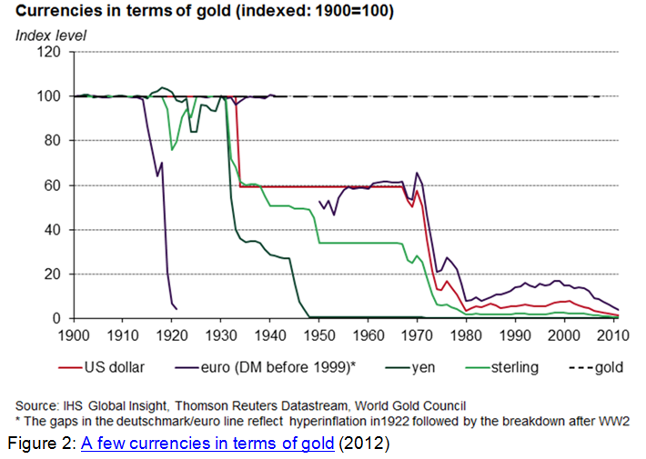
Some may argue that gold and silver will not be money again and their prices will never match their values. The problem with those opinions is that those people forget how long gold and silver have been used as money and how long the average life cycle of the fiat currency is. History told us unlimited times: Any fiat currency will eventually become useless paper. No fiat currency has lasted forever. Figure 2 shows the value changes of a few currencies in terms of gold from 1900 to 2012 (World Gold Council). We can see the value trend for all those currencies is going to zero. No matter whether or not gold and silver will be money again, one thing is for sure: All fiat currencies will eventually fail, but gold and silver will hold purchasing power forever. From this point of view, any price is a good price to buy gold and silver. However, you must be aware that if you purchase gold and silver at a price higher than their value, such as the price in January 1980, you may have a risk temporarily. But you will be the winner eventually if you own real gold or silver instead of the fiat currency. Some people measure stuff such as commodities, houses, stock indexes and workforce costs in gold and silver instead of paper currencies. That is an alternative method to value gold and silver.
4. Buy real gold and silver, not shadows
If we buy gold and silver at the current price $1,325 / ounce and $22.2 / ounce, we have an investment return of 9 folds for gold and 40+ folds for silver. It might not happen overnight except that the market will repeat January 30, 1934 again, it might last for a few years or decades until your current currency fails or a new gold standard system will be reassumed. The bottom line is that you should include gold and silver in your portfolio. History also tells us that silver usually moves in the same direction as gold. As long as gold price goes up, silver price will rise faster than gold price. If you believe that gold price will rise, you have no reason not to buy silver.
I recommend everyone buy some real gold or silver bullion such as bars, coins, U.S. Eagle, Canadian Maple, Chinese Panda, Australian Nugget, etc. Don’t buy the old coins or commemorative coins if the premium is too high because the high premium will lower your investment return. You can always choose the lower premium bullion to get a better investment return.
You can buy some other forms of gold and silver such as the ETF shares, a certificate by a bank or an organization, mining shares, futures contracts and options, but they are all shadows of gold and silver. Shadows are for trading, not for investment. It’s easy to understand that if you own shadows, you own nothing. There are some unexpected issues in owning shadows. First, some mining companies will finish digging out their underground gold and silver reserve someday; their shares may fall down sharply then. Second, banks may not have enough gold and silver in their vault at all. You might never get real gold and silver. There are rumors that many central banks sold out their gold reserve already or leased to commercial banks and have never bought it back again. I cannot imagine what will happen if that is true. Third, all ETFs are the same as bank certificates. Last, futures contracts and options are designed for arbitragers, speculators or traders, not for investors. If you are a serious investor and not a seasoned trader, you cannot use any leverage or loan to buy gold and silver. Otherwise, you may have trouble in a deep correction. Your own money is the only choice.
Conclusion
I often tell people to buy gold and silver bullion to protect their wealth with money history, inflation knowledge and the trend of paper currency. One month ago, a person challenged me with “The current gold price at $1,300/ounce is too high. I would buy gold at $35/ounce in 1971.” First, I told him: “It is worth to buy gold and silver if the price is under the value.” Then I spent 20 minutes expounding that the current price of gold was cheaper than the price at $35/ounce in 1971 if we compared the price with their monetary value (refer to figure 1).
There are a lot of catalysts for gold and silver prices to rise abruptly. They might be: The peak of global gold and silver production, world war, people get their real gold and silver from the banks or ETFs, short squeeze in the futures markets, some insolvent countries default, super inflation in some large countries, or the next time Chinese government publishes their gold reserve. Anything expected or unexpected can ignite an accelerating uptrend.
As a final reminder: The numbers I gave you in this paper are not the price targets. You must dynamically calculate the value and compare it with the price. If you unluckily purchased gold or silver at a relative high price, don’t complain, don’t worry, you will be determined about the uptrend of gold and silver after understanding their real value.
About the Author

Into the Transformational Future
Where in the World Is Your Pension?
Rich City, Poor City, Beggar City, Thieves?
Toronto, New York, Chicago, Tucson, and the Barefoot Ranch
“The future is already here,” intoned William Gibson, one of my favorite cyberpunk science fiction authors, “it’s just not very evenly distributed.” Paraphrasing Gibson, the pension crisis is already here; it’s just not very evenly distributed. For the past two weeks we’ve been exploring the problems of state pension funds. This week we will conclude our look at pension plans for the nonce with a 30,000-foot overview of the states and then take a deeper dive into one city: mine. This will give you at least one version of how to do your own homework about your own hometown. But fair warning, depending on your locale, you may need medical help or significant quantities of an adult beverage after you finish your research. Then again you may be pleasantly surprised and congratulate yourself on choosing a particularly adept hometown. And be on notice that, no matter what your personal conclusion and how well-grounded your analysis is, there will be people who live in your neighborhood who think you are utterly full of, well, let’s just say “nonsensical matter” and leave it at that. This is a family letter.
Into the Transformational Future
First, a quick announcement. I am constantly asked where the future jobs will be, and I think hard about the answer to that very personal question (it’s crucial to those of us who have young kids). Will we see Gibson’s dystopian world or Ian Banks’ world of abundance? The answer is, of course, that secular growth in employment will come from the new, transformational technologies that are already being created all around us, truly new industries that will change everything and create opportunities for work that we can’t even imagine yet, in the same way the automobile or telecommunications or the McCormick reaper both took some jobs away and created even greater opportunities. The transition is the thing, though. It will be filled with opportunities for some and forced change for others, while we wait for the future to become more evenly distributed. In the next few weeks, you are going to get a letter from me that will tell you about the newest addi tion to Mauldin Economics, the Transformational Technologies Alert, written by my longtime friend Pat Cox, who is no stranger to readers of this letter. Pat and I have long wanted to work together, exploring the future and especially biotech. He is the best, and you will want to join us from the very beginning. We invite you to charge ahead into the future with us, exploring opportunities that will begin to change your own life right now. And now back to pensions…
Through the courtesy of one of your fellow readers I’ve been given a treasure trove of data on 702 city pension plans. I won’t say that I got lost in the data, but the search and rescue teams sent to find me had to go back for extra supplies. There were some very dark alleys that it took a while to find my way back out of. Not to mention some twists and turns that were totally surprising.
So first I need to say a big thank you to Gregg L. Bienstock and Justin Coombs of Lumesis for giving me access to their data. Gregg is a cofounder of Lumesis, and their signature software is called (appropriately enough, given the oceans of data they plumb) DIVER. They’ve compiled data on 54,000 issuers of municipal and state bonds from over 100 sources. They sent me an Excel file on the major pension plans of every state and the pension plans of cities with populations over 100,000. And Justin was kind enough to create multiple spreadsheets and graphs upon request and patiently explain their data. The bulk of the data in this letter is from http://www.lumesis.com. The opinions are my own and should not be attributed to Lumesis. From time to time we will also look at another fascinating study from the Pew Charitable Trusts on pensions and retiree healthcare in 61 cities.
As we have seen the last two weeks (here and here), the assumptions that states make about their future investment returns are fairly unrealistic and generally nothing like what they’ve achieved for the last 10 years. This makes their balance sheets look far better than they really are, and for some states the discrepancy is pretty stark. Witness Illinois, where unfunded pension liabilities run north of $280 billion, give or take. That is more than $20,000 for every man, woman, and child in the state. And the bill keeps rising every month as the state plows ever deeper in debt to its own future.
Keeping in mind the caveat that the percentages may actually be worse than reported, let’s look at a few graphs on a state-by-state basis. This first graph shows the funded ratio of state pension plans through 2012. (Note: on all the graphs the large “island” below Louisiana is a representation of Puerto Rico. To its left is Alaska, and both are obviously not to scale.)
The next graph shows actuarial required contributions (ARC). The ARC is simply the amount of money required to fund the pension plan given the return assumptions of the plan. The important thing to note here is the amount of blue in the graph. If you ask your local politicians how their pension plan is doing, they can probably tell you with a straight face (and because they don’t know any better) that their state’s pension is fully funded. I note with some alarm that “conservative” Texas doesn’t fare very well. While Texas claims funding above 80%, a more reasonable assumption on returns suggests it is no better than 43%. Can Rick Perry run for president as a conservative on that number? Then again, can New Jersey Republican governor uber-star Chris Christie run on his state’s funding level of 33%? Just asking.
Where in the World Is Your Pension?
The more appropriate question to ask is “What percentage of my state’s total future liability is unfunded?” And here the color pattern of the map changes. If you can look at this map and discern a political pattern, you are seeing something that I can’t find. “Red states” can be adequately funded or a disaster, and the same goes for “blue states.” This will also hold true when we look at cities. There is simply no rhyme or reason as to why some cities are paragons of virtue when it comes to funding pensions while others make drunken sailors look virtuous.

I asked Justin to give us one last chart, which is unfunded liability as a percentage of state GDP. This gives us an idea about the ability of a state to increase its level of funding if it needs to do so.
As we showed last week, the funded ratio represents a plan’s assets as a percentage of liabilities, or the amount of money owed in benefits. The funded ratio is one of the primary measurements of a pension plan’s overall funding health. It provides an additional layer of context that unfunded liabilities alone cannot. For example, California has a larger unfunded liability than Kansas does, but based on what these states currently know they will owe to retirees versus the amount of money they actually have, the funded ratio tells us that Kansas is in worse shape than California, with Kansas’ plans being 29% funded and those of the Golden State being 42% funded.
By this measure, the seven most poorly funded states are Illinois (24%), Connecticut (25%), Kentucky (27%), and Kansas (29%), along with Mississippi, New Hampshire, and Alaska, which are tied at 30% funded. At the other end of the spectrum, using a realistic assumption of future returns suggested by both Moody’s and GASB, Wisconsin, the most well-funded state in the country, has just a 57% funded ratio, followed by North Carolina (54%), South Dakota (52%), Tennessee (50%), and Washington (49%). This is in spite of their claiming a much higher ratio based on very aggressive assumptions. (Data is from a great report in which you can see how your state fares.)
Rich City, Poor City, Beggar City, Thieves?
I have struggled to find a way to convey the disparity among cities with regard to their pension programs. I suppose, given the realities of city politics, which can be the most vicious of all contact sports in America, the differences should not be surprising. Whether a city is rich or poor, the personal assassination and endemic corruption can be riddled through city politics like fat through bacon. It is a wonder that anyone would want to go into city politics.
All real estate prices are local, we are told, and the same is true of pension funding. Take Lexington, Kentucky, a town full of Southern charm with a genteel feel sprouting in the midst of Kentucky horse (and basketball) country. And for whatever reason, in Lexington they seem to feel they should almost over-fund the city employees’ pension fund, at a level of 91% (only outdone in the database by Gainesville, Florida).
And then go up the highway to their neighbor (and basketball archrival) Louisville. There must be something different in the water there, as they have decided to fund only 30% of their firefighters’ pensions, while assuming they will get 7.5% returns on their investments, an unduly optimistic assumption that will surely make the true level of their unfunded liabilities even more egregious.
We can go a little south to Nashville, Tennessee, one of my favorite cities, internationally known for its devotion to country music. Some of their pension programs are funded only to the tune of 20-25%. But their suburb Murfreesboro, a ZIP Code away, is 98% funded.
Arlington, Texas, home to the Texas Rangers and the Dallas Cowboys and where I used to live and own a home, is overfunded by 20%. And then there is Dallas, where I have just purchased an apartment. The database tells me the city employees’ pension fund is 86% funded and assumes an 8.25% future return on its investments. Not all that bad in the grand scheme of things but nothing to brag about. Oh wait, you also have to look at the Dallas police and fire pension fund, which is only 76% funded. And they are projecting an 8.5% annual return, which puts them at the top of the charts for optimism about the future. But those numbers tell only part of the story.
I randomly selected about eight cities and did further research on their pension funds. In almost every case there was far more than meets the eye, both good and bad. So rather than pick on Chicago (far too easy a target) or another random location, let’s look at my new (as of June) hometown of Dallas. I would encourage you to do the same type of analysis on your own town or city.
Let me first put on my Chamber of Commerce hat before I take off the gloves. Dallas is a thriving city with a history of very active and effective civic leaders. While some freeway is always under construction, it is relatively easy to get around the region. The Dallas-Fort Worth airport is a dream. There are very few places in the world that I can’t get to with just one layover. I can walk out of my apartment in downtown Dallas and be through airport security in less than 30 minutes. Try that in Chicago or New York. The area in general and Dallas in particular has fabulous restaurants that honestly rival those of any city I’ve been in. The area has more live-theater venues than any city but New York (who knew?). From time to time our local sports teams have been known to achieve some success. Admittedly, the schools range from being ranked among the top in the nation to being complete failures, but there are many options. Taxes are generally low, and the area is a great place to do business. The infrastructure works, and the labor force is educated and abundant. The women are legendarily beautiful, and all the children are above average. Given that I could live almost anywhere, Dallas is where I want to be.
And now, as Paul Harvey would say, here’s the rest of the story. Most of the world knows Dallas through the 1980s television series Dallas, starring Larry Hagman as a swaggering oilman. The show was replete with beautiful women with big hair, stereotypical men in big hats, and lots of family feuds and vendettas. The truth is a lot different, but there is a rhyme or two here or there. And that brings up a tale that will lead us into the Dallas pension story.
Back in 2007, some ambitious real estate developers decided to build a fabulous jewel of an apartment high-rise in the middle of what is known as the Arts District in downtown Dallas. Dallas civic leaders have chosen to develop its major museums, symphony hall and separate major opera hall, plus live-theater venues, in the center of town. They even built a massive (and very expensive) park over a freeway entirely with private money in the middle of the Arts District, which has become a gathering place for the citizens. And then came the financial crisis.
Not to be deterred, the city went forward with the building called the Museum Tower. And I will admit that it is one of the more beautiful buildings in Dallas. When I was searching for places to live, I did a little research on it and quite frankly decided not to even take a closer look. Let’s just say it was very aggressively priced. I ended up buying a very similar property only a few blocks away with great views for a fraction of their asking price. But there was another reason I didn’t look: there was a major lawsuit going on between the building and its next-door neighbor, the Nash Sculpture Center, which is a truly wonderful venue supported by all the don’t-cha-knows of Dallas. It seems the glass Museum Tower building reflects light onto the sculpture center, destroying the open-air ambience, or at least that’s what their lawyers claim. The story that it is melting the sculptures is apparently b ogus. It doesn’t help that a few “rogue” architects said during the planning sessions for the Museum Tower that the problem would occur. Who would want to buy a place when you don’t really know what the homeowners’ association fees are going to be?
So who funded this luxury high-rise building? As it turns out, the Dallas Police and Fire Pension Fund did. To the tune of $200 million. Leveraged. Six percent of the current value of the fund, give or take. Which is already underfunded by around $1.2 billion, assuming they meet their stated objective of 8.5% annual returns. Plus, they have other unstated commitments to what are known as DROP accounts, which could become a liability totaling hundreds of billions, by my back-of-the-napkin estimation.
Note: when you look at your city’s or county’s pension fund, don’t just look at the readily available public reports. Sometimes you have to dig for the other, “off-budget” commitments of the city. Some cities report pension and healthcare commitments separately. Of the 61 largest cities in the US, 22 face larger unpaid bills for healthcare than they do for their pension funds. An astonishingly large number of cities have reserved next to nothing to cover future healthcare promises. Without looking at the local politics, I can almost guarantee you that those cities will end up shifting their liabilities to “Obamacare,” that is, to federal taxpayers like you and me, in the very near future. It’s is the only rational thing to do. Just like Walgreens and IBM did. Sort of. Just saying.
I have to admit that when I first saw the data that suggested the city of Dallas expected to get 8.5% returns on their pension funds, I was aghast. That is the highest level of projected returns for any city I could find in the database. Here I have committed to paying taxes in Dallas, and I am looking at a personal major unfunded liability. But then I looked at the rest of the story.
As it turns out, the management of the Dallas Police and Fire Pension Fund has actually returned 8.5% for the last 10 years. They rank in the top 1% of all city pension funds in the United States. Last year they did 11.4%, and for the last three years they did 6.7%, although if you go back five years and include the Great Recession, the returns have only averaged 1%. Even so, a fabulous track record for a major fund. If any fund could make a case, based on past performance, that 8.5% future returns are possible, they could. So I began to wonder, how in the heck have they done so well? You clearly don’t do that through normal pension fund allocations. (Ask Illinois.)
And of course they didn’t. Fifty percent of the fund is in real estate – far above the normal allocation. And they manage the fund internally (which is both unusual and controversial). A fair amount of the fund is in luxury real estate (totaling $400 million or over 12% of the fund), some of which has been hammered. And they are saddled with lots of legal problems, which, not surprisingly, appear prominently in the local press. Why, the newspaper asks, is a supposedly safe police and fire pension fund invested in luxury homes in Hawaii, homes that haven’t sold for five years? Why has the fund spent $1 million flying its executives around the world to fabulous locations to look at real estate? Why wouldn’t they fix the building that is spoiling the ambience of the centerpiece of the Dallas Arts District? And why would they hire a local PR firm to create false Facebook posts (a ploy they claim no knowledge of, of course) and one of the most aggressive law firms in town to go after anyone who criticizes them?
And yet, somehow management figured out how to make 12% on its global fixed-income portfolio (while the Templeton Global Bond fund returned a mere 7.6% the past year) and 16% on its global private-equity portfolio (as of 3/31/13), for one year. On private equity 12% seems to be closer to the average. I couldn’t get details on the components of those returns or the specific funds involved, but the surface returns seem rather phenomenal. Wouldn’t we all like to earn 35% above our benchmarks? Talk about all the children being above average… Just saying.
And herein lies one of the instructive lessons. The Dallas fund has significantly outperformed its peers by choosing a course that is far from the norm. They have made what would be normally called “alternative investments” a core holding. Not unlike David Swenson’s approach at Yale, although he does it with a different mix of alternative investments. If I had the misfortune to be responsible for a large pension fund, I would be arguing for much a larger allocation to alternative investments. Real estate might not be my personal preference, but it is a good one nonetheless.
The second lesson is that if you do it (“over”-allocate to alternatives) you’re going to be heavily criticized, and you probably need skin thicker than the glass on the Museum Tower. And be just as able to reflect the glare of local criticism.
For all their overall success, the Dallas fund’s projections of future returns are still significantly higher than I consider to be prudent. And even given their projections, the fund is significantly underfunded, to the tune of $1.2 billion. Which is not small change, even in Dallas. If I were depending on that fund to be the source of my future retirement, I might well be asking the city of Dallas to pony up more than the $100 million they are contributing each year. And the city of Dallas might be thinking that the policemen and firemen should be offering to do a little more as well.
All that being said, the average Dallas police or fire department employee will not be getting rich on his or her retirement. This is not a California prison guard retirement fund. It is rather bare bones, from what I can see. And when you read all the social commentary surrounding the fund, you come away with a strong sense of the local angst involved. These are real people with real issues, both taxpayers and city employees and retirees. And those issues are not different than in any other city in any other state. If you start reading the stories on the bankruptcy of Detroit, the situation is quite heart-rending, and logic flies out the window. (Seehttp://mobile.nytimes.com/2013/09/20/us/residents-of-detroit-go-to-court-for-pensions.html.)
“There is no room for austerity,” said one Detroit resident. Somehow, those in charge should be made to come up with the money when they go bankrupt. But the politicians who made the decisions that led to the bankruptcy are long gone from the scene. Austerity is a consequence of prior decisions. If prudent decisions are not made in the present, the future shows up all too quickly. Some cities have made prudent decisions, others not so much.
Meredith Whitney is famous for telling 60 Minutes that 50 to 100 municipalities would default in 2011. I was quite skeptical when she said it, and she was clearly wrong. But looking at the data, there are far more than 50 to 100 cities in potential trouble. Will a wave of defaults happen next year? I highly doubt it, as cities have the ability to kick the can down the road at least as well as Europe countries do. But would I want to live in Houston or San Diego? Not based on their pension liabilities. Nor would I want to live in Nashville or Louisville or any number of otherwise wonderful cities.
Most cities and states that are in trouble still have the “luxury” of being able to deal with the problem in advance of being forced to buy the markets. They need to take the time they have to get their programs straightened out. Those cities and states that have been prudent are to be congratulated, but they might want to worry about being forced to fund their less prudent brethren from their own tax revenues. It can happen, as it did in Texas when the judiciary forced shared taxes for school districts even though voters and the legislature said no. Just when you think you are safe…
Municipal bond markets are going to become far more difficult places to make money in the future because of pension issues. Municipal bonds make sense for certain investors, but it is going to become very important to know who your municipal bond fund manager is. Can they discern between good credit and bad local management? A small change in ZIP Code can make a huge difference in returns.
Is this a national crisis? I don’t think so, but it can certainly be a local one. If I were you I would do little research. And maybe it would be prudent for both of us to get a little more involved with our local cities. I still have scars from getting involved in city politics in Arlington many years and a couple of lifetimes ago, but maybe I need to ask a few questions here and there. And perhaps you should, too.
Toronto, New York, Chicago, Tucson, and the Barefoot Ranch
I leave tomorrow for Toronto, where I will be speaking with my friend Louis Gave at his conference on Monday. Sunday night I get to have dinner with good friends David Rosenberg and Louis and Steve Cucchiaro (of Windhaven Funds). The night won’t be long enough to contain our conversation, but I know we will squeeze in as much as possible. I go from Toronto to New York City, where I will get to dine with my great friend Art Cashin and the usual suspects, plus a few new friends. I will be speaking at several events for Altegris Investments the following two days before returning to Dallas. Then it’s a quick trip to Chicago, again speaking for Altegris Investments, before I move on to Tucson to celebrate my birthday at the Casey Conference with a lot of good friends. When I come back, I will get ready to head out to Kyle Bass’s Barefoot Ranch to spend a few days with a number of investment types, discussing the issues of the day. I will report back.
If all that sounds somewhat exhausting but enormously fun, that’s because it actually is. I sometimes wake up wondering how it all happened and what I have to do to keep the magic going. That is on top of waking up and wondering what city I’m in. The exhaustion and exhilaration seem to go hand in hand. But I wouldn’t change any of it, at least not right now. I am having way too much fun.
It is time to hit the send button. In a few weeks I’ll start telling you about a new book that will come out in about a month. Yes, I actually finished something, as opposed to the books that I keep telling you I’m going to write about the future of work or what the world will look like in 20 years. Which are indeed still works in progress. But it doesn’t hurt to tell you about the things I keep thinking about and researching away on.
The future of work keeps getting brought home to me in very poignant ways through conversations with my kids. They get frustrated when they go looking for jobs and can’t find any that are more than part-time or that pay what you would think a college degree would be worth these days. I look at the data on employment and grow more concerned about the next generation. I vividly remember struggling when I was their age, sometimes waking up at two o’clock in the morning wondering whether I should pay the electric bill, my secretary, or the bank. Or where I could get money for just one more day. Some of my readers assume that life for me has always been the current bed of roses. It has been anything but. It’s what makes me appreciate the remarkable turn of events I have wandered into. And it’s what makes me appreciate you and sit down every week no matter where I am or what I’m doing to write to you about what I’m thinking. I am grateful that you in vest your most valuable commodity, your time, to consider my humble offerings.
Have a great week. Pick up the phone and call an old friend. It’ll make your day go better.
Your needing to fund my own pension analyst,

John Mauldin
subscribers@MauldinEconomics.com

The Only Major Oil Basin Without A Horizontal Play (Yet)
If you were on the hunt for the next big horizontal oil play in the U.S., where would you be inclined to look?
Texas? That makes sense; Texas is the top oil producing state in the country.
California? That also makes sense, California has been a top oil producing state for decades.
But Illinois? Well, would you believe it has produced 4 billion barrels already, and 4 Tcf (that would be Trillion cubic feet) of natural gas?
It’s true. And now, there are rumblings of something very significant happening again in the Illinois oil patch–rumblings of a big horizontal oil play.
Companies in the region are keeping their cards close to their vest, but there is enough information in the public domain to know that some oil companies think the Illinois Basin’s New Albany Shale could hold a sizable shale prize. In fact, I’m very surprised we haven’t heard a lot more about this basin yet.
History of the Illinois Basin–It’s Right Under the Industry’s Nose
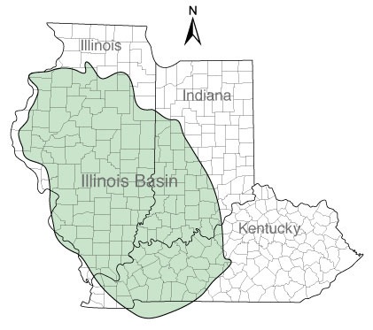
The Illinois Basin is an oval depression that’s roughly 60,000 miles in the United States Mid-Continent—southern Illinois, southwest Indiana and northwest Kentucky.
Drilling in the Illinois Basin goes back to 1853—and like many things, it was discovered accidentally; by drilling that was being done in a search for saltwater. (Early settlers needed saltwater for preserving food and agriculture.)
But it wasn’t until the early 1900s that the first Illinois basin oil boom truly occurred when well casings were used to manage all the water. (Most retail investors have no idea how much water the oil industry produces—it’s huge.)
In the 1930s a second boom started when seismic technology became available and helped to pinpoint oil pools.
This made oil a lot easier to find, and this oil boom lasted through the 1940s and 1950s. Production peaked in 1940 at 147.6 million barrels.
After World War II, production rates fell because all of the easy targets had been drilled. During the boom the Illinois basin was the third largest producing oil basin in the United States.
Since then production has declined with no new oil targets to drill.
That historical production of 4 billion barrels of oil and 4 trillion cubic feet of natural gas was all done with vertical wells in old-style, “conventional” oil pools; not today’s shale or “unconventional” plays.
All that oil had to come from somewhere. Underneath all those conventional oil pools is the New Albany Shale—and oil and source rock analysis indicates that’s where the oil came from. Given the success of all these other shale plays in the US under very similar geology, those source rocks could provide a re-birth for oil production in a region that has been in decline for more than half a century.
The New Albany Shale Looks Just Like The Bakken
The New Albany Shale is Devonian age and was formed roughly 350 million years ago in a shallow sea that once covered the eastern half of the United States.
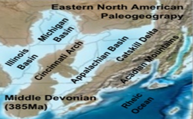
The New Albany Shale was formed at the same time as four other major U.S. oil resource plays that include:
-
The Williston Basin / Bakken Shale
-
The Anadarko Basin / Woodford Shale
-
The Appalachian Basin / Marcellus Shale
-
The Michigan Basin / Antrim Shale
So it was deposited at the same time as some of the most prolific source rocks in North America—that’s certainly a great pedigree! If the other source rocks have borne major horizontal resource plays why wouldn’t the New Albany Shale?
A 2002 study estimated that the New Albany Shale was deep enough to have generated up to 300 billion barrels of oil—that’s what the industry calls OOIP—Original Oil In Place.
With that much oil in place, the New Albany shale has the potential to be another big—very big—horizontal oil play–even if only a small percentage can be recovered.
That conventional production has come from 140,000 wells that were drilled into the Illinois Basin. 32,000 of those wells are still producing! The drilling and production from these wells have allowed oil companies sniffing around the New Albany Shale to gather a lot of evidence. The industry calls that “well control.”
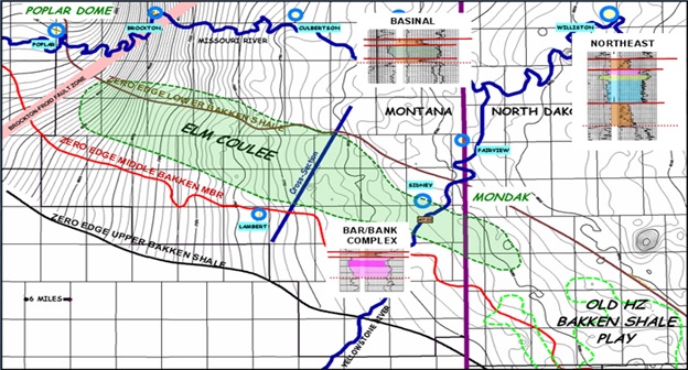
What these companies and their geologists have found has been encouraging as it has led them to conclude that the best analog for the New Albany Shale appears to be the Elm Coulee Bakken of Montana—which has produced 123 million barrels of oil from horizontal wells so far.
The New Albany and Elm Coulee are similar in age, porosity and size. No two shale plays are exactly alike, but there is good reason to believe that a short learning curve with horizontal wells could move the New Albany Shale from being a potential shale oil play to the real deal.
How The Play Gets Proved Up
The New Albany Shale is developing the same as the Bakken, Eagle Ford and other horizontal plays.
First you find a basin that has produced a lot of oil already. Step two: identify the source rock that still contains huge quantities of oil; usually a bit deeper. Step three then is to “crack the geological nut” and figure out how to get enough of that huge amount of oil left in those source rocks out at profitable rates—that requires fracking.
Step one and step two are already complete for the New Albany Shale. How close we are to step three is hard to tell.
The companies operating in the region have drilled a few wells, but the results have been kept very quiet to date.
Companies don’t promote bad results, and good results are kept even quieter since letting that information would immediately drive acreage prices through the roof.
What we know for sure is that the oil is in the ground in the New Albany Shale. Decades of conventional production tells us that.
What we also know is that enormous tracts of land have been leased over the past couple of years in the basin and we know that prices per acre have already at least quintupled over that time.
Someone wants to lock down that land.
Horizontal drilling combined with multi-stage fracturing may again be the miracle that releases the oil trapped in the New Albany Shale.
The potential of this play is exciting, and still quite early stage. And I just found the one junior explorer that has some incredible leverage to this new play.
Stand by for the details in my next article.
– Keith
P.S. Another new play with incredible leverage is an offshore producer I’ve been tracking for two years. It has the best growth profile of any junior in the world—because no other junior will have a bigger jump in production this year. Find out the full story on my #1 offshore oil pick, and how you can profit, here in my new research.

The S&P futures have lost over 10 pts on the day reaching a low of 1690. This represents a drop of over 36 pts from the new all time highs and a return of all the “no taper” gains.
Drew Zimmerman
Investment & Commodities/Futures Advisor
604-664-2842 – Direct
604 664 2900 – Main
604 664 2666 – Fax
800 810 7022 – Toll Free
 Lookout, Unfunded Liabilities, Pensions and Healthcare issues are coming to the boil. Everybody would be touched if this crisis really hits.
-
I know Mike is a very solid investor and respect his opinions very much. So if he says pay attention to this or that - I will.
~ Dale G.
-
I've started managing my own investments so view Michael's site as a one-stop shop from which to get information and perspectives.
~ Dave E.
-
Michael offers easy reading, honest, common sense information that anyone can use in a practical manner.
~ der_al.
-
A sane voice in a scrambled investment world.
~ Ed R.
Inside Edge Pro Contributors

Greg Weldon

Josef Schachter

Tyler Bollhorn

Ryan Irvine

Paul Beattie

Martin Straith

Patrick Ceresna

Mark Leibovit

James Thorne

Victor Adair