
Real Estate
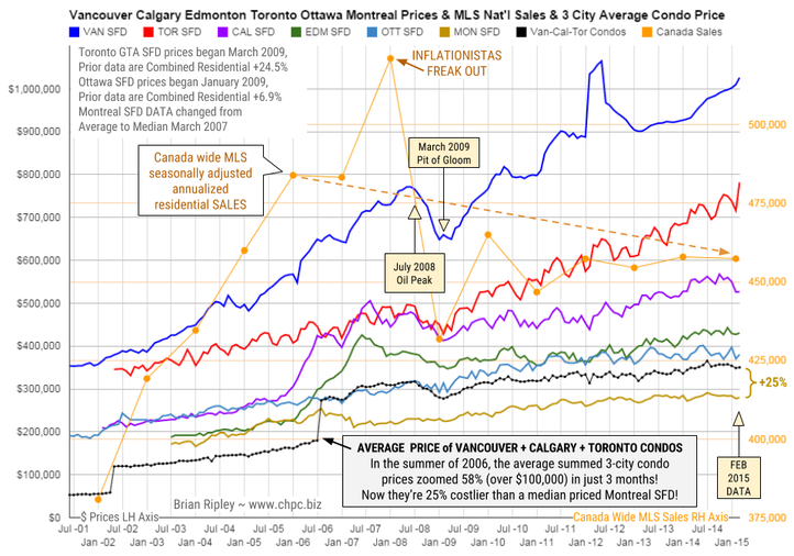
The chart above shows the average detached housing prices for Vancouver, Calgary, Edmonton, Toronto*, Ottawa* and
Montréal* (the six Canadian cities with over a million people) as well as the average of the sum of Vancouver, Calgary and Toronto condo (apartment) prices on the left axis. On the right axis is the seasonally adjusted annualized rate (SAAR) of MLS® Residential Sales across Canada.
In February 2015 the big city metros drew a divergent picture on price and volume. Toronto SFD prices broke out again to the upside for a new record peak and Vancouver SFD prices ticked up as well. The remaining metros traded flat or dropped on energy pricing anxiety (deflation).
Any price gains were accomplished against a 3 year overhead resistance in Canadian national residential housing sales volume.
Can the “posted retail” 5 year fixed rate mortgage low of 4.74% (+/-3% on the street) drive the hunger games into overtime in 2015?
Or is the continuing commodity crash signalling an upcoming major correction for Canadian housing? Your opinion is welcome.
Mattress money has gushed into condos with no respect for fundamentals or plan for contingencies that may be required if Pit of Gloom II develops and one must write off capital gains and or rely on employment earnings to subsidize negative yields.
The Canadian Real Estate
PLUNGE-O-METER
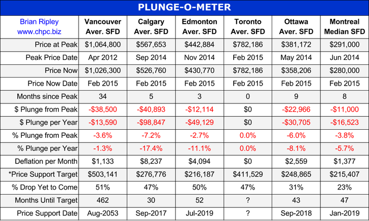
The Plunge-O-Meter tracks the dollar and percentage losses from the peak and projects when prices might find support. On the price chart in the spring of 2005 there was a 4-6 month plateau period while buyers and sellers twitched like a herd. When the credit spreads narrowed and the yield curve began its journey towards inversion, the commodity stampede began.
*The Price Support target represents prices at March 2005; the start of a 40 month period of ardent speculation in all commodities; then a full blown crash into the pit of gloom (March 2009); and then another 39 month rocket ship to the moon but then the crowd suddenly thinned out in April 2012. The revival of spirits erupted in 2013 as global money went short cash and long real estate on an inflation bet (see Whale Watching). Now we have a major divergence with Vancouver and Toronto going against the trend

Sentiment for the yellow metal is very weak
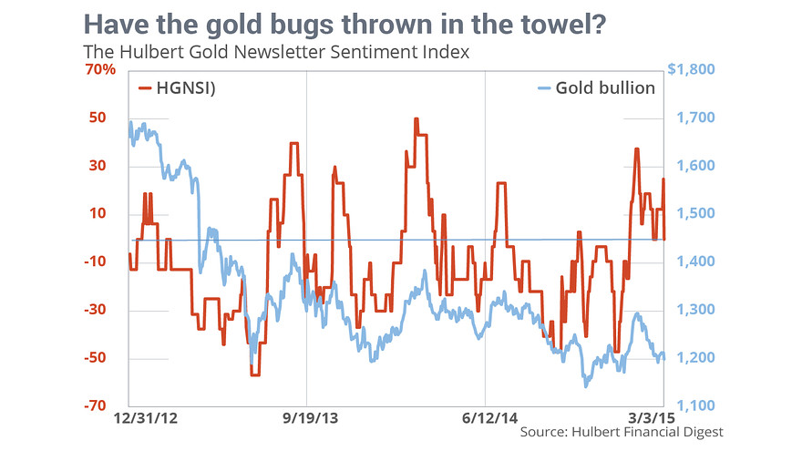
CHAPEL HILL, NC (MarketWatch) — The gold-market timers I track aren’t exhibiting the extreme pessimism and despair that is the hallmark of a bottom in prices, despite a dismal six-week period for the yellow metal.
Over the past month and a half, the March Comex gold contract has fallen by more than $100 — from a high of $1,307 on Jan. 22 to a low of $1,195 earlier this week. It’s currently just above $1,200. In fact, bullion is now back to within shouting distance of its late-December low.
Nevertheless, the average recommended exposure among gold timers I monitor is nowhere near as low as where it was during those December lows. And that’s not a good sign, according to contrarian analysis.
The current average recommended exposure level (as represented by the Hulbert Gold Newsletter Sentiment Index, or HGNSI) stands at 0% — indicating that the average gold timer monitored by the Hulbert Financial Digest is completely in cash. At the late-December lows, in contrast, the HGNSI stood at minus 46.9%, which meant that, at that time, the average gold timer was allocating nearly half of his gold-trading portfolio to going short, betting on a decline.
That represented a very aggressive bet that gold was headed lower, and in true contrarian fashion, the gold market quickly responded by rallying: Bullion rose by more than $100 an ounce over the following four weeks.
Unfortunately, as you can see from the accompanying chart, the HGNSI is a lot higher today than in late December. As a result, the current gold market rests on a markedly weaker foundation of sentiment than it did then.
What’s it going to take to create that strong foundation? Contrarians typically don’t speculate. It could happen quickly if many gold timers decide in coming sessions to throw in the towel. It would take longer if the gold timers stubbornly stick on to their relative bullishness.
We’ll know soon enough.
In the meantime, don’t forget that contrarian analysis applies primarily to the short term, and thus sheds little light on gold’s longer-term prospects. Gold could easily be much higher at the end of this year, for example. But, if so, and if contrarian analysis is right, bullions’s path to that higher level will take it lower first.
Click here to inquire about subscriptions to the Hulbert Sentiment Indexes.

There has been quite a bit of chatter recently about interest rates in the US with many proclaiming interest rates are now headed up. Are these voices right? Having just analysed the technicals of the 30 Year US Treasury Bonds, it is my considered opinion that they are both right and wrong.
Keeping in mind that interest rates go up as bond prices go down, let’s investigate the price charts and we’ll mix it up by starting with the monthly chart first.
30YR US T-Bonds Montly Chart

We can see price put in a high in 2012 at 153.34. Since then price has corrected and then rallied all the way back up only to fall just shy of all time record highs.
This has set up a double top. However, this double top is against the trend so it is not very bearish. Sure, it is great for traders that play the expected reaction downwards but as double tops generally don’t end bull trends, once the move down has run its course price should then come back up and bust to new highs.
To my eye, it looks like an ABC corrective pattern is in play with the wave A low and wave B high already in place. That means price has just commenced the move down that will eventually put in a wave C low.
The Bollinger Bands show price just starting to move away from the upper band so this move is still in its infancy.
So where is the wave C low likely to be?
I have added Fibonacci retracement levels of the move up from 2009 low to 2012 high. The wave A low was a smidgeon above the 61.8% level which stands at 127.59 and my favoured scenario is price making a false break low of the wave A low which would be a smidgeon under the 61.8% level. This would set up a double bottom which would be very bullish as it would be with the trend.
My second favoured scenario for low is price making a deeper retracement back to the 76.4% level at 121.50 and probably a tad lower.
The Relative Strength Indicator (RSI) is showing a new high reading on the recent wave B price high. This is a bullish sign. I like final highs to be accompanied by bearish divergences which would require price to eventually trade higher while the RSI reading makes less high readings. For now, the RSI looks to be trending down and I expect it to bottom out near the oversold line.
The Stochastic indicator has just made a bearish crossover while the Moving Average Convergence Divergence (MACD) indicator looks to be threatening one.
So, the lower indicators appear to be signalling lower prices are likely in the months ahead.
However, let’s not delude ourselves about the fact that a strong bull trend is still in play which is evidenced by the moving averages I have added to the chart. The 100 period moving average (red) is still well above the 200 period moving average (black) and they both appear to be trending up uniformly.
Let’s now looks at the big picture yearly chart.
30YR US T-Bonds Yearly Chart

We can see the massive uptrend that has been in progress since the 1981 low at 42.11. The black uptrend line I have drawn has never been threatened seriously in all that time. Outstanding!
There looks to be a “three strikes and you’re out” top formation in play which consists of three consecutive higher highs. We already have the first two highs in place, denoted by the numbers 1 and 2, and now just await the third and likely final high.
The RSI is showing a bearish divergence at the 2012 high and I’d really like to see a triple bearish divergence set up on the expected third and final high. Let’s see.
The MACD indicator is still trending up bullishly with the blue line above the red line. No sign of damage there yet.
The Momentum indicator shows momentum is indeed declining and there are already five bearish divergences in place. My tip is the final high will be accompanied by a sixth bearish divergence. Time will tell.
As for where to expect the coming correction low, I am looking for the black uptrend line to once again provide support.
I have added Bollinger Bands and I think the middle band can be relied on for support once again.
I have also added Fibonacci retracement levels of the whole move up from 1981 low to 2012 high and, considering the bull market is in its final stages and corrections should not be deep, I favour the next major low to be around the 23.6% level which stands at 127.14.
Finally, I have added the Parabolic Stop and Reverse (PSAR) indicator which pertains to the dots on the chart. Now I have added two sets of dots – a tight setting and a loose setting.
The tight setting PSAR support is at 126.13 for this year and I would like to see the correction low being just above that level. This is my favoured scenario while my second favoured scenario would see price pull up just above the loose setting PSAR support which stands at 116.92.
Let’s now finish up the analysis by bringing it in tight with the daily chart.
30YR US T-Bonds Daily Chart

We can see the recent high was a fourth strike high which is denoted by the numbers 1 through to 4. This was accompanied by multiple bearish divergences in the lower indicators being the RSI, Stochastic and MACD indicators. So we have a solid intermediate top in place. Price is now headed down and it looks like some bullish divergences may set up on these lower indicators which would likely give rise to a bear rally.
The PSAR indicator has a bearish bias with the dots above price.
I have drawn two horizontal lines which denote the previous swing lows set in December 2014 at 142.34 and November 2014 at 140.25. I would like to see price take out both of these levels before a serious bear rally commences.
I have added moving averages with time periods of 14 (purple), 50 (blue) and 100 (red). The 14ma has already made a bearish crossover of the 50ma and looks set to do the same with the 100ma. I suspect the bear rally won’t start until the 50ma looks set to make a bearish crossover with the 100ma. Time will tell.
Once that lower low is in place, price can rally and eventually put in a lower high. From there a big move down should ensue as price makes its way to the expected low levels already outlined.
Summing up, bond prices look set to decline in 2015 before resuming the bull trend which should see the bond price make all time record highs in future.
And once that high is in place, the bull trend that began in 1981 will have likely run its course and a massive bear trend should commence. This should see bond prices collapse which will send shockwaves throughout the world and may well see a change in the world order.

Let’s step back in time. As we all remember, on January 15th, a surprise decoupling from the euro peg caused the Swiss franc to rally up to 23%, an unprecedented move in the currency market. Why was the peg introduced and later removed?
The SNB pegged the franc to the euro on September 6th, 2011, in the very middle of the Eurozone debt crisis. A few peripheral countries, whose debts had been downgraded to junk status, asked for bailouts. Therefore, investors ran from euros and moved into the Swiss franc, a traditional safe haven. The SNB introduced a minimal exchange rate at CHF 1.20 per euro (0.83 euro per franc) in order to resist the currency appreciation (the CHF gained 28% since the beginning of the Global Financial Crisis). Although gradual appreciation is positive and reflects the strength of a currency, sudden capital inflows and exchange rate fluctuations may be quite detrimental, and therefore the SNB began printing and selling francs to keep the currency from exceeding 0.83 euro.
The peg worked quite well, but not without costs. The SNB expanded its balance sheet to 80% of GDP and the foreign currency reserves doubled from around 250 billion to 500 billion francs. At one point the SNB was buying half of the new government debt issuance of the Eurozone.
Thus, the SNB removed the peg due to concerns about the large expansion of the money supply. Not only did the monetary base expand but also broad money (Chart 1), which actually increased as it did in Ireland or Spain before the Global Financial Crisis.
Chart 1: Swiss money supply (M3) from December 2004 to December 2014 (in billions of Swiss francs)

According to the SNB, 70% of the increase in the M3 money supply, which occurred between October 2008 and October 2014 (311 billion francs), can be attributed to the increase in domestic Swiss franc lending. Between 2011 and 2014 the bank’s lending rose from 145% to 170% of the GDP, which set off a property boom. Swiss real estate prices rose by an average of 6% per year between 2008 and 2013, and flat prices more than doubled since early 2007 until now. Consequently, the real estate bubble index published by the UBS found itself in the ‘risk zone’. Thus, the SNB’s move could have resulted from adopting a tighter monetary policy to avoid a further bubble and followed the housing collapse that crippled the economy in the early 1990s.
Perhaps, the gold referendum in November, 2014 added some political pressure to tighten the monetary policy, while the expected announcement of the QE in the Eurozone on January 22 might be responsible for the timing of the SNB’s decision. Note that its move came just a day after the European Court of Justice paved the way for a program of sovereign bond buying. Additionally, as Thomas Jordan, the president of the SNB, pointed out, “The euro has depreciated substantially against the US dollar and this, in turn, has caused the Swiss franc to weaken against the US dollar.” For once, one of the reasons of keeping the peg was removed.
What are the possible consequences of the SNB’s move for the global economy and the gold market? The removal of the peg caused significant franc appreciation, which harmed exporters (strong currency is not bad for the economy, but abrupt exchange rate movements are usually harmful) and banks which granted international loans. Due to the Swiss franc’s safe haven status and low interest rates, lots of loans in Europe are denominated in Swiss francs, which creates a new risk in the old continent (for example, Austrian borrowers hold 10% of GDP in CHF loans). Removing the peg could entail the European mortgage backed security crisis, which would be supportive for gold, the ultimate safe haven.
Theoretically, it could cause another shift from the euro into the Swiss franc. The ECB’s QE would also strengthen the Swiss franc. However, the SNB lowered the interest rate for balances held on sight deposit accounts from -0.25% to -0.75%, in order to deter the capital inflows and currency appreciation, inducing banks to conduct more “real” lending to boost the economy. Interestingly, the SNB introduced the negative interest rate in December, 2014 to a large extent in order to stem a tide of money flowing in due to Russia’s financial crisis.
The predicted slight recession in the 2015, a possible bursting of the real estate bubble, and banks’ problems with the international non-performing loans would also weigh on further price appreciation. Therefore, after some depreciation (initial movements in the currency movements are often exaggerated), the Swiss franc may likely trend sideways in coming months (unless the Eurozone collapses). However, investors should be aware that the negative interest rates between 1972 and 1978 introduced by the SNB did not prevent the 75-percent appreciation of the franc. The long-term future of the Swiss currency depends to a large extent on the pace of printing money and whether the SNB is willing to abandon price stability in favor of an exchange rate target.
In the short run, the winners would be the greenback and gold, because there is one less safe-haven currency in town. The yellow metal and the U.S. dollar can additionally gain if the SNB re-allocates some of its euro-denominated holdings into them, which seems to be logical step after removing the peg to euro. Although some foreign investors (like Russians, which is quite understandable, taking into account the ruble’s uncertain future) still want to hold Swiss francs and pay 0.75%, gold has become relatively cheaper to hold as a safe-haven. Any further decreases of the Swiss interest rates, thus, would positively affect the gold prices.
Would you like to know what the major central banks’ action mean to the global economy and gold market? We analyze the recent surprising SNB’s action in our last Market Overview report. We provide also Gold & Silver Trading Alerts for traders interested more in the short-term analysis. Sign up for our gold newsletter and stay up-to-date. It’s free and you can unsubscribe anytime.
Thank you.
 And selling out to “dumber” hands
More and more, those who have made long, successful careers in money management are realizing that the system has morphed into a strange beast they no longer recognize, nor trust. Fear of epic, perhaps historic, dislocations in price when the current market reverses is causing more and more of the “smart money” to sell out now and seek safe harbor:
….continue reading HERE


-
I know Mike is a very solid investor and respect his opinions very much. So if he says pay attention to this or that - I will.
~ Dale G.
-
I've started managing my own investments so view Michael's site as a one-stop shop from which to get information and perspectives.
~ Dave E.
-
Michael offers easy reading, honest, common sense information that anyone can use in a practical manner.
~ der_al.
-
A sane voice in a scrambled investment world.
~ Ed R.
Inside Edge Pro Contributors

Greg Weldon

Josef Schachter

Tyler Bollhorn

Ryan Irvine

Paul Beattie

Martin Straith

Patrick Ceresna

Mark Leibovit

James Thorne

Victor Adair