
Asset protection
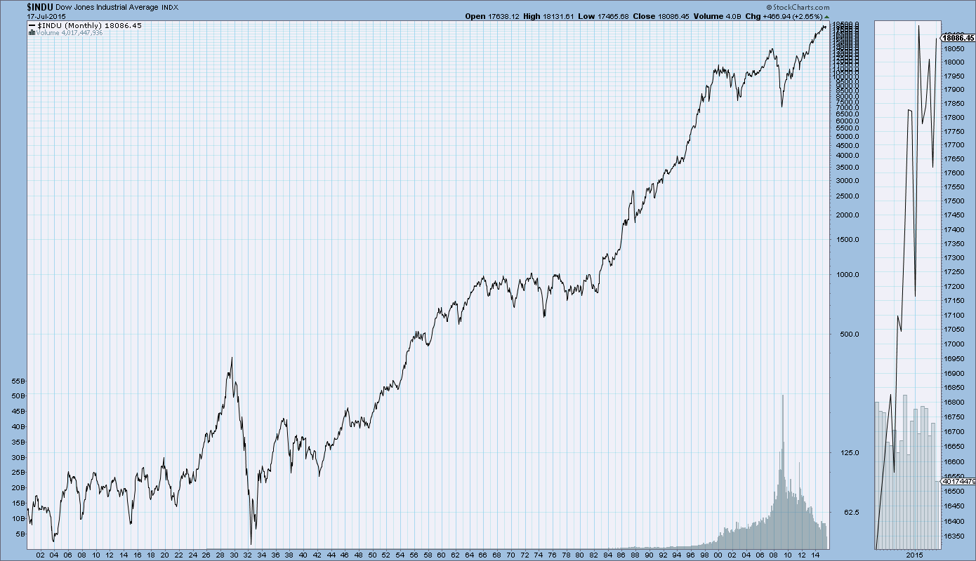
Click Chart for Larger Version of this 50 Year Chart Dow Chart
U.S. market in bubble territory
“I’ve built an asset allocation model in which we compare forty different world markets and… when I look at all global assets on average, they’re fairly valued. There’s nothing much to worry about. But within the matrix, there are one or two markets which are frankly expensive. And it doesn’t matter whether you use the Shiller P/E, the Forward P/E, Tobin’s Q; however you stack it up, the U.S. market by its own historical standard is expensive now. In fact, you could say it’s quite well into bubble territory.”
Not time to sell yet; possible bear market in 2016-2017
….continue reading HERE

Originally published at 11.00 am EDT on 20th August 15 HERE
There are various reasons, both fundamental and technical, to believe that a market crash is almost upon us. This crash will affect virtually all world markets, including and especially the big Western Markets which have thus far escaped the devastation already afflicting the developing markets. Here we are going to focus on US markets, but they will all get taken down – European markets including the UK, and Far Eastern markets such as Hong Kong and Japan.
The fundamental reasons for a market crash now are big and obvious – the ravages of deflation and depression brought about by extremes of debt which must cut into corporate profits – in Japan the debt situation is now hopeless, the Sovereign debt crisis set to crush Europe and probably destroy the euro, the collapse and implosion of the monstrous debt fuelled bubble in China which is already underway, an accelerating currency crisis in the Far-East exacerbated by the recent Chinese devaluation of the Yuan, and the collapse also already underway in Emerging Markets. Given that US markets have been driven to giddying heights by the combination, among other things, of maxed out margin debt and stock buybacks, it is clear that a crash of perhaps unprecedented proportions in on the cards. So much for the fundamentals, since we are more concerned with timing, we now turn to consider the latest charts.
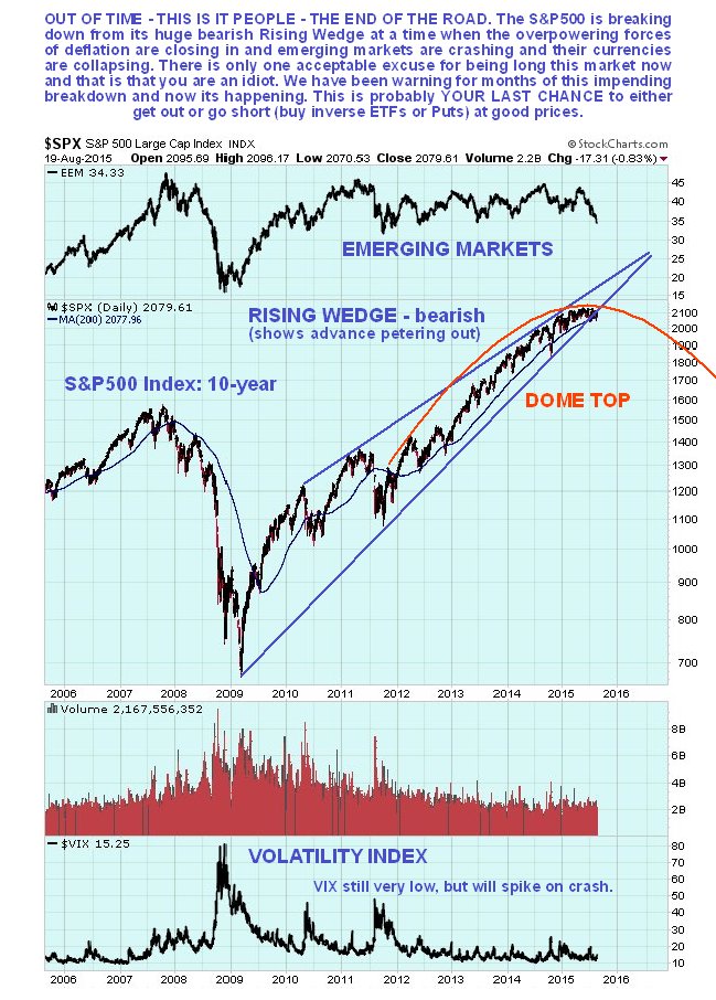
We’ll start with the 10-year chart for the S&P500 index, on which we see a very bearish setup, where after a multi-year bullmarket, the index is now breaking down from near the apex of a giant bearish Rising Wedge, having been capped by a large Distribution Dome. It is now in position to plunge, and this is made more likely by the rapidly weakening Emerging Markets, shown at the top of the chart, and the Volatility Index, or VIX, shown at the bottom of the chart, which has been at a low level for a long time, indicating a high degree of complacency, makes it unlikely that the market will drift lower – it is much more likely that it will plunge, as immediately it becomes clear that the game is over and the trend has changed there will almost certainly be an almighty stampede for the exits.
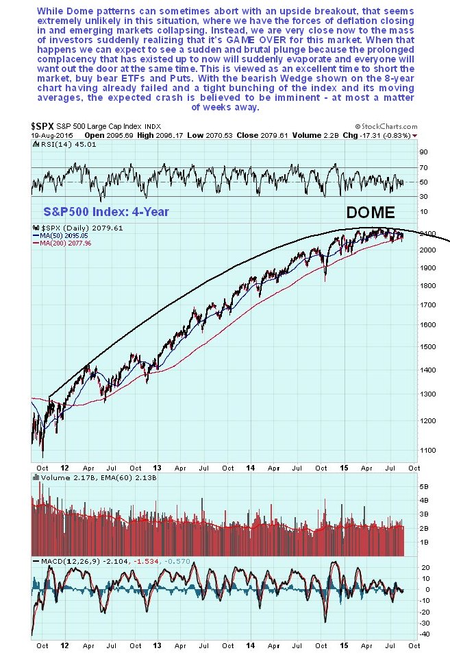
On the 4-year chart we can see the origins of the Dome pattern more clearly, and how the market has been rounding over beneath the top of this Dome all this year, which is now starting to force it lower. These Dome patterns sometimes abort with an upside breakout, but that looks highly unlikely given the rapidly worsening fundamental situation.
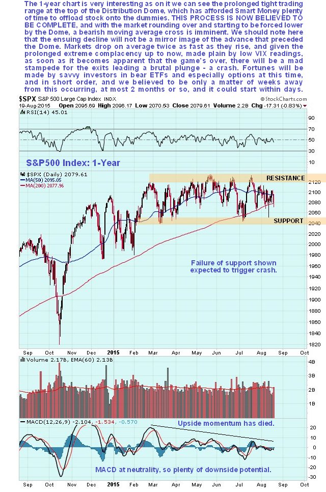
The 1-year chart shows recent action in more detail. On this chart we can see how upside momentum has fizzled out completely this year as a tight choppy trading range has developed sandwiched between the support and resistance levels shown. This trading range has afforded Smart Money all the time it has needed to offload stock onto the dummies, who are now left “holding the bag”. With distribution now believed to be complete, as symbolized by the tight bunching of the index and its moving averages, everything is in place for a severe bearmarket phase to begin, and it is particularly ominous that the 50-day moving average is now closer to breaking down through the 200-day than it has been for a long time – as we can on the 4-year chart, it would be the 1st time that this has happened since 2011 – nearly 4-years. This is the so-called “Death Cross” because it frequently signals a major change of trend. Failure of the support at the bottom of the range at 2040 is likely to trigger the crash phase.
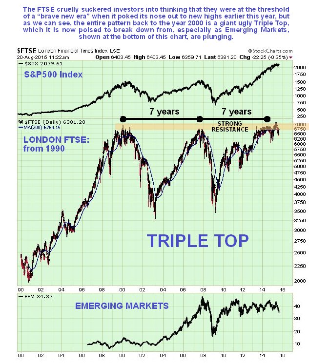
It’s worth taking a sideways look at another big Western market, the London market to see if a similar topping pattern is evident. It is – on the long-term chart for the London FTSE index going back to the start of the 90’s we can see that a giant epochal Triple Top is completing. This market is believed to be “done for”, particularly since the UK is just another debt bubble, and the Emerging Markets, shown at the bottom of the chart, are already plunging. It’s another good market to short.
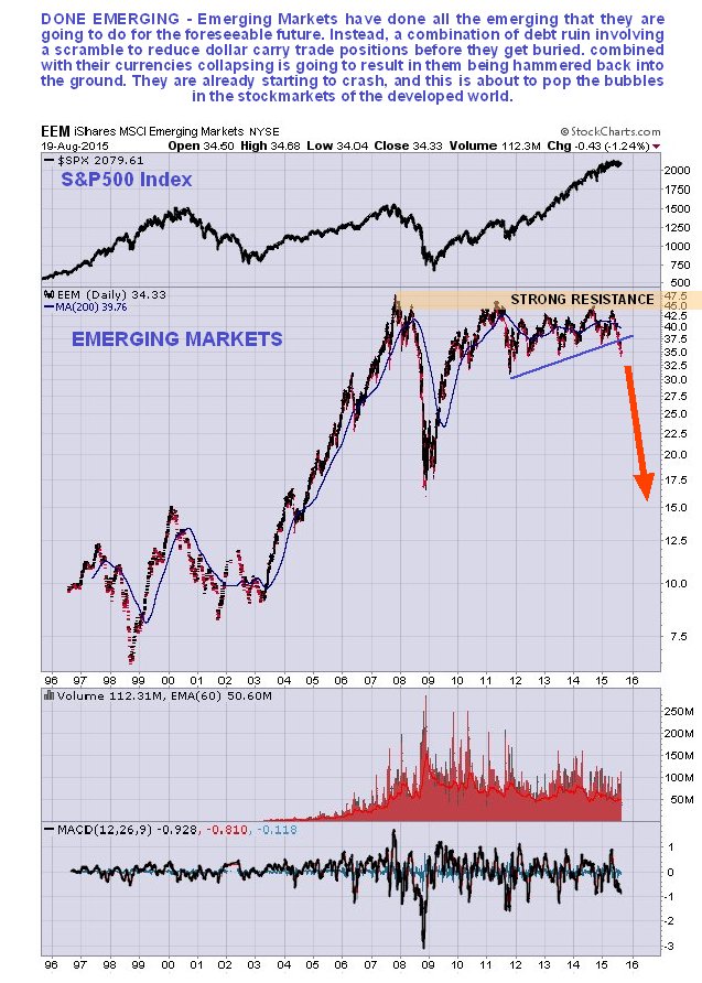
Finally we will take a brief look at the chart for Emerging Markets themselves, using the EEM ETF as a proxy. As we can see on the long-term chart for EEM, a huge top pattern has formed between late 2007 and the present beneath a clear line of resistance. This presumably would have been a fairly uniform top pattern had it not been for the 2008 market crash, which resulted in it plunging before quickly recovering all its losses the following year. The whole pattern looks like a misshapen giant Double Top, not unlike the long-term copper chart, incidentally. It has already broken down from a potential Ascending Triangle and is starting to drop away fast and looks set to crash, with the ball being kicked downhill by the recent plunge in the Chinese market and the devaluation of the Yuan. Emerging Market currencies are already crashing and burning, and Emerging Markets themselves look set to do likewise, which will surely not be a bullish influence on major Western Markets.
Further reading: the following articles by other writers are certainly well worth reading – The Collapse Has Already Begun by Michael Snyder, Doomsday clock for global market crash strikes one minute to midnight as Central Banks lose control by John Ficenec and last but not least this very insightful article by David Stockman which is a little dated but still very relevant Why the Dollar Is Rising As The Global Monetary Bubble Craters. The fact that the 2nd of these articles has appeared in a mainstream publication like the UK Telegraph is a sign that Big Money is now comfortably in position to benefit from the crash.
A major stockmarket crash probably worse than 2008 looks imminent, and by imminent we mean probably within weeks, possibly as far as out as two to three months, but perhaps within days. A break below 2040 on the S&P500 Index may trigger it. Virtually all stocks on the broad market should be sold, and bear ETFs and possibly Puts bought before the breakdown. We have already lined up suitable bear ETFs, both unleveraged and unleveraged on the site in PREPARING FOR THE CRASH – BEAR (INVERSE) ETFs SHORTLIST, INCLUDING LEVERAGED. and will be looking at a range of large cap stock Put options very soon.
Originally published at 11.00 am EDT on 20th August 15 at http://www.clivemaund.com/

 Most people are blissfully ignorant of the fact that 2007-8 was just a mild rehearsal of what we soon are going to experience. The additional $60 trillion in credit and printed money since then and the lowering of interest rates to zero have given the world the impression that all is now well again.
Let me be very clear, nothing is well. As a matter of fact in the 8 years since the start of the Great Financial Crisis the bubble economy has now properly spread to the world’s second largest economy – China. China has had exponential growth in debt from $2 trillion to $28T this century. A major part of this debt has financed white elephant projects and ghost cities. It would be surprising if the total Chinese bad debts were below $10 trillion before all of this is finished……continue reading HERE
Normally there’s a distinct pattern to the impact of Federal Reserve statements on the financial markets. The tone of equities trading in particular starts to improve as the moment of the announcement approaches; the words turn out to be blandly positive, full of promises of easy money and upbeat forecasts; and share prices soar for a day or two. It’s been thus for most of the past six years, leading large numbers of new investors and recently-minted analysts and traders to see the Fed as a modern version of Plato’s philosopher king, wielding absolute power to achieve perfect justice in the form of rising asset prices.
So it must have been a shock yesterday when the Fed released the minutes of its last meeting — which were full of the usual bland equivocations aimed mostly at not upsetting anyone, though with the recently added promise of a tiny rate increase one of these days — and the markets tanked. As of this writing (noon-ish on Thursday) US equities are down over 1% and the S&P 500 has turned negative for the year. Bond yields are falling, gold and silver are rocking, and the sense of fear, confusion, and betrayal is palpable.
What happened? What inevitably had to. Liquidity-driven markets love low interest rates and massive money creation. But those things cause imbalances that eventually become self-negating. The bang for each dollar of newly-printed or borrowed currency falls to zero and then turns negative.
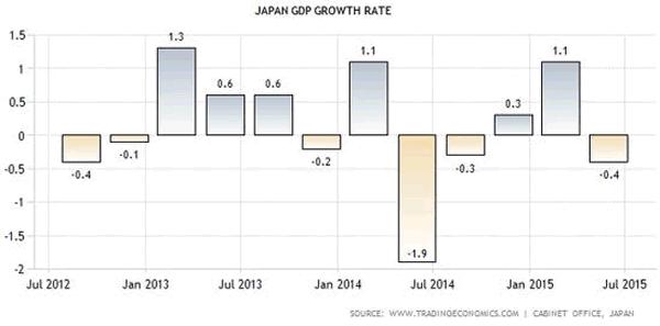
That’s happening now as the major economies continue to borrow but can’t seem to turn the proceeds into measurable growth. Japan, for instance, is running epic deficits and monetizing the whole thing, but over the past five quarters its economy has gotten smaller. Which is another way of saying its ratio of debt to GDP is soaring at an accelerating rate.
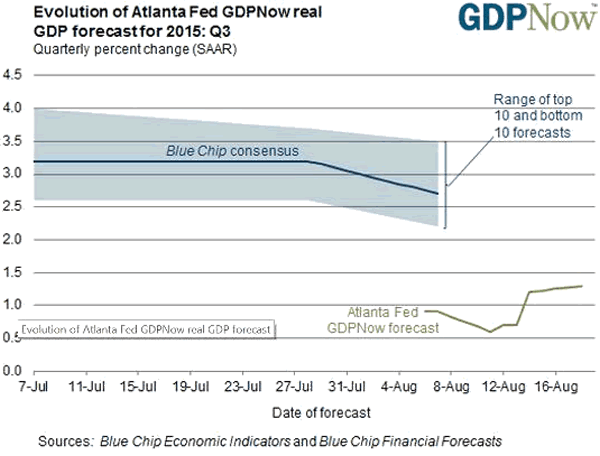
The Atlanta Fed, which has been highly-accurate lately in its near-term predictions, now has the US growing at a rate of less than 1.5% in the third quarter, far below the 3% needed to stop the growth in debt/GDP.
Europe’s growth is less than 1%, with most of that coming from Germany. And China, well, it claims to be growing but most of the world now suspects it’s in recession — if that’s not too bland a word for the crisis unfolding there.
So, back to the Fed. The markets have been buying the promise that adult supervision and superior judgment on the part of the monetary authorities would produce steady growth and continued easy money. But now a bit of doubt has begun to creep in. What if these guys are not in fact omnipotent and all-seeing? What if the trends they’ve engendered are finite? And what if they don’t have a plan for avoiding the brick wall that seems to be blocking this smooth stretch of highway? What indeed?

 On the heels of the Shanghai stock market plunging another 3.5%, today one of the greats in the business sent King World News a fantastic piece that warns about the chaos in China, oil and the currency markets. Also included is a fascinating chart of gold and oil.
King World News: One of the legends in the business has a key note below, but first let’s take a look at an extremely important chart. The chart below shows that the gold vs crude oil ratio has now broken out to nearly a 30-year high! (see chart and more analysis HERE)


-
I know Mike is a very solid investor and respect his opinions very much. So if he says pay attention to this or that - I will.
~ Dale G.
-
I've started managing my own investments so view Michael's site as a one-stop shop from which to get information and perspectives.
~ Dave E.
-
Michael offers easy reading, honest, common sense information that anyone can use in a practical manner.
~ der_al.
-
A sane voice in a scrambled investment world.
~ Ed R.
Inside Edge Pro Contributors

Greg Weldon

Josef Schachter

Tyler Bollhorn

Ryan Irvine

Paul Beattie

Martin Straith

Patrick Ceresna

Mark Leibovit

James Thorne

Victor Adair