
Daily Updates
In 2006, just as the Housing market was peaking, the NYT ran this graphic of the 100-year Case Shiller chart. It showed how radically overvalued Housing had become.
Two years later, TBP reader Steve Barry updated that graphic, including the projected Home Price mean reversion. (See versions for 2008, 2009 and 2010).
Its time to update this for 2011. Note the 2009 tax credit wiggle:
click image for larger version
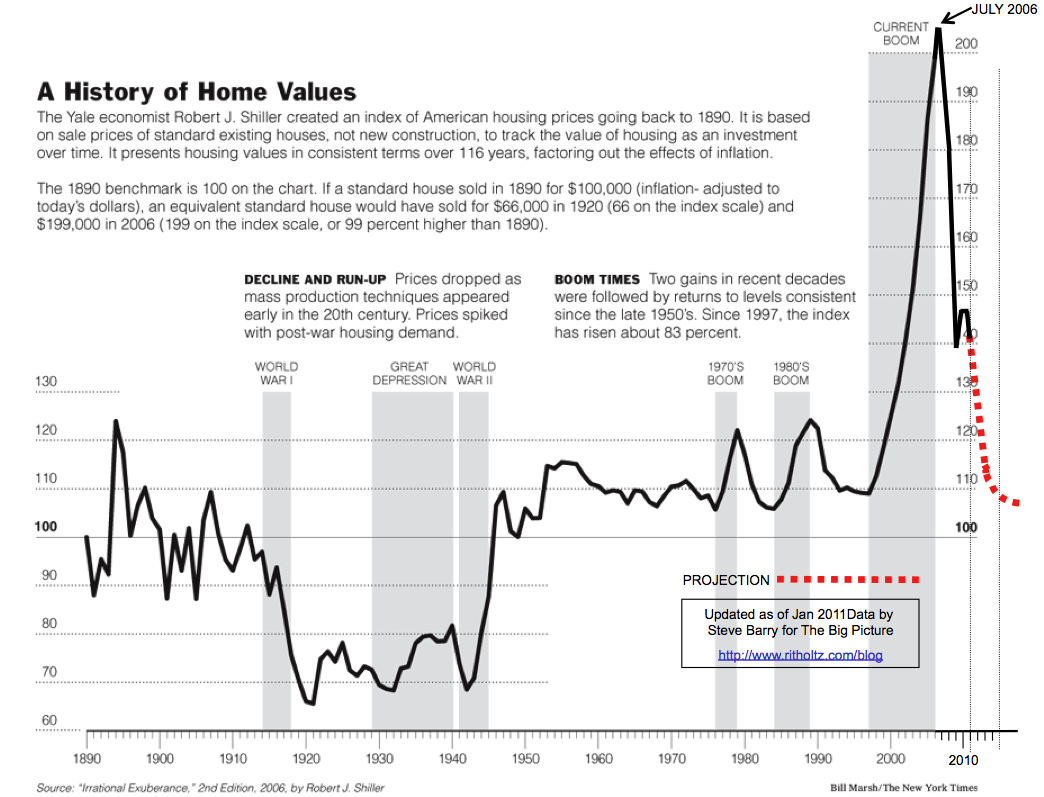
chart created by Steve Barry. Commentary by Barry Ritholtz of The Big Picture
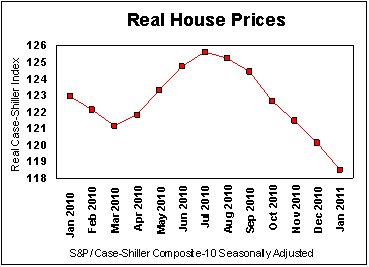
House Prices in Free Fall
The latest house price data (the S&P Case-Shiller index) shows a clear downward trend for the most recent six months, as shown in the graph below:
The next graph shows how this year’s data fits in with the long-term trend. It is clear that the house price bubble, which began in 1997 and peaked in 2006, has not yet finished popping:
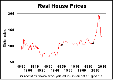
How we Got There
The black stars in the above graph highlight 1951 and 1997, the two years when Congress changed how the capital gains tax applies to home sales. The first change produced 46 years of wealth accumulation. The second change produced 9 years of rising house prices and living beyond our means to be followed by about 9 years of belt tightening and economic stagnation.
In 1951, Congress, at the urging of President Truman, instituted the roll-over treatment for taxation of capital gains from home sales, an economically sound treatment of capital gains. As a result, from 1951 through 1997, whenever a homeowner sold his or her primary residence to buy another residence, the capital gains tax was deferred, not forgiven. In technical parlance the gain was rolled-over until the new home was sold. Homeowners would typically build up their equity in one home, sell that home, and then use their savings to make a down payment on a larger home. During that period, there were large changes in interest rates, yet real home prices were quite stable.
In 1997, a foolish Congress, at the urging of a foolish President Bill Clinton, eliminated the capital gain tax on homes sold by most homeowners. This change immediately stimulated the housing price bubble. It told speculators that the capital gain that they would earn would be tax free if they bought a house in the expectation of a rise in its market value and sold it at a higher price. Under the new provision, almost anyone who had lived in a house for 2 years of the past 5 years could sell the house free from capital gains tax. The new policy encouraged people to gamble on real estate. They saw that houses were going up in price year after year. What an easy way to make money!
Here is how Kenneth Harney (2008) described how the 1997 tax treatment encouraged speculation in a Washington Post article about Congress’s 2008 attempt to tighten its provisions:
…..read more HERE (scroll down)

Precious metals are proving resilient after yesterday’s beat-down. Gold is back up to $1,461. Silver spent a few nanoseconds below $40 yesterday and as of this writing sits smartly at $40.56.
With regular runs at historic highs, it’s no longer cranky gold bugs and dollar bears doing their share of gold price forecasting. Analysts for the proper, if stodgy, British bank Standard Chartered announced yesterday they are expecting gold to reach $2,107 an ounce by 2014.
What’s more, they say, “our modeling suggests a possible ‘super-bull’ scenario,” based on a “powerful relationship” between per capita income in Asian emerging markets and the gold price.
Standard Chartered estimates that per capita income in China and India will reach 30% of the US level over the next 20 years. On that basis, the bank sees “gold prices rallying up to $4,869 per ounce by 2020, should current relationships between Asian demand and gold persist.”
Standard Chartered wouldn’t find much argument from US Global Investors chief and Vancouver alum Frank Holmes, who was the lunchtime keynote presenter here in Zurich today at the European Gold Forum.
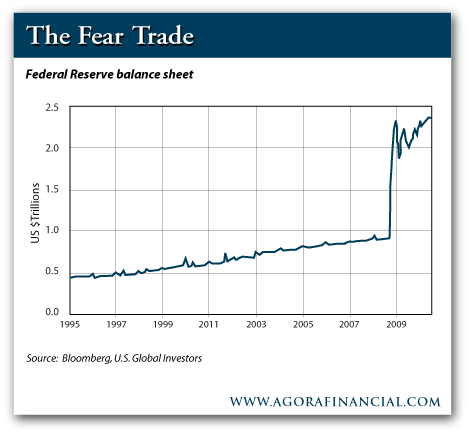
For starters, he furnished visual evidence to back up Marc Faber’s claim in this space on Monday that gold is not in a bubble.
You’ll see the chart follows the trajectory of three bull markets – gold beginning in 1971, the NASDAQ beginning in 1990 and gold again beginning in 2001.
“Bubbles require massive leverage,” Frank says, and there’s no evidence investors are borrowing to load up on gold.
For now, gold demand will increase steadily, driven by two of Frank’s favorite themes – the “fear trade” and the “love trade.”
That is, investors buy gold because they fear what the Federal Reserve is doing with its balance sheet…
The result – negative real interest rates. That’s when inflation is greater than the nominal interest rate. “Whenever you have negative real interest rates coupled with increased deficit spending,” says Frank, “gold tends to rise in that country’s currency.”
Likewise, the two party blockade on fiscal reform writ large in the US Congress.
The “love trade,” on the other hand, is something alien to North Americans and Europeans. “It is customary in most emerging countries to give gold as a gift to friends and relatives for birthdays, weddings, and to celebrate religious holidays,” he explains.
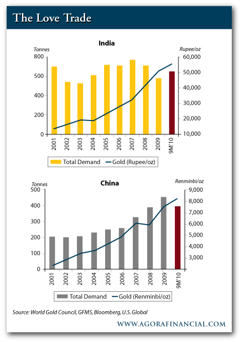
Thus, the point to which Standard Chartered agrees: As incomes rise in China and India, jewelry demand is driving the “love trade.”
Gold demand in India during the first three quarters of 2010 exceeded all of the previous year. And China was on a pace to exceed the 2009 figures as well… all of that despite a steadily rising gold price all last year.
Addison Wiggin
for The Daily Reckoning
Addison Wiggin is the editorial director of The Daily Reckoning, and executive publisher of Agora Financial, an independent financial research firm based in Baltimore, Maryland. His second editions of international best-sellers Financial Reckoning Day Fallout and The New Empire of Debt, which he co-authored with Bill Bonner, were updated in 2009. His third book, The Demise of the Dollar… and Why it’s Even Better for Your Investments was updated in 2008, the same year he wrote I.O.U.S.A.
Silver rose as high as $41.98 an ounce this week – a 31-year high – and has remained above the $40-an-ounce level. That means that the “other” precious metal is up about 32% so far this year – and has more than doubled since Money Morning recommended it to readers in early September.
One input to our US dollar bull market call at the beginning of the year was the potential
shift in capital between the financial economy and the real economy. The stock market
began a dramatic rally well before the US economic “recovery” took hold. And stocks have
continued climbing.
Commentary below from Mark Leibovit, TIMER DIGEST’s #1 Intermediate Market Timer for the 10-year period ending in 2007, the #2 Intermediate Market Timer for the 10-year period ending in 2009, AND the #3 Gold Timer for the Ten Year Period ending 12/31/10. Subscribe to the VRTrader Newsletter.
Options Expiration Should Help Provide A Lift – But There Could Be Some More Downside Volatility Ahead. Volume Should Guide Us!
Stocks – Bull – The S&P 500 rallied nearly 100 points from 1249 to 1339 between my predicted mid-March low (on March 16) and the April 8 high. Let’s turn Fibonacci. The Fibonacci sequence is named after Leonardo of Pisa, who was known as Fibonacci (a contraction of filius Bonacci, “son of Bonaccio”). Using .236, .382 and .618 we generate support in the S&P support levels of 1317, 1304 and 1284 (about 11,900 in the Dow Industrials). We touched 1309 yesterday, but, alas, this is Options Expiration week, so could easily bounce from here or, perhaps, have already seen the low. We took profits yesterday in our inverse S&P 500 ETF with that thought in mind, so let’s see if the market has any legs or falters again on the weight of the Japan story, the budget compromise, disappointing corporate earnings, or fear that QE2 won’t be followed by QE3.
My opinion is that Bernanke has no choice but invoke QE3, though it may not come right away. Too much is at risk if he doesn’t. His targeting a higher stock market won’t unfold, job creation could come to a grinding halt, the impact of a faltering Japanese economy could become contagious, and home prices will continue to erode. At the moment, my view is that we’re simply correcting the runup and not in the early stages of an extended bear move. That said, I am not long indexes until I see some Leibovit Positive Volume Reversals. Perhaps that will come from lower levels, so we have to be patient.
Gold – Bull – Yesterday I told you Spot Gold had risk back down to 1449 and we touched 1443.50 before bouncing back into the close. Silver, however, only managed to touch 39.72 versus potential down to 38.20-38.60. Like the equity market, I am awaiting the return of upside volume, but I also recognize that we’re in a super-bull market and dips could be minimal and we have to seize on any and all corrections as gifts
Bonds – Bearish – On the sidelines awaiting an opportunity to position on the short (inverse index) side.
Subscribe to the VRTrader Newsletter
-
I know Mike is a very solid investor and respect his opinions very much. So if he says pay attention to this or that - I will.
~ Dale G.
-
I've started managing my own investments so view Michael's site as a one-stop shop from which to get information and perspectives.
~ Dave E.
-
Michael offers easy reading, honest, common sense information that anyone can use in a practical manner.
~ der_al.
-
A sane voice in a scrambled investment world.
~ Ed R.
Inside Edge Pro Contributors

Greg Weldon

Josef Schachter

Tyler Bollhorn

Ryan Irvine

Paul Beattie

Martin Straith

Patrick Ceresna

Mark Leibovit

James Thorne

Victor Adair