Energy & Commodities

Lumber Prices near the Top of their Historical Range

You have come a long way baby

The lumber market has really come off the 2009 bottom of $140 per mbf and closed Friday at $399.80 per mbf on the back of good news out of the housing sector of the economy. 
 
15 year lumber with moving averages
 
The housing sector of the economy led the way in 2012 with record low interest rates, and investors and banks working through the foreclosed inventory, leading to a trending and steady rise in both average home prices and new constructions.
 
1 year lumber chart
 
Everything related to the housing sector performed well in 2012 from materials to the home improvement and remodeling big box retailers in Home Depot and Lowe`s Companies Incorporated.
 
6 month lumber chart
 

Lumber prices getting slightly ahead of themselves?

 
But if we examine the history of lumber prices relative to the strength of the housing sector, lumber prices may be getting slightly ahead of themselves from a valuation standpoint. 

 
2 Month chart lumber
 
Lumber prices will probably break through the $400 level on trading momentum alone, but if we look at the charts most of the time lumber prices are south of the $400 level. ‘
 
25 years with moving averages
 
The all-time high for lumber prices established in 1993 was just shy of $500 on a spike, with additional spikes of $440 in 1997, and $420 in 2005. So we are now basically sitting at $400 and in spike territory based upon the charts.
 
10 year lumber chart with moving averages
 
I will be watching lumber for some additional upside momentum, and looking for a good entry on a longer term reversion to the mean short in the commodity as I think the risk and reward dynamics are setting up nicely in lumber for an eventual short once the momentum is exhausted. 
 

About EconMatters

EconMatters  is made up of a team of financial and market analysts who research, analyze, and write articles devoted to the discussion of important economic and market specific issues relevant to our readers and global strategic investing. 

In addition to the EconMatters staff, we are fortunate to have a global network of guest authors who contribute regularly to the site, and we value their contributions. If you would like to contribute to the website as a guest author, then send your request via the contact link below. 

Thanks for visiting our site, and if you have any comments, questions or media requests be sure to send us a message. 


Global Warming and Other Superstitions

Each of the three great experiments in authoritarian government in the senior economy included some promotional inspiration. As Rome was corrupted from a republic to a police state the “Genius of the Emperor” provided compelling guidance. In the Sixteenth Century “Papal Infallibility” provided the front for a venal and corrupt bureaucracy. The current financial experiment started around 1900 and essential dogma has included the omniscience and omnipotence of central bankers.

The wonders of extremely intrusive government under the label of Communism was rejected by an always dissatisfied and, in 1989, suddenly critical public. The fall of the Berlin Wall was the symbol.

Just as suddenly, full-on socialism could not be sold to the public by control freaks. “The Freeman” in the early 1990s had an article that named the names that turned to environmentalism as a possibly more successful way to impose control. The most successful and at the same time the most dangerous within this political movement has been “Anthropogenic Global Warming” (AGW). Then, the promoters discovered that the climate has been warming for some 12,000 years and the pitch was morphed to “Climate Change”. The labels also included “Greenhouse Effect” and no matter what the weather event the “cause” has been the evils of free-market economies.

Research behind the effort was quite limited – the assumption has been that there has been only one influence upon the climate and that is atmospheric carbon dioxide. This was an IPCC selection from all of the influences upon climate. The main ones are solar energy, which is variable, and the amount received at the Earth’s surface, which also varies. Both variations are periodic – as are consequent warming phases and cooling phases.

On the nearer-term, Solar Cycle 23-24 has been the weakest since 1913. Solar physicists, Livingston and Penn, have been working on the possibility of diminishing solar output since the mid-1990s. A link to the 2008 review of their updated paper follows.

Subject: Livingston and Penn paper: “Sunspots may vanish by 2015′′. | Watts Up With That?

In early January, the UK Met Office quietly released their study that temperatures have not increased since 1998.

The chart below clearly shows the “Maunder Minimum” and the “Modern Maximum”, which is the period of unusually high output that prevailed from the 1940s to the 1990s. Prof. Solanki at the Federal Institute of Technology in Zurich states that this is the sun’s brightest period in a thousand years. Temperatures have been at the highest in a thousand years, but not as high as with the Medieval Maximum.

The latest warming trend seems to have stalled out, naturally, almost 15 years ago. The following chart (1979 to date) plots temperature history (blue line) trending sideways. CO2 (green line) is still going up. If the Left’s theories about CO2 were valid the rise in global temperature would be getting steeper. It isn’t. As in “paper covers rock”, solar energy trumps CO2.

Screen shot 2013-02-19 at 1.12.18 PM

Note CO2’s remarkably regular seasonal variation. This is explained as due to seasonal variation from plant life (land and sea) changing from emitting CO2, to absorbing CO2. Global commercial and industrial activity does not show the equivalent variation.

Screen shot 2013-02-19 at 1.13.34 PM

Beginning with the 1990s low, the next chart covers Cycles 23-24 when the high count was 170 sunspots with the peak in 2000. So far the high has been slightly less than 100 in 2011. This compares to the high of 254 in 1957.

Solar activity has been diminishing since and recently solar physicists have provided the research that explained and anticipated the decline to the lowest minimum since 1913. The current cycle has been scheduled to reach its best this year (one review expects this leg up to peak at 84 in August) and then turn down.

Screen shot 2013-02-19 at 1.15.04 PM

Livingston and Penn called for a significant decline in solar activity and the numbers are confirming it. Within a couple of years it could be concluded that the Modern Maximum is over. That the trend could continue to another minimum that would be as severe as the Maunder Minimum is uncertain.

The main thing is that IPCC was run by a political caste that selected theories about climate disaster and when necessary data were cooked to “prove” otherwise unsupportable notions. The goal was to create hysteria that could only be remedied through massive increases in taxation and intrusion upon private life.

The advance of science has always depended upon skepticism, sound data and logic. This authoritarian age has created some interesting departures. Throughout mankind’s history we have thrived during climate warming and suffered during extensive cooling. The IPCC insists that for the first time in history warming is harmful. Oh well, it goes with the ideology – the Berlin Wall was the first wall ever built to keep the people in rather than the bad guys out.

The last time the authoritarians made it dangerous to hold scientific theories that denied the politically correct ones was at the end of the last great experiment in intrusion. In the early 1600s Galileo was condemned for denying that the solar system rotated around the Earth.

A couple of pieces we published in 2009 concluded that the mania about “AGW”, or “Climate Change” was peaking. These are attached.

*****

Other Superstitions

Ambitious authoritarians promoted that only one thing was influencing climate change and that is the amount of CO2 in the atmosphere. That it makes up only 0.038% of the gases surrounding our planet does not matter. Nor does the long history whereby the amount of CO2 lags temperature change by some 400 to 800 years.

Of course, ambitious governments using one focus for control have not been limited to climate hysteria. Beginning in the early 1900s financial adventurers touted that a US central bank would end financial panics and disguised as the Federal Reserve System it was imposed. Original and subsequent promoters seem to have overlooked that the tout behind the formation of the Bank of England in 1694 was that it would “infallibly” lower interest rates. Naturally, to prevent financial disasters. There have been many since – usually two or three big ones per century. Sometimes severe enough for the establishment to distress itself about the inadequacies of the prevailing banking system. The other part of the pattern is that the same establishment during a financial mania boasts the current government financial agency will prevent things from going wrong.

In the 1873 Bubble enthusiasms were assured because the US did not have a central bank and the Treasury System was proof against contraction. At the crest of the 1929 Bubble enthusiasms were supported by the tout that the old and dreadful Treasury System was gone and replaced by a “scientific” Federal Reserve System.

The Fed was the first of over-rated concepts that were selected to serve authoritarian ambition.. The next was the grand idea that a central agency can and should “manage” a “national” economy. Keynesian theories were selected because they enabled a massive expansion of government, which extended its power through mainly one thing – the amount of money in circulation. Warm-mongers have been obsessed about atmospheric CO2 and policymakers have been obsessed about M1, M2, etc.

Financial history has a long record of dynamic economic expansions turning into eras of magnificent asset inflations – including financial assets. After the huge expansion of credit a long post-bubble contraction has followed. The feature of which has been severe recessions and weak recoveries.

Essentially on a global scale, when policymakers have discovered that there is no such thing as a “national” economy.

The financial mania that climaxed in 2007 virtually replicated all of the great bubbles since the first one in 1720. Ours was number six and 1929 was number five. And the record is that the senior central bank has never been able to keep a bubble going and has never prevented the lengthy post-bubble contractions.

Wrap

The next few years are going to be very interesting. Solar activity and its influence upon the warming trend that began out of the exceptionally cold winters of the late 1600s is ending. The Maunder Minimum became the Modern Maximum and the latter is ending. This would be supported by the sunspot count resuming its downtrend in the fall.

The establishment has been boasting that by manipulation of only one gas society can be saved from a self-inflicted climate disaster.

In 2007 the establishment boasted that through manipulation of interest rates a financial calamity was impossible. They had a “Dream Team” of economists. Then the same establishment admitted that it was the worst recession since the last Great Depression. Then they boasted that without their “stimulus” the 2008 Panic would not have ended. Now they admit that this has been the weakest recovery since the 1930s. This is the basic pattern of a post-bubble contraction.

The first business expansion out of the Crash is becoming mature and any weakening will be dangerous to an economy still over loaded with debt.

It should be understood that great financial manias and their consequent contractions have been regular events, as has been an unusually active sun and its recent decline. Mother Nature will continue to prevail. Implacable market forces will insist that debt be contracted and solar physics has arranged for a significant decrease in solar output.

*****

Fads in “Science”

“During the last 20 to 30 years, world temperatures have fallen, irregularly at first but more sharply over the past decade. Judging from the record of past interglacial ages, the present time of higher temperatures should be drawing to an end…leading into the next ice age.”

– National Academy of Science (NAS), 1974 – as quoted in Forbes, December 5, 2009

“The overwhelming majority of climate scientists agree that human activities, especially the burning of fossil fuels (coal, oil, and gas), are responsible for most of the climate change currently being observed.”

– National Academy of Science, Website, February 2012


Welcome to the Rational Fringe – FREE TRIAL SUBSCRIPTION 

by BOB HOYE,

INSTITUTIONAL ADVISORS

WEBSITE: www.institutionaladvisors.com

Mass Media Mimics Mass Mania

Ruhland Andrew - compressed tie horzSince our January edition of Views from the Crows Nest, equity markets continued their slow grind higher for almost two weeks. In the last two weeks we’ve finally begun to see signs of a short-term market top. One of the most reliable signs of an inflection point was delivered yet again by the mainstream media.
 

On Saturday February 2nd, uber-accurate gold market timer Mark Leibovit spoke at the World Outlook Financial Conference and remarked about a powerful headline in that day’s business section of the Globe & Mail. In reference to the equity market rally, they declared “The End of Fear.” We know from experience that “The Herd is always wrong at the extremes, but creates the trend in between.”   

Since the close on Friday February 1st, the Dow Jones Industrial Average has advanced a mere .06%, the S&P 500 grew .54%, and both look poised for a pullback; the TSX and major European equity indices peaked in the last few days of January and short-term corrective action appears to now be in motion. 

To me, this is further proof of the important duality of mainstream media: they are simultaneously USELESS and USEFUL; useless as a source of insightful advice but extremely useful as a barometer of “group think.” Mass media mimics mass mania.   

In last month’s newsletter I wrote, “While I remain long term bullish on Precious Metals, I’m getting increasingly concerned that we might have a downside scare before getting back to the secular trend.” Unfortunately for those holding longer term positions purchased at higher levels, my concerns are currently unfolding.   

Gold and silver have now both violated short-term technical formations, causing us to take another step back and view longer-term charts for clues. Depending on whose indicators you follow, the failure of gold to hold support around $1,629 brings into play lower level support around $1585 or even as low as $1525.

Bullions and PM producers have reached very stretched “oversold” readings, and the shares of PM-producers are again radically under-valued versus bullion prices. The price of gold relative to other commodities is also very close to extreme readings that have typically marked significant turning points. We would not be surprised if these extreme conditions persist for a few weeks, though we hope the turn happens faster.

Sometimes bullions and producers move in concert with broader equity markets (currently pointed downward), and sometimes they act more as a “safe haven” and move contrary to other assets classes. We never know with certainty whether Dr Jekyll’s or Mr. Hyde’s Precious Metals persona will show up. Our strategy now is to hold onto very-recently-acquired positions with stops below major support levels. 

Though this newsletter is primarily focused on providing higher level perspectives on global financial markets, this platform also affords me an opportunity to express other non-mainstream views about non-financial trends that are very relevant to your wealth, health and happiness. We will explore some of these non-financial issues in future articles…there’s lots to dig into!  

In today’s world, there are a lot of things that thinking people can legitimately worry about. Though smaller doses of stress can actually be quite healthy, prolonged exposure to stress or worry can lead to chronic anxiety. Humans have many different ways of “self-medicating” their constant anxiety, including working or thinking too much, or zoning out in front of the TV or other screens. Some people abuse alcohol, food or other addictive substances. The result is always a negative spiral, and the anxiety continues until its root causes are addressed.   

As we walked the dog by the Bow River yesterday morning, our discussions turned to some of the destructive anxiety-provoking trends unfolding all around us. These subjects are rarely (if ever) part of the public discourse. So much of what is happening in our modern world is driven by promoting fear in the masses.

I’ll return to this subject in future articles because it’s critically important. In the meantime, I will continue to focus on serving readers by doing what is within my personal power to help reduce their stress.  

In that respect, readers are welcome to attend our upcoming free Winter Education Series workshop on Wednesday February 27 from 7 to 8:30 PM here in Calgary. Entitled “Protect and Prosper in 2013,”  this workshop will focus on practical actions that investors can take to reduce their personal investment stress.
 

These sessions are being promoted in various media, including our upcoming roadshow with Larry Berman on February 20th, so if you’d like to attend we encourage you to attend. Click Here to find out more and to register. Remember, “Applied knowledge is power,” and getting educated on how to optimize your outcomes is one of the most liberating and empowering actions you can take.

Patience and Discipline are accretive to your wealth, health and happiness; Fear and Greed are destructive.  

If you would like to speak with our team about your personal situation, please Click HERE to arrange a time.

Cheers, 
Andrew H. Ruhland, CFP, CPCA
President, Integrated Wealth Management Inc.

Portfolio Strategist, ETF Capital Management 

Changes in the Demand for Gold & the Dollar-Gold Link

The World Gold Council published a report last week that raises a few important questions and quite a few eyebrows, so let’s examine it.

You can access the report here. We recommend that you read it, but if you’re not going to go through the entire report, please just take a look at its first page and the chart with total demand for gold from 2003 to 2012.

The thing that got people concerned is the decline in demand and in particular the decline in the investment demand. First, let’s take a closer look at the decline in total demand. The key point here is that it’s not the first time that we see a y-o-y decline in demand. We saw the same in 2006 and in 2009. Guess what price did in the following years – 2007 and 2010? It rallied strongly in both cases. In 2007 gold rallied 31% and in 2010 gold rallied 29%. If gold is to close 2013 30% higher than it closed 2012, then the price for the end of this year would be $2,176.

To measure the investment demand we summed up two columns: “total bar and coin investment” and “ETFs and similar” (source: World Gold Council).

radomski february192013 1

The sum of the two has actually decreased for the first time since this bull market began over 10 years ago. Should this be surprising? Investment demand is very different from regular demand for any good. Normal demand decreases with prices as people don’t want to buy things that are getting expensive. With investment goods, it’s the other way around because investors that see higher prices tend to extrapolate the trend and buy the expensive asset believing that the price will move even higher in the future. Gold price didn’t do much in the second half of 2011 and throughout the whole 2012 – it seems natural to expect investors to be discouraged and thus to invest less.

The dip in demand would likely be bigger this year because of the increased demand in India in 2012 due to expected tariffs increase on gold imports this year. Without this “early demand” we would be likely looking at even lower values.

Is that a bad thing? Not necessarily, because this is something that shows that investors’ optimism has declined. In the Feb 8 gold article we wrote the following:

We would like to add that the time factor may make this consolidation significant. Less than 40 years ago the correction took gold much lower – about half of the previous high – before the final rally in gold materialized. At this time we think that the prolonged consolidation might have been enough and gold doesn’t have to move even lower – the lack of a rally might have been enough to make people throw in the towel.

Lower investment demand indicates just that – lower levels of investor optimism. The data shows that the correction is actually more discouraging and profound than it seems if you take a look at the price only. The decline in investment demand simply confirms that the price may NOT have to move much lower because the damage to the investor sentiment has already been done. Consequently, it’s not a bearish piece of information.

Another important thing visible in the report is what we’ve been writing about for quite some time – that the official sector is now buying gold instead of selling it. While this makes us a bit concerned as the governments tend to be the worst investors, it is a very positive factor for gold in the years to come. Governments may say what they have to say (just what they have always done) but the money will flow in tune with what they really think. And it’s flowing into gold and countries are either demanding their gold back (Germany) or seriously considering it.

Since we analyzed the gold charts themselves in our last gold article, today we would like to focus on the currency markets as they seem to exert the most influence on precious metals in the medium- and long term. We’ll start with the Euro Index short-term chart (charts courtesy by http://stockcharts.com)

radomski february192013 2

We see that the index declined on Thursday and also earlier this month. These declines appear to be a verification of the reverse head-and-shoulders pattern and the implications remain bullish at this time.

The same can be said about the implications of the short-term trend – the currency remains above the short-term support line.

Let us now move on to the U.S. dollar with the USD Index serving as a proxy here.

radomski february192013 3

In the medium-term USD Index chart, we see that significant declines followed the 2012 top. Since then, a prolonged consolidation period has been seen and the period of declines ahead after such a lengthy consolidation could very well continue and complete the head-and-shoulders pattern in the coming weeks. This would have very negative consequences for the dollar.

Now, we’ll have a look at the short-term picture of the USD market.

radomski february192013 4

Many investors may now be asking themselves, “Will a breakdown be seen anytime soon?” In the short-term USD Index chart, the fact is that we see that a cyclical turning point is coming very soon. With the preceding move to the upside, we could very well see the long awaited medium-term decline begin. With each consecutive attempt to break down below the support line (neck level of the head-and-shoulders pattern), the odds of success increase slightly. It once again seems that a successful breakdown will be seen soon, and the head-and-shoulders pattern will be completed.

Summing up, current situation in the gold market – as indicated by the abovementioned World Gold Council report – seems to be a good foundation for the substantial rally that we believe will materialize in the coming months. Investor’s optimism has clearly cooled off and the institutional part of the market carries on buying more and more of the yellow metal.

The overall situation remains bearish for the USD Index even though the index has rallied a bit this month. The weeks ahead will likely see the index level move to the downside. Once the index reverses direction, a bigger rally will likely be seen in the precious metals sector.

Thank you for reading. Have a great and profitable week!

Przemyslaw Radomski, CFA

Founder, Editor-in-chief

Gold Investment & Trading Website – SunshineProfits.com

* * * * *

Disclaimer

All essays, research and information found above represent analyses and opinions of Przemyslaw Radomski, CFA and Sunshine Profits’ associates only. As such, it may prove wrong and be a subject to change without notice. Opinions and analyses were based on data available to authors of respective essays at the time of writing. Although the information provided above is based on careful research and sources that are believed to be accurate, Przemyslaw Radomski, CFA and his associates do not guarantee the accuracy or thoroughness of the data or information reported. The opinions published above are neither an offer nor a recommendation to purchase or sell any securities. Mr. Radomski is not a Registered Securities Advisor. By reading Przemyslaw Radomski’s, CFA reports you fully agree that he will not be held responsible or liable for any decisions you make regarding any information provided in these reports. Investing, trading and speculation in any financial markets may involve high risk of loss. Przemyslaw Radomski, CFA, Sunshine Profits’ employees and affiliates as well as members of their families may have a short or long position in any securities, including those mentioned in any of the reports or essays, and may make additional purchases and/or sales of those securities without notice.


Scrambling for Returns

In this special edition of Outside the BoxWorld Money Analyst contributor Ankur Shah digs in his heels to help us all stay uphill from the slow-motion, jumbled landslide of bond yields and equity returns. Putting some solid analysis under our feet, he leads us onward and upward, dodging dislodged corporate-earnings boulders, relaying warnings shouted back by Head Sherpa Bill Gross, guiding us up the narrow but rock-solid ridge of dividend yields – and what’s that we see glimmering up there, through the swirling mists; can it be this mountain really is capped with gold? To the summit, then!

In all seriousness, Ankur gives us a somewhat technical analysis of the potential for future stock-market returns. This makes a great companion piece to the work Ed Easterling and I did a few weeks back on secular bear markets. In short, the data are not consistent with the beginning of a new secular bull market. Returns are likely to be muted over the next few years.

And how long can total corporate profits continue to stay at all-time highs in terms of GDP? That factor has always been mean-reverting. For a secular bull market to begin from here, we would have to see that percentage go yet higher in what is a low-growth world. Stranger things have happened, but do you want to bet against gravity, and without some way (like a new growth engine) to counteract it?

Ankur and the rest of the World Money Analyst  team surefootedly tackle the challenges of investing in uncertain times. Their mandate is to deliver the view from the summit, expanding your vision beyond the US to encompass the entire planet. If you like the piece below, I recommend you check outWorld Money Analyst. Its global perspective will broaden your investing horizons to take in a whole new world of intelligent, risk-sensitive opportunities.

John Mauldin, Editor
Outside the Box
JohnMauldin@2000wave.com

Scrambling for Returns

Success in investing, as with life, sometimes boils down to timing. When I graduated from college in the late ‘90s, I actually had an offer to join PIMCO, which at the time was a relatively small, fixed-income manager tucked away in Newport Beach, California. I remember visiting their headquarters building, with its sweeping view of the Pacific Ocean. I could only imagine Bill Gross at his desk, gazing at the blue expanse and pondering the fate of interest rates across the developed world.

Despite my reverence for Mr. Gross, I chose a different career path, due to my youthful ignorance. I thought to myself, Why would anyone want to be a fixed-income investor when the “real” money is in equities? As we now know, I inadvertently ended up missing the tail-end of the ongoing bull market in US treasuries and caught the brunt of the secular bear market in equities that began in 2000.

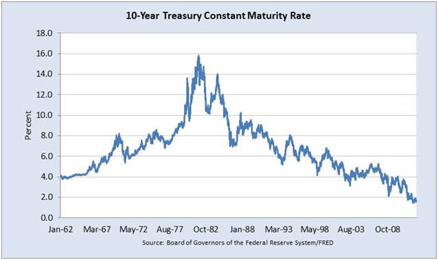
We can see from the chart below that yields on US treasuries are at generational lows. As yield declines, the price of bonds rises. Given the unprecedented level of yields on US treasuries, we are, in my view, close to the end of the secular bull market in government bonds.

10 year 130219

As Martin Pring highlighted in his book Investing in the Second Lost Decade:

At the culmination of the 1982-2000 secular bull market in stocks the Fidelity Magellan Fund (a stock fund) was the largest mutual fund in the world. In 2012, the largest mutual fund in the world is the PIMCO Total Return Fund – a bond fund!

It’s no surprise that PIMCO Total Return is the world’s largest fund, given that the secular bull market in government debt began in 1981. The question that remains for investors is, with yields so low for US treasuries, what is the upside in terms of prices, from current levels? After all, interest rates are zero-bound at the end of the day. Even Gross himself recently Tweeted, “Gross: Makin’ money with money gettin’ harder every day. When yields approach zero, all financial assets are squeezed.” If the “Bond King” is having trouble finding a decent return, what can we mere mortals hope to achieve?

If fixed-income can’t provide the inflation-adjusted returns that retirement-bound investors so desperately seek, then equities might be the key. Unfortunately, Gross doesn’t see much hope for equities, either. He recently stirred up a bit of controversy in the normally staid world of asset management with his claim that the “cult of equity” was dying, in his August, 2012 Investment Outlook. I actually agree with his original premise that by the end of the current secular bear market in equities, investors will be completely turned off from equities as an asset class. Investors are in for a rough ride, and will earn far less in the current decade than the historical 6.6% annual real return achieved over the past 100 years.

Gross’s argument had two main pillars:

1.      Since 1912, equities have provided a real return of 6.6%, surpassing real GDP growth of 3.5% over the same timeframe. Essentially, he’s arguing that if stocks continue to appreciate at a faster rate than GDP, then stockholders will eventually own a disproportionate share of total wealth. Thus, expected real returns to shareholders can’t outstrip GDP growth indefinitely.

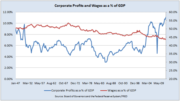
2.      As a percentage of GDP, wages are near an all-time low, concurrent with corporate profits near an all-time high. Corporate profit margins will eventually mean revert.

I agree with Gross that equity investors are facing sub-par returns going forward, but I disagree with the first pillar of his argument. To explain my view, let’s start with the basics. Total annual return is calculated as follows:

Total Stock Return = [(P1 – P0) + D] / P0

P0 = Initial price
P1 = Ending price (period 1)
D = Dividends

Essentially, your total return is determined by two components – price appreciation and dividends – in any given year. Using data graciously provided for free and updated on a regular basis by Robert Shiller (http://www.econ.yale.edu/~shiller/data.htm), I calculated that annualized real returns from equities have been 6.27% since 1871 (the earliest data available). Although I use a longer timeframe than Gross, my calculation of real returns is in the same ballpark.

The key point is that over that timeframe dividends have accounted for 70% of the total annualized real return to investors. Price appreciation added the other 30%.

Price appreciation is ultimately driven by a combination of earnings growth and multiple expansion. Gross is correct when he states that earnings growth is constrained by GDP growth. Additionally, we assume that price multiples will mean revert, which has been the case historically.

Dividends, which are typically spent and not perpetually reinvested, are the main reason that equity investors have achieved real returns well above the rate of GDP growth. If investors had reinvested their dividends, we would expect that over time real returns to equity holders would have diminished as an increasing amount of capital chased after limited profit-making opportunities. Thus, there is nothing inherently illogical about real equity returns outstripping real GDP growth, if we take into consideration that dividends are usually spent and not reinvested.

The second point that Gross raises is correct. We can see in the chart below that corporate profits (after tax) as a percentage of GDP have reached an all-time high. Conversely, wages as a percentage of GDP have consistently declined since the 1970s. Gross makes the point that the division of GDP between capital, labor, and government can vary over time and greatly advantage one constituency over another. It’s clear that since the end of the 2008 recession, the corporate sector has been the winner.

However, as fund manager John Hussman has consistently stated, corporate profit margins are mean reverting and current profitability levels are unsustainable. If you agree that margins in the corporate sector have peaked, it’s unlikely that the stock market can sustain rising price multiples.

Corp Wage 130219

Analysts who view current valuations as cheap on a forward operating earnings basis are making a huge assumption that current profit margins are sustainable. However, analysts who take a normalized earnings approach to valuation will inevitably come to the opposite conclusion. As Hussman observed in a weekly market comment:

“Profit margins are also highly cyclical over time. The wide margins at present are partly the result of deficit spending amounting to more than 8% of GDP – where government transfer payments are still holding up nearly 20% of total consumer spending, and partly the result of foreign labor outsourcing (directly, and also indirectly through imported intermediate goods) which has held down wage and salary payouts. Indeed, the ratio of corporate profits to GDP is now close to 70% above its long-term norm.”

In addition to the potential for declining margins, valuations as measured by the cyclically adjusted P/E ratio (CAPE) are still stretched. Earnings – the denominator in the CAPE ratio – are calculated by taking an average of the past 10 years. By using an average, we normalize for changes in profitability that occur due to the business cycle. Unfortunately, the CAPE ratio doesn’t tell you where the market will head in the next quarter or year, but is an exceptionally useful tool when calculating prospective returns over a long timeframe, such as a decade.

We’re nowhere near the peak levels achieved during the technology boom, but current levels still exceed the historical average of 16.5x, shown in the next chart.

CAPE Ratio 130219

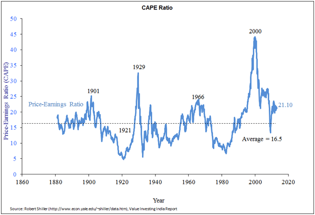
The chart also shows that the market was briefly cheap on a normalized basis in March 2009. Despite the protestations of some analysts, we are not in a new secular bull market for equities. Secular bull markets begin when the CAPE ratio is in the single digits.

What type of return from US equities can we expect going forward, given the current CAPE reading of 21.1x? We can calculate prospective long-term annual total return on the S&P 500 by utilizing the following formula derived by John Hussman:

Long Term Total Return = (1 + g)(Future PE / Current PE)^(1/T) – 1 + dividend yield (Current PE/Future PE + 1) / 2

g = Prospective growth rate of earnings

The equation simply forecasts the two components of total return that, as I noted earlier, are price appreciation and dividend yield. Using the data provided by Shiller, I calculated a long-term historical nominal earnings growth rate of 3.8%. Then, using the current 2.8% S&P dividend yield, I calculated prospective nominal returns for various future CAPE ratios, shown in the next table.

Table 130219
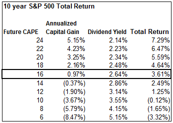
We can see from the table that if the CAPE ratio reverted to slightly below its historical mean of 16.5x, it would result in an annualized prospective return on the S&P 500 of 3.61% over the next ten years. And if the market were to de-rate down to a single-digit CAPE ratio, investors could expect negative returns, based on current valuation levels.

Keep in mind that total return is calculated in nominal terms. So, depending on your inflation expectations, real returns over the next 10 years will be nowhere near historical levels unless earnings can grow well above historical averages or investors are willing to re-rate the market from already-lofty valuations. I have no doubt that prospective returns will eventually improve. Unfortunately, that will entail a significantly lower level on the S&P 500.

Even Bill Gross himself warned about the current valuation levels of stocks and bonds when he tweeted the following back in October: “Gross: Stock and bond managers today must be alchemists: turn lead into gold. NOT likely. Too much lead (bubbled assets).”

With both US treasuries and equities offering poor future returns, where can an investor find adequate inflation-adjusted returns?

With the announcement of QE4, the likelihood of significant inflation surfacing in the back-half of the decade has definitely increased. The best options for investors, in my view, are quality domestic and international equities with decent dividend yields, and precious metals. I may have missed the equity bubble of the late ‘90s and the current bond bubble, but the precious metals bubble is just getting started. I don’t plan on missing this one.

Ankur Shah is the founder of the Value Investing India Report, a leading independent, value-oriented journal of the Indian financial markets. Ankur has more than eight years of equity research experience covering emerging markets, with a focus on Southeast Asia. He has worked as both a buy-side investment analyst for a global long/short equity hedge fund and as a sell-side analyst for an emerging-markets investment bank. Ankur is a graduate of Harvard Business School. You can learn more about his latest views on global markets at Value Investing India Reportor follow him on Twitter.


test-php-789