
Bonds & Interest Rates


For those wanting to initiate investments in precious metals & related instruments, this authors conclusion is quite optimistic. Despite the ominous title, the author is describing the highs before the declines into recent lows. His conclusion contains the following quote: “Irrationally low prices are the greatest opportunities for the investors, as all markets return to the mean. For the moment, I think that we have a decent bottom in place” . Good charts & a good read- Money Talks Editor
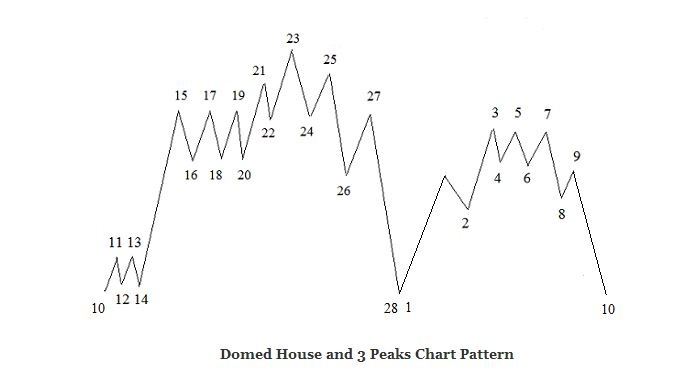
Miners Index: Domed House and Three Peaks Chart Pattern
The Miners Index has made a perfect Domed House and Three Peaks Chart Pattern. This pattern, discovered by a stock market analyst, George Lindsay, can be found in multiple timeframes. On the following charts you can see the model of the Lindsay’s Domed House and Three Peaks Pattern, as well as the current chart of the Miners Index (HUI). You can notice that the HUI Index has made a perfect Domed House and Three Peaks Pattern during these last ten years.
On the right side of the HUI Patterns Big Picture chart you can see that the three peaks (3-5-7) were followed by two strong waves decline into point 10. This down move defined the “separating decline” as prices separate the Three Peaks from the rest of the formation. Point 10 returned to point 28 and prices rebounced strongly on the Symmetry Guide Line as they normally do.
You can also notice that the Domed House Pattern (275 weeks) lasted almost for exactly the same period as the Three Peaks Pattern (269 weeks). The Domed House and Three Peaks Pattern is now complete as final point 10 returns to points 28-1 level. I have been following this pattern for a long time and it is important to monitor such chart formation as it plays an important role in the market.
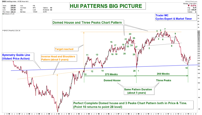
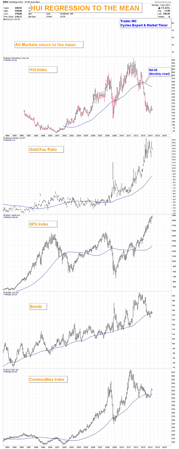
As you can see, both the Domed House and the Three Peaks Patterns have violent up moves, followed by strong reversals. In order to understand how the market works, it is important to keep in mind that all markets return to the mean. On the charts below you can see that the HUI Index, the Gold/XAU ratio and the SPX are far stretched from the 65 Monthly Moving Average. Every time it happened in the past, it generated a violent regression move which is a normal reaction for a market that has been too extreme. (I also included the Bonds and the Commodities charts as additional examples.) These charts are suggesting that odds favor an upside move for the Miners and a correction for the SPX Index on the intermediate term trend.
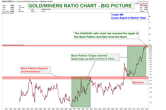
The next chart shows that the Gold/XAU ratio has reached its Base Pattern target and has a lot of downside potential. The vertical moves show how badly the Miners have performed to Gold these last two years. A regression to the mean may result in a violent down move and the Precious Metal stocks could strongly outperform the Gold Metal.
Here is another chart of the HUI Index where you can see that prices are between the two major parallel trend lines. The false breakdown last December looks like a bear trap and could have been a Multi-Year Cycle Low as it was late in the timing band for the HUI to print a Yearly Cycle Low. The lower blue trend line of the primary channel is still acting as a resistance and needs to be monitored closely. If prices go back into the blue channel, it would be a bullish sign for Miners.
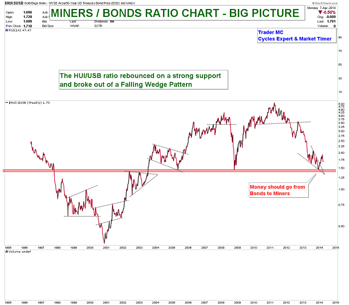
Next is the Miners/Bonds ratio chart. You can see that the HUI/USB ratio rebounced on a strong support and broke out of a falling wedge. Miners are outperforming Bonds and I expect more and more investors to leave the Bonds sector and to come into Miners during the coming months.
It is also interesting to keep an eye on the HUI/SPX ratio chart. Once a breakout of the resistance trend line occurs, Miners will be more attractive for the investors than the SPX Index. The HUI/SPX ratio got rejected right on the resistance trend line last month but the next attempt could be a successful one.

Irrationally low prices are the greatest opportunities for the investors, as all markets return to the mean. For the moment, I think that we have a decent bottom in place but nobody can predict the markets with 100% accuracy as they are irrational and like to push things to the extreme. I therefore cannot rule out the possibility of one more down move in Miners – in order to bring extreme pessimism – but if it happens then I expect it to be very brief, as the regression to the mean forces should play out and that would result in a great buying opportunity.
— Posted Tuesday, 8 April 2014
Sovereign bonds yields of the peripheral European countries (that’s the current polite term – they used to be called the PIGS) have been falling sharply (prices have been rising) since mid-2012 when the head of the European Central Bank, Mr. Draghi, declared that he would do “Whatever it takes” to save the Euro. Spanish 5 year bonds were yielding nearly 7% in 2012, today the yield is near 1.75%! That is a HUGE move in the bond market… and of course Government bonds can be bought on margin. Anybody who bought Spanish bonds two years ago and still owns them has made HUGE (unrealized) profits! Adding to the fun, the Euro has gone up about 15% against the US Dollar during that time. So if a US Dollar based hedge fund had bought Spanish Government bonds on margin they would have made the trade of a lifetime!
But the real shocker is that Spanish 5 year bonds now yield less that 5 year US Treasuries… implying that Spain is a better credit risk that the USA.

Spanish unemployment is running around 25%…for people under 25 years of age the EU rate is around 53%. A better credit than the USA? But be fair the real yields (coupon yield minus the inflation rate) shows Spanish bonds with net higher yields…because they have deflation in Spain. And further (to be fair) American 5 year bond yields have been rising for the past year (and just hit 3 year highs) as the Fed is winding down, tapering, their asset purchases. But still…where is the arbitrage? How can Spanish bonds yield less that American bonds?
Remember in late 2012 we talked about how the Spanish Government was ploughing nearly the entire Government Employee Pension fund into Spanish Government bonds and it seemed that nobody else wanted to buy them? We thought this was a reckless act by the Government… well, maybe they had some real “We’ve got your back” promises from the ECB? If there is someone out there big enough to buy those bonds the pension fund would register a HUGE profit!
Remember also that the Chinese and the Japanese were buying distressed Euro bonds in 2012 and it looked like they were doing a quid pro quo to maintain trade flows with Europe but maybe they understood that the ECB had their back too.
The rally in the peripheral European bonds has been on expectations that the ECB will (have to) do some sort of Quantitative Easing like Japan and America have done and this will involve buying bonds. The big profits with the assumed ECB “We’ve got your back” guarantee have generated HUGE momentum in this trade.
The fantastic rally in PIGS bonds is also another aspect of REACHING FOR YIELD and at this point (to paraphrase the country music song) IN ALL THE WRONG PLACES.
Where’s the trade? Given that markets can remain irrational far longer than we can remain solvent, I can’t pick the end of an extremely powerful trend that seems to be going parabolic. BUT the wildness in credit spreads means that
We like the US Dollar Vs the Euro

We like buying Treasuries and selling junk
We like buying Treasuries and selling the stock market.


Dow down 159 on Friday. Gold up $18 an ounce.
Remember, it’s just a matter of time until US stocks begin to fall. How much time? Darned if we know!
We spent Friday cosechando (harvesting). We were on our knees going through the vineyard at the family ranch, harvesting grapes. The going rate for such work is 5.70 Argentine pesos (or about $0.70) per gamela – the plastic bin we dragged along after us.
This was the first time we had ever worked as a grape picker. Experienced, hardy pickers can fill 40 gamelas a day, giving them about 230 pesos (or about $28) for the day’s work. Your editor worked at fast as he could. Still, he was only able to pick at the rate of nine gamelas a day. That gave him an income for the day of 51.30 pesos… or about $6.40.
The sun beat down. The grapes hid behind leaves and clung to vines, making it hard to cut them off. Our knees found every rock in the field. Still, we were proud to be doing honest work… and happy to earn some extra money.
Now, let us turn back to last week’s subject.
You’ll recall that the credit bubble must continue to expand. Or else all Hell will break loose. Civilization probably won’t be able to survive a real credit deflation, economist and author Richard Duncan believes. With visions of chaos, depression and war in his head, he advocates policies that give the bubble more air.
We live in a credit-driven economy. The money supply relies on banks creating new credit. Credit must expand… or the economy shrinks. It can’t stand still because the current level of jobs and incomes depends on additional debt.
Last year, for example, through its QE program the Fed created $1 trillion of new bank deposits (offsetting them with $1 trillion in new bank reserves). And the economy grew just 1.9% – or by only about $320 billion. Think what would have happened without this boost!
But for credit to really expand without the help of QE, banks must find willing and able borrowers. And who will those willing and able borrowers be?
Not consumers. They don’t have the disposable incomes to support much additional borrowing.
And not corporations. Their earnings are beginning to turn down, too. The days of borrowing money in order to goose up their own stocks (and, not coincidentally, get management bigger bonuses) must be nearing an end.
Who does that leave? Government. Government is the only large entity with the ability (in theory at least) to borrow an infinite amount of money. Because it doesn’t have to worry about paying it back. It’s the only institution with the legal right to counterfeit its own money… and use this cash to pay its own debts.
What a sweet deal!
Duncan reckons that the US can, will and should follow the example given it by the Japanese.
Although the US has debt equal to about 100% of GDP, Japan’s government debt is about 240% of GDP. By that measure the US could borrow another $17 trillion – enough to keep the credit bubble and the economy expanding for many years.
You see, dear reader, we live in a world of wonders. One of them is that we have an economy that now lives, and apparently thrives, on air.
Each year, households, government and corporations spend their revenues…. and then some. This extra spending would normally come from savings. Instead, it comes out of thin air – conjured up by the Fed and the banking system.
Now, imagine that the air were cut off. You can see what a disaster it would be. Everyone would be gasping for cash… for credit… for a last breath.
What’s the solution? Keep the credit flowing!
That is what the Japanese did following their stock and property market crash in 1990. And it’s what they’ve been doing ever since. They were faced with the same challenge – the household sector could no longer be persuaded to borrow… and the corporate sector could no longer afford to.
So, the government stepped in as the borrower and big spender of last resort… allowing the Japanese government to run up record amounts of debt relative to the size of its economy.
But wait… With the government borrowing and spending so freely, didn’t prices go up? Didn’t inflation discourage people from lending to the government?
Nope. Prices were stable or actually fell. For two reasons. Because everyone else was paying down debt and reluctant to spend at all. And because wage competition from nearby China was substantially lowering the cost of consumer items.
So, with no threat from consumer price inflation, the government just kept borrowing and spending. This has held the Japanese economy together for 24 years. Many economists look at the Japanese example as a success story.
But the final chapter on that story still hasn’t been written. We will take a guess at how it turns out: badly.
Regards,
Bill
Editor’s Note: Our new analyst, Braden Copeland, has put together a special report on what to do when the “thin air” economy finally falls apart. Learn about the three important steps you need to take to protect your wealth before, during and after the coming crisis by following this link.
Market Insight:
A BIG Headwind for
Stocks Right Now
From the desk of Chris Hunter, Editor-in-Chief, Bonner & Partners
Nobody knows for how long US stocks can continue to rally…
But a BIG headwind for the US stock market is overstretched valuations.
There are different ways to value stocks. But one of the most straightforward is to look at their price relative to their 12-month “as reported” earnings. (What’s also known as a “trailing P/E.”)
As you can see from the chart below from StockCharts.com, the normal range for the trailing P/E for the S&P 500 going back to the 1930s is between 10 (green line) and 20 (red line)… with an average trailing P/E of 15.5.
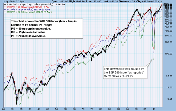
And as you can see, the index is now at the top of its normal range.
Overstretched valuations like this don’t necessarily cause a crash. But they will make investors think twice about going long the S&P 500… and encourage more investors to take up short positions.
Meanwhile, the Wall Street consensus for earnings growth for Q1 has gone from 4.4% year over year in early January to -0.4% today.
If prices don’t fall, a drop in earnings will push up P/Es even higher… and create an even bigger headwind for US stocks.
P.S. Don’t forget to check out Braden’s new report on what to do to prepare for a crash in the US stocks. It contains a list of six stocks to buy when the next crash comes. Find full details here.
Briefly: In our opinion no speculative positions are justified.
Our intraday outlook is neutral, and our short-term outlook is now neutral, following Friday’s move down:
Intraday (next 24 hours) outlook: neutral
Short-term (next 1-2 weeks) outlook: neutral
Medium-term (next 1-3 months) outlook: neutral
Long-term outlook (next year): bullish
The U.S. stock market indexes lost between 1.0% and 2.7% on Friday, as investors reacted negatively to monthly jobs data release. However, the S&P 500 index has managed to reach yet another new intraday all-time high at 1,897.28, before going down to its daily low at 1,863.26. The nearest important resistance remains at 1,880-1,900, and the support is at 1,840-1,850, marked by March local lows, among others. For now, it looks like some sort of a medium-term topping pattern, however, further consolidation along the level of 1,850-1,900 cannot be ruled out:

Expectations before the opening of today’s session are negative, with index futures currently down 0.3-0.7%. The main European stock market indexes have lost 0.5-1.1% so far. The S&P 500 futures contract (CFD) trades in a relatively narrow intraday range, following Friday’s selloff. The nearest resistance is at around 1,860, with potential support at 1,840-1,850, marked by the late March local lows, as the 15-minute chart shows:

The technology Nasdaq 100 futures contract (CFD) is relatively weaker, as it trades below its March lows. The resistance is at around 3,550, and a potential support is at the psychological level of 3,500. There have been no positive signals so far, however, we can see some oversold:

So, was Friday’s selloff a new downtrend or just a short-term pullback? It’s a tough call right now – the signals are mixed and the outlook is unclear. The reason is that the S&P 500 index has invalidated its recent breakout into new all-time highs – extending March consolidation. The question is if it’s still a consolidation (bullish implications) or has the consolidation already ended and we should treat breakout’s invalidation on a stand-alone basis (bearish implications). Things should become much clearer in the coming days – stay tuned.
Thank you.


-
I know Mike is a very solid investor and respect his opinions very much. So if he says pay attention to this or that - I will.
~ Dale G.
-
I've started managing my own investments so view Michael's site as a one-stop shop from which to get information and perspectives.
~ Dave E.
-
Michael offers easy reading, honest, common sense information that anyone can use in a practical manner.
~ der_al.
-
A sane voice in a scrambled investment world.
~ Ed R.
Inside Edge Pro Contributors

Greg Weldon

Josef Schachter

Tyler Bollhorn

Ryan Irvine

Paul Beattie

Martin Straith

Patrick Ceresna

Mark Leibovit

James Thorne

Victor Adair