
Gold & Precious Metals
The relationship between the Dow and silver has been very consistent during the last 100 years. After each of the major Dow peaks (real, not necessarily nominal peaks), we eventually had a major bottom in silver. Below, is a 100-year inflation-adjusted Dow chart:
Click image for larger view

In September 1929, the Dow peaked in terms of US dollars as well as in terms of gold ounces (real terms). After about 1 year and 4 months, silver made a significant bottom. While the Dow continued to fall for most of the time, silver rallied until it peaked in January of 1935. At silver’s peak, the Dow was about 30% lower in real terms than what it was at silver’s bottom.
Again, in January 1966, the Dow peaked in real terms. After about 5 years and 10 months, silver made a significant bottom. While the Dow continued to fall for most of the time, silver rallied until it peaked in January of 1980. At silver’s peak, the Dow was about 55% lower than it was at silver’s bottom.
In 1999, the Dow once more peaked in real terms, and about after 2 years and 3 months, silver again made a significant bottom. However, over the period from the silver bottom to the peak in April 2011, The Dow actually went sideways (actually slightly higher). See on the following chart:
Click image for larger view

This is just one of the reasons why I know that the April 2011 high in silver is not the peak for this bull market. Why? Silver stands in direct opposition to paper assets like stocks that are part of the Dow. Therefore, when silver has a “real deal” rally, then paper assets like the Dow will lose significant value over the same time.
This is because the debt-based monetary system does what I call a “mirror-effect”, whereby, silver (and gold) is pushed down in value, to a similar extent as to which paper assets such as general stocks are pushed up in value. When the rally of the paper assets eventually runs out of steam, then there is a big push for silver and gold.
Silver’s real deal rally will happen when people run to silver for its monetary benefits. That is not really happening yet, in a big way, but it is about to – very soon. Money is what silver is, and it is this that will drive the coming spectacular silver rally.
So, if we look at the Dow chart again (below), one can see that the silver peaks of the 70s and 30s occurred when the Dow was trading closer to the lower levels of its range. Currently, the Dow is trading at all-time high levels. If the Dow is currently having a “real deal” rally, then it means we are going to have to wait a long time before silver has its real rally.
Click image for larger view

However, if the Dow is just having a fake rally, then silver will spike as soon as the Dow’s fall gathers steam, and possibly peaks when the Dow hits a level indicated on the chart, as a minimum. One, therefore, has to decide whether this Dow rally is real or fake.
For more of this kind of analysis on silver and gold, and why I think that the Dow’s current rally is fake, you are welcome to subscribe to my premium service. I have also recently completed a Long-term Silver Fractal Analysis Report.
Hubert
“And it shall come to pass, that whosoever shall call on the name of the Lord shall be saved”

Over the last several weeks, I have been reiterating the risks that remain in the market. However, I have maintained the allocation model at target levels due to the fact that the markets had done nothing wrong. That all changed this past week.
As I stated in the March 29th report:
“The good news is that, despite plenty of headwinds from geopolitical events, ongoing tapering of bond purchases by the Federal Reserve which is reducing liquidity and weak economic data, the markets have not declined. The index has consistently held support at 1850 and on a very short term basis is beginning to get oversold.”
The first half of the week was relatively benign and on Wednesday the market surged as the FOMC minutes hit the markets. With no signs of increased “tapering,” and filled with friendly language, the markets surged due to the result of two or three media outlets’ duplicitous spin of the FOMC Minutes. However, on Thursday, Mr. Market peaked behind the curtain and did not like what it saw.

As the King Report for Thursday noted:
“The Fed stated that QE tapering will continue and the pace might increase. Please recall that the last big equity rally occurred when the usual suspects proclaimed that the Fed would reduce its QE tapering pace or stop tapering QE altogether. It was a false declaration.
The traders and investors that succumbed to the B.S. from media shills got caned on Thursday and Friday. It serves them right for reacting to imprecise headlines, spin and algo (HFT) buying.
On Thursday, numerous economists, pundits and Fed watchers echoed our view that the FOMC Minutes provided little new information and internal dissent in regard to future Fed policy is increasing.”
It is becoming clear that the Federal Reserve has gotten itself caught in a liquidity trap.
Furthermore, the new Fed chairwoman doesn’t seem to have the “vocal magic” of her predecessor to calm the markets through Fed speak.
From the NY Times:
“Beyond the broad agreement to continue tapering the pace of asset purchases and the dropping of the 6.5 percent threshold, committee members disagree on just about everything else.”
For example, there is a rising dissent about the extent of slack in the labor market, a debate that continued at the March meeting. Only a few Fed officials suggested the labor market is nearing a new equilibrium, implying the Fed should wind down its stimulus campaign more quickly or risk higher inflation.
There was also a good bit of disagreement about the health of financial markets. Some officials see growing risks to financial stability, including a downward trend in risk premiums, while a majority continues to see those risks as modest and secondary. The problem is that the Fed has never been “ahead of the curve” in spotting excessive risk in the market.
As FTN’s Jim Vogel summed up well:
“Market confidence in its ability to read the Fed is in tatters on the floor. The Fed’s ability to understand the market’s reaction to its communications might be in even worse shape…Unfortunately, the early obsession with the Fed’s plans for 2015 obscures investors’ understanding of the current economy.”
The problem is that the markets have, until now, placed their faith primarily in the Federal Reserve’s ongoing liquidity programs to support their financial manipulations without “risk.” Pushing stock valuations in the stratosphere has been the game as long as the Fed was there to bailout the markets in the event something went wrong. As noted by Savita Subramanian, BofA-Merrill’s head of US Equity Strategy and Quantitative Strategy in Global Macro Research:
“Biotechnology and Internet stocks have seen their EV/Sales multiples triple and double, respectively, over the past two and a half years and they now make up a combined 8% of total US market cap. The median Biotech stock trades at 24x sales, nearly 10x that of the S&P 500 and the highest level since the Tech Bubble.
Meanwhile, the percentage of Biotech and Pharma stocks trading above 10x EV/Sales has reached about 60%.Strong performance, and high valuations, may be justified in some cases by improving pipelines and visibility, but the market has uniformly rewarded stocks in hot industries. The recent sell-off in high growth industries has been ETF driven, as mutual funds have actually been net buyers over the last several weeks. Given that Biotech and Internet carry 60% and 50% over weights in active managers’ portfolios, respectively; we may see more selling pressure in these pockets of the market.”
With valuations now being questioned combined with the extraction of liquidity this puts the markets at risk of further downside risk in the future. However, this DOES NOT mean that the markets are about to “crash.” However, a further decline in the future, particularly this summer, is indeed likely at this juncture.
How Big Of A Correction?
As I stated this past Monday:
“With the markets falling by an average of 12% since 1833, and 6% since WWII, the summer months of mid-term election years have not been kind to investors.
However, let’s sum up the risks at play in the markets currently:
-
- The Federal Reserve is extracting liquidity from the markets.
- Interest rates are potentially rising
- 2013 was an exceptionally strong year for the markets.
- Markets have gone an exceptionally long period of time without a 10% correction.
- The “momentum” play has cracked (biotechs, low float stocks)
- Mid-term election years, particularly when Democrats are in control, have been weak during the summer months.
While there is certainly a possibility that this summer could yield a positive return, there are enough concerns to be more cautious than normal. While there is no guarantee that this summer will produce a negative return overall, it certainly doesn’t negate a pretty nasty hiccup along the way.”
The chart below shows the market on a weekly basis going back to 2004.

As you will note, in both instances the longer term cyclical bull trend saw prices lift off late in the cycle into an“exuberant” bullish uptrend. That sharp advance cannot be sustained indefinitely.
I have also noted with the vertical “blue” dashed lines where the overbought/sold indicators have identified market bottoms. Currently, the indicators are suggesting that there is likely a bit more to go to the downside at the moment which brings 1800 into focus as the next major support level.
Furthermore, one of my “fear” gauges (the CBOE Total Put/Call Ratio) is also indicating that the current sell-off is likely not complete yet.

I have highlighted the previous market “topping” action as we see currently, and the coinciding turn up in the put-call ratio.
As I published on Tuesday of this past week (prior to the correction) in “No One Rings A Bell At The Top:”
“The point here is simple. The combined levels of bullish optimism, lack of concern about a possible market correction (don’t worry the Fed has the markets back), and rising levels of leverage in markets provide the “ingredients” for a more severe market correction. However, it is important to understand that these ingredients by themselves are inert. It is because they are inert that they are quickly dismissed under the guise that “this time is different.”
Like a thermite reaction, when these relatively inert ingredients are ignited by a catalyst they will burn extremely hot. Unfortunately, there is no way to know exactly what that catalyst will be or when it will occur. The problem for individuals is that they are trapped by the combustion an unable to extract themselves in time.
I recently wrote an article entitled ‘OMG! Not Another Comparison Chart‘ because there have been too many of these types of charts lately. The reason I make that distinction is that the next chart is NOT a comparison for the purposes of stating this market is like a previous one. Rather, it is an analysis of what a market topping pattern looks like.”

As you can see, during the initial phases of a topping process complacency as shown by the 3-month volatility index at the bottom remains low. As the markets rise, investor confidence builds leading to a “willful” blindness of the inherent risks. This confidence remains during the topping process which can take months to complete. With individuals focused on the extremely short term market movements (the tree) they miss the fact that the forest is on fire around them. However, as shown, by the time investors realize the markets have broken it is generally too late.
Do Nothing Right Now
While I do believe that the markets are likely to correct further, they are also oversold enough on a short term basis to bounce toward 1850 first. As investors, our job is not to try and “predict” what the markets will do, but rather react to them.
Since we work on “weekly” data to slow down the volatility and reduce turnover in portfolios, by the time a signal is given the markets are already oversold enough to attract some short-term buying. We want to use that “dead cat bounce” as an opportunity to implement any portfolio changes necessary.
The chart below shows the short term view of the market and the likely target for a bounce.

The vertical blue lines denote when the short term moving average has crossed BELOW the longer term moving average. In these instances, the selloff was not complete but the markets bounced before going lower. The horizontal red line shows the most likely level of resistance for the markets currently which is 1850, the previous support level that was tested multiple times since the beginning of the year. This level will now provide fairly significant resistance.
Portfolio Actions
Therefore, in portfolios, take the following actions on a bounce:
- Fully allocate portfolios to target weightings of fixed income. Interest rates have given a strong buy signal suggesting lower rates and higher bond prices.
- Reduce overweight holdings in equities, particularly in the momentum areas of the market such as biotechnology and technology.
- Increase cash levels while selectively overweighting holdings in more defensive areas of the market such as utilities and consumer staples. (feed the garden)
- Sell portfolio laggards and losers in their entirety. (weed and prune the garden)
- Reduce winners back to target weightings (harvest the bounty)
The simple reality is that I have no idea whether we are entering into the next major correction or just a buying opportunity. There are “too many” people writing and talking about a “bubble” for there to actually be one.
Dare To Be Different
One of my mentors, Howard Marks, recently wrote something that everyone should clearly understand.
“This just in: you can’t take the same actions as everyone else and expect to outperform.
For years, I have posed the following riddle: Suppose I hire you as a portfolio manager and we agree you will get no compensation next year if your return is in the bottom nine deciles of the investor universe but $10 million if you’re in the top decile. What is the first thing you have to do – the absolute prerequisite – in order to have a chance at the big money? No one has ever answered it right.
The answer may not be obvious, but it’s imperative: you have to assemble a portfolio that’s different from those held by most other investors. If your portfolio looks like everyone else’s, you may do well, or you may do poorly, buy you can’t do different. And being different is absolutely essential if you want a chance at being superior. In order to get into the top of the performance distribution, you have to escape from the crowd. There are many ways to try. They include being active in unusual market niches; buying things others haven’t found, don’t like or consider too risky to touch; avoiding market darlings that the crowd things can’t lose; engaging in contrarian cycle timing; and concentrating heavily in a small number of things you think will deliver exceptional performance.
Only if your behavior is unconventional is your performance likely to be unconventional…and only if your judgments are superior is your performance likely to be above average.
The bottom line on striving for superior performance has a lot to do with daring to be great. Especially in terms of asset allocation, ‘can’t lose’ usually goes hand-in-hand with ‘can’t win.’”
The problem is that while this sounds easy, it isn’t. This is why roughly 80% of all investors severely miss their goals over time. They buy high, sell low and do mostly everything wrong in between by chasing short term gains and the expense of long term pain.
The goal in investing is asymmetry in aligning the portfolio to garner a return (not market related returns) without a commensurate exposure to risk (potential to lose greatly).
That doesn’t mean that all losses are avoidable. They aren’t and it’s not realistic. Return expectations have to be aligned with regards to the mitigation of risks. The more risks that you wish to mitigate the lower the overall portfolio returns will be. Quite simply, there is no free lunch. It is just a matter of how much you are willing to pay for the meal you want to eat.
Regards

Lance Roberts
Lance Roberts is the General Partner & CEO of STA Wealth Management, Host of the “Streettalk Live” Daily Radio Show(streamed live at www.streettalklive.com), and Chief Editor of the X-Factor Report and the Daily X-Change Blog.Follow me on Twitter: @streettalklive

A specter is haunting the world … and it’s NOT the specter of communism. Or the collapse of capitalism.
It’s the specter of the ramping up of the war cycles I’ve told you about — bloody regional and civil wars like we haven’t seen since the 1930s … wars that may soon wreak havoc with your finances … further erode your civil liberties … and maybe even endanger your personal safety.
From Istanbul to Rio de Janeiro, Syria to India, Thailand to Ukraine — the world’s Internet-connected masses are rising up against incompetent, corrupt, increasingly authoritarian governments … and the results will NOT be pretty.
For most of this century, I’ve been reporting on the global financial markets while based in Bangkok, Thailand. Reporting from the world’s hot spots.
Living in Southeast Asia, just a few hundred miles from China’s southwestern border, has given me a unique perspective on world events and access to news about imminent wars that is rarely, if ever, reported in U.S. media outlets.
 And I can tell you firsthand that the most significant economic events of your lifetime are about to unfold.
I’m talking about a series of cascading regional wars that are about to break out overseas. About hundreds of millions of people — in the Middle East, Europe, Asia and South America — who are going to revolt against the economic misery imposed by their authoritarian governments.
These regional conflicts and civil wars are going to do two things:
First, they are going to unleash the full fury of heavily armed, increasingly authoritarian governments — new Big Brother states all over the world — that now track nearly everything we write, say, buy or even think.
Second — and most surprising of all — this new cycle of warfare will also coincide with some of the greatest market booms of our lifetimes — booms that too many ordinary investors will miss out on due to bad advice and even blind panic.
I know this will strike many people as counter-intuitive … that an era of global warfare and government repression could also result in enormous wealth.
And I know a lot of people will fail to make the connection between these two apparently contradictory events.
But it’s extremely important that you have a road map to guide you through what’s about to happen.
If you follow the crowd and make the wrong moves, you could end up losing literally everything you’ve worked all your life to create.
But if you invest in the few key investments that will likely explode during an era of increased global conflict — you could end up making more money in the next few years than you’ve made in the past two decades.
For many years now, I’ve studied
the relationships between economic
trends and warfare.
I’ve come to believe that there are regular patterns that occur in the spheres of economics, society and global conflicts that can be observed — and often predicted — with shocking accuracy.
Now, my research suggests that rising global economic and social tensions will erupt into a series of regional and civil wars over the coming months and years.
It’s already beginning … and believe me, it’s about to get much, much worse.
Here’s what I see happening …
CONFLICT #1: A MAJOR war in the Middle East, possibly among Israel, Syria, Lebanon, the United States and Iran, that could make the Iraq War look like a minor skirmish.
The Syrian civil war, which has already claimed 100,000 lives, is increasingly drawing in nations across the Middle East, creating a regional conflict that threatens to pit world powers against each other.
And don’t kid yourself: Iran’s recent friendly gestures are pure deception. When you add in the additional wild card of Iran — struggling for years to build a nuclear weapon to use against Israel — the possibility of a catastrophic Middle East war increases exponentially.
CONFLICT #2: A war between China and Japan over the South China Sea, dragging in Vietnam, Malaysia, the Philippines and possibly even the United States.
Most Americans know almost nothing about what is happening right now in Southeast Asia, but the situation is growing increasingly unstable. “The risk of conflict in the South China Sea is significant,” reports the U.S. based Council of Foreign Relations.
And as scary as this scenario might be, it’s not the only war that could erupt in Asia:
CONFLICT #3: The North Korea wild card that could trigger World War III.
In response to threats from North Korea on Seoul and Washington, the U.S. and South Korean governments have recently signed a new joint security agreement, laying out contingency plans and responses against North Korea should war break out.
According to The New York Times, the joint agreement insists on the right of both countries to “immediately and decisively respond to any North Korean provocation.”
Military conflict is not limited to Asia, however.
CONFLICT #4: Europe is about to break in two — split between rich countries at the core and bankrupt countries on the periphery.
This is one area of the world where most Americans DON’T expect any military conflict … yet there are numerous signs that civil wars could soon break out again in Europe … similar to the bloody genocide that occurred in the Balkans in the 1990s.
Or that Russia could soon invade Ukraine … Latvia … Estonia … Georgia and other former Soviet Union satellites.
“The world is at a crossroads in history,” writes Britain’s Daily Mail newspaper. “Vast, untamable economic forces are remaking the landscape of international affairs.”
As bad as the Great Recession has been in the United States, it pales in comparison to the full-scale depression now occurring throughout Europe, especially in the east and south.
Economic austerity measures, imposed by the central EU government and insisted on by Germany, are sparking ultra-nationalist, potentially neo-fascist movements across the Continent.
Riots have broken out in bloody protests in Athens, Rome, Madrid, Paris and, most recently, Istanbul.
And just as the Great Depression led to fierce nationalism and eventually to outright war in Europe in the 1930s, so, too, the recent economic tensions worry experts in Europe.
“Russia has threatened NATO with military strikes against Poland and Romania if missile defense radar and interceptors are deployed in Eastern Europe,” reports the Daily Telegraph.
The paper quotes General Nikolai Makarov, Russia’s most senior military commander, that “a decision to use destructive force preemptively will be taken if the situation worsens.”
CONFLICT #5. Egypt is once again on the verge of civil war. Worse, some of the richest oil countries in the world are now at each other’s throats because they each support opposing sides in Egypt.
CONFLICT #6. Nuclear-armed Pakistan is descending into chaos, with the Taliban gaining strength in the Northwest and ethnic warfare spreading in the South.
CONFLICT #7. Ethnic warfare is spreading in two other oil producing countries — Iraq and Nigeria.
And this is just the tip of the iceberg. Other deadly conflicts are popping up all over the world.
Buddhists are attacking Muslims in Myanmar. Muslims are battling Hindus in India.
Muslims are rebelling against Han Chinese in Western China.
And all over the Middle East, Shia Muslims are at war with Sunni Muslims.
Everywhere, anyone with wealth is asking: How can I get my money out of here? Where can I find safety? How do I get my money to the safest large economy in the world — the United States? What big-cap American stocks should I buy?
Now, here is the critical point:
As a result of all this rising global chaos — and despite the meagerly growing U.S. economy — tens of billions … and then HUNDREDS OF BILLIONS of dollars will pour into the safety of U.S. markets from overseas, sending the U.S. stock market soaring.
And into other key assets, namely, gold, silver, and other precious metals and commodities.
We are not yet at that point in time where these markets will explode. Stocks are finally staging that much needed pullback that I’ve been warning you about.
And gold and silver are forming nice bases, trying to avoid one more leg down.
But stay alert: With the cycles of war ramping up more quickly than even I had expected, big market changes — and huge profit opportunities — are right around the corner.
Best wishes,
Larry
– See more at: http://www.swingtradingdaily.com/2014/04/14/the-true-specter-haunting-the-world-right-now/#sthash.WAp2og3V.dpuf
In this Weekend Report I would like to look under the hood of some of the precious metals stocks indexes to see what is really taking place. We’ll look at a bunch of PM stocks to get a feel for where we are in the short, intermediate and long term pictures. When one just observes an index you really don’t get to see, in detail, the stocks that make up that index that could be showing some important clues to the overall big picture. For instance, there are just three or four of the biggest of the big cap precious metals stocks that account for a large percentage move for say the HUI. There are many more stocks in the index but they don’t carry as much weight.
Before we look at some of the precious metals stocks I want to show you a combo chart that puts everything into perspective and gives you a feel for where we are in the intermediate term time frame. This combo chart has the HUI on top, GLD in the middle and SLV on the bottom. First I want you to look at the left hand side of the chart where you see that the HUI and silver each formed a blue triangle while gold formed a bullish rising wedge. Each consolidation pattern took the same amount of time to build and all three broke out together, first purple vertical dashed line. Note the impulse move out of the blue patterns that show SLV leading the way higher as GLD and the HUI had a backtest while SLV didn’t. Here’s where it gets interesting. As you can see SLV rallied straight up to its bull market top way ahead of the HUI and gold that were lagging behind, second thin purple vertical dashed line. After a few months of consolidation it was gold’s turn to go parabolic and make its bull market high in September of 2011. The heavy purple dashed line shows where all three topped out together with the HUI and gold making their bull market highs while SLV was already in correction by falling way short of reaching its bull market top that it made back in April.
What was so frustrating for those of us that were holding precious metals stocks is that they hardly moved when gold and silver had their parabolic moves higher. As you can see the HUI did in fact make its bull market high at the same time gold did but the HUI had no parabolic move up. As you can see it was more of a slightly rising horizontal type move. That had to be one of the worst times to be a gold bug, to see gold and silver go parabolic and the precious metals stocks hardly budging. I’ll post this chart here so you can see the blue consolidation patterns on the left side of the chart then we’ll discuss the red consolidation patterns on the right side of the chart.
**To get larger images & read without having to click each chart go HERE – Editor Money Talks
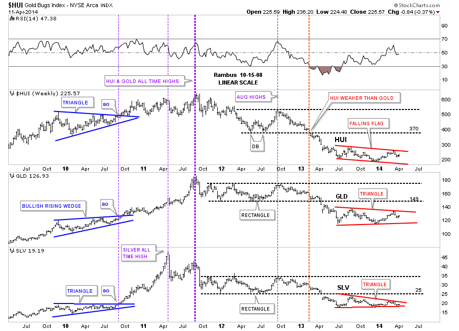
Let’s not fast forward to the heavy red dashed vertical line that shows how the HUI was the first of the three to really show weakness by breaking below its horizontal black dashed line first. The precious metals stocks were leading he way down. It took about another 12 weeks or so before GLD and SLV joined the party to the downside when they finally broke out of their nearly 22 month consolidation patterns with a breakout gap. As with the blue consolidation patterns on the left side of the chart our current red consolidation patterns all bottomed at the same time, late June of 2013, and have been chopping out their respective chart patterns ever since. As you can see all three are working on their fourth reversal points right now. Even though the HUI is building out a falling flag formation, which will be pretty bearish if it breaks through the bottom rail, the SLV is trading the closest to its bottom rail of its red triangle. This chart gives you the big picture look and lets you know where we stand and what to look for.
One last comment before we move on. As you know reverse symmetry plays a big role in how I interpret the price action. Until something changes, I’m viewing the blue consolidation patterns, that formed on the left side of the chart with the price action going up, equal to the red triangles on the right side of the chart with the price action going down as reverse symmetry. Since the bull market top in 2011 you can see a series of lower lows and lower highs all the way down to our current price which is just the complete opposite of what we seen in the bull market years. Until we can see a higher low and a higher high the downtrend remains intact.
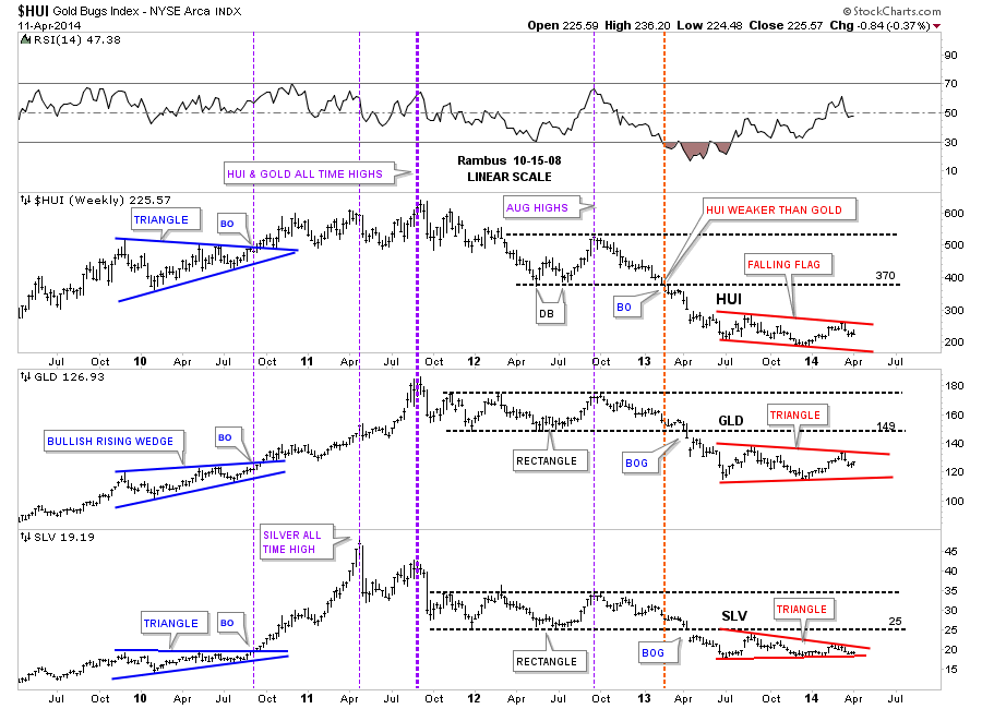
Lets take a quick peek at our red consolidation patterns starting with the HUI. Here we see the blue falling flag that is working on its fourth reversal point down. As you can see we had an important test of horizontal resistance last week at the 236 area. Also note the big impulse move down that has led to the formation of our current consolidation pattern that I will view as a halfway pattern if the bottom rail is broken to the downside. The HUI should show a similar move that led into our current blue falling flag when the price action leaves, thus this pattern will show up between the two impulse legs down.
Below is gold’s blue triangle that is showing the most strength right now between the three. It to is working on its fourth reversal point to the downside. Keep in mind these potential consolidation patterns won’t be complete until their bottom rails are decisively broken to the downside. I expect there will be a very big down day once the possible breakouts occurs that will leaves no doubt as to what just happened.
Below is silver’s potential blue triangle that is trading the closest to the bottom blue rail. The 18.50 area on the bottom blue rail will be critical support.

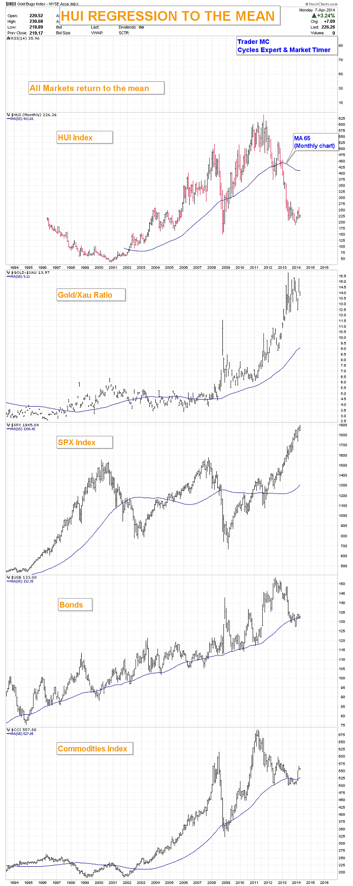
Lets now put our blue consolidation patterns in perspective so you can see how they fit into the big picture. This first chart is for the HUI, which is a long term weekly line chart, that goes all the way back to the beginning of the bull market. Keep in mind a line chart only uses the closing price so the patterns will look slightly different. There is a lot of good information on this chart that we can use to help us understand where we are in the big picture. First notice all the blue consolidation patterns that formed during the bull market years, one on top of the other. That’s a bull market folks. Next notice our massive H&S top that reversed the bull market and has led to our current price. We are now reversing symmetry down and what I believe is our first consolidation pattern to the downside with its blue counterpart on the left side of the chart. Next lets look at the fanlines which is a chart pattern. The rule of thumb is when the 3rd fanline is broken to the downside is when you get your big move. Note fanline #1 and #2 that have the green circle around where the fanline and the neckline intersect. Once that area was broken to the downside the HUI wasted little time declining in earnest. Some of our long term subscribers may remember this chart as I was showing it as we were watching the neckline and fanline #2 breaking down. A daily bar chart will show there was a small backtest to the underside of the neckline before the impulse move began.
Lets now look at gold’s potential triangle and how it may fit into the bigger picture. Gold’s potential triangle has formed on top of the neckline extension rail that is taken off of the 2008 H&S consolidation pattern in which I extended all the way to the right hand side of the chart. Are we seeing reverse symmetry with our current red triangle vs the red bullish rising wedge that formed in the uptrend on opposite side of the chart?

If someone can look at this weekly chart for silver and tell me silver is in an uptrend I would have to call them crazy. Just look at the price action on the left side of the chart when silver was going parabolic creating a series of higher highs and higher lows all the way up to its bull market top. Now compare that price action to the right hand side of the chart since silver topped out just under 50 in April of 2011. Silver has now completed three years of its bear market, this month, by creating lower lows and lower highs. This is basic elementary Chartology. Maybe something will happen to create a new higher high and higher low but until that happens the major trend is down and that is the best direction to trade unless you’re a day trader. It’s always the easiest to trade in the same direction of the major trend as it can fix a mistake if you bought at the wrong time. Just the opposite in a bull market.

So far we looked at the HUI, gold and silver potential consolidation patterns on the short term to longer term look charts. Now we need to look under the hood and see what some of the precious metals stocks are showing us to help bolster these possible consolidation patterns as having some validity. What we have forming on some of the precious metals stocks are several different consolidation patterns ranging from triangles. expanding triangles, rectangles and rising wedges
………………………..
Editors Note :
This Portion of tonight’s Weekend Report engaging the Chartology of 10 Individual Stocks is for Subscribers .
……………………….
In Summary
There are many more charts I could post but I think you get the picture of what I’m trying to show you. By looking under the hood you can get a totally different perspective than just looking at an index. These charts give me the confidence to hang on to our game play when I know many are in doubt. So far nothing is broken from a Chartology perspective which is why we are still short. Until something changes, this is the way I will stay and hopefully we will be able to catch another big impulse move down. I believe we are positioned very well especially if these fourth reversal points hold on these nine month consolidation patterns.
All the best…Rambus

 An “87-type crash” in the next 12 months he said in a TV interview Saturday. “And I suspect it will be even worse.”
“it’s not a very good time right now to buy stocks.” “I believe that the market is slowly waking up to the fact that the Federal Reserve is a clueless organization. They have no idea what they are doing. And so the confidence level of investors is diminishing.”
“I think there are some groups of stocks that are highly vulnerable because they’re in “cuckoo land” in terms of valuations.” – Marc Faber
There is more in this interview below with Marc that begins at the 2 minute mark & goes to the 9 minute mark. Prior to that there are some comments from floor traders during Friday’s drop, after that the same traders comment on Marc’s prognostications – Editor Money Talks


-
I know Mike is a very solid investor and respect his opinions very much. So if he says pay attention to this or that - I will.
~ Dale G.
-
I've started managing my own investments so view Michael's site as a one-stop shop from which to get information and perspectives.
~ Dave E.
-
Michael offers easy reading, honest, common sense information that anyone can use in a practical manner.
~ der_al.
-
A sane voice in a scrambled investment world.
~ Ed R.
Inside Edge Pro Contributors

Greg Weldon

Josef Schachter

Tyler Bollhorn

Ryan Irvine

Paul Beattie

Martin Straith

Patrick Ceresna

Mark Leibovit

James Thorne

Victor Adair