
Currency
“Our main format is now video analysis…”
Here are today’s videos:
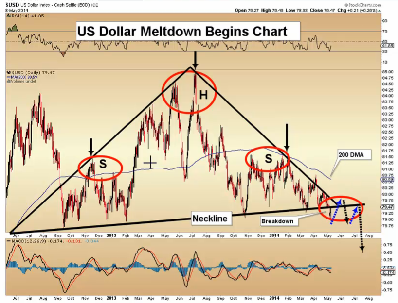
US Dollar Meltdown Begins Charts Analysis
Gold Money Flows Charts Analysis
Silver Fuel Cell Charts Analysis
GDX Dark Clouds Charts Analysis
Gold Stock Exhaustion Gap Charts Analysis
Thanks,
Morris

“Like sands through the hourglass, so are the days of our lives.”
McDonald Carey who played Dr. Tom Horton
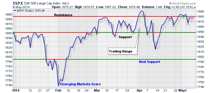
The idea of “time slipping by” relates directly to the stock market over the past several months as we rapidly approach the halfway point for 2014. “Better than expected” economic data and earnings news has buoyed the market against the drain of liquidity from the Fed. Despite commentary from the mainstream media that the markets are doing great, the updated chart below shows the market continues its tug-o-war.
There are two ways to look at stagnation in the markets. It is either a consolidation process that works off an overbought condition which leads to further advances, OR it is a topping process that leads to a market decline.
The chart below is what a consolidation process looks like. I have shown the Dow, S&P 500, Nasdaq and Russell 2000 indexes from July of 2013 through the end of last year.

Notice that the all the markets get oversold but remained in consolidation together. As the market gained strength the more “aggressive” stocks, as represented by the Nasdaq and Russell 2000, broke out first followed by the more defensive S&P 500. In other words, the degree of correlation between stocks remained high which is bullish.
The next chart shows what a topping process looks like. In 2011, the markets began a topping pattern which led to a rather aggressive selloff during that summer. As you can see in the next chart, the consolidation pattern looks very similar to the current period as shown above. All stocks remain highly correlated and the markets get oversold prior to the next move.
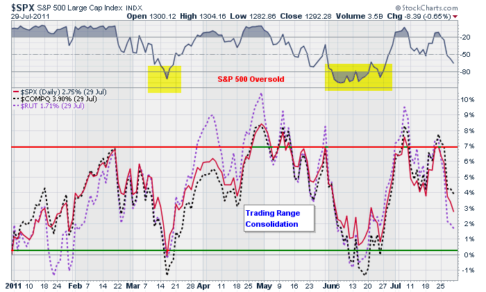
Of course, the difference is that in 2011, this pattern ended in a rather severe correction of almost 20%.
The obvious question is what was the difference? Were there any signs that suggested that the consolidation in 2011 was going to breakdown as opposed to the ramp up in 2013?
For that answer let’s take a look at some internal measures of the market for any tell-tale clues.
The first charts shows the number of stocks on bullish “buy” signals for the S&P 500 in 2011, 2013 and currently.
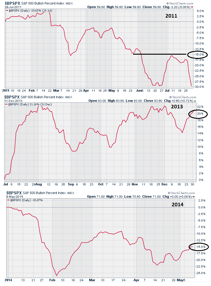
In 2011, this indicator was deteriorating sharply and by the middle of May was down 15%. This was as opposed to the consolidation process in 2013 as the index was up 20%. Notice, that during the current correction process the index is down 15% at the same point as we were in 2011.
The next chart is the CBOE Total Put/Call Ratio, which measures “fear” in the markets. When investors are complacent, or have no fear of a correction, markets tend to rise. However, when this index is on the rise it is generally a sign that underpinnings of the market are more fragile.
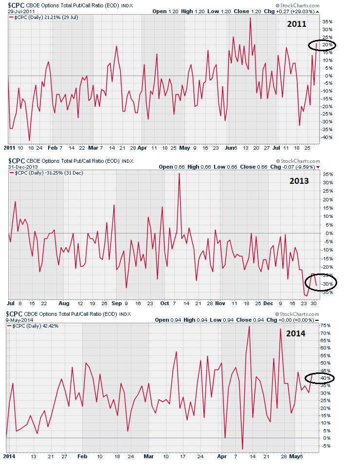
As shown in 2013, as the markets consolidated, there was no “fear” of a correction. In fact, the longer the consolidation ran the less fearful investors got. This was not the case prior to the onset of the correction in 2011, nor is it today.
Lastly, the NYSE High-Low Index, which measures the number of stocks hitting new highs versus new lows, is an indicator of the participation of stocks in the market.
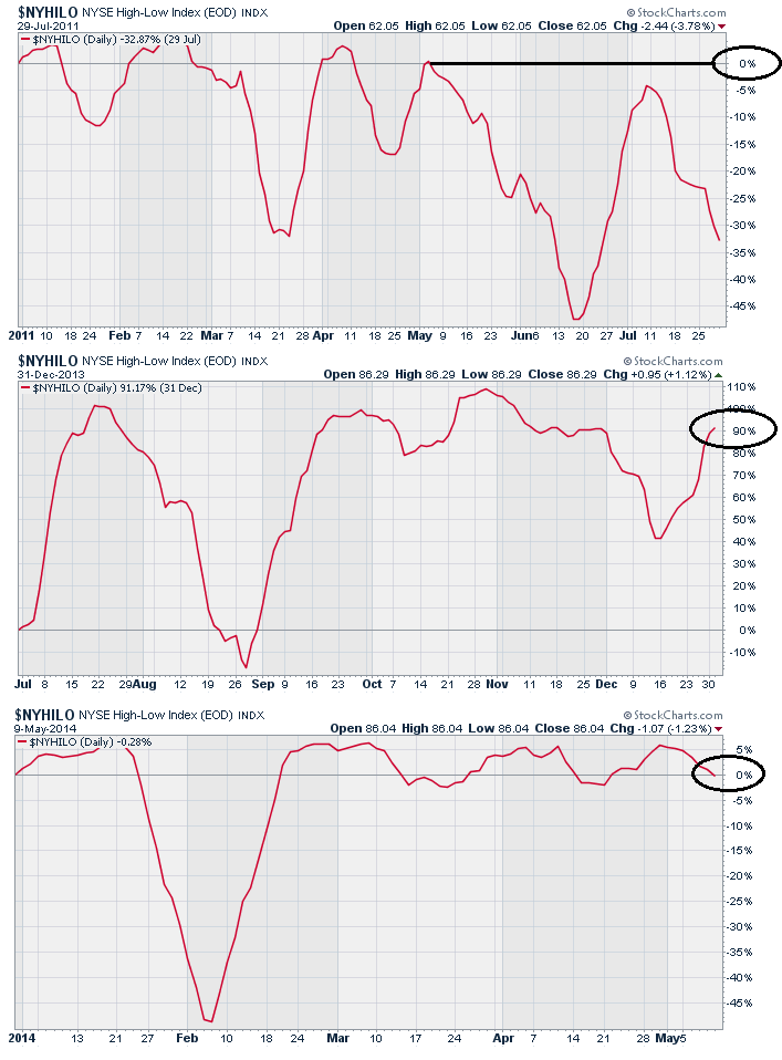
As you can see in both 2011, and currently, the performance of the index in May was near zero as opposed to the consolidation prior to the advance in 2013 where the performance was close to 90%.
The point here is that the current consolidation process looks more similar to 2011 than 2013.
There is also another important similarity.
In 2011, the Federal Reserve was in the process of winding down their second liquidity program (QE2) as opposed to 2013 as the Fed aggressively bought $85 billion monthly in bonds which directly supported asset prices. Today, the Fed is in the process of shutting down their current liquidity program hoping that “forward guidance” will be enough to support asset prices.
Let me be clear. I am not stating that the current consolidation process will absolutely collapse into a sharp correction in the months ahead. However, I am stating that the current environment is more similar to past markets that did correct, than not.
While we are maintaining current portfolio allocations currently, our “alert” signals are high. The chart below shows the paths of the market and where actions will be triggered.
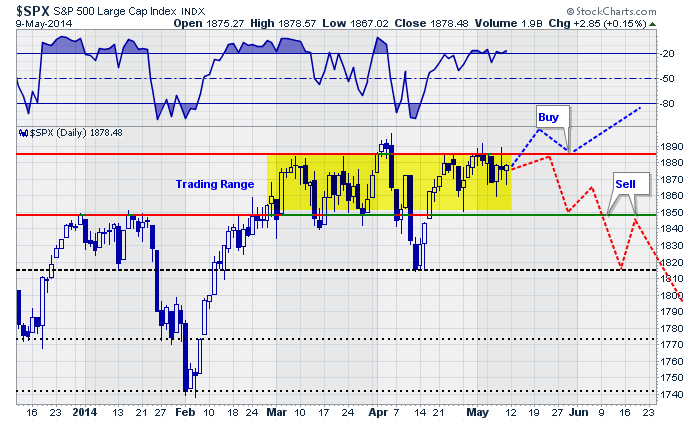
I have denoted where actions will likely be suggested, as well. A breakout to the upside will need to retest previous resistance (top red line) and move higher. This will confirm the breakout, which failed back in April, and suggest that the markets are moving higher and portfolio allocations to equities should be increased.
However, a breakdown in the market below 1850 will be an indication that equity related exposure in portfolios should be reduced. A break of that previous support would suggest a further decline to 1820. At this point, the markets are likely to be fairly oversold on a weekly basis and a bounce that fails at 1850, turning previous support into resistance, will likely be the second and last chance to reduce equity exposure prior to a sharper correction ensuing.
The timing of such events is somewhat nebulous. It could happen next week, next month or next quarter. The point here is that it is important to pay attention to the markets and your portfolio.
As my good friend Richard Rosso, CFP, pointed out to me on Friday:
“The markets spend 5% of their time making new highs. The other 95% of the time is spent making up prior losses.”
This is an important point to remember. Getting back to even is NOT an investment strategy. Therefore, employing some discipline to avoid large losses is FAR more important to your long term investment success than chasing market returns.
“The house doesn’t beat the player. It just gives him the opportunity to beat himself. “
Nick Dandalos
Chasing Yield
As I have discussed previously, there is little doubt that the Federal Reserve’s ongoing liquidity programs have lofted asset prices far in excess of economic value. Furthermore, the move by the Fed to artificially suppress interest rates to abnormally low levels, in hopes of stimulating an economic recovery, has led to the “great yield chase” as investors seek to garner a return on cash.
This chase for yield, combined with the Federal Reserve’s “support” of the financial markets, has led to an excessive level of “greed” within the financial markets. This is clearly shown in the next chart which shows near record levels of asset prices, margin debt or “leverage” and near record low yields on “junk bonds.”
As shown, such a mix of “greed” and “complacency” by investors never ends well. The cause of the reversion is never known beforehand. Economists and analysts routinely come with a variety of metrics as to why current levels of market valuation are reasonable. It is only in hindsight that the culprit is revealed and is usually something the markets were completely unaware of.
The current decline in interest rates suggests that the economy is indeed weaker than current economic reports suggest. The majority of the recent upticks in economic data is due to an inventory restocking cycle after the drawdown in the first quarter. More importantly, for investors, the decline in rates is not supportive of higher asset prices currently. The chart below shows the divergence between stocks and bonds.
Both cannot be correct and the gap will eventually be filled as it has in the past. The important question for investors is whether it will be a sharp rise in interest rates or a decline in stocks? We are likely to have a resolution sooner rather than later as slip into the dog days of summer. (Read “Sell In May?”)
With the markets near their highs for the year, and no technical violations of key support, complacency remains high. That complacency has been emboldened, as I discussed recently, each decline has been met by Federal Reserve intervention to inject liquidity and stem selling.
“Is it “actually” the Federal Reserve’s actions that are supporting the financial markets? To answer this question I examined the weekly changes to the Fed’s balance sheet as compared to the S&P 500.”
“As you can see, through the majority of 2012 the market struggled to advance as the changes to the Fed’s balance sheet limited overall balance sheet increases. However, beginning in December of 2012, as the Federal Reserve fully implemented the current QE program, asset prices begin to surge. Furthermore, as I have highlighted with vertical lines, market declines were halted as large rounds of asset purchases pushed liquidity into the financial system.”
There is currently no reason to reduce portfolio allocations at the current time. However, the rising risks do have my undivided attention. With the Federal Reserve continuing to reduce their support, and eventually end it altogether, there is a rising degree of uncertainty whether the markets can continue to interpret “bad news” as“good news.” With both the S&P 500 and Wilshire 500 indices extremely deviated from their long-term (36 month) moving averages, the risk of a significant “reversion” has increased.
At some point, a negative catalyst will overwhelm the bullish consensus creating a stampede for the exits. I do not know when that will happen or what will cause it, but I do know that it will occur. As I stated above, the markets have not technically done anything wrong as yet, however, there are plenty of reasons to be scared. History is replete with the “blood baths” that have occurred from a combination of excess complacency and overconfidence. This time is unlikely to be any different.
Have a great week.

Lance Roberts

A few weeks ago, in my March 31 column, I told you that …
>> I am 100 percent confident precious metals will bottom this year and resume a new leg to the upside.
>> That the extreme emotions right now regarding gold and silver are typical at major turning points.
>> That all the underlying fundamental, cyclical and technical conditions for a new bull market in gold and silver are in place. The most important: The rising tide of the war cycles and global geo-political stress.
I also told you that while the short-term swings are always extremely difficult to pin down — and even far more difficult when entering a period where a major trend turn is expected …
I will get you as close to the bottom as humanly possible.
Naturally, subscribers to my Real Wealth Report and the members of my trading services will get the first buy signals. I’m sure you understand why.
And they will get the very first high-powered recommendations as well.
But I won’t leave you completely at the station. In fact, today I am going to give you an update on the latest action in gold, silver, platinum and palladium.
Let’s start with gold:
On the surface, gold looks weak again. Over the past several trading sessions, it’s managed to rally as high as $1,315.80, but promptly fell back to the 1,284 level.
The swings are wild. The bulls and bears in gold are duking it out more than I have seen in a while. Again, typical of a major turning point.
At the same time, the main driving force — the ramping up of the war cycles — is front and center, with a new development: Extreme tension between China, Japan, Vietnam, and the Philippines over the Spratly Islands and South China Sea — is now rising to the surface as well.
Here’s what you want to keep your eyes on in gold:
Bigger picture: As long as gold holds $1,268.40 on a nearest futures basis (roughly $1,267 spot), gold should whip back and forth, but begin a move that will eventually take it first to $1,449 and then to $1,657 (then pause, pullback and then rally even higher).
Short-term: There is support at $1,272 and resistance at $1,331.
And here’s what you should be watching in silver:
Bigger picture: As long as silver holds $18.68 on a nearest futures basis (roughly $18.64 spot), silver too should whip back and forth, but begin a move that will eventually take it first to $22 and then to $28 (then pause, pullback and then rally even higher).
As I’ve mentioned in the past, make sure you have cash ready to deploy.
Specific recommendations are reserved for subscribers.
Also get ready to speculate on the unfolding new bull market in gold and silver. I myself am gearing up to make more money in gold and silver over the next few years than I have since their late 1970s bull market.
 Now, let’s go to two metals I haven’t discussed in a long time. Platinum and palladium.
Let me start by putting it this way: These two metals are now shaping up to be as bullish and as profitable as gold and silver are, if not more.
First, platinum and palladium are the two most widely used of the platinum group of metals, or PGMs. And demand is set to rise … while supplies are limited and politically unstable.
The chief driver behind their demand is their increased use in pollution control devises, especially catalytic converters, where growth is exploding exponentially, due to China’s and India’s auto markets and to increased mileage efficiency mandated by policy makers globally.
In fact, the automotive sector now accounts for as much, if not more, than 38 percent of the demand for palladium and 71 percent for platinum.
In addition, China has become a huge market for platinum jewelry, making up nearly 70 percent of global demand.
But here are the real kickers:
![]() Russia accounts for as much as 54 percent of the world’s total mine production of platinum and palladium … while South Africa accounts for as much as 75 percent of platinum production and 38 percent of palladium production.
Russia accounts for as much as 54 percent of the world’s total mine production of platinum and palladium … while South Africa accounts for as much as 75 percent of platinum production and 38 percent of palladium production.
At the same time …
![]() The ore grade of the platinum group metals, that is the amount of the metals found in ore, is declining rapidly, with a plunge of more than 50 percent in ore grades in Russia and South Africa combined since 1998.
The ore grade of the platinum group metals, that is the amount of the metals found in ore, is declining rapidly, with a plunge of more than 50 percent in ore grades in Russia and South Africa combined since 1998.
But most important of all are the war cycles. Besides the increased use of these metals in high-tech military equipment, there is the very real chance that we will see Russia sanction the West by withholding part, or even all, of its platinum group metals from the market.
Again, specific recommendations for platinum and palladium are reserved for my subscribers. For now, I merely want to give you a heads up that these are two metals you will not want to ignore if you intend on maximizing your profits in the next leg up in precious metals.
I end with the same message as last time: Stay tuned in, very tuned in, to all of my writings.
If you do not, you may miss the most explosive turnaround to the upside — ever — in the precious metals sector.
Best wishes,
Larry
P.S. As I said at the outset, I am 100 percent confident precious metals will bottom this year and resume a new leg to the upside. Don’t miss the explosive turnaround! Subscribe to my Real Wealth Report and you won’t be left in the dust.

The inspiration for this memo came from a report entitled Alpha and the Paradox of Skill by Michael Mauboussin of Credit Suisse. In it he talks about Jim Rutt, the CEO of Network Solutions. As a young man, Rutt wanted to become a better poker player, and to that end he worked hard to learn the odds regarding each hand and how to detect “tells” in other players that give away their position.
Here’s the part that attracted my attention:
At that point, an uncle pulled him aside and doled out some advice. “Jim, I wouldn’t spend my time getting better,” he advised, “I’d spend my time finding weak games.”
Success in investing has two aspects. The first is skill, which requires you to be technically proficient. Technical skills include the ability to find mispriced securities (based on capabilities in modeling, financial statement analysis, competitive strategy analysis, and valuation – all while sidestepping behavioral biases) and a good framework for portfolio construction. The second aspect is the game in which you choose to compete.
Mauboussin goes on to talk primarily about changes in the relative importance of luck and skill. But for me, what his words keyed first and foremost were musings about market efficiency and inefficiency. What they highlighted is that the easiest way to win at poker is by playing in easy games in which other players make mistakes. Likewise, the easiest way to win at investing is by sticking to inefficient markets.
Are Markets Efficient?
In well-followed markets, thousands of people are looking for superior investments and trying to avoid inferior ones. If they find information indicating something’s a bargain, they buy it, driving up the price and eliminating the potential for an excess return. Likewise, if they find an overpriced asset, they sell it or short it, driving down the price and lifting its prospective return. I think it makes perfect sense to expect intelligent market participants to drive out mispricings.
I also believe some markets are less efficient than others. Not everyone knows about them or understands them. They may be controversial, making people hesitant to invest. They may appear too risky for some. They may be hard to invest in, illiquid, or accessible only through locked-up vehicles in which some people can’t or don’t want to participate. Some market participants may have better information than others . . . legally. Thus, in an inefficient market there can be mastery and/or luck, since market prices are often wrong, enabling some investors to do better than others.
Remember the assumptions underlying market efficiency: the participants have to be objective and unemotional. Regardless of the market, few investors pass that test. How many are unemotional enough to resist buying into a fast-rising bubble, or selling in a crash when the price of an asset appears to be on the way to zero?
How, then, do I expect to find inefficiency?
My answer is that while few markets demonstrate great structural inefficiency today, many exhibit a great deal of cyclical inefficiency from time to time. Just five years ago, there were lots of things people wouldn’t touch with a ten-foot pole, and as a result they offered absurdly high returns. Most of those opportunities are gone today, but I’m sure they’ll be back the next time investors turn tail and run.
Markets will be permanently efficient when investors are permanently objective and unemotional. In other words, never. Unless that unlikely day comes, skill and luck will both continue to play very important roles.

For years, home prices in Canada tracked those in the US, including during the crazy bubble years. But as US home prices peaked in 2006 and then skidded downhill unglamorously, Canadian home prices, after a brief swoon during the financial crisis, just continued to soar, unperturbed by reality and unhampered by any sense of gravity.
Now the average home price in Canada is $400,000, according to an analysis by BMO, one of the largest Canadian banks. In the US, where price bubbles are forming once again in a number of cities, the mean home price is $250,000. OK, we’re comparing average and mean, which aren’t the same thing, but the trends speak volumes (chart by OtterWood)

….read more HERE

-
I know Mike is a very solid investor and respect his opinions very much. So if he says pay attention to this or that - I will.
~ Dale G.
-
I've started managing my own investments so view Michael's site as a one-stop shop from which to get information and perspectives.
~ Dave E.
-
Michael offers easy reading, honest, common sense information that anyone can use in a practical manner.
~ der_al.
-
A sane voice in a scrambled investment world.
~ Ed R.
Inside Edge Pro Contributors

Greg Weldon

Josef Schachter

Tyler Bollhorn

Ryan Irvine

Paul Beattie

Martin Straith

Patrick Ceresna

Mark Leibovit

James Thorne

Victor Adair