
Gold & Precious Metals
Here are today’s videos:
US Dollar Distribution Charts Analysis
China Stock Market & Crude Oil Flag Charts Analysis
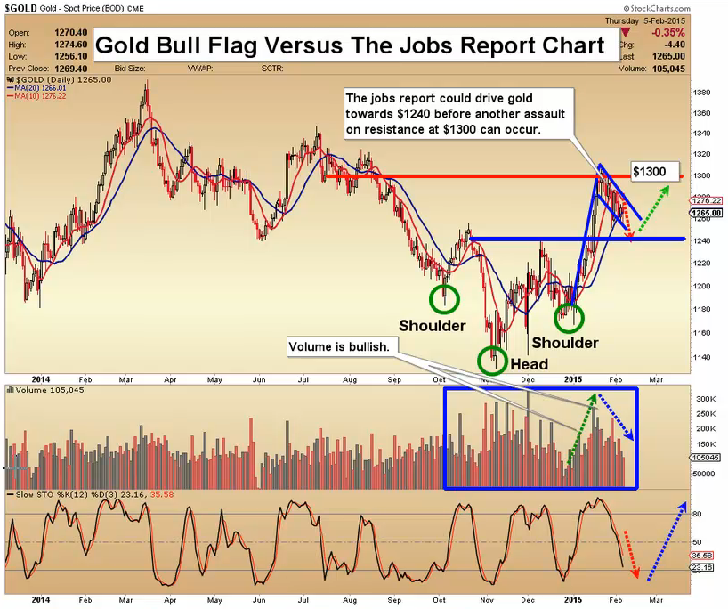
Gold Bull Flag Versus The Jobs Report Charts Analysis
Silver Right Shoulder Formation Charts Analysis
GDX Right Shoulder Construction Zone Charts Analysis
GDXJ No Pain No Gain Charts Analysis
Thanks,
Morris
Friday, Feb 6, 2015 Super Force Signals special offer for Money Talks Readers:
Send an email to trading@superforcesignals.com and I’ll send you 3 of my next Super Force Surge Signals free of charge, as I send them to paid subscribers. Thank you!
The SuperForce Proprietary SURGE index SIGNALS:
25 Surge Index Buy or 25 Surge Index Sell: Solid Power.
50 Surge Index Buy or 50 Surge Index Sell: Stronger Power.
75 Surge Index Buy or 75 Surge Index Sell: Maximum Power.
100 Surge Index Buy or 100 Surge Index Sell: “Over The Top” Power.
Stay alert for our surge signals, sent by email to subscribers, for both the daily charts on Super Force Signals at www.superforcesignals.com and for the 60 minute charts at www.superforce60.com
About Super Force Signals:
Our Surge Index Signals are created thru our proprietary blend of the highest quality technical analysis and many years of successful business building. We are two business owners with excellent synergy. We understand risk and reward. Our subscribers are generally successfully business owners, people like yourself with speculative funds, looking for serious management of your risk and reward in the market.
Frank Johnson: Executive Editor, Macro Risk Manager.
Morris Hubbartt: Chief Market Analyst, Trading Risk Specialist.
website: www.superforcesignals.com
email: trading@superforcesignals.com
email: trading@superforce60.com
SFS Web Services
1170 Bay Street, Suite #143
Toronto, Ontario, M5S 2B4
Canada

 The Dow shot up 212 points, or 1.2%, yesterday. Gold was flat.
The biggest challenge is to figure out what to laugh at first. So many frauds. So much nonsense. So little time.
Last week, Zero Hedge reported that a bubble was inflating in the burger business.
Shake Shack Inc. – which was taken public last week – was initially priced at between $14 and $16 a share. But a pre-IPO frenzy pushed the IPO price to $21 a share.
Then things got really silly…
On its first day of trading… for no apparent reason other than that investors had taken leave of their senses… the share price jumped to a peak of $52.50 – a 150% increase.
Shake Shack is a milkshake and hamburger joint. According to Zero Hedge, the company’s “EBITDA multiple” – a more sophisticated version of the price-to-earnings ratio – is 108.
Think of EBITDA (Earnings Before Interest, Taxes, Depreciation and Amortization) as a quasi-estimate of free cash flow.
At an EBITDA multiple of 108, investors are willing to pay 108 times the free cash flow Shake Shack produces.
The Double ShackBurger sells for $7.99. So to put it another way, a $10,000 investment gives you the equivalent, in cash-flow terms, of about 11 hamburgers. Maybe they’ll give you fries with that.
What’s so special about the Shake Shack’s burgers?
We don’t know. But we suspect it has more to do with the heady flavor of the stock market than the taste of its fries.
Lies, Lies, Lies
According to Bloomberg, from March 2009 through June 2014, the S&P 500 has risen 4.7% a quarter – about five times faster than US GDP. That’s the biggest gap since at least 1947.
One company can increase earnings even in a stagnant economy. But when stock prices rise – which are supposed to reflect earnings growth – in aggregate more than GDP, you have to ask: Where is the money coming from?
We can tell you – from QE money and accounting shenanigans.
The numbers are embellished by “adjustments” that hide real costs. Report the figures according to GAAP (Generally Accepted Accounting Principles) standards, and earnings for the last quarter were 5% lower than those a year ago.
Today’s 5.6% official jobless rate is a “Big Lie” too, according to the CEO of Gallup, Jim Clifton:
There’s no other way to say this. The official unemployment rate, which cruelly overlooks the suffering of the long-term and often permanently unemployed as well as the depressingly underemployed, amounts to a Big Lie.
I hear all the time that “unemployment is greatly reduced, but the people aren’t feeling it.” When the media, talking heads, the White House and Wall Street start reporting the truth – the percent of Americans in good jobs; jobs that are full time and real – then we will quit wondering why Americans aren’t “feeling” something that doesn’t remotely reflect the reality in their lives. And we will also quit wondering what hollowed out the middle class.
Based on demographic trends, I suggest the real unemployment rate after weeding out disability fraud, forced retirement, kids hiding out in school for lack of a job, and those who are not counted as unemployed simply because they gave up looking is more like 9% than 7%.
Competitive Disadvantage
Why so few jobs?
You probably thought the “renaissance” in US manufacturing was bringing an employment boost.
Foreign labor costs were rising, according to the storyline, even in China. US labor costs have gone down. And with all that cheap oil and gasoline so handy, US factories were about to kick butt.
In a poll, it was revealed that even US manufacturers believed it – with 57% of them saying the “renaissance” was real.
But guess what? The renaissance in US manufacturing… it’s counterfeit too. TheGlobalist magazine reports:
At the end of 2013, there were still 2 million fewer manufacturing jobs and 15,000 fewer manufacturing establishments than in 2007, the year before the Great Recession, and inflation-adjusted manufacturing output (value-added) was still 3.2% below 2007 levels.
Although the US manufacturing sector has grown since 2010, resulting in 520,000 new jobs and 2.4% real value-added growth, almost all of this growth has been cyclical in nature, driven by just a few industries that contracted sharply during the recession.
When the worldwide price of oil went down, it went down for the Chinese too. Despite rising wages in China, labor costs there are still only about one-eighth of those in the US.
And a stronger dollar doesn’t make those US costs go down; compared to the rest of the world, they go up.
The US still has a competitive disadvantage in manufacturing, in other words. And it’s not likely to go away any time soon.
Tomorrow – even more quackery!
Regards,
Bill
Market Insight:
It’s Not Just Burger Companies That Are Pricey
By Chris Hunter, Editor-in-Chief, Bonner & Partners
It’s not just burger companies that are expensive these days…
The so-called q ratio for the US stock market is at its second highest reading going back to 1900.
The q ratio – developed by late Yale and Harvard economics professor and Nobel laureate James Tobin – is one of the simplest valuation tools out there.
Tobin reckoned the combined market value of companies listed on the stock market should be roughly equal to the replacement cost of their combined assets.
If the cost of replacing companies’ assets was lower than their market capitalization – a q ratio of 0-1 – it implied the stock market was undervalued.
If the cost of replacing companies’ assets was higher than their market capitalization – a q ratio of more than 1 – it implied the stock market was overvalued.
Over the long run, the average q ratio for the US stock market has been 0.68… meaning investors have been willing to pay, on average, slightly more than the replacement costs of companies’ assets to own shares.
But the current q ratio is 1.11 – 63% above its long-term average… and higher than at any point in history bar the tech bubble in the late 1990s and early 2000s.
Does this mean the US stock market is about to crash?
The q ratio isn’t a market-timing indicator. Extremes can last many years, as was the case in the 1990s.
But investors would have been well served buying US stocks at lows in the q ratio – in the early 1920s, early 1930s, early 1950s and early 1980s – than at peaks in the late 1920s, late 1960s and late 1990s.
The troughs all preceded bull runs. Each peak preceded a major bear market…
Will “this time be different”?
That’s certainly the line mainstream market pundits are feeding mom-and-pop investors.
At Bonner & Partners we’re not so sure….

The very recent fall of the Baltic Dry Index (BDI) to the lowest level since 1986 (Figure 1.) confirms our fears about the health of the world economy. Why is the drop in the index a bad sign for the global economy?
….read entire article HERE

 As the world continues to digest breaking news out of Greece, today the Godfather of newsletter writers, 90-year old Richard Russell, discussed what central banks don’t want you to know about a $199 trillion nightmare. Russell also discussed what this will mean for the gold and silver markets.
….continue reading HERE

The following is part of Pivotal Events that was published for our subscribers January 29, 2015.

Perspective
Draghi claims that there are no bubbles. Perhaps this is an improvement in central bank comprehension. In the midst of the Tech-Bubble, Chairman Greenspan stated that you could not identify a bubble until it was over.
The first great financial bubble was the South Sea Bubble of 1720 and it was described by many participants and observers as a “bubble”. That was in real time.
The Shorter Oxford Dictionary defined a bubble as “A delusive commercial or financial scheme” and dated as 1599.
William Robert Scott in his masterful “THE CONSTITUTION AND FINANCE OF ENGLISH, SCOTTISH AND IRISH
JOINT STOCK COMPANIES TO 1720 (1911)” noted as follows:
“The use of the term “Bubble” in this connection is often supposed to have been the creation of the South Sea period, and it is sometimes derived from “Bob”. Shakespeare has a “bubble reputation”, and Wycherley describes one of his characters as “Bubbled of his mistress”. The plates in Het Groote Tufereel der Dwaashied, 1720, show that the word was understood literally, and was closely connected with air bubbles – as something un-substantial, which was capable of “being blown up” rapidly and was liable to burst.”
The inability of central bankers to be forthright about financial bubbles and manias is astonishing. But they live in strange world whereby the “Random Walk Theory” insists that there is no history of recurring bubbles and there will be none in the future. Beyond these absurdities is the notion of a national economy isolated from other economies and most importantly financial markets.
One big concern is about the arousal of the public’s “inflation expectations”. The other main one is the fear of deflation. And why are they fearful of deflation? Because they can’t figure out how to tax it.
Of course such “inflation” only happens in the CPI and never in financial assets. And that is why they can’t call a bubble a bubble.
The bubble in global bond markets has not only been the biggest such bubble but it is also the largest by market cap of any in history.
Junk bonds reached their best in June and have reversed trend. The bubble in senior obligations is still on.
Stock Markets
In Tuesday’s “Special” we noted that the experiment in positive feedback was still being pushed to the limit. It is worth emphasizing that while some in the central banking community may be sceptical, the leaders remain adamant that recklessness will accomplish enough GDP growth to then step back. Of course, this extreme began as a heroic effort to prevent the 2008 Crash from lasting “forever”. Bond buying has continued to the point of absurdity, which many veteran writers have been noting.
There is a saying from the old and highly speculative Vancouver Stock Exchange.
“So long as the stock is going up, the public will believe the most preposterous story.”
In literature and theatre it has been called “suspension of disbelief”. We are reluctant to provide a similar description for central banking but the conveyance of “belief” is through the overly-frequent FOMC meetings and shopworn economic theories.
Whatever the venue, once the spell is broken, the game is over.
Our recent theme has been that Exuberance and Divergences have been recorded. These are only found in and around cyclical peaks in the stock market. Divergence is the next step in the process from peak to Resolution.
Resolution is inevitable and won’t arrive due to central banks discovering prudence. Our view has been that without speculators leveraging up the Fed could not carry out its portion of the credit and stock bubble. Eventually the speculators (outside of central banks) become exhausted and the play collapses.
And then the overall story is seen as absurd.
Preposterous 2.0 is about to start.
Comments in yesterday’s FOMC are interesting and notes that it was the shortest since 2012 and that S&P liquidity on an FOMC day was “the lowest ever”.
Initially it was interpreted as “dovish”.
It is possible that some economic numbers are warm enough such that the Fed sees success and can back off on the intense promotion.
We see that commodities are weakening, again.
The NYA represents the overall stock market and it has been replicating the pattern seen at its peak in 2007 and 2000. Last week’s rally made it to a little above the 50 and 200-Day moving averages. Rally attempts on Monday and Tuesday failed at those lines. Wednesday’s slump shows considerable weakness.
Key to the action in 2007 was the decline through the 50-Week ma. In 2007 the take out was right at the end of the year at 6.6% below the high.
This time around, the take out of the 50-Week is being worked on this week at a decline of 4.6%. Actually, this needs to be tested to conclude the pattern.
Last week we noted that banks and financials were not acting well. The BKX led the overall market in 2007. On this move, the index is well below the 50-Week, which has been tested.
At 66.8 now, there is support at the lows of 66 a couple of weeks ago and at 65 in December.
Canadian banks, as represented by RY, is acting as poorly as in 2007. In January 2008 the decline had taken out the 52-Week low, which was a critical level in that bear.
Now at 59 in US$, the low last year was set in February at 58. Clearly this is important support.
The Oil Patch (XLE) followed the 50-Week ma all the way up to its high of 100 in June, which registered an Upside Exhaustion. That key moving average was violated in October.
Stability was found at the 72 level in December and in early January. Recent rallies were turned back at the 50-Day ma, which is declining. The sector could suffer the full cyclical decline that the Precious Metals experienced.
For the overall US market, the critical level for the NYA at 10400. It is now at 10600 and in taking out support, the big Rounding Top becomes another completed Rounded Top.
Currencies
A natural target for the DX has been the 92 to 94 level and it made it to 95.7 on Monday. This is up to 83 on the Weekly RSI, which is overbought. But it has been this overbought since June, which is when we noted that the action in a number of price-series could go exceptional – some up, some down.
A trading range for some weeks could ease the near-term overbought condition, but the long-term trend is up.
The Canadian unit continues to slide and while becoming the most oversold on the Weekly and Monthly RSI numbers since 1998, the trend is down. There is support at the low of 2009 which was at the 76 level.
By a couple of measures, Mark Carney was the best central banker in Canada’s history. Handsome with a pleasant speaking voice in English or French. This is important when listening to centralbankspeak. His track record is likely no better or worse than any who headed up the Bank since its inception in 1934.
However instead of being sceptical of a boom in commodities he fell for the excitement and in September 2012 advised:
“The demand for commodities can be expected to remain robust and prices elevated.”
Credit Markets
On the 20th, we sent out a comprehensive review of the Treasury market that asked the question about “Ending Action?”. The great rise in interest rates from 2.5% in 1946 was essentially another secular trend that was accompanied by a massive and continuous effort to keep rates from rising. Constant accommodation drove commodities to the moon, which added to the natural rise in interest rates. The natural high might have been around 6%, the actual high was 14%.
On the secular decline in yields in the senior currency that goes with any post-bubble contraction the natural target would be around 2.5%. Yields at 0.35% in Germany and 1.31% in Spain are clearly exceptional.
And European central bank buying is just starting.
However, it has been the biggest tout by government since the late 1940s when the US was going to keep rates from rising above 3%. Also coming to mind is the massive bear raid against gold that drove gold down to 253. Those that acted with the central banks were again wrong.
When commodities started the bear market in 2011 long Treasuries would likely rally. Inspired by the 2008 Crash, central banks dragged out the old remedy of buying bonds. Then in the face of a weak recovery they kept buying bonds. They now “have a tiger by the tail” and they can’t let go.
What possibly could be the economic benefit of driving the German yield from 0.35% to 0.25%?
Of course, economic benefit is not the objective. The objective is that another one-point rise in the bond price will keep the inflation in financial assets going. The effort to prevent deflation in financial assets is becoming frantic. Efforts to prevent deflation in tangible assets have been ineffective since 2011.
With the month-end numbers in, Ross can update the technical review on US Treasuries. The Weekly RSI has been at this extreme only three time before on the great bull market that began in 1981.
We have been looking for “ending action” and it is getting closer.
“We have to recognize that the era when central bank improvisation can be the world’s growth strategy is coming to an end.”
– Former Treasury Secretary Larry Summers at Davos last week.
Precious Metals
Sunday’s ChartWorks noted excesses in gold’s rally as well as in the Commitment of Traders numbers. The advice was that gold could decline to the 1200 to 1225 level.
The high on Friday was 1307 and today’s low has been 1253.
This seems to be within the process of setting a cyclical bottom for the gold sector.
However, today’s trade in silver relative to gold is worth a serious look.
One of the signs of a pending credit contraction becoming more serious is the sudden drop in silver’s price relative to gold’s. As we write, gold is down 21$ and silver is down 95 cents. The changes amounts to 2 percent and 6 percent, in round numbers.
By this measure, there are two warning steps to contraction.
One is the increase in volatility in the gold/silver ratio. The next is a sharp rise in the ratio. Both seem to be underway.
In which case, precious metal stocks will be weak.
The old HUI rallied from 146 in November and a test at 150 in December to 211 last week. The Daily RSI had a significant increase and became somewhat overbought. The rally made it to a little above the 200-Day ma, retreated and the next attempt stalled at that line.
We now look for the next opportunity to buy a little more.
Iron Ore Prices

- Iron ore prices are working on the “full round trip”.
- That is from a long period of stability to a speculative blow off, which completed in February 2011.
- That was a cyclical peak for many commodities, as well as precious metals.
- The “round trip” will complete at the previous level of stability. As a guess, somewhere around 30.
Commodities Without Energy Prices

- The high was 205 set in April 2011.
- The year-end post was 146, which compares to 110 set in December 2008.
- The trend is well in place.
Link to January 30th Bob Hoye interview on TalkDigitalNetwork.com:http://talkdigitalnetwork.com/2015/01/bank-of-canada-ruining-good-reputation/


-
I know Mike is a very solid investor and respect his opinions very much. So if he says pay attention to this or that - I will.
~ Dale G.
-
I've started managing my own investments so view Michael's site as a one-stop shop from which to get information and perspectives.
~ Dave E.
-
Michael offers easy reading, honest, common sense information that anyone can use in a practical manner.
~ der_al.
-
A sane voice in a scrambled investment world.
~ Ed R.
Inside Edge Pro Contributors

Greg Weldon

Josef Schachter

Tyler Bollhorn

Ryan Irvine

Paul Beattie

Martin Straith

Patrick Ceresna

Mark Leibovit

James Thorne

Victor Adair