
Timing & trends
This past week, I penned a piece entitled “You Think Like A Bear But Invest Like A Bull?” that discussed the disconnect between my writings and the “Bullish” posture of the portfolio. To wit:
This past week, I penned a piece entitled “You Think Like A Bear But Invest Like A Bull?” that discussed the disconnect between my writings and the “Bullish” posture of the portfolio. To wit:
However, when that reversion process occurs is anyone’s guess.
Therefore, while the analysis suggests that portfolios should be heavily underweighted ‘risk,’ having done so would have led to substantial underperformance and subsequent career risk.
This is why a good portion of my investment management philosophy is focused on the control of ‘risk’ in portfolio allocation models through the lens of relative strength and momentum analysis.
The effect of momentum is arguably one of the most pervasive forces in the financial markets. Throughout history, there are episodes where markets rise or fall, further and faster than logic would dictate. However, this is the effect of the psychological, or behavioral, forces at work as ‘greed’ and ‘fear’ overtake logical analysis.
I have discussed the effect of ‘full market cycles previously as shown in the chart below”

A list of contents in this newsletter:


 This will be about the weirdest thing you see today….
You know that we talk a lot about the insane level of government interference in our lives. About what we can and cannot put in our bodies. The amount of interest we’re entitled to receive on our savings. Etc.
But I’m noticing now even more ridiculous trends of governments wanting to get involved in people’s sex lives.
Last year the Danish government promoted an initiative called “Do it for Denmark”, encouraging Danes to travel abroad and have sex while on holidays. They even have a pretty racy Youtube video featuring a scantily clad gorgeous blonde waiting to do her duty for her country and procreate.
Singapore as well has a catchy jingle about going out and making babies, brought to you by the same guys who did the Mentos theme song.
The Swedish government actually spent taxpayer money on its new genitals song, so it can start indoctrinating children early on how they can make babies.
Here in Japan, which has one of the lowest birthrates in the world, the government is desperate to find solutions to what it calls its libido crisis.
According to their data, Japanese men aren’t terribly interested in sex and the women find sex to be bothersome.
Japanese being expert process engineers are coming up with a government solution to reengineer sexual desire in their country.
(I have to imagine that if this solution reached US soil, the government option would include the smooth sounds of Barack Obama whispering some pillow talk: “C’mon, lemme give you this big tax cut, baby…”)
Easily the most ridiculous solution they came up with is to impose a ‘handsome tax’ on attractive men. I thought this was a headline from the Onion, the greatest news source in the world, but it turned out to be true.
The idea being that if you tax handsome men, then less attractive men would have more money and hence be able to attract women.
Zerohedge covered this in fantastic detail—I encourage you to check it out. This is not a joke.
The thing that many of these countries have in common, Japan, Denmark, etc., is a rapidly declining birthrate.
A declining birthrate is disastrous for an economy, particularly for an ageing place like Japan.
Ironically, the oldest person in the world turned 117 years old yesterday—and no surprise that she’s Japanese. In fact, Japan is home to one of the oldest populations in the world and has one of the longest life expectancies.
Curiously they also have one of the largest pension programs in the world. You put all that together and you have fewer and fewer young people paying more and more of their income to support a disproportionately large population of retirees who are living for decades after they stop working.
Each one of these governments is trying to find a solution to fix this unsustainable fiscal problem.
In Denmark they seem to think that people aren’t going on vacation enough. In Japan they think it’s a problem of sexual desire. But in actuality it has everything to do with cost of living.
Month to month, year to year, it’s hard to notice the subtle changes in costs of living and standards of living, but after a long period of time it’s easy to look back and remember how things used to be.
You used to be able to support a family on a single income. You used to be able to afford medical care and higher education.
It’s often said that the greatest expense that someone will have in their life is his or her home. That’s total nonsense.
Now, I’m not saying it’s not worth it, but the biggest expense most people will have is family, and particularly children.
And after years and years of suffering through pitiful, destructive policies that have chronically made people less prosperous, it’s no surprise that they’re coming to the conclusion—you know, we can’t really afford to have a child right now.
There are consequences to conjuring money out of thin air. There are consequences to destructive policies.
So destructive in fact that central bankers and politicians even have the power to make a population disappear.
How ironic that they try to fix their own problem by trying to introduce themselves into our bedrooms.

Today, we’re going to revisit yesterday’s subject – something so surprising and counterintuitive that almost no one expects it or is prepared for it.
We’re talking about a sudden disappearance of dollars.
For a brief time – perhaps three days… maybe three months – Americans will wonder what happened to their money. The greenback will become more precious than gold… perhaps even a matter of life and death.
But we’ll come to that in a moment…
First, a dear reader wrote to ask about our new “Trade of the Decade.”
The trade in question is not based on any forecast. We simply take a look at what has gone up the most in the last 10 years and sell it (or “go short,” as they say on Wall Street). On the other side, we look for what has gone down the most and buy it.
We let mean reversion do the rest…
(In statistics, “mean reversion” describes the phenomenon whereby extreme variables – such as stock and bond prices – tend to move back toward their average over time.)
More Juice in Japan
At the beginning of this decade, the best trade we saw was to buy Japanese stocks, which had gone nowhere but down for the preceding 20 years, and to sell Japanese bonds, which had gone nowhere but up.
The trade had a not-so-hidden logic, too.
Japan was clearly borrowing itself into bankruptcy. At some point, people would realize that Japanese government debt was not worth what they had thought it was worth. They’d sell their Japanese government bonds (JGBs).
But what would they do with the money?
They would have to buy Japanese stocks.
So, how are we doing so far?
The Nikkei 225 – Japan’s equivalent of the Dow – has gone up from 10,654 to 18,703 points. In yen terms, that’s a gain of 75% since the start of 2010.

JGBs, on the other hand, have not gone down as expected – yet. They’re still going up in price (with yields falling). The price of the 10-year JGB has risen from 139 to 147, in yen terms – or about 6%

That leaves us with a net gain of about 69% in yen terms.
Not too bad. But if we are keeping score in dollars, we have to adjust for the drop in the yen. This takes our net dollar gain down to about 30% so far. (Remember, this is a trade of the decade; we still have another five years to go.)
Still, we’re happy with that. And we’re going to be a lot happier when investors finally wake up and realize their JGBs are worthless.
There’s still a lot of juice in this trade…. especially because Japanese stocks are still relatively inexpensive.
As colleague Steve Sjuggerud put it in his new True Wealth Market Intelligence service, “The best value in developed markets this month is Japan.”
A 50% Drop…
Now, let’s return to the line of thinking we took up yesterday.
We remind readers that we live in such a topsy-turvy financial world that it is hard to tell up from down and backward from forward.
Central banks and central governments issue more and more debt. But the price of debt goes up… so that the yield on $2 trillion of developed-world sovereign debt is now negative!
In other words, lenders pay borrowers to take their money. Go figure.
Meanwhile, the world economy is slowing. US corporate profits are falling. And US stock prices are so high relative to the earnings they produce that it would take a miracle to give investors a decent rate of return over the next 10 years.
Former Value Line equity analyst, and our go-to guy on stock market valuations, Stephen Jones tells us that the rate of US stock market gains is slowing.
There aren’t many examples from the past, says Stephen, but they suggest that gains will go lower and lower, until they become negative:
On October 3, when I last wrote the note, stocks were up 17.2% from one year earlier. Today, March 5, stocks are up 12.2% from a year earlier.
Forecasts are always tough, and there is not a lot of precedence at these high valuation levels. But this slowdown appears likely to continue, and thus position us with 0% year-over-year returns sometime over the coming year.
Again, precedents are few, but they have resulted in roughly 50% market declines.
A Monetary Shock
Whether that 50% collapse happens next week or five years from now, we don’t know.
But when it happens it is likely to set in motion an alarming series of events that will lead to a temporary, but violent, monetary shock…
People will go to their banks to get cash. But the banks won’t have any cash. The ATMs will run dry.
There will be a “run on the banks,” to use the old-fashioned term. People will line up, desperate to get cash. Not because they fear the bank will fail… but because they need cash to pay for the necessities.
“Wait a minute,” says French colleague Simone Wapler (or words to that effect).
“Governments are already trying to stop people from using cash. In France, transactions of more than €3,000 [$3,292] in cash are forbidden.”
In the US, too, cash is suspect.
Ask your bank for “too much” cash… and the bank is obliged to report you to the feds. And if the police stop you and find a lot of cash, they are likely to confiscate it.
“You must be doing something illegal,” they’ll say.
(In fact, the Justice Department recently revealed that US police departments seized more than $6 million from citizens in roadside stops in the recent fiscal year – despite not pursuing any criminal charges against their “suspects.” It’s all part of the Justice Department’s “Civil Asset Forfeiture” program.)
So, what would cause cash to come back into style… suddenly and overwhelmingly?
What would cause a panic into dollars?
Stay tuned…
Regards,
Bill
Market Insight:
The “Buffett Indicator” Flashes a Warning
by Chris Hunter, Editor-in-Chief, Bonner & Partner
Take your pick of valuation ratios. They’re all at or near extremes.
But today, let’s look at Warren Buffett’s favorite – the total value of the stock market relative to GDP.
In 2001, Buffett told Fortune magazine that market cap to GDP was “probably the best single measure of where valuations stand at any given moment.”
That’s bad news for investors. Because the US stock market is the most expensive it’s been relative to GDP in the last 100 years… bar an eight-month period in 1999 and 2000 at the peak of the dot-com boom.
And you know what happened next…
Add in the contraction in US corporate profits in 2015… and the picture becomes even bleaker.
According to Bloomberg, profits for S&P 500 companies are expected to come in at 2.3% for 2015 versus 5% last year.
So, what’s keeping this market afloat?
One big tailwind for stocks, as we mentioned on Wednesday, is the record level of share buybacks. (Remember, when companies buy back their shares, they cancel them. This means each outstanding share represents a higher percentage of earnings, which makes them more valuable.)
Bloomberg reports that the biggest source of funds going into the US stock market is companies buying their own shares.
They’re outspending speculators and exchange-traded funds by a 6-to-1 margin.


Stock Markets
Clearly, William McChesney Martin’s job description of the Fed is no longer applicable. The Fed and other senior central banks are not only drinking, but have embraced the punchbowl. What’s worse, they are too far into the party to quit. Compulsive policymaking, so to speak.
When opportunity presents, the Chartworks notes excesses as they occur in commodities ranging from copper to coffee to cotton as they reach identifiable peaks. This would also include precious metals as such opportunities show that “overboughts” do work in un- manipulated markets.
Overboughts in most Euro-Bonds have not worked.
Central bank manipulation of stock and bond markets is celebrated and regarded as ongoing. After all, policymakers will know when it is time to quit. Our view is that they will not willingly quit. At some point, Mother Nature and Mister Margin will take away the punchbowl.
This formidable tag team ended the rally in Junk in June. Using seasonal forces, the price peaked and fell into a Springboard Buy in December. This put an end to the decline and associated widening credit spreads. Both needed a correction and now JNK has bounced enough to register a Springboard Sell.
Resumption of widening spreads will be a negative.
The Treasury curve continues flattening, which is a positive. The Advance/Decline line on the S&P remains positive.
We have been using the NYA to keep track of the broad market. It stayed above the 50-Day ma and then popped to a new high yesterday. Widely followed senior indexes jumped to new highs as well.
The overall stock market is stretched as to duration of the run and intensity of speculation. One should be watching for change and on Valentine’s Day Ross reviewed his unique approach to the Dow Theory.
Both the Dow and the Transports set new highs on December 29th. DJIA set a fresh high yesterday. Transports have not set a new high. Non-confirmations that last for less than six weeks tend to generate modest corrections. This week is number eight, which suggests a more-than-modest correction is at hand.
Transports accomplished an Outside reversal yesterday and were weak earlier today. Can the Venerable Dow Theory overwhelm Modern Portfolio Theory?
Another timing item is the Chartworks review on the S&P rally following a severe low in crude oil prices. It counts out to around March 6 to 13.
A loss of momentum in the senior indexes would suggest an important change.
Commodities
This week, Business Insider repeated the standard definition of inflation as “Too much money chasing too few goods”. Considering the unprecedented “accommodation” by frantic central bankers, goods should be at the moon. But they are not. The problem is not in the markets but in the definition. The classic definition was “An inordinate expansion of credit”, which explains today’s rampant inflation in financial assets.
Both in base and precious metal circles the notion remains that all of that “ease” will eventually drive up commodity prices. Well, that’s how it worked in the 1970s and the link should be continuous.
Shouldn’t it?
Please!
Afraid not, the inflation in credit has been associated with soaring prices for financial assets. Eventually there will be “too many goods (paper) and not enough bids”. Have you ever seen a hot IPO market last forever? New issues always satisfy excessive demand, and then some. A future Pivot will tell some stories about the 1968 example, which was outstanding.
If history continues to guide, the failure of speculation in a bubble in financial assets will not see a massive rotation into tangible assets.
Crude continues in the forefront and satisfied our target of a possible low in January. Following previous such crashes, it took months to set a bottom. The shortest was two months and the longer the process extends, the closer it will be to the start of the next global recession when most commodities will be weak.
Rallies in crude have prompted minor rallies in other commodities, which could last for a while.
Lumber fell out of its sideways pattern and the March contract has dropped to 282. The last high was 364 in August. On the continuous contract the cyclical high was 411 set in early 2013. Importantly, it has taken out the slump in June to 295.
Rice set its cyclical high at 17.75 in 2011 and traded in a range from 14 to 16 from 2012 to early 2014. It is now at 10.45.
The old formula that a reckless Fed drives commodities is not working.
Currencies
Last June we thought that the action in the DX would go from overbought to super- overbought. That was accomplished at 95.85 on January 26th. The trading range has been between 93.85 and 95. This could be easing the overbought condition and the range could continue for a month or so.
The “World” is short the dollar. Just think about all of that debt service payable in US dollars into New York.
The Canadian dollar plunged to a “super-oversold” and has been stabilizing. The low was 78.13 set in late January. The trading range has been between 78.75 and 80.80. This could continue for some weeks.
Credit Markets
The key to a number of successful trades in lower-grade bonds as well as the stock market has been the action in JNK. At the plunge-low of 37.26 in December it registered a Springboard Buy. Last week the rally was strong enough to register a Springboard Sell.
It is now giving the latter signal on the Weekly as well as a Daily Upside Exhaustion. The latter has only been seen only 7 times since 2007 and each was followed by a significant setback.
Credit spreads which seriously widened from June until January have enjoyed a very good correction. The worst was 213 bps and the best was 191 bps on Friday. The spread is now at 193 bps. Not much but the correction could be over.
We were positive on long-dated Treasuries from January 2014 until early in December when this page started looking for “Ending Action”. The ChartWorks identified the top and we have been expecting a significant price decline.
The high for the future was 152 set at the end of January. The initial slump was a quick 8 points to 144. Most quick breaks are around 4 1/2 points. The rebound reached 147.7 earlier today, which was right at the 50-Day ma.
This is close to a 50 percent retracement and looks like a good test of the high. The forecast has been for much lower prices.
Comments on European bonds will be updated next week.
Precious Metals
When looking at gold’s real price, as in relative to commodities, it has been becoming more precious. The long decline reversed in June and increased to 505 in January. It has corrected to 451 on February 14. Now at 461, rising above 463 would end the correction. The rise of real gold prices has been one of the main features of a post-bubble contraction.
Silver’s price relative to the CRB soared to 323 (moved the decimal point) in May 2011 and plunged to 117 in December. Cleary silver was vulnerable to the crash in crude. The index has recovered to 144 in the middle of the month and has checked back to 135, which is support at the 50-Day ma.
Another feature of the post-bubble condition is silver underperforming gold. It could modestly outperform most commodities as gold outperforms “most everything”.
With our special study in November, we began to accumulate gold stocks on weakness. The sector is in a bottoming process and we are not yet fully invested.
Gold stocks are for traders and investors, gold itself is a trade against whatever currency you are in.
Link to February 27 Bob Hoye interview on TalkDigitalNetwork.com:

This analysis covers the long term charts of gold, gold mining shares represented by the HUI Gold Bugs Index and the world’s largest gold producer, Goldcorp.
Let’s commence with the gold price.
Gold
Gold has been trading as expected in recent times but there has been something in the back of my mind that has been niggling me. That is the long term chart. While I have been feeling in rhythm with gold for quite some time now, I have kept the focus on the shorter term picture. However, now it is time to confront the issue.
Let’s get straight to it with the yearly chart.
Gold Yearly Chart
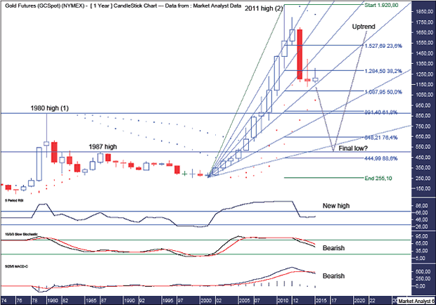
In previous analysis, I drew a Voodoo candle which called for a spike down to below US$1000 before a big reversal
higher which closed out 2015 near its highs. This was assuming the 2014 candle would be a slightly positive candle. Well, my timing has been a little off and the 2014 candle turned out slightly bearish.
I can be quite finicky with how I like the picture to look and this change in “look” has been the thing that has been bothering me. However, I have turned a blind eye to it as I focused solely on the shorter term picture. Not anymore.
Let’s cover the lower indicators first.
The Relative Strength Indicator (RSI) set a new high reading at the 2011 price high. This leads me to believe that the ultimate top is yet to be seen. I would like to see a bearish divergence set up which would require a new price high accompanied by a lower RSI reading.
The RSI is trending down but it is still in positive territory so it would not surprise this indicator if price turned back up soon and went to new all time highs. Something to keep in mind.
The Stochastic indicator is trending down and looking bearish. Once again, it wouldn’t surprise to see this indicator turn back up but it is bearish until it’s bullish.
The Moving Average Convergence Divergence (MACD) indicator has made a recent bearish crossover so the likelihood is for lower prices.
So, the lower indicators all appear fairly bearish and that is the bias we must have going forward until there are clear signals to think differently.
There looks to be a massive “three strikes and you’re out” top formation in play with the 1980 high the first strike and the 2011 high the third strike. So I definitely do not think the massive bull market is finished.
I have added the trusty Parabolic Stop and Reverse (PSAR) indicator. There are two sets of dots which pertain to a tight setting PSAR and a loose setting PSAR. Price has already busted the tight setting support so the sirens have gone off on my early warning system. The probability now is for price to eventually go on and bust the dots of the loose setting support. These dots stand at US$1000.
And herein lies my dilemma. I was looking for a move to sub US$1000 as I view that as an important psychological barrier that needs to be cracked. However, price cracking this barrier means cracking important PSAR support which would increase greatly the odds of lower prices.
Perhaps price pulls up above the loose PSAR support and the next bull trend begins from there. Perhaps, but I don’t favour that scenario. I’m going with the probability play which is the busting of tight setting PSAR support being a true early indication of the loose setting support inevitably being taken out.
So how low do I expect the gold price to trade?
I have drawn a Fibonacci Fan with price currently just above the 61.8% angle. There has been some support here and I expect the next 76.4% angle to also provide support. However, I think the final low will be somewhere down near the 88.6% angle.
I have added Fibonacci retracement levels of the move up from 2001 low at US$255 to the all time high in 2011 at US$1920. Previously, I used the 2008 level as the starting point. That was probably due to my bullish fundamental mindset not thinking a move to below the 2008 lows was possible. Well, I should know better. Anything and everything is possible in the markets!
Old highs often provide support in the future and I expect the 1980 high at US$873 to provide temporary support. However, I suspect the 1987 high at US$502 will be closer to the mark for final low.
Now I have been a massive fundamental gold bull all the way down from the high and I will continue to be so all the way down to the final low. Nothing changes there for me. However, my technical view always trumps my fundamental view and I remain a technical gold bear.
I am now looking for a low at the 76.4% level which stands at US$648 and possibly a touch lower. I doubt price will trade as low as the 88.6% level at US$444.
What about the 50% of the all time high price level? Yes, I will still be looking closely at the price action around that US$960 level but a final low there is now not my expectation.
Also, the famed Jim Rogers, who freely admits he’s not a good trader, has recently come out saying he expects a move back to the 50% level. Whoa! Hold the phone!! So Jim, who openly admits he’s not a good trader, is now entering the trading arena calling for a low around the 50% level. Well, byjingoes! That 50% level is already getting too much attention so I believe it is suspect and the gold price will ultimately fall much lower. While I’m with Jim on the fundamentals, I’ll go my own way on the technicals.
NYSE Arca Gold Bugs Index (HUI)
The NYSE Arca Gold BUGS Index (HUI) is an index of gold mining companies with the BUGS standing for Basket of Unhedged Gold Stocks and is listed on the American Stock Exchange (AMEX). Price last traded at $180.21.
We’ll start with the monthly chart.
HUI Monthly Chart
There is a “three strikes and you’re out” low formation in place denoted by the numbers 1, 2 and 3. This normally leads to a significant rise in price and I expect this rally is still playing out.
The most recent low was accompanied by multiple bullish divergences in the lower indicators being the RSI, Stochastic and MACD. This generally leads to a more substantial rally than we have witnessed so far.
The Parabolic Stop and Reverse (PSAR), indicator has a bullish bias after price busted the dots on the upside back in January.
The Bollinger Bands show price is now just below the middle band and I would like to see the final rally high come in around the upper band.
In a bearish development, the 100 period moving average (red) has just made a bearish crossover of the 50 period moving average (blue). Yet more bearish forces at work.
I have drawn a horizontal line which denotes the 2008 low at $150.56. The recent low at $146 sets up a double bottom and considering double bottoms generally don’t end trends, price should eventually come back down and bust below this level.
Also, I have drawn an Andrew’s Pitchfork which shows price trending down within the upper channel. Price looks to be finding support at the middle channel line and I suspect the final low, whenever that is, will be at this support line.
So where do I expect the final low to be?
Let’s go to the big picture yearly chart in an attempt to answer that.
HUI Yearly Chart
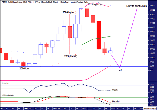
The RSI is in weak territory while the Stochastic indicator is trending down and looking bearish with no sign of turning back up yet. There is not a lot to be pleased about here if you are a bull.
The Parabolic Stop and Reverse (PSAR) indicator has a bearish bias with the dots above bias so the coast is clear on the downside, so to speak.
To my eye, it looks like a massive 5 point broadening top is in play with the 2008 high point 1, the 2008 low point 2 and the 2011 high point 3. That means price is currently making its way to a point 4 low after which price launches higher to new all time highs and eventually puts in a point 5 high.
So where is the point 4 low likely to be?
I have added Bollinger Bands which show the middle band has failed to provide support for price. Therefore, I believe the final low will be around the lower band and perhaps trade a bit below just as the 2011 high traded a bit above the upper band.
In previous analysis, I used Fibonacci retracement levels using the 2000 low at $35.31 as the starting point. I am now having second thoughts about this believing the assumption that new record lows weren’t possible being too presumptive.
I suspect price can nudge marginally below the 2000 low and that is where the final low will be. Of course I will still be watching how price behaves before that, especially around the 88.6% Fibonacci level which stands at $104.08 but it is now my stance that the final low will make marginally record lows.
And as always, it is just my opinion!
Let’s finish up by analysing the gold behemoth, Goldcorp.
Goldcorp (GG)
Goldcorp Inc (GG) is a low cost gold producer with operations and development projects located throughout the Americas. It is the Big Daddy of the gold world and is listed on the New York Stock Exchange (NYSE) with a market capitalisation of around $17billion. Price last traded at $20.51.
Let’s begin with the yearly chart.
GG Yearly Chart
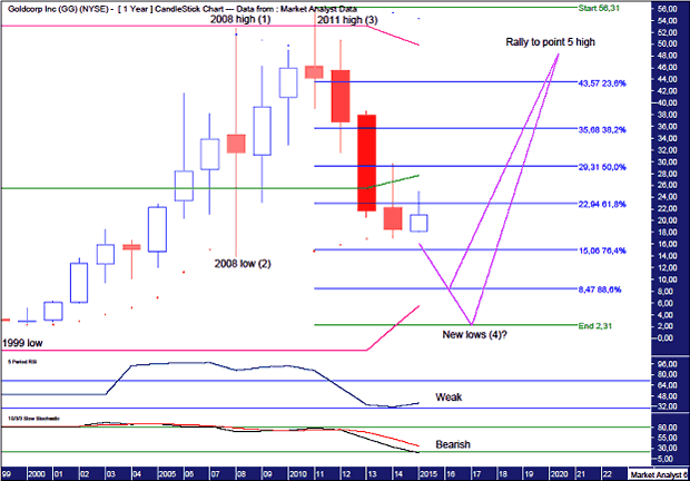
The Relative Strength Indicator (RSI) is looking weak while the Stochastic indicator is trending down bearishly. Nothing for the bulls to get excited about here.
The Parabolic Stop and Reverse (PSAR) indicator has a bearish bias after price busted the dots on the downside last year.
There looks to be a massive 5 point broadening top in play with the 2008 top point 1, the 2008 low point 2 and the 2011 high point 3. That means price is now headed for the point 4 low.
Where is the final low likely to be?
I have added Fibonacci retracement levels of the move up from 1999 low at $2.31 to the 2011 high at $56.31. I struggle to believe price will get so smashed that new lows are made but it must be given consideration. For now, I am looking for price to make a low around the 88.6% level which stands at $8.47.
And once the low is in place, wherever that may be, price should then launch to all time highs as it searches for a point 5 high.
Let’s move on to the monthly chart.
GG Monthly Chart

There is a “three strikes and you’re out” low formation in place which is denoted by the number 1, 2 and 3.
The lower indicators, the RSI, Stochastic and Moving Average Convergence Divergence (MACD), are all showing multiple bullish divergences at this recent low and I expect a more substantial rally than we have so far seen in response to that.
The PSAR indicator has a bearish bias with the dots over price but I suspect a pattern of dots being busted every which way is occurring which is an indication of corrective price behaviour. The dots are currently at $26.18 and I expect price to take them out.
I have drawn two trend lines which form a downtrend channel and I am looking for the final rally high to be at resistance given from the top of the channel.
I have added moving averages with time periods of 50 (blue) and 100 (red) and we can see they are just now making a bearish crossover. And this is the monthly chart so it is a solid indication of a downtrend in progress.
After the coming rally high I expect price to get crunched and fall to new lows. There will probably be a reaction off the 2008 low level which stands at $13.84 and is denoted by the horizontal line. After a brief reaction higher, price should then break down below the lower trend line as the downtrend gains momentum.
Disclosure: I have no financial interest in GG.
Summary
Finally, to touch on the psychology of the gold market, there still appear way too many market participants and commentators that are bullish gold and expect this year to see in the final low. This was giving me a major case of the heebie-jeebies recently as I had the same outlook. It is pretty hard to find any analysis that is more than a little bearish and I now feel much more comfortable being against the overwhelming majority opinion.
Summing up, I expect deflationary forces to really pick up later this year and gold will not be spared despite the opinion of the masses.
And once this deflationary cycle has caused maximum damage to the bank accounts and psyche of the gold bulls, the long awaited boom should see the gold price explode higher as inflationary euphoria finally takes hold.

-
I know Mike is a very solid investor and respect his opinions very much. So if he says pay attention to this or that - I will.
~ Dale G.
-
I've started managing my own investments so view Michael's site as a one-stop shop from which to get information and perspectives.
~ Dave E.
-
Michael offers easy reading, honest, common sense information that anyone can use in a practical manner.
~ der_al.
-
A sane voice in a scrambled investment world.
~ Ed R.
Inside Edge Pro Contributors

Greg Weldon

Josef Schachter

Tyler Bollhorn

Ryan Irvine

Paul Beattie

Martin Straith

Patrick Ceresna

Mark Leibovit

James Thorne

Victor Adair