
Asset protection
 The Ongoing Financial Crisis Is Leading People To Take Drastic Measures In Order To Survive
The Godfather of newsletter writers, 90-year-old Richard Russell, warned that central banks of the world are engaged in a desperate battle and that the ongoing financial crisis is leading people to take drastic measures in order to survive.
….read more HERE

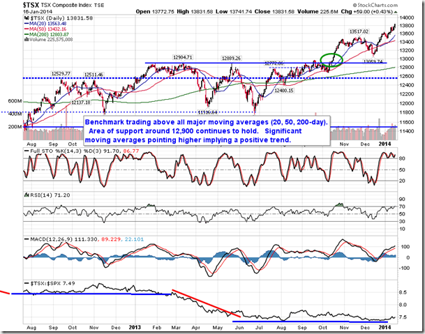
“A notable breakout was recorded in the Canadian market on Thursday. The S&P/TSX Capped Financial Services Index broke above the neckline of an apparent head-and-shoulders bottoming pattern, which suggests a move back toward resistance around 265, or just over 5% above Thursday’s close. Technical indicators and the 50-day moving average are all pointing higher, suggesting improving intermediate-term momentum. Seasonally, Canadian financial services stocks strengthen between January and the end of May, just prior to the reporting of earnings for the second quarter.”
To read the entire report on current market action and seasonal’s read Jon Vialoux’s entire report HERE

Why Buying Cheap Makes All the Difference in the World!
I’m a cheapskate. And no, I’m not afraid to admit it.
When I go grocery shopping, I bring along a plastic coupon holder and use as many clipped ones as I can. I also go online to Publix.com and “clip” the digital ones there every week.
When I buy new clothes, I try to hit up the local outlet mall rather than the regular one. The prices are better, and the quality is just fine. I increase my savings by doing things like signing up for email and text coupons — something that has saved me even more!
When it comes to investments, my approach is no different. If I can get a stock or ETF “on sale,” I love it. And if I can buy stocks at once-in-three-decade depressed valuations … when extreme pessimism is rampant in the mainstream media … and when investors are positioned the most egregiously negative on those stocks than they’ve ever been … I’m like a kid on Christmas morning!
 That brings me to one of my favorite sectors on the planet right now: Energy. Yes, energy.
You see, everyone and his sister was puking up energy stocks late last year and earlier this year. You couldn’t give ’em away, with some plunging 60 percent, 70 percent, or more just since last summer!
Crude oil futures got the most oversold, and showed the most extreme downside momentum, ever — even worse than during the 2008-2009 implosion! Oil prices fell the most since the 1986 collapse driven by Saudi Arabia’s decision to flood the market with crude.
The result: Drilling rig activity in the U.S. and Canada collapsed at the fastest rate in history. Energy sector junk bonds plunged in price. Several smaller drillers tumbled into bankruptcy, or got very close to doing so. Predictions of a crisis on the order of the dot-com collapse or the housing market implosion grew widespread.
And you know what I did? I started recommending that my subscribers and my readers buy!
Was I off my rocker? I like to think not. Instead, I like to think it was a chance to grab some once-in-a-lifetime bargains!
Not $5 off a work shirt at Calvin Klein, which I got a while back from a text-based deal.
Not $50 off at Men’s Wearhouse, which I just enjoyed this past weekend as a reward for previous purchases for my stepson.
But an honest-to-goodness mega-discount, the kind you can’t even find on TV shows like Extreme Couponing!
Did I know then that oil prices had bottomed, 100 percent, for always and forever? Do I know that now, a few months of bottoming action later? Of course not!
But what I do know is that buying cheap, cheap, cheap makes all the difference in the world — whether at the grocery store or in the stock market! I hope you joined me in buying energy, and are reaping the benefits now.
After all, many energy stocks are now rallying to multi-month highs as investors anticipate better days ahead. Mega-giants like Royal Dutch Shell (RDS/A, Weiss Ratings: C) are making their biggest deals in more than a decade to take advantage of dirt-cheap valuations. And private equity buyers and corporate buyers are combing through the energy sector wreckage, presaging even more transactions down the road.
One last piece of advice: I don’t think this train has left the station. Not by a long shot. So even if you’ve missed the first leg of the move higher in energy stocks, there could be much, much more room to run if I’m right about where we’re headed! Be sure you watch this space for more guidance on this issue as 2015 unfolds.
Until next time,
Mike

#25. Horizon North Logistics Inc (TSE:HNL.CA) — 12.6% YIELD
Horizon North Logistics is engaged in the provision of camp and catering, ground matting, and marine transportation services to oil and gas exploration and production companies, oilfield service companies and mining companies working on oil sands, mineral exploration and development, and conventional oil and gas projects throughout Canada’s northern regions. Co. divides its operations into three business segments: Camps & Catering; Matting; and Marine Services.

![]()

Larger Image – Source: www.sharelynx.com
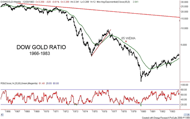
One of the best ways to gain some perspective on stock markets and gold is to look at the Dow Jones Industrials (DJI)/Gold ratio. The Dow/Gold ratio has a long history as the 200-year chart above attests to. The ratio has had considerable movement over the years, which is an accomplishment in itself since gold was until August 1971 fixed first roughly at $20.67 and then at $35 in April 1933 when the Roosevelt administration revalued gold up in order to devalue the US$. The devaluation of the US$ was a part of the currency wars of the 1930’s. The Roosevelt administration also forbid the hoarding of gold, gold bullion and gold certificates and gold was purchased by the US administration at the then fixed rate of $20.67. The resulting profit was used to fund the Exchange Stabilization Fund (ESF) a fund that was established by the Gold Reserve Act of 1934.
One thing that stands out with the above chart is that following the creation of the Fed in 1913 the Dow/Gold ratio has become a lot more volatile. Sharp peaks (favouring stocks) were seen in 1929 at 19, 1966 at 29 and 1999 at 45. Deep troughs (favouring gold) were seen in 1933 near 2 and in 1980 near 1. Prior to the formation of the Fed, the Dow/Gold ratio ranged from roughly 0.2 to 5. Sharp lows were seen in the 1840’s and again in the 1870’s. Economic depressions were a feature of both those periods. If the broadening pattern that appears to have formed following the formation of the Fed were to hold to form, the Dow/Gold ratio could fall to the bottom of the channel that is currently below 1.
To give some further perspective to the ratio one should look at gold’s two bull markets – 1966-1980 and 1999-2011.
Charts created using Omega TradeStation 2000i. Chart data supplied by Dial Data
The Dow/Gold ratio peaked near 29 in February 1966. The ratio began a slow steady decline and made its final peak in April 1971 just under 25. By the time of the 1974 stock market bottom in December 1974 the ratio had fallen to near 3. The period that followed was the one that saw gold prices almost cut in half while the stock market started a recovery. By September 1976, the ratio was almost back to 10. It was at that point that gold began its sharp rise to $878 by January 1980. The stock market continued its range trading and in January 1980, the Dow Jones Industrials closed at 875. The ratio had fallen to roughly 1:1.
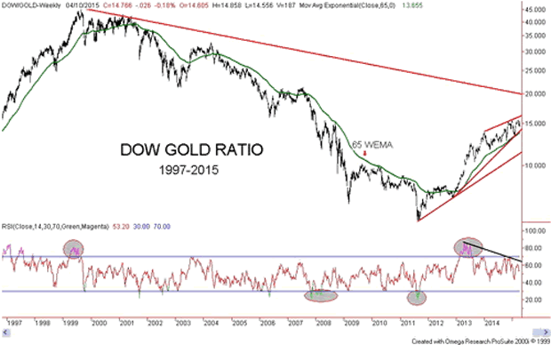
That turned out to be the low for the ratio and the Dow/Gold ratio began a long climb back in favour of stocks. It was not until 1995, however, that the Dow/Gold ratio finally broke the down trendline from the 1966 top. What followed was a swift rise in the stock market and a long period of weak gold prices. From 1995 to the top in 1999, the Dow/Gold ratio rose from roughly 10 to 45 as the DJI exploded from 5,100 to almost 12,000 while gold was falling from $388 to $252.
Source: www.bmgbullion.com
Charts created using Omega TradeStation 2000i. Chart data supplied by Dial Data
The last major peak for the Dow/Gold ratio was in August 1999 near 45. As with the market following the 1966 peak, the initial decline was gentle. The collapse got under way following the events of 9/11. There were brief rallies in favour of the Dow in 2003/2004 and again in 2006/2007 otherwise the trend of the Dow/Gold ratio was relentlessly down in favour of gold. There was another brief rebound for the Dow during the 2008 financial crisis but by 2009, the trend resumed in favour of gold. The ratio bottomed in August/September 2011 just under 6.
Since then a strong rally has been underway in favour of the Dow. Despite the strong rally in favour of the Dow, the Dow/Gold ratio remains well below its peak of 45 only recently hitting a high just above 15. The key downtrend line from the 1999 peak is currently near 20. A break of that level would signal that the trend has shifted firmly in favour of stocks as represented by the DJI. The current period from September 2011 is the first strong rally in favour of stocks since the gold bull market began back in 2001. Some have compared this period to 1974-1976 another time that stocks were favoured over gold during a gold bull market.
The Dow/Gold ratio appears to be forming what may be an ascending wedge triangle pattern. This pattern is normally bearish. A similar pattern is being seen on the S&P 500. A breakdown of the Dow/Gold ratio below 14 would be negative. Confirmation of a breakdown underway would be a decline below 13.50. Final confirmation of a breakdown would come when the ratio breaks under 11.30. Note the declining RSI that has been making lower highs even as the Dow/Gold ratio has been making higher highs. This suggests a deterioration in the Dow/Gold ratio even as it has been moving higher. The question now is not so much as to will the tide turn in favour of gold to when will the tide turn in favour of gold.
The next chart is an alternative way of looking at the record of the Dow/Gold ratio. The chart is courtesy of Bullion Management Group (www.bmgbullion.com). The chart sub-divides into three periods 1966-1982, 1983-2000 and 2001-2014. The former period largely covers the 1966-1983 Dow/Gold ratio chart above while the latter period covers primarily the 1997-2015 Dow/Gold ratio chart shown above. The 1966-1982 period was one of a bull commodity market while stocks were primarily in a long term bear market. The situation reversed itself from 1983-2000 as stocks soared while commodities were a bust. Since 2001, commodities have generally outperformed once again while stocks have suffered.
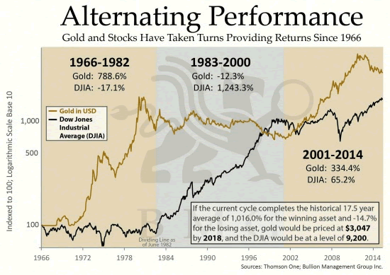
Source: www.bmgbullion.com
What stands out that setting aside the periods where gold outperforms stocks or stocks outperform gold, since 1966 gold has gained 3,328% ($35 to $1,200) while the DJI has gained 2,177% (785 close December 31, 1966 to 17,920 close April 8, 2015). Further, despite the bear market experienced by gold since September 2011, gold has gained 328% since 2001 vs. 79% for the DJI. Since gold became free trading in 1971 gold has proven to be the superior investment despite periods of underperformance.
This outperformance is dependent on where one wishes to start. I have seen studies suggesting gold’s gross underperformance. Those studies invariably started with the top in 1980 and a time when the Dow/Gold ratio was about 1:1. Argumentively I could also be criticised for starting back in 1966 at a time when stocks were high relative to gold. A more reasonable measurement of gold’s performance vs. the DJI might be to start in August 1971 when the gold standard ended and the current fiat system commenced. Except the DJI was higher in August 1971 then it was at the end of 1966. The Dow/Gold ratio was around 25.6:1.
Maybe where it should truly be measured from is the inception of the Federal Reserve that was founded on December 23, 1913. On that day, gold was fixed at $20.67 while the DJI closed at 78.11. The Dow/Gold ratio was 3.8:1. On that basis, the DJI wins with a gain of 22,819% vs. gold’s gain of 5706%. The DJI’s gains are before dividends. But then an ounce of gold back in 1913 is still an ounce of gold today whereas the DJI has undergone numerous changes over the years with weak companies removed and new strong companies added.
Probably the best reason for following the Dow/Gold ratio is to help in determining as to whether one should be in gold or stocks. While gold topped in September 2011 the confirmation that the tide had shifted in favour of stocks did not happen until 2013. It was on April 12 and 15, 2013 that the gold market broke down when parties unknown offered the equivalent of 400 tonnes of gold in the futures market at the open all at once. It was a definitive statement that the futures market or paper gold dominates the gold market and not physical gold. The question now is can paper gold continue to dominate? The slow shift of the physical gold market from London/New York to Shanghai suggests that physical gold may soon dominate once again.
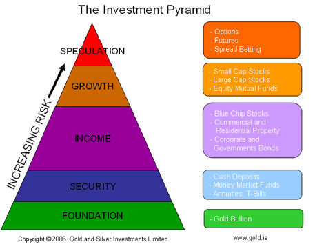
Physical gold has no liability unlike derivatives (futures), stocks and bonds. It is for this reason that some investment analysts place physical bullion as the foundation of any investment portfolio. This is the opposite of where traditional investment analysis places bullion. Following the Dow/Gold ratio can help one stay on the right side of the market.

-
I know Mike is a very solid investor and respect his opinions very much. So if he says pay attention to this or that - I will.
~ Dale G.
-
I've started managing my own investments so view Michael's site as a one-stop shop from which to get information and perspectives.
~ Dave E.
-
Michael offers easy reading, honest, common sense information that anyone can use in a practical manner.
~ der_al.
-
A sane voice in a scrambled investment world.
~ Ed R.
Inside Edge Pro Contributors

Greg Weldon

Josef Schachter

Tyler Bollhorn

Ryan Irvine

Paul Beattie

Martin Straith

Patrick Ceresna

Mark Leibovit

James Thorne

Victor Adair