
Asset protection
 The largest and worst sovereign debt crisis, ever, is rapidly approaching.
Greece is now at its tipping point. As I pen this issue, the government of Greece is desperately trying to stave off default on a 750 million euro repayment ($835.7 million) to the International Monetary Fund (IMF).
Whether Greece gets concessions or not, won’t matter. Because come June, Greece faces another 2.6 billion euro repayment (US $2.9 billion).
And come July and August, it will face a whopping 8.7 billion euro ($9.69 billion) repayment — 7 billion ($7.8 billion) of which is owed to the European Central Bank (ECB).
 There is simply no way Greece can pay off that debt. It doesn’t have the money. Just to make a minor 200 million euro payment last week, the Greek government had to call in all excess cash from regional banks, leaving government employees and pensioners waiting for their checks.
Nor can Greece rollover the debt without paying excessive interest rates — near 12 percent for 10-year money — bankrupting the country even further.
Meanwhile, the IMF and the ECB are ramming more and more austerity measures down the throats of the Greek people — all in the name of making sure bondholders and authorities get repaid.
I ask you, is this what the world has come to? Sacrificing the lives of ordinary people to make sure creditors get repaid?
Already in Greece, a recent study shows that the suicide rate has soared 36 percent during the crisis. Not surprising considering the stress the Greek people are under which, in turn, has forced unemployment to 25.4 percent and youth unemployment stands at a whopping 50.1 percent.
If you think Greece is to blame, think again. Sure, like any country, Greece has its tax cheats and black market economy.
But in 2001, Greece was essentially held at gunpoint to join the euro, through forced financings at attractive low interest rates.
And now that it has having trouble repaying that debt, Greece is being held at gunpoint again.
Thing is, it’s not just Greece that is about to reach the tipping point. all of Europe is about to go under. You can see the most indebted of them — compared to their GDP — in this chart here.
While Greece is certainly the worst, Italy isn’t far behind, or is Portugal.
And of those European countries that have debt levels just above or below the 100 percent of GDP level, don’t let anyone kid you. Not one of these countries is capable of servicing its debt, not even France.
Lest you think a sovereign debt crisis is confined to Europe, think again. Europe’s sovereign debt crisis is merely the starting point.
Japan’s debt stands at more than 24 percent of GDP, nearly $12 trillion.
And worst of all is, yes, none other than the United States, where Washington is in hock — not for just its $18 trillion national debt — but for more than $215 trillion — the worst and biggest debt in the history of civilization at nearly 12 times our GDP.
Put another way, if you took every penny of what our country produces in a single year, it would take 12 years to pay off that debt.
Put yet another way, it would require each and every American to give up their earnings and production, essentially go bankrupt, for 12 straight years.
And that’s not even counting the interest expense on the debt, which is sure to rise in the months and years ahead.
A sovereign debt crisis of unprecedented proportions? You bet it is. We all knew it was lurking out there, and now, it’s here. Greece is merely the starting, tipping point.
One of the most important aspects of this sovereign debt crisis as it unfolds over the next several years will be how they impact the financial markets.
Understand that, and you will survive.
Thing is, very few indeed will understand what will really happen. So let me summarize it now.
First, and most obvious, government bond markets are headed into the abyss. Don’t touch sovereign debt with a 100-foot pole. Do so and you might as well commit financial suicide.
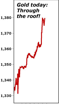
Second, and far less obvious, gold and commodities generally: At the beginning stage of the crisis, now, commodities, including precious metals, will remain caught in deflation.
Why? It’s actually rather simple. In the beginning phase of a sovereign debt crisis, investors of all sorts seek the safe haven of hoarding cash. And since the U.S. dollar is still the world’s reserve currency, that’s bullish for the dollar, and bearish for commodities.
But later in the crisis, that thinking will invert, and …
Third, once commodities reach their lows in a panic sell off, they will take flight to the upside, in a massive new bull market, one which will ultimately see gold hit better than $5,000 an ounce.
Why? Because later in the crisis it will become apparent that it is not just the government of Europe that is going under, but also the governments of Japan and the United States.
And when that recognition comes, it will reignite a bull market in commodities and all sorts of tangible assets. In addition …
Fourth, most will expect U.S. equity markets to crash. But that’s dead wrong. The history of sovereign debt crises is that stock markets perform exceptionally well — when government, the public sector, not the private sector, is going bust.
Why? Because no one would dare lend money to government. Because the U.S. stock markets represent the safest, deepest, most liquid bastion of capitalism on the planet. And because our biggest companies, very simply put, will outlast our government.
So get ready. The worst sovereign debt crisis, ever, is right around the corner.
Best wishes, as always …
Larry

Buy Silver or You Will Die!
 It’s the news everyone dreads-a call from the hospital. And it’s about one of the most important people in the world.
Your mother.
[Every ALL-CAPS ITEM below contains silver or is required in its use.] (M/T Ed Note: Be sure to read some statistics in the last paragraphs)
You hear the nurse talking urgently through your TELEPHONE and you realize it’s serious.
You grab your REMOTE CONTROL and turn down the volume on your PLASMA TV that’s playing your favorite DVD movie. You push the BUTTON and the SPEAKERS go mute. You press “save” on the KEYBOARD of your COMPUTER.
“Yes, she’s okay,” the nurse tells you. “But you need to come to the HOSPITAL right away.”
That’s all you need to hear. You yell to your spouse and grab your CELLPHONE to call your siblings.
“Is she alright?” your wife asks frantically. She was using the VACUUM CLEANER and WASHING MACHINE and didn’t hear the conversation.
“Yes, but hurry,” you reply, reaching to turn off the STOVE.
Your wife springs into action-she pushes the TOYS out of the way, grabs a WATER BOTTLE from the REFRIGERATOR and closes the MICROWAVE door.
You run to the bedroom and put on that new SUNBLOCK SHIRT she got you and check yourself in the
MIRROR. You notice the glint off your SOLAR PANELS shines brightly through the WINDOW. You’re sweating and are glad the AIR CONDITIONER and AIR PURIFIER are working.
Your wife opens the LATCH to the front door. You notice she’s wearing those EARRINGS you got her for Christmas, the ones you put in with the CD of her favorite singer.
You unlock the car with your REMOTE KEY and rev up the ENGINE. Your wife opens the POWER WINDOWS while you adjust the POWER SEATS.
You leave the RADIO off, and are impatient at the STOPLIGHT, even though you can already see the CELLPHONE TOWERS on top of the hospital. Your wife is talking to your other family members on her CELLPHONE.
You pull up to the toll booth and the SCANNER beeps you through quickly. Your wife glances at her WATCH, and you remember she needs a new BATTERY.
You enter the hospital through the AUTOMATIC DOOR and a receptionist uses an IPAD to give you the room number. The indoor temperature is cool and you remember reading about the new INSULATION the hospital used in construction. You quickly push the ELEVATOR BUTTON for the second floor.
You reach the room and there is your mother, lying on a RECLINING BED, with a BREATHING TUBE in her mouth. She’s connected to NUMEROUS HOSPITAL DEVICES, some of which display readouts on a COMPUTER SCREEN. You try not to panic, as you see various SURGICAL INSTRUMENTS lying on a nearby SILVER tray.
“Your mother is on MEDICATION,” says a doctor walking into the room. He has a STETHOSCOPE around his neck and EYEGLASSES perched on his nose.
“She fell and sustained some injuries, but she will be okay.” You see the BANDAGES on her face and arms, and the doctor notices your concern.
“We’ll take some X-RAYS to be sure she didn’t break any bones,” he says. “And she’s already on ANTIBIOTICS, so we’ll catch any infection before it starts.”
You take a deep breath of relief as you realize she’ll be okay. You grasp your mother’s arm and notice she’s still wearing her favorite BRACELET.
The doctor uses a LAPTOP to update her status. The nurse uses a WATER PURIFIER to fill the water pitcher and sets it on the ANTI-SCRATCH surface of the nearby table.
You settle into a PLASTIC CHAIR beside your mother and take a deep, relaxing breath. It then dawns on you just how much.
Silver Is Essential to Modern Life
There are numerous medical examples like this every day, where silver served a cornerstone purpose to treat a hospital patient. In fact, if you’ve ever been treated by a doctor or admitted to a hospital, you’ve been a direct recipient of one or more of the medical benefits of silver. From simple bandages to life-saving equipment in operating rooms, silver is quite literally a lifesaving precious metal.
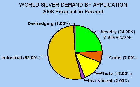
Silver is used in nearly every major industry today, from biocides and electronics to solar panels and batteries. In fact, silver is so embedded in modern life that you do not go one day without using a product made with or by silver. It’s everywhere, even if you don’t see it.
Due to the exponential increase in the number of uses for this precious metal, demand has exploded. Check out silver’s growth.
-
Jewelry and silverware use is up 27.2% since 2011.
-
India imported 5,500 tonnes of silver last year, 180% more than just two years ago.
-
Solar power accounted for 29% of added electricity capacity in America last year. “Eventually solar will become so large that there will be consequences everywhere,” says the US Solar Energy Industries Association.
-
China’s solar industry is exploding-it represented about 0.2% of the global market in 2009, but last year soared to 17%.
-
Silver demand in China exceeded a quarter million ounces last year for the first time in history.
-
New uses for silver continue to be discovered. The latest fashion-a “scough“-uses silver nanoparticles to trap and kill germs and pollutants.
-
Total industrial demand is projected to increase 5% per year through 2016-and outpace global GDP growth.
-
In spite of the fall in price, ETF demand soared in 2014, as total holdings exceeded the 2011 record high.
Demand is relentless.
But Here’s the Best Part.
If you’re an investor, the price of silver is poised for a massive rebound, after one of the most severe bear markets in history. Silver has declined three consecutive years-and hasn’t fallen four straight years since 1991. The price is so undervalued that adjusted for inflation, $17 silver is equivalent to about $4 in the year 2000!
In fact, silver is currently trading below its price before the financial crisis struck in 2008, and beforethe first QE program was introduced. It’s basically trading as if no money has been printed!
There is a clear disconnect between this precious metal and its price.
And that is our opportunity. The silver price has overreacted so dramatically to the downside that it is one of the most compelling investments today. In fact, it’s hard to find a more distorted market full of opportunity.
While hopefully you won’t need silver to save your life anytime soon, we’re convinced it will be a portfolio-saving investment in the very near future.
Just like gold, a stash of silver bullion will help us maintain our standard of living. In fact, silver may be more practical to use for small purchases, as there will be times you may not want to sell a full ounce of gold. And in a high-inflation/decaying-dollar scenario, the silver price is likely to exceed consumer price inflation, giving us further purchasing power protection.
The bottom line is that silver is quite possibly the buying opportunity of this decade. The next few years could be very exciting. And if you like bargains, silver’s neon “Sale!” sign is flashing like a disco ball.
To take advantage of this potentially life-changing setup, we have a special offer in the just-released issue of BIG GOLD.
All investors should own a stash of sovereign bullion coins-Eagles, Maple Leafs, Philharmonics, etc. They’re the most recognizable around the world and the most liquid, an important trait when it comes time to sell.
However, we’ve identified a potentially lucrative trend in the silver market, where we can buy bullion coins with numismatic potential. In other words, these coins could increase in value muchmore than standard bullion coins. Even many veteran silver investors have not caught on to this trend.
How do we know these coins have numismatic upside? Because it’s already happened with similar coins. In fact, a similar coin from 2011 is now selling for near a 100% premium. And this occurred while precious metals were in a bear market!
Right now, you can buy this coin for roughly the same premium as a silver Eagle. In other words, there is essentially no risk to buying these coins-if for some reason they never accrue any numismatic value, they’ll still always sell for at least the price of bullion since they contain a full ounce.
And here’s the best part: our recommended dealer has discounted these coins exclusively for BIG GOLD readers. The price is lower than you’ll find anywhere else in the bullion market, handing us even further savings. We also include a similar discount on a gold coin with numismatic potential.
There’s much more to our May issue. We detail why we think the next bull market in gold could kick into high gear very soon (it’s in Jeff Clark’s introduction). It’s a development most mainstream investors are completely overlooking-which is our opportunity, because they’ll be surprised by this event and rush into the precious metals market literally overnight. If we’re right, it could light a fire under the gold price.
But you need to invest now, before it takes place, and while the discounted premium on these coins is still available. Either way, don’t let the current bear market fool you – it’s stretched to an extreme and will shift into a new bull market soon. Markets cycle, as history has repeatedly shown, and this market is due for its next upcycle.
About The Author: Jeff Clark
Having worked on his family’s gold claims in California and Arizona, as well as a mine in a place to remain nameless, Jeff’s research and writing skills are utilized in his role as editor and one of the primary writers of Casey’s Gold & Resource Report.
Whether it is researching new companies to recommend, analyzing the big trend in gold, or looking for other safe and profitable ways to capitalize on the bull market, Jeff is devoted to making Casey’s Gold & Resource Report the best precious metals newsletter for the prudent investor. He coordinates the efforts among the research and writing team, ensuring that whatever is happening in the gold and silver market doesn’t escape coverage.

The old saying is that a “Get me in!” bond market is always followed by a “Get me out!” event. In shorter form, it is GMI! followed by GMO!.
This was the case with the price of the US Treasury soaring to an Upside Exhaustion at the end of January. Our special study of January 20th, titled “Ending Action”, reviewed the probability that this could be the end of the great bull market that began in 1981 when the long-dated yield was 15%.
Our Pivot of April 9th noted that the reversal would be a global event and that the “European Central Bank is full of unsupportable positions”. Our April 22 comment was that the loss of liquidity in the US market could be “Tied to an equally significant loss in global [bond] markets”.
More specifically, the reversal in spreads that could be accomplished by June could be as “interesting” as the one in 1998 that took down LTCM.
The Eurobond Future set its high at 160.69 on April 17 and the break to today’s 154 level shows some intense “GMO!”. Technically and within this the German 30-year bond price registered an Upside Exhaustion. Of importance is that the bull move from September 2013 was confirmed by a positive crossover on two key moving averages. These provided support on the way up and have been decisively taken out this week. A negative crossover is being accomplished now.
Eurobond Future

The chart of the German Ten-Year Yield puts the reversal in perspective.

Much has been said about nominal rates declining to less than zero. This as it turns out was providing short sellers a very low “carry”.
Adjusted for CPI inflation real interest rates during a financial mania record a distinctive decline. That’s in the senior currency. Sometimes to negative levels, as with the 1873 Bubble. In 2007 it declined to minus 1.5%. This increased by 6 percentage points in the 2008 Crash.
With the CPI rate at close to zero during the first quarter, the low for the real rate was close to 2 percent. Now it is approaching 3 percent.
The typical increase in a post-bubble contraction has been 12 (no typo) percentage points. It has been Mother Nature’s way of ending compulsive expansion and abuse of credit, otherwise known as a financial mania. A huge increase in real rates for global government debt seems inevitable. In which case, the long experiment in artificially lowering rates by policy adventurers would come to an end.
Those who analyze major financial setbacks as policy errors or random accidents, have described them as a “Minsky Moments” or a “Black Swans”. A review of the greatest crashes in history concludes that they have been setup by speculative excess, which is technically measurable. On the stock market part of a bubble, the peak has been anticipated by a distinctive changes in credit spreads and the yield curve. On all six examples since the first in 1720, there has been a reliable seasonal component.
Forget “Minsky “and “Black Swans”, this is central bankers discovering a “Get Me Out!” moment.

In April 2015 Canada’s big city metro SFD prices all caught a bid with Toronto prices breaking out again to the upside for a new record peak. It’s all about the land that real estate sits on; big money is willing to pay a premium for sitting on it.

The chart above below the average detached housing prices for Vancouver, Calgary, Edmonton, Toronto*, Ottawa* and Montréal* (the six Canadian cities with over a million people) as well as the average of the sum of Vancouver, Calgary and Toronto condo (apartment) prices on the left axis. On the right axis is the seasonally adjusted annualized rate (SAAR) of MLS® Residential Sales across Canada.
Price gains were accomplished on a push higher in sales volume of the Canadian national MLS residential
annualized housing sales data. Trophy hunters are looking for well located SFD properties in hot markets and the hoi polloi want in before they are priced out.
Can the “posted retail” 5 year fixed rate mortgage low of 4.64% (sub-3% on the street) drive the hunger games into overtime in 2015? Or is the commodity crash signalling an upcoming major correction for Canadian housing? Your opinion is welcome.
Mattress money has gushed into condos with no respect for fundamentals or plan for contingencies that may be required if Pit of Gloom II develops and one must write off capital gains and or rely on employment earnings to subsidize negative yields.
It remains interesting to note that the combined average price of a Vancouver, Calgary & Toronto condo is currently 25% more expensive than a median priced Montreal SFD and note also that in the spring of 2006, those 3-City average condos zoomed 58% in price (over $100,000) in just three months as the buy side of the market freaked out over the inversion of the 10yr less the 2yr spread as it went negative (Yield Curve).
The inflationistas have made a big bet and it’s showing up in the supply of rentals.

The big disconnect in the US stock market just keeps getting bigger.
A new Bank of America Merrill Lynch survey published Thursday finds that US investors have pulled $99 billion out of equities year-to-date — including net outflows in 11 of the past 12 weeks — despite stock prices continuing to break record highs.
This week also saw the biggest outflows from equity ($17.2 billion) and high-yield bond funds ($2.6 billion) this year. This data follows a similar report from BAML last month that showed investors pulled $79 billion from the stock market this year and nine of 10 weeks to that point.
As this imbalance grows, Bank of America writes, so does the risk of something we haven’t seen in the market in years: a correction.

Bank of America Merril Lynch
SEE ALSO: Unemployment rate falls to 5.4%
NOW WATCH: How to invest like Warren Buffett


-
I know Mike is a very solid investor and respect his opinions very much. So if he says pay attention to this or that - I will.
~ Dale G.
-
I've started managing my own investments so view Michael's site as a one-stop shop from which to get information and perspectives.
~ Dave E.
-
Michael offers easy reading, honest, common sense information that anyone can use in a practical manner.
~ der_al.
-
A sane voice in a scrambled investment world.
~ Ed R.
Inside Edge Pro Contributors

Greg Weldon

Josef Schachter

Tyler Bollhorn

Ryan Irvine

Paul Beattie

Martin Straith

Patrick Ceresna

Mark Leibovit

James Thorne

Victor Adair