
Gold & Precious Metals

“The US stock market has been this high only three times before since 1881.”
– Yale University’s Dr. Robert Shiller, referring to the price/earnings (P/E) ratio that bears his name.
Present market conditions join the second most extreme valuations in U.S. history (on measures most reliably correlated with actual subsequent 10-year S&P 500 total returns) with increasing divergences and dispersion in market internals. Despite current extremes, valuations say very little about near term market direction. Valuations are enormously informative about likely market returns over horizons of 7-15 years. In contrast, market internals convey a great deal of information about the prevailing risk preferences of investors, and that’s what amplifies our concerns here. Uniformly favorable internals across a wide variety of sectors and security types typically convey a signal that investors have a robust willingness to seek and accept risk, and it’s that feature that can allow overvalued markets to become persistently more overvalued. But remove that feature, and overvalued markets have often become vulnerable to vertical air pockets, panics, and crashes.
I’ll say this again – valuations alone are not the concern. It’s the additional feature of deteriorating market internals that introduces a critical element of risk here. That feature helped us to correctly warn of the 2000-2002 and 2007-2009 collapses, and shift to a constructive outlook in-between. The recent half-cycle since 2009 has been more challenging as the inadvertent result of my 2009 insistence on stress-testing our methods of classifying market return/risk profiles against Depression-era data. The resulting ensemble methods outperformed every approach we had ever tested against post-war data, Depression-era data, and holdout validation data, but they also encouraged an immediate defensive stance when overvalued, overbought, overbullish syndromes emerged. Throughout history, those syndromes had regularly been accompanied or closely followed by breakdowns in market internals. The one truly “different” aspect of the half-cycle since 2009 is that quantitative easing disrupted that regularity. Nearly a year ago, we imposedoverlays on our methods that require hard-defensive investment stances to be accompanied directly by deterioration in market internals or other risk-sensitive measures (e.g. credit spreads).
It’s worth emphasizing that until mid-2014, the strongly defensive outlook we took in recent years would have been rejected by those overlays more than two-thirds of the time. Without those bubble-tolerant overlays, our actual experience was largely a mirror image (though muted) of the escalating valuation extremes. As I observed then, we don’t get to re-live the recent cycle in a way that demonstrates the effectiveness of those adaptations, but we can certainly do so over time. On that front, market conditions presently (and in recent quarters) support a hard-defensive outlook that’s largely identical to those we took in 2000 and 2007. The same return/risk profile has been associated with vertical market losses in market cycles across history. The chart below shows the cumulative total return of the S&P 500, restricted to the 8% of historical periods with an estimated return/risk profile matching what we presently observe. The overall returns are also partitioned between periods of Fed easing and Fed tightening. The notion that Federal Reserve easing prevents market losses is simply historically uninformed. Even a cursory review of the last two market collapses should suffice as a reminder.

What creates a temptation to ignore risk here is that the S&P 500 has recently advanced despite these…continue reading HERE

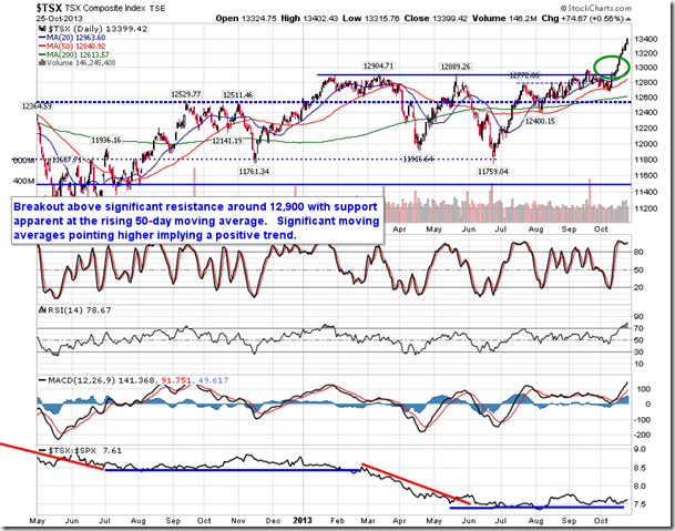
These two charts by Equity Clock visually underscore what’s likely ahead for Canadian Stock Market Investors:


While the Stock Markets may not be set to rise higher, a long forgotten commodity is. Take a look at Sugar and Jon Vialoux’s comment highlights the gains that normally occur in the coming months in this sold out commodity. Currently trading at 12.36 down from its high of 35.92 in Feb 2011:

“A turning point may be evident for the price of Sugar as it enters its period of seasonal strength. The price of sugar is attempting to chart a double bottom around $0.12; momentum indicators are showing signs of curling higher from oversold levels. Sugar seasonally gains between the beginning of June and the beginning of August, gaining over 11% during the period. Both June and July have seen positive returns for the price of the commodity 75% of the time over the past 20 years. Upside potential for the price of sugar points to the 200-day moving average, currently around $0.145, or over 18% above Monday’s closing price.” – Jon Vialoux’s charts on sugar below.

Jon’s whole report for June 2nd HERE

 “This year marks the 57th year that I’ve been writing about the markets. During all these years a lot has changed, and I have changed too. Rather than write about every little jiggle in the markets, I now prefer to stick to the big picture.
The Big Picture
The big picture, minus manipulations, propaganda and lies, is that the US is on the long road to deleveraging and deflation, which, of course, is a correction of the years since World War II, when the trend was towards inflation and leveraging. With the advent of the internet and email, this business has become increasingly difficult and not only have many newsletters dropped out of the field, but many hedge funds and money managers have thrown in the towel.
John Williams Exposes The Truth Behind The Lies
I’ve been reading John Williams’ newsletter on the economy. John calls his newsletter Shadow Statistics, and by that he
means that he’s telling the true story about the American economy minus government propaganda and Fed lies.
I’ve been wondering what to make of the major averages and indexes, whipping up and down within their trading ranges. Now it occurs to me that investors’ reaction to this oscillation is, “So what?” The stock market is going nowhere in a hurry. Thus investors have been lulled to sleep by the seemingly trendless activity of the major averages. Based on recent action in the stock market, I think the market could correct by 10% or more before investors will take it seriously.
My intuition tells me that John Williams and his Shadow Statistics are telling us the real story. I also suspect that the Fed agrees with the negative scenario that John Williams has presented. Therefore I assume that the Fed will not raise rates in the June session nor will it raise rates in September. After that comes an election year, during which the Fed will surely not raise rates. So it could easily be 2017 before we see the first rate rise by the Fed.
U.S. Debt Headed To $20 Trillion
In the meantime I expect the national debt to compound and accelerate, moving the national debt into the 18 to 20 trillion dollar zone. This will have its impact on the US dollar, which is now overbought and overloved. If the dollar crashes, the US will almost surely lose its reserve status. At that point I believe the Chinese yuan will share reserve status with the US dollar.
Gold Tracks The Direction Of Power
Throughout history, the path of gold has traced out the direction of power. But despite all this, I am an optimist. I believe we’ve reached the time when war between major powers has ended. Unbeknownst to most, spirituality and love are beginning to creep like a huge blanket over mankind.”
Time
Here’s something they won’t tell you at your local brokerage office or in the “How to Beat the Market” books.All investing and speculation is basically an exercise in attempting to beat time.
“Russell, what are you talking about?”
Just what I said — when you try to pick the winning stock or when you try to sell out near the top of a bull market or when you try in-and-out trading, you may not realize it but what you’re doing is trying to beat time.
Time is the single most valuable asset you can ever have in your investment arsenal. The problem is that none of us has enough of it.
But let’s indulge in a bit of fantasy. Let’s say you have 200 years to live, 200 years in which to invest. Here’s what you could do. You could buy $20,000 worth of municipal bonds yielding say 5.5%.
At 5.5% money doubles in 13 years. So here’s your plan — each time your money doubles you add another $10.000. So at the end of 13 years you have $40,000 plus the $10,000 you’ve added, meaning that at the end of 13 years you’d have $50,000.
At the end of the next 13 years you have $100,000, you add $10,000 and then you’d have $110,000. You reinvest it all in 5.5% munis and at the end of the next 13 years you’d have $220,000 and you add $10,000 making it $230,000.
At the end of the next 13 years you’d have $460,000 and you add $10,000 making it $470,000.
In 200 years there are 15.3 doubles. You do the math. By the end of the 200th year you wouldn’t know what to do with all your money. It would be coming out of your ears. And all with minimum risk.
So with enough time, you would be rich –guaranteed.You wouldn’t have to waste any time picking the right stock or the right group or the right mutual fund. You would just compound your way to riches, using your greatest asset — time.
There’s only one problem, In the real world you’re not going to live 200 years. But if you start young enough or if you start your kids early, you or they might have anywhere from 30 to 60 years of time ahead of you.
Because most people have run out of time, they spend endless hours and nervous energy trying to beat time, which, by the way, is really what investing is all about. Pick a stock that advances from 3 to 100 and if you’ve put enough money in that stock you’ll have beaten time. Or join a company that gives you a million options and your option moves up from 3 to 25 and again you’ve beaten time.
How about this real example of beating time– John Walter joined AT&T, but after nine short months he was out of a job. The complaint was that Walter “lacked intellectual leadership.”Walter got $26 million for that little stint in a severance package. That’s what you call really beating time. Of course, a few of us might have another word for it– and for AT&T.
You can subscribe to Richard Russell’s 90 years of wisdom and remarkable writings at Dow Theory Letters by CLICKING HERE TO SUBSCRIBE.

Canada’s New Shale Oil Field Could Rival the Bakken
Canada’s energy industry may be most famous for its world-class oil sands resources. But a new shale oil field could surpass  the oil sands as Canada’s largest untapped oil reserve.
In fact, it could even rival the massive Bakken shale of North Dakota in terms of recoverable oil.
This area lies north of British Columbia and east of the Yukon. It’s the Northwest Territories.
Recent data from the National Energy Board (NEB) and the Northwest Territories Geological Survey shows that this area holds as much as 200 billion barrels of shale oil reserves. That compares to U.S. Geological Survey estimates that the Bakken shale formation will yield up to 7.4 billion barrels.
Not all of this Canadian oil is necessarily recoverable. But the Canol and Bluefish shales contain a total approaching 7 billion barrels of economically viable resources.
Here’s a look at the vast potential of Canada’s Northwest Territories…
A New Shale Oil Field with “Significant Potential”
Major oil companies have been exploring this area just 145 kilometers south of the Arctic Circle, known as the Mackenzie Plain, for some time.
Oil producers such as Husky Energy Inc. (TSE: HSE), Imperial Oil Ltd. (TSE: IMO), Royal Dutch Shell Plc. (NYSE ADR: RDS.A), and ConocoPhillips (NYSE: COP) have performed exploratory drilling in the Canol field.
A total of 14 exploration licenses have been granted with $628 million in work commitments dating back to 2010.
The Canol Field could hold as much as 145 billion barrels of oil. That’s comparable to Texas’ Permian basin, where about 3% of oil in place is currently being recovered by operators.
The Bluefish shale has yet to even be explored. It could hold up to 46 billion barrels.
David Ramsay, Minister of Industry, Tourism and Investment for the Government of the Northwest Territories, commented on the NEB data, saying, “This study confirms what we have known all along – that there is significant petroleum potential in the Sahtu.”
Developing these fields could be a ways off, however. Some living in the territory as well as Greenpeace oppose fracking, claiming it could contaminate groundwater.
Perhaps an even larger obstacle to development is infrastructure. The area’s remote location currently lacks such basic services as an all-weather road. A pipeline system to carry the recovered oil and gas to market will also need to be built eventually.
So now the big question: Can investors profit from this new Canadian shale oil field?
A Winning Play on Shale Oil
Because pipelines are crucial to the whole shale oil industry, they offer one of the most attractive ways to play this opportunity.
Although I’d love to suggest a pipeline play that will leverage the vast new potential of Canada’s north, right now it’s not the way to go. It’s too early to play this discovery.
But, this does draw attention to a strong profit play in the shale oil industry, so you can make money while we evaluate the future winners of Canada’s shale oil boom…
The better strategy today is to focus on an existing, attractive, and very profitable pipeline right in the United States.
Williams Companies Inc. (NYSE: WMB) is one of the largest energy infrastructure companies in the United States. Its history dates back to 1908, and its head office is located in Tulsa, Okla.
WMB moves as much as 30% of America’s natural gas through its vast network of pipelines every day.
Williams is a $39 billion company currently trading at a reasonable P/E of just 19. Shares yield a hefty 4.7%. The WMB share price did take a hit along with the crash in oil prices, but not by nearly as much. The stock price fell 32%, but bottomed in mid-January and has already recovered more than half that drop.
With $7.6 billion in revenue, Williams Companies earns a rich 27% profit margin and 16.5% operating margin and produces a 15.2% return on equity.
The company management also expects earnings to grow substantially in the future. And with 88% of the oil and gas moved under long-term fixed-fee contracts, oil and gas prices don’t matter all that much to company profits.
WMB stock is currently trading at $51.47 (Monday) and is up about 14% year to date.
Stay up-to-date on all the shale oil investing news you need @moneymorning on Twitter.

-
I know Mike is a very solid investor and respect his opinions very much. So if he says pay attention to this or that - I will.
~ Dale G.
-
I've started managing my own investments so view Michael's site as a one-stop shop from which to get information and perspectives.
~ Dave E.
-
Michael offers easy reading, honest, common sense information that anyone can use in a practical manner.
~ der_al.
-
A sane voice in a scrambled investment world.
~ Ed R.
Inside Edge Pro Contributors

Greg Weldon

Josef Schachter

Tyler Bollhorn

Ryan Irvine

Paul Beattie

Martin Straith

Patrick Ceresna

Mark Leibovit

James Thorne

Victor Adair