
Gold & Precious Metals
The month of July has seen the most intense demand for physical gold and silver since April of 2013, setting numerous records for the year. On the heels of the spectacular drop in spot prices, buyers of physical metal have come out in droves. In fact, available supply is hardly able to keep up with the demand for immediate delivery of metals.
This betrays a fundamental reality about the market for physical gold and silver bullion that many investors – even regular buyers of bullion – are not aware of. There simply is not much supply available at any given time. In other words, gold and silver products spend very little time sitting on the shelf waiting to get bought, making inventory very tight. As such, in times of intense demand, the entire available supply can be bought up in a matter of weeks, or even days. This results in higher product premiums and extended shipping times.
This is exactly where the market is for physical metals is right now. Consider what has happened in just the last couple of weeks.
Major Mints Are Now on Allocation for Products
When a major mint like the United States Mint or the Royal Canadian Mint (RCM) goes on allocation, they are limiting the amount of product authorized purchasers can buy and when they can buy it. Simply stated, it means there is less available supply until the Mint ceases its allocation or increases it. This translates into extended shipping timelines for allocated products. Large dealers are still able to lock in orders for clients, but the product will not ship until that allocation from the issuing mint first arrives at their vault.
The US Mint suspended Silver Eagles sales for three weeks in July. When production resumed earlier this week, the Mint sold more than 2.5 million Silver Eagles in two days. The Mint now reports more than 5.3 million sold in all of July. With two days left in the month, this figure could end up topping January’s sales of 5.5 million. The Mint is now allocating product with regular shipments.
Even bigger news is that the RCM has gone on allocation for silver and gold. While silver products have been on allocation several times in recent years, the last time gold products were on allocation from a major national mint was during the 2007-2008 financial crisis. During that time, investors had to wait a month or more before receiving product. (Silver shipments took much longer, averaging around two to three months or more.) These are roughly the same dynamics we are witnessing currently from the RCM. For the first time in over eight years, investors who want to buy a highly marketable gold product – the Gold Canadian Maple Leaf– may have to wait a month or more to receive it. The importance of this event should not go overlooked.
Significant Rise in Product Premiums
Strong demand for physical metals also results in higher premiums on popular products, such as nationally minted coins. Typically, products that are most backordered and delayed are also the products selling at a much higher premium. This has been the case nearly every single time major mints have gone on allocation. It’s similar to a spike in gasoline prices at the pump when a hurricane or natural disaster disrupts the supply of fuel. The charts below demonstrate this reality with respect to two popular silver products, the 1-ounce Silver Eagle and 90% “junk” silver.
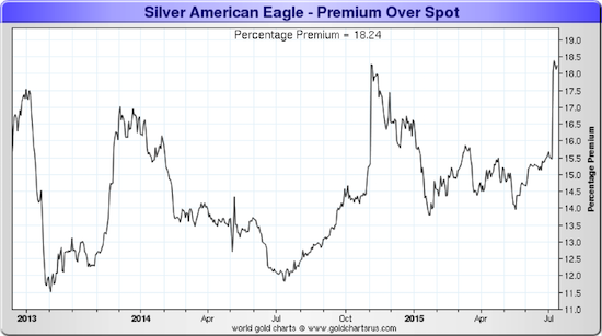
The premium on Silver Eagles is now as high as it was when silver made its multiyear low last November.
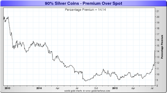
90% junk silver is particularly sensitive to premium increases, since it is no longer produced.
Conclusion: Caveat Emptor
The most important take away from all this is that it really doesn’t take much extra demand to wipe out the “on the shelf” supply of physical precious metals.
Keep in mind that a large percentage of physical metal buyers have no intentions to sell. This means that during the next big wave of demand, there will be that much less available metal to market. Read our recently released special report, , to learn more about this market undercurrent.
Remember – this surge in demand can come whether the price moves up or down in dollar terms. It was a $48 move downward in the price of gold that triggered the extra demand this month. If the move is $98 upwards, the same thing could occur as investors scramble to get in on the ground level of a new bull market. In fact, such a surge in price could be even worse for the supply picture, as people may begin to wake up to the inherent problems of our current monetary system.
Dickson Buchanan Jr. is the Director of International Development and a Senior Precious Metals Specialist at SchiffGold. He holds an MA in Economics from King Juan Carlos University and regularly contributes commentary and analysis on gold and financial markets. You can contact him directly at 888.465.3160 ext. 112.

 On the heels of continued volatile trading in key global markets, the Godfather of newsletter writers, 90-year-old Richard Russell, discusses what is really happening in the United States. Also, Dr. Paul Craig Roberts weighs in with his thoughts about the ongoing crisis in Greece.

Originally published July 31st, 2015.
In this update on the broad market S&P500 index we are going to look at no less than 5 charts for it, covering different time frames, the reason for this is that there are different points to make on each of these charts.
Before looking at the charts for the S&P500 index we are going to review first a range of charts, including the latest charts for Margin Debt and NYSE available cash. These charts provide the direst warning imaginable of impending trouble.
The NYSE Margin Debt chart shows that it is “through the roof” – way higher than it was at the 2000 and 2007 market peaks. When the wheel comes off, out will go the margin calls setting off a brutal self-feeding cycle of liquidation…

Chart courtesy of www.sentimentrader.com
The chart for NYSE Available Cash shows a shocking extreme negative cash situation far worse than that at the 2000 and 2007 market peaks, which is of course due to extreme leveraging on capital being employed to play the market. Once the market starts falling, this leveraging is going to work in reverse.

Chart courtesy of www.sentimentrader.com
The two charts above don’t suggest an ordinary bearmarket decline – they point to a devastating crash soon.
Next we take a quick look at a pair of charts that appeared in Zero Hedge, which show what happened to Junk Bond prices in 2008 ahead of the crash, and what is happening now. As you can see the same divergence is already evident, and it means trouble. The top chart shows the lead up to now, the bottom chart the lead up to the 2008 crash…

Now we will look at the latest Volatility Index (VIX) chart, which makes plain that a lot of investors are sitting contentedly in their comfy armchairs, perfectly happy with the current state of affairs, completely unaware that very soon their armchairs will be upended and they will find themselves sprawled on the floor….

It’s time to move on to consider a range of charts for the flagship S&P500 index. We are going to zoom in progressively, starting with the long-term 20-year chart.
On the 20-year chart we can see that, purely on a cyclical basis, we are overdue for a bearmarket after an 6-year bullmarket with no significant correction since 2011. What is most bizarre about this bullmarket is that it hasn’t even been the result of an economic recovery. It is has driven by printing money, misallocation of capital fuelled, by ZIRP and on company share buybacks, which in terms of genuine progress is about as effective as you climbing into a bucket and trying to lift yourself up by the handle. When you factor in inflation, this market hasn’t even made a new high – hasn’t got above its 2000 top.

Next we consider the 8-year chart, on which we see that the bullmarket from early 2009 has taken the form of giant bearish Rising Wedge, with volume steadily dwindling, which is bearish. With this Wedge having closed up and the market advance fizzling out, it is on the point of breaking down from it, and when it does the abrupt change in psychology will result in a devastating plunge, with the first two charts above suggesting that it will quickly become an absolute bloodbath. Bear ETFs will soar in price, especially the leveraged ones, and Puts will skyrocket.

On the 4-year chart, within the Rising Wedge shown on the 8-year chart, we see that all of the advance from late 2011 has occurred beneath the confines of a giant Distribution Dome, and the geometry of this Dome explains precisely why the advance has ground gradually to a halt this year, as it comes up against resistance at the top of the Dome. Unless it breaks out of the top of the Dome, which looks highly unlikely given the charts that we have already reviewed above for Margin Debt and NYSE Available Cash, not to mention the terrible breadth of the market now and declining Advance – Decline line etc, then the Dome must now force the market lower – and into quickly breaking down from the Wedge shown on the 8-year chart, with the dire consequences already outlined.

Zooming in closer still on the 1-year chart, we can see how the market’s advance has completely ground to a halt this year, with a horizontal resistance level at the top of the Dome now capping advances to the highs. A dangerous diminution of upside momentum is shown by the weakening MACD indicator at the bottom of the chart, and the current “bunching” of the index and its principal moving averages is what typically precedes a major change of trend. Once the support at the March low fails, which is at about 2040, things are likely to get ugly in a hurry – this is a key level to watch.

Finally we look at the 6-month chart on which we can see recent action in detail. This chart helps us to time further purchases of bear ETFs, and options, which are becoming steadily more attractive. We can see that we have had another weak rally from the 200-day moving average in recent days, following the Fed meeting, and as it approaches the resistance at the highs, the prices of bear ETFs and Puts of course improve. So this is the time to buy them. Note, however, with the Dome now starting to descend, the index may not make it as far as previous highs, so it is considered appropriate to buy before it gets there and with it looking like it is stalling out as this is written, now looks like a very good time.

Inverse ETFs based on the major market indices are a very good play here, because the major market indices are the façade of the market, which to many still looks OK, but beneath this façade the run rots deep, with the market’s Advance-Decline line in a negative trend and many stocks already below their 200-day moving averages. The market is very like one of those shiny red apples which has been left too long in the fruit basket – looks great on the outside but when you bite into it you make the distasteful discovery that it is brown right through and has been rotting from the inside out. THAT is the state of affairs that exists now, and it is precisely because these bear ETFs are based on the major indices, which are the shiny façade of the market, that they represent such great value now – once the façade comes crashing down these ETFs are going to soar, especially the leveraged ones. The sequel to this update is the article PREPARING FOR THE CRASH – Bear ETFs Shortlist, including leveraged ones, now up on www.clivemaund.com and we will soon be looking at a range of Put options for the crash on the site.
Perhaps rather strangely, gold could soar on this market crash, in contrast to what happened in 2008. Certainly this is what is implied by its latest COT chart shown below, which is the most bullish I have ever seen. The Commercials, who have never been long gold, have scaled back their shorts almost to 0, so they are clearly getting ready for something. What this implies is that, unlike in 2008, the dollar is going to drop with the stockmarket, which further implies that the flows of funds into the US will decelerate.

Posted at 1.40 pm EDT on 31st July 15. COT chart and interpretation added later.

 The Chinese stock market recently saw its biggest selloff in 8 years as the dramatic 8.5% fall in Shanghai “A” shares also rattled markets around the world.
For the past few weeks China has been balancing its desire to keep the equity market from a complete meltdown, while still courting the international investment community with hopes of being a dominant player in the capital and currency markets.
But recently The International Monetary Fund (IMF) warned China’s government about its concern over limiting investors’ freedom to take equity out of financial markets. These concerns were raised when the IMF met with officials in to discuss the chances of including the yuan in the fund’s basket of currencies, also known as Special Drawing Rights (SDR).
As China tries to balance the demise of its equity bubble while still keeping the illusion of free markets intact, two delusional narratives have started to circulate around Wall Street.
The first such Wall Street inspired delusion is that the collapsing Shanghai stock market will have no effect on the underlying Chinese economy. However, even though China’s 260 million trading accounts may be a relatively small percentage of its total population, it’s also the richest and most productive portion of its citizenry, which also happens to be equal to the entire U.S. population in 1993. And Chinese GDP growth accounts for 1/3 of total global growth. Therefore, we can already find the manifestation of slowing Chinese growth from the nascent fall in equity prices.
For example, the profit of China’s industrial firms dropped 0.3% in June from a year earlier, that reversed a 0.6% rise in May and 2.6% gain in April. For the first six months of 2015, industrial profits were 0.7% lower than a year earlier.
In June, China’s producer price index fell 4.8% on an annual basis, its 39th straight month of declines. In fact, the economy is headed for its poorest overall performance in a quarter of a century.
The second fallacy is Wall Street believes in the TV commercial that claims what happens in Las Vegas stays in Vegas. Or, in this case, what happens to the Chinese economy stays in China.
But the truth is the meltdown in China is already spreading all around the Asia Pacific region. For example, Taiwan’s year over year export growth has hit multi-year lows due to collapsing trade with China.
But perhaps the biggest indicator of the magnitude of China’s slowdown can be found in the global commodities market. Most pundits are trying to link the recent selloff in commodities strictly to the rising dollar as measured by the Dollar Index (DXY). But that Index is actually down about 3% since March. During which time the rout in precious and base metals, energy and agriculture has greatly accelerated.
We see the Bloomberg Commodities index now at a thirteen year low. Copper is down 28% for the year, tin is down 30%, and nickel is down 44%. And then we have gold. Last week China dumped 4 tons on the market, causing the price of the precious metal to fall almost 4% within a matter of seconds. This had little to do with the value of the dollar on the DXY, but it was rather mostly about the waning demand in China from its imploding economy and the need to sell what you can when capital controls are in place.
Indeed, these commodity prices began to plunge concurrently with China’s steep drop in officially reported GDP growth from 12% in 2010, to just 7% today — the real current growth rate in China is closer to 4% when measured by private data. It is no coincidence that the price of copper dropped from $4.52, to $2.37 during this same timeframe.
The true message of plunging commodity markets is that the Chinese government wasted $20 trillion worth of credit digging holes to mollify the fallout from the Great Recession of 2007; primarily creating a huge fixed asset bubble with little economic viability. And then forced another $1.2 trillion in margin debt to engender a consumption-based economy; primarily by creating a stock market bubble after the fixed asset bubble strategy began to fail miserably.
So where does this leave the global economy now? US GDP is growing at a meager 1.5% for the first half of 2015. And the second half looks even worse, as an organic U.S. slowdown meets cascading global trade. Adding to this malaise, it appears as though the handful of U.S. stocks that have led the rally are finally starting to join the hangover party. For instance, social media stocks are now crashing harder than commodity prices, with Yelp recently falling 27% in one day after dropping 60% YOY; Twitter has also tumbled 45% in the last 52 weeks; and Facebook recently dropping nearly 5% after reporting a miss in the number of eyeballs staring at their cellphones checking the like box.
But here is the most important take; the arrogance that led the Fed to believe it could save the world in 2008 by manipulating markets is causing Ms. Yellen and co. to promulgate the idea that it can now raise rates into a global slow down without negative repercussions — thereby, demonstrating its success in rescuing the economy from the Great Recession by proving interest rates can now rise with impunity.
However, the truth is the Fed hasn’t raised interest rates in a decade and will probably never be able to move much off the zero bound range without totally collapsing markets and the economy. I think the Fed is aware of this and that’s why it is continually finding excuses not to start a rate hiking cycle — just like it did yet again in the July meeting. Therefore, the real money to be made is in fading the massively overcrowded trade that believes U.S. stocks are immune from the worldwide economic slowdown and that the U.S. dollar will be in a secular bull market.
 Yves here. Get a cup of coffee. This is a detailed account of the long and tortured history of budget fakery in Greece and how it is has been aggressively defended by successive Greek governments. A tidbit from the post: one section is labeled “When revising wrong statistics is treason.”
By Sigrún Davídsdóttir, an Icelandic journalist, broadcaster and writer. She has earlier written on what Icelandic lessons could be used to deal with the Greek banks.
The word “trust” has been mentioned time and again in reports on the tortuous negotiations on Greece. One reason is the persistent deceit in reporting on debt and deficit statistics, including lying about an off market swap with Goldman Sachs: not a one-off deceit but a political interference through concerted action among several public institutions for more then ten years….. CLICK HERE to read the complete article


-
I know Mike is a very solid investor and respect his opinions very much. So if he says pay attention to this or that - I will.
~ Dale G.
-
I've started managing my own investments so view Michael's site as a one-stop shop from which to get information and perspectives.
~ Dave E.
-
Michael offers easy reading, honest, common sense information that anyone can use in a practical manner.
~ der_al.
-
A sane voice in a scrambled investment world.
~ Ed R.
Inside Edge Pro Contributors

Greg Weldon

Josef Schachter

Tyler Bollhorn

Ryan Irvine

Paul Beattie

Martin Straith

Patrick Ceresna

Mark Leibovit

James Thorne

Victor Adair