
Real Estate
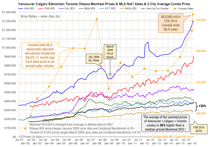
The chart above shows the average detached housing prices for Vancouver, Calgary, Edmonton, Toronto*, Ottawa* and Montréal* (the six Canadian cities with over a million people) as well as the average of the sum of Vancouver, Calgary and Toronto condo (apartment) prices on the left axis. On the right axis is the seasonally adjusted annualized rate (SAAR) of MLS® Residential Sales across Canada (one month lag).

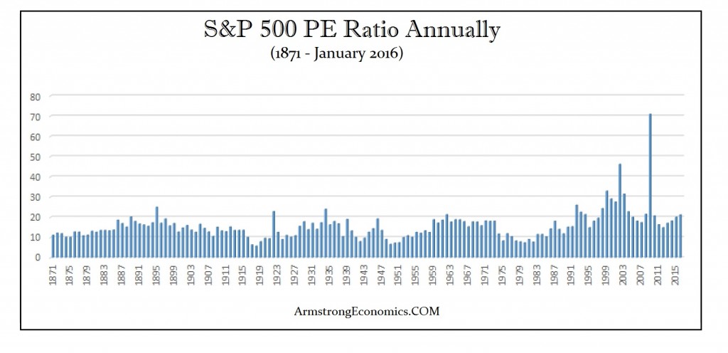
With all due respect, you have to look at this, not as a mania of speculative fever, but as a panic in government with a collapse in confidence. That is when money just seeks safety; not profit. A mania is a speculative boom where profit is the motive. What we face is the opposite. When capital is just trying to break even, the P/E Ratio rises to historical highs. Above is the P/E Ratio on the S&P 500 since the 2007 high. It rose to over 120 during the crash. This is why we warned that the market would make new highs and while Barrons reported that forecast, they were probably doing so tongue-in-cheek.
 Earlier today, we explained why so-called “helicopter money” can’t save the world when ZIRP, NIRP, and QE have all failed to revive global demand and boost inflation.
The reason: QE is helicopter money. That is, we’ve been doing this for 8 years and it hasn’t worked yet.
Some readers were reluctant to buy this rationale, but the fact is, just because the bank intermediary failed to do its part for Main Street doesn’t thereby mean this entire experiment isn’t still a farce. Think about the mechanics of it: 1) the government prints a liability (a bond), 2) that liability is sold to a primary dealer, 3) the central bank buys that government liability with yet another liability (dollars) that the government also prints.
That’s a scam. It’s deficit financing with one (very tenuous) degree of separation. The fact that the middlemen (the banks) didn’t pass along the benefits to you doesn’t make the mechanics of it any less ridiculous.
But if that’s helicopter money “v.1,” Main Street thinks it didn’t work out so well. Banks recovered, Jamie Dimon and Lloyd Blankfein became billionaires, financial assets soared, and everyday people got....continue reading HERE

Cautionary COT Data – Overbought Oscillators
We will look for an initial peak in Gold this month, possibly spiking up to the 38% or 50% speedlines ($1350 & $1460) . For now we remain bullish as long as Gold closes hold above $1180 ( $1170 intraday).
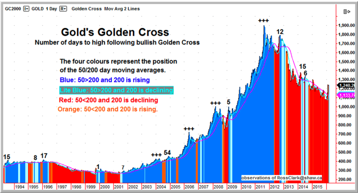
The Golden Cross.….continue reading HERE
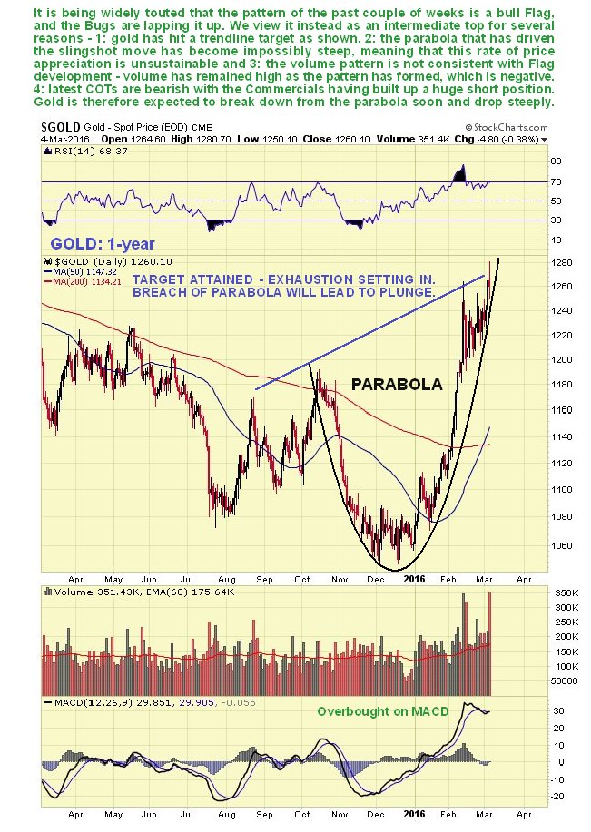
Many analysts and writers have described the pattern forming in the past couple of weeks in gold as a “bull Flag or Pennant” with some appearing to be “playing to the gallery” – i.e. telling their audience what they want to hear, which is that gold will continue to go up. I, on the other hand, decided that the triangle that had formed was not a continuation pattern, but a top, and said so about a week ago. So, as you will readily understand, I was not looking good when gold seemingly broke out upside on Thursday, and came in for considerable flak. However, on Friday there were some dramatic developments across the sector which look set to vindicate my stance.
When you buy a used car it is not enough to look at the clean shiny exterior and decide as many do, that the car is good – you have to know what its internal state is – the condition of the motor and the transmission etc. which means you have to poke around and dig deeper. In the same way it is not enough to look at the price pattern in something like gold and say “It’s looks like a bull Flag and therefore it is a bull Flag” – you have to know what’s going on beneath the surface – in the “internal plumbing” of the market so to speak, and we do this by using COT data and the volume pattern, and as we will see, the internal state of this market is not good at all and calls for a sharp drop soon that will take most by surprise. There are a number of compelling reasons to expect an intermediate correction in the Precious Metals sector imminently that could be severe, which we will now proceed to look at.
Starting with the 1-year chart for gold, we see that it has made a parabolic slingshot advance that has brought it to the trendline target shown, where the advance hit a wall. Many are expecting the choppy action of the past couple of weeks to be followed by another sharp upleg, but that looks highly unlikely for several reasons. In the 1st place, look at how steep the parabola has become – even if gold has started a new bullmarket, do you really expect it to just go up vertically, like a rocket, without any reactions or periods of consolidation?


-
I know Mike is a very solid investor and respect his opinions very much. So if he says pay attention to this or that - I will.
~ Dale G.
-
I've started managing my own investments so view Michael's site as a one-stop shop from which to get information and perspectives.
~ Dave E.
-
Michael offers easy reading, honest, common sense information that anyone can use in a practical manner.
~ der_al.
-
A sane voice in a scrambled investment world.
~ Ed R.
Inside Edge Pro Contributors

Greg Weldon

Josef Schachter

Tyler Bollhorn

Ryan Irvine

Paul Beattie

Martin Straith

Patrick Ceresna

Mark Leibovit

James Thorne

Victor Adair