
Gold & Precious Metals
Nearly two months ago I published a video in which I discussed conventional CoT analysis and the mistake many investors might make assuming Gold and gold stocks would undergo a big correction. The fact is a bull market that follows a nasty bear usually stays very overbought throughout its first year and therefore sentiment indicators remain in bullish territory. As a result of the primary trend change, conventional CoT analysis fails and requires an adjustment. Today we look at the Gold and Silver CoT’s while harping on a few of the mistakes people are making.
The first mistake people are making (and I’ve seen this quite a bit recently) is painting the commercial traders as smart money. This completely mischaracterizes that group. Commercial hedgers are the users, producers or consumers of the commodity. They are using the futures market to hedge in some way. As Steve Saville writes in his explanation of the CoTs, the commercials usually do not bet on price direction. Generally speaking they tend to fade the trend while speculators drive or follow the trend. Risk certainly rises for bulls when speculators increase long positions aggressively and we should be aware of that. However, we should look beyond nominal figures to get a better reading of the degree of speculation.
The second mistake is looking at the CoT’s in only nominal terms and not as a percentage of open interest. The nominal net speculative position in Silver is at an all time high, which sounds scary. However, as a percentage of open interest the net speculative position is nowhere close to an all time high.
In the chart below we plot Silver and its speculative position as a percentage of open interest. The current position is 45.7%, which is nowhere near the all-time highs seen in 2002 and 2004 of nearly 75%. Also note how the net speculative position does not tell us anything about the primary or long-term trend. Speculators were most bullish in 2002 and 2004 just after the start of a secular bull market. Speculators were least bullish in 2013. Silver bounced but continued to make new lows for a few more years!
Silver & Silver CoT
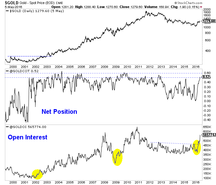
When considering open interest, Gold’s primary trend change has been confirmed yet the net speculative position in Gold is much closer to extremes than Silver’s. Take a look at the chart below and note the huge increases in open interest that immediately followed the lows in 2001, late 2008 and late 2015. A rise in open interest confirmed the trend change at those points. As of Tuesday, the net speculative position in Gold was 52.1%. Note that from 2003 to 2012 the net speculative position often peaked at 55% to 60%. Keep in mind, we do not know if Gold’s next peak will be at 55% or even 70%.
Gold CoT
Overall, the CoT is one of a handful of tools we use and we learned how to interpret and analyze it the hard way. Remember, the speculators drive the trend and it’s best to judge their position in terms of open interest. I do not see anything in the CoTs or price action of the metals or the miners that says they are about to endure a large correction. That will change at somepoint but for now weakness or consolidation is a buying opportunity.
Jordan Roy-Byrne, CMT
go to Jordan@TheDailyGold.com for an offer from Jordan
related

Michael asks Victor what the hottest stock market in the world is. Turns out its a Canadian index that’s up 28% since the 1st day of 2016! The CDN $ dropped 4% this week alone. Victor on where to from here on key markets….
….listen to the entire interview with Victor and Michael below:
{mp3}grant/050716va{/mp3}

Canadian Dollar chart below:


Quotable
What is our life? A play of passion,
Our mirth the music of division,
Our mother’s wombs the tiring-houses be,
Where we are dressed for this short comedy.
Heaven the judicious sharp spectator is,
That sits and marks still who doth act amiss.
Our graves that hide us from the setting sun
Are like drawn curtains when the play is done.
Thus march we, playing, to our latest rest,
Only we die in earnest, that’s no jest.
–Sir Walter Raleigh, Life
Commentary & Analysis
Chart View: A look at some charts we follow which may be of interest…
Page 2: Commodities/Stock Ratio
Page 3: Inflation in stocks versus commodities
Page 4: Japanese stocks versus the yen
Page 5: Copper as a bell whether?
Page 6: Silver looking good
Page 7: GBP/USD Weekly
Page 8: UK gaping current account deficit
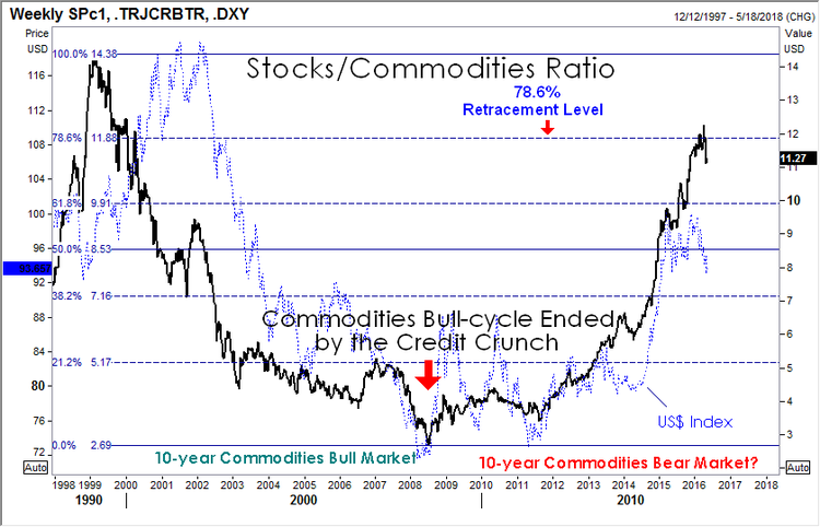
Stocks/Commodities Ratio: We shared this chart many moons ago in Currency Currents. Just checking in; nothing profound to add here other than to suggest how interesting the symmetry of this pattern. From left to right viewing the chart below, we saw a 10-year bear market move in the ratio (i.e. commodities outperformed stocks); and now we are in 8-years bull market move in the ratio, i.e. stocks have outperformed commodities). Obviously we don’t need to see a big bull move in commodities for this ratio to work lower; we only need to see stocks underperform.
Inflation? You bet. Not in real goods (yet) but definitely in stock prices (financial assets—money has to go somewhere). This is why the 1% are happy with the status quo. This is why those with professional jobs with access to capital are happy and asking: What recession? So all you brainiac’s who read The New York Times, The Wall Street Journal, or The Washington Post and actually believe the pap printed, and can’t quite figure out why all those stupid hicks in the hinterlands (I am happy to be among them) are voting the way they do—take a look. Real economy in the toilet. The financial economy for those educated in the right places, and those who believe they are but are simply lucky, is doing very well.
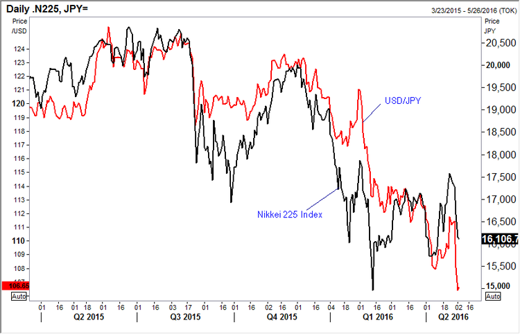
Japanese Stocks versus the Japanese yen: Gosh the yen looks expensive and overdone. The Bank of Japan policy backfired relative to the needs of Japan when NIRP (Negative Interest Rate Policy) was announced. We want to load up long on $/yen, but this chart gives us pause. It shows Japanese stocks, measured by the Nikkei 225 Index (black line), and USD/JPY currency pair (red line). Visually, a pretty tight correlation—weak stocks and strong yen. It is interesting because the Japanese government already owns a huge amount of major listed stocks—what will it take to drive the Nikkei 225 higher? We aren’t sure, but when we see it I think we should get long USD/JPY. Note: A fresh swing low in USD/JPY, but not yet for the Nikkei. Maybe a non-confirmation setting up? Stay tuned.
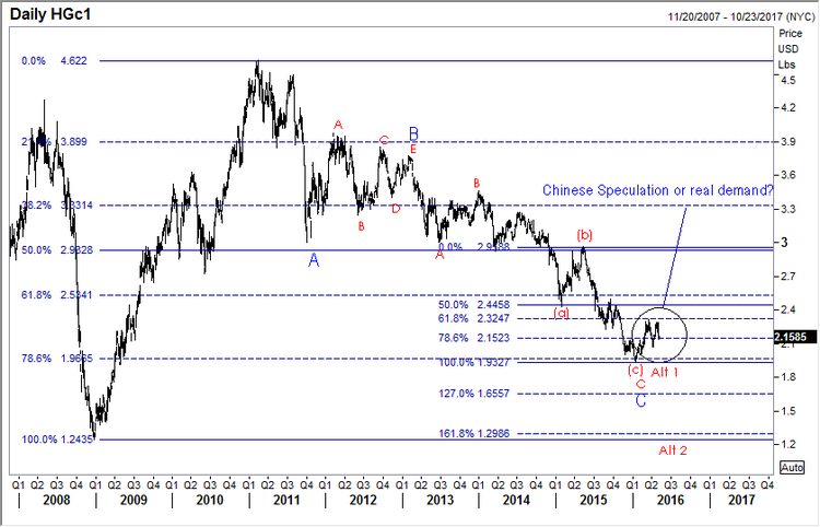
Copper, the big question. Real demand or Chinese speculation accounting for the recent “rally”? If global growth is indeed on the wane yet again, and the IMF is so warning, as data across the board isn’t encouraging, we would expect copper to tumble again. Maybe it isn’t over till we see a round trip in the metal (labeled at Alt 2). This may very well be the bell whether for the rest of the commodities pack. Worth watching even if you don’t care to play. Note the retracement down to yet another key level—78.6% (1.9665)–before turning higher. Obviously hindsight makes all of us geniuses, but it is interesting how often these key levels are respected.
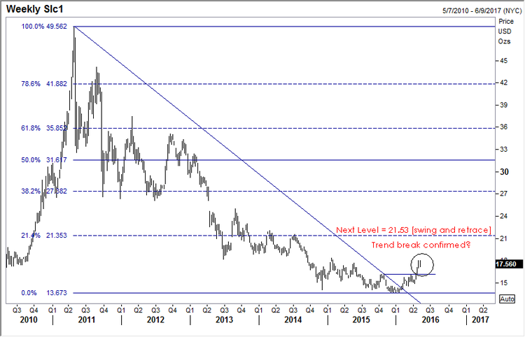
Silver looking good. We got a trend break higher in silver back on February 2nd, 2016 and we got some confirmation on a move above 15.90 [a la Victor Sperandeo trend line technique]. Now looking for at least 21.53 if this move is for real. Resistance becomes support, so a close back below 15.90 concerns.
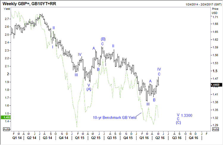
GBP/USD Weekly: We shared this chart with our subscribers yesterday, in support of our short position in the pound. I won’t belabor the Brexit issue, you all know the status and the propaganda so associated. I do wish to add: Why the Brits would ever listen to anything President Obama says regarding Brexit is beyond my comprehension—Mr. Meddler he was on his latest trip to Europe. You’ve got enough of your own problems here at home Mr. President, in case you haven’t noticed. And now that you are playing the role of Hillary Clinton’s full-time mouthpiece and hit man, just open up a can of STHU when it comes to Brexit and let the Brits decide for themselves what they care to do. And on that score, it seems, based on the latest data, the UK economy is slowing. Whether Brexit related or not, no matter. The pound seems to be losing yield coverage as growth fades; and as you can see in the chart below, there seems a pretty good correlation with the direction of the UK 10-year benchmark yield (green dotted line) and GBP/USD. The chart on the next page is the UK current account. It shows massive red ink. Not sure it this matters. But if it does start to matter, it likely won’t be good for British pound sentiment.
UK Currency Account Quarterly: Ugly to uglier!

Happy Friday. Now the really tough question: Gin and tonic (Beefeater 24), or single malt (Glenmorangie 10 year)?
Jack Crooks
President, Black Swan Capital
related: What Gold Does In A Currency Crisis, Canadian Edition
 How to Analyze Any Stock or Market in 10 Seconds
See the actual trading charts Tyler was talking about today and how he used them to make good trades this week. So important for investors to learn these basic skills.
No special software is required, just log on at the webinar time and watch Tyler’s live presentation including question and answer periods. AND IT”S FREE! ~ Ed.

We just got through another Berkshire Hathaway shareholders meeting (something I hope to never attend), where Warren Buffett gave us an update on his “hedge funds vs. S&P 500” bet.
Back in 2008, Buffett made a very loud, annoying bet that the Vanguard S&P 500 index fund would outperform a basket of hedge funds over 10 years. Eight years into the 10-year period, Buffett is winning pretty handily. In the classic understatement we have come to expect from a former Business Insider editor, Joe Wiesenthal said that Buffett is “absolutely crushing it” on his trade.
Indeed he is. Here is the chart.

So a few things here. Buffett is very cynical and likes to take advantage of people’s stupidity. He also famously bet a billion dollars that nobody would pick a perfect NCAA tournament bracket, which he was mathematically certain to win.
This bet was a no-brainer from the start. Everyone knows that active managers underperform passive managers in the long run—this is not new. It’s been around since Malkiel and his random walk theory decades ago. Buffett is feeding the prevailing sentiment, which is that Wall Street people are corrupt and dishonest and charge lots of fees and add no value. People believe this because Buffett says it and he has credibility (hopefully they do not take his advice about drinking five Cokes a day).
But I’m going to ask you the same question I asked myself when I read A Random Walk Down Wall Street almost 20 years ago: If it were really true that active management was a fool’s errand, and that the hundreds of thousands of people who work in the money management business add no value, then why does it exist?
Because they do add value.
Minimizing Volatility
Go back to the chart above—what is the first thing you notice? I hope you notice that while actively managed funds underperform in up years, they outperform in down years.
There are many reasons for this, the first being that a hedge fund manager can go to cash. He can also short things, or even just go outright short. But even Buffett knows that the point of professional money management is not to simply beat the S&P 500.
The point is also to minimize volatility. Because if you can’t handle the volatility, then you’re likely to vomit out of your investment at the worst possible time—on the lows.
This is very important. Vanguard offers a whole slate of very low-fee index funds. You can sign up at Vanguard.com and send them some money and get started. You can look at the 1/3/5/10-year performance of these funds.
Now, here is the $24,000 question: Do you think people really realize the performance in these funds, or maybe do a bit worse?
They definitely do worse, because human beings are human beings, and if you are long the Vanguard Energy Fund, and it goes down 40%, you are going to barf it, and then you are going to buy it back when it goes up 40%. If you instead invested in a hedge fund, which was rolling around with 20% cash and shorted stuff on the way down, maybe you would only lose 15%—and make it all back, and then some, on the way up.
But guess what—minimizing volatility enabled you to stay in the trade and continue to compound returns over time. If you barf, the compounding comes to an end.
Buffett likes to say that you should buy and hold stuff forever, like he does, but not everyone is Buffett. Not everyone has permanent capital, not everyone has godlike status among his shareholders, and quite frankly, not everyone has the constitution Buffett has.
When things go down, Buffett buys more, which is what you are supposed to do (if you are a value investor). He says you are supposed to have a really long time horizon, like, forever. He is right. But most people can’t do that.
I bet Vanguard has data on what the actual rate of return of their shareholders is. I bet it is nowhere near that of the S&P 500. I bet it is very poor—even negative!
But at least the fees are low…
The Brokerage Industry
In addition to active management, the other class of people on Wall Street who get beat up pretty consistently are the brokers. The conventional wisdom is that these guys add no value and get paid to churn your account and jam you into mutual funds with fees so they get kickbacks. Some or all of that may be true. But you know what else they do? They talk you out of selling on the lows.
The most important function of a broker or investment advisor is to save you from your own worst instincts. They are amateur psychologists—when the market goes down 10-15%, they get calls from all the widows and orphans who want to sell their XYZ utility stock. The broker talks them out of it. He is acting in his own self-interest because he doesn’t want to lose assets, but temporarily, the interests of the broker and his customers are aligned. The broker is actually doing right by the investing public, by keeping them invested.
Of course, every 50 years we have this extinction-level event like the financial crisis, but even then, you would have been much better off holding on to your hat (just like Buffett).
The Conventional Wisdom Is (Almost) Always Wrong
The conventional wisdom is that:
- Active management is dumb, you just need to be in index funds
- Hedge funds add no value, considering how much they charge
- Brokers are fools
All wrong. If hedge funds really added no value, then why would the richest people in the world invest in them? Are they all stupid?
Professional money management is first and foremost about minimizing losses, which is something you don’t get from an index fund. That takes talent, and costs money. An individual hedge fund can blow up from time to time, but the industry, by and large, does a pretty good job of conserving capital and—more importantly—giving you exposure to uncorrelated strategies that you can’t get at Vanguard.com.
Buffett knows all this, but ironically, it is Berkshire that has been doing a good job of closet indexing of late.
There are legitimate criticisms of active management (like closet indexing, for one) and there are legitimate criticisms of brokers, but to say that both industries shouldn’t exist is just moronic.
Let me put it this way. If you won the $350 million Powerball, would you put it all in the Vanguard S&P 500 Index Fund?
I didn’t think so.
…related: For a market situation that could very well precede a market pullback/collapse check out Morris Hubbart’s Dow Breakout of Danger Chart

Jared Dillian
Editor, The 10th Man![]()

-
I know Mike is a very solid investor and respect his opinions very much. So if he says pay attention to this or that - I will.
~ Dale G.
-
I've started managing my own investments so view Michael's site as a one-stop shop from which to get information and perspectives.
~ Dave E.
-
Michael offers easy reading, honest, common sense information that anyone can use in a practical manner.
~ der_al.
-
A sane voice in a scrambled investment world.
~ Ed R.
Inside Edge Pro Contributors

Greg Weldon

Josef Schachter

Tyler Bollhorn

Ryan Irvine

Paul Beattie

Martin Straith

Patrick Ceresna

Mark Leibovit

James Thorne

Victor Adair