

Quotable
What is our life? A play of passion,
Our mirth the music of division,
Our mother’s wombs the tiring-houses be,
Where we are dressed for this short comedy.
Heaven the judicious sharp spectator is,
That sits and marks still who doth act amiss.
Our graves that hide us from the setting sun
Are like drawn curtains when the play is done.
Thus march we, playing, to our latest rest,
Only we die in earnest, that’s no jest.
–Sir Walter Raleigh, Life
Commentary & Analysis
Chart View: A look at some charts we follow which may be of interest…
Page 2: Commodities/Stock Ratio
Page 3: Inflation in stocks versus commodities
Page 4: Japanese stocks versus the yen
Page 5: Copper as a bell whether?
Page 6: Silver looking good
Page 7: GBP/USD Weekly
Page 8: UK gaping current account deficit
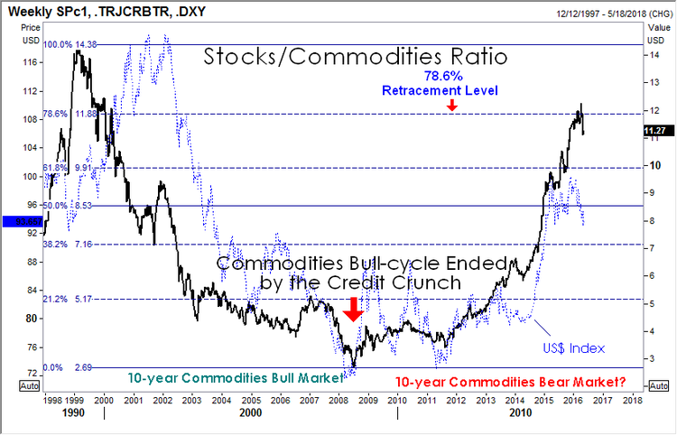
Stocks/Commodities Ratio: We shared this chart many moons ago in Currency Currents. Just checking in; nothing profound to add here other than to suggest how interesting the symmetry of this pattern. From left to right viewing the chart below, we saw a 10-year bear market move in the ratio (i.e. commodities outperformed stocks); and now we are in 8-years bull market move in the ratio, i.e. stocks have outperformed commodities). Obviously we don’t need to see a big bull move in commodities for this ratio to work lower; we only need to see stocks underperform.
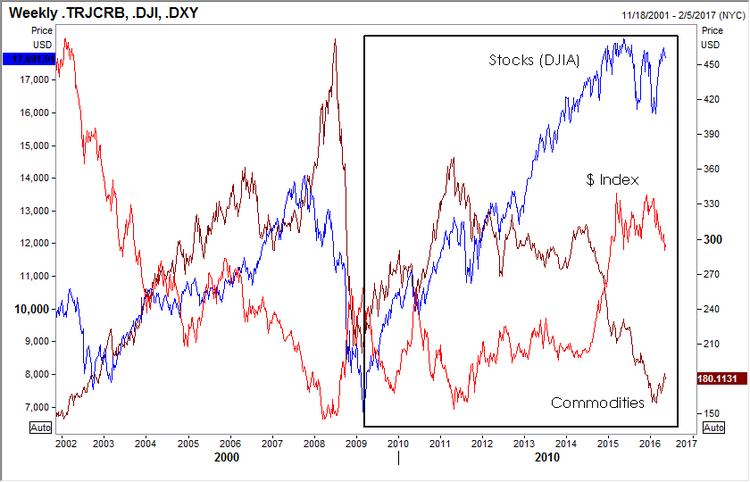
Inflation? You bet. Not in real goods (yet) but definitely in stock prices (financial assets—money has to go somewhere). This is why the 1% are happy with the status quo. This is why those with professional jobs with access to capital are happy and asking: What recession? So all you brainiac’s who read The New York Times, The Wall Street Journal, or The Washington Post and actually believe the pap printed, and can’t quite figure out why all those stupid hicks in the hinterlands (I am happy to be among them) are voting the way they do—take a look. Real economy in the toilet. The financial economy for those educated in the right places, and those who believe they are but are simply lucky, is doing very well.
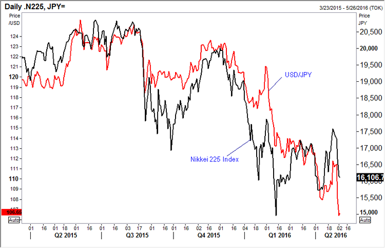
Japanese Stocks versus the Japanese yen: Gosh the yen looks expensive and overdone. The Bank of Japan policy backfired relative to the needs of Japan when NIRP (Negative Interest Rate Policy) was announced. We want to load up long on $/yen, but this chart gives us pause. It shows Japanese stocks, measured by the Nikkei 225 Index (black line), and USD/JPY currency pair (red line). Visually, a pretty tight correlation—weak stocks and strong yen. It is interesting because the Japanese government already owns a huge amount of major listed stocks—what will it take to drive the Nikkei 225 higher? We aren’t sure, but when we see it I think we should get long USD/JPY. Note: A fresh swing low in USD/JPY, but not yet for the Nikkei. Maybe a non-confirmation setting up? Stay tuned.
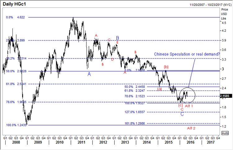
Copper, the big question. Real demand or Chinese speculation accounting for the recent “rally”? If global growth is indeed on the wane yet again, and the IMF is so warning, as data across the board isn’t encouraging, we would expect copper to tumble again. Maybe it isn’t over till we see a round trip in the metal (labeled at Alt 2). This may very well be the bell whether for the rest of the commodities pack. Worth watching even if you don’t care to play. Note the retracement down to yet another key level—78.6% (1.9665)–before turning higher. Obviously hindsight makes all of us geniuses, but it is interesting how often these key levels are respected.
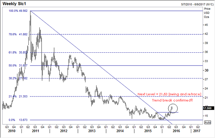
Silver looking good. We got a trend break higher in silver back on February 2nd, 2016 and we got some confirmation on a move above 15.90 [a la Victor Sperandeo trend line technique]. Now looking for at least 21.53 if this move is for real. Resistance becomes support, so a close back below 15.90 concerns.
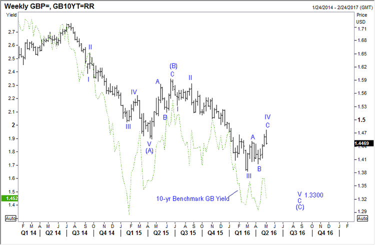
GBP/USD Weekly: We shared this chart with our subscribers yesterday, in support of our short position in the pound. I won’t belabor the Brexit issue, you all know the status and the propaganda so associated. I do wish to add: Why the Brits would ever listen to anything President Obama says regarding Brexit is beyond my comprehension—Mr. Meddler he was on his latest trip to Europe. You’ve got enough of your own problems here at home Mr. President, in case you haven’t noticed. And now that you are playing the role of Hillary Clinton’s full-time mouthpiece and hit man, just open up a can of STHU when it comes to Brexit and let the Brits decide for themselves what they care to do. And on that score, it seems, based on the latest data, the UK economy is slowing. Whether Brexit related or not, no matter. The pound seems to be losing yield coverage as growth fades; and as you can see in the chart below, there seems a pretty good correlation with the direction of the UK 10-year benchmark yield (green dotted line) and GBP/USD. The chart on the next page is the UK current account. It shows massive red ink. Not sure it this matters. But if it does start to matter, it likely won’t be good for British pound sentiment.
UK Currency Account Quarterly: Ugly to uglier!

Happy Friday. Now the really tough question: Gin and tonic (Beefeater 24), or single malt (Glenmorangie 10 year)?
Jack Crooks
President, Black Swan Capital
related: What Gold Does In A Currency Crisis, Canadian Edition


