
Energy & Commodities
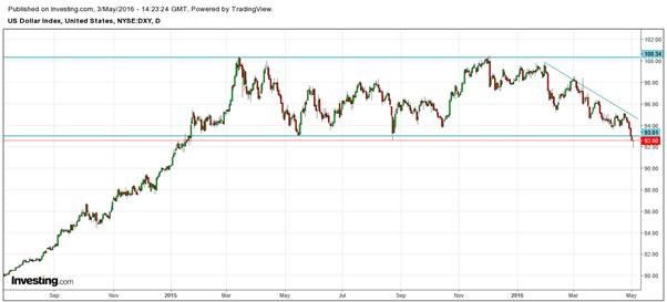
Traders who follow the price of gold and silver, should keep an eye out on the U.S. dollar index. The dollar has been within a trading range for more than a year. During December of 2015, the dollar rose to test the highs at 100, however, since February of 2016, the dollar has been in a downtrend, as shown in the chart below.
The FED has reduced the expectations of a rate hike in 2016 from one full percentage point, in the beginning of the year, to a half percent and perhaps to none at all. However, my expectation is that the FED may have to start rolling back this increase before the end of 2016.
The bullishness in the dollar was sparked by expectations of a change in the monetary policy of the FED. Market participants believed that the Zero Interest Rate Policy, NIRP, would end and that the rates were on an upward trajectory. However, world economic conditions have deteriorated since the beginning of 2016 and the ECB and BOJ both responded with Negative Interest Rates, NIRP and more QE. Consequently, the FED was forced to delay their rate hikes.
Last week’s shot term breakdown of the dollar, below the critical support of 93, was a bearish sign which can bring the dollar further down to the 86 levels. But the dollar posted a solid rally by the end of the week to regain that critical support level for the time being.
Although gold is a commodity, it is used as a hedge against ‘uncertainties’ and ‘crisis points’ which gives it a different edge. Gold, also behaves differently because of its’ usage as money, as ‘a store of value’, for many centuries for both individuals and countries.
Due to the ‘meaningless’ monetary policies of the various global Central Banks, gold will follow its’ unique behaviour. I have explained this earlier and my models have been very timely in forecasting the turning points.
Gold will have a one-way move higher with many corrective phases on its’ impulsive new uptrend, therefore, I always keep my subscribers immediately informed so as they know when to make the next profitable trades of both gold and silver. The next trade I feel is just around the corner.
Chris Vermeulen
related by Jack Crooks: Chart View: A look at some charts we follow which may be of interest…

In the previous week, crude oil moved higher once again and re-tested the strength of the key resistance zone. Despite this improvement, oil bulls didn’t manage to hold gained levels, which resulted in another invalidation of earlier breakouts. What happened at the same time with oil stocks? Will they follow crude oil’s moves in the coming weeks? Let’s jump right into charts (chart courtesy of http://stockcharts.com) and find out what can we infer from them.
Let’s start today’s article with the long-term chart of oil stocks.

Looking at the monthly chart, we see that oil bulls push the XOI higher in the previous month, which resulted in invalidation of the breakdown under the long-term black resistance line. This positive signal triggered further improvement and oil stocks increased slightly above the upper border of the blue declining trend channel. Despite this improvement, oil bulls didn’t manage to hold gained levels, which resulted in a decline under this important resistance line. Earlier this month, we saw similar price action, but the index dropped once again, invalidating earlier breakout. This is a bearish signal, which suggests further deterioration and (at least) a test of the previously-broken black long-term support/resistance line (currently around 1,070) in the coming weeks.
Finishing today’s commentary on the long-term picture, we would also like to draw your attention to the current position of the monthly indicators. As you see, we saw similar signals at the beginning of Feb 2015. Back then, they didn’t trigger significant upward move, which suggests that they are not reliable enough.
Are there any other factors that could encourage oil bears to act? Let’s examine the weekly chart and find out what can we infer from it.

From this perspective, we see that the recent upward move took oil stocks to the red resistance line based on the mid-Dec 2014 low (the bottom of the potential first wave). As you see the upward move since Jan was much bigger than correction between Dec 2014 and Apr 2015, which suggests that the index might create a wave 4 in a 5-waves downward trend (according to Elliot wave theory).
If this is the case, further declines in the coming weeks should not surprise us – especially when we factor in sell signals generated by the CCI and Stochastic Oscillator. Is it more reliable than monthly indicator? In our opinion, it is, because all sell signals generated since 2014 preceded sizable downward moves, which increases the probability that we’ll see similar price action later this month.
Will the very short-term picture confirm this scenario? Let’s check the daily chart.

On the very short-term chart, we see that oil stocks extended gains since our previous Oil Investment Update was posted and approached the resistance zone created by the late-Nov highs and the barrier of 1,200, which triggered a correction of the earlier upward move. With this decline, the XOI dropped under the medium-term green support line, which is a bearish signal that suggests further deterioration – especially if we see invalidation of the breakout above the 200-day moving average. Additionally, sell signals generated by the indicators are still in play, supporting oil bears and lower prices. If this is the case and oil stocks move lower once again, the initial downside target would be around 1,032-1,038, where the green support zone and the 50% Fibonacci retracement level (based on the Jan-Apr rally) are.
Summing up, the resistance zone created by the late-Nov highs and the barrier of 1,200 triggered a correction, which took oil stocks not only under the medium-term green support line (seen on the daily chart), but also below the upper border of the long-term declining trend channel marked on the long- and medium-term charts. In this way, the XOI invalidated earlier small breakouts, which is a bearish signal that suggests further deterioration in the coming weeks.

Summary
New lows are significant.
The bounce – currencies are less volatile than other assets.
Central bank policies are confusing.
Commodities are sending signals.
The trend is your friend.
As the weekly chart highlights, during the week of November 30, the dollar traded to new highs and then closed below the lows of the previous three weeks, creating a bearish key reversal trading pattern on the weekly chart.
….for more analysis and Larger Chart go HERE

related:
Eight “New Normal” Charts That Are Insanely Abnormal — and Dangerous
A young man is a theory; an old man is a fact.
Edgar Watson Howe
The first answer that comes to one’s mind is yes, as this economic recovery has been nothing but an illusion. The unemployment rate might have dropped, but the way the BLS (Bureau of Labour Statistics) calculates this figure is questionable at best. They conveniently do not include individuals who have stopped looking for a job in their calculation. Mind you, many of these people stopped looking for a job; not because they no longer want to work, but after trying a countless number of times without success, they simply gave up and assumed they would never land a job. The majority of the new jobs created are low paying jobs and in many cases, they are only part time jobs. Many individuals are working two and sometimes three jobs just to be able to make ends meet; this is not a sign of an improving economy. Over 6.5 million Americans work part-time jobs, but all of them seek full-time jobs; before the so-called great recession, only 4.5 million Americans worked part-time and more importantly, we did not waste trillions of dollars trying to create an illusion that all was well. This money could have been put to better use, but it was not and the same will hold true going forward. Instead of trying to deal with the underlying issues, more money will be flushed down the toilet to maintain the illusion that things are not so bad.
The corporate world issues several signals that all is not well; more companies are cutting their dividends in a sign that all is not well on the economic frontier. However, an even clearly signal comes from the number of companies using stock buybacks to boost their EPS. None of the companies are going to state this in the open, but if you calculate many of the companies that have announced massive share buybacks in the past 2-3 years, you will notice that a large percentage of them would not make their earnings or appear to grow their earnings without these share buyback programs. This is why every year during this so-called fake economic recovery the dollar amount dedicated to share buybacks has risen and will continue to rise in the foreseeable future; it is the easiest way to boost earnings.
All these factors and more would lead you to believe that the market should have crashed long ago. However, it has continued to trend higher. The forces behind the market are divorced from reality. It’s hot money that is powering this market and will continue to power this market. This is why this is probably the most hated bull market in the history of all bull markets. The world is embracing negative rates and so that means that even more hot money will flow into this market. It will lower the cost of borrowing, and the corporate world will go on feeding frenzy once negative rates hit the US.
Thus even though logic dictates that this market is ready to crash and burn, it probably will not. We will witness extreme moves in volatility, and many will mistake strong corrections for crashes; Aug of 2015 and Jan 2016 are two such examples that had the bears and naysayers out in full force yelling that the world was about to end. We expect the markets to experience stronger and stronger corrections, the higher it trends, but this market will not crash until the masses are finally forced to embrace this bull market.
We can see that the mass mindset is still not ready to give up; this is reflected in the story below;
Amid its biggest about-face in nine decades, a funny thing has happened in the U.S. stock market, where rather than loosen their grip bears have grown ever-more impassioned. They’ve sent short interest to an eight-year high and above $1 trillion, by one analyst’s math. Position reports from the Commodity Futures Trading Commission show mutual fund managers are more skeptical now than any time since at least 2010.
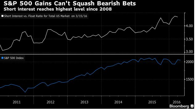
The bears are shorting the market to the tune of $1 trillion. Sure this could trigger a correction, but they started to short so long ago, that at the height of the correction, they might if they are lucky hit breakeven. Do you think they will have the sense to bail out at that point? Well, we hope so, but history indicates otherwise; they will be chagrined and start screaming from the top of their lungs that the end is nigh, and that is when the markets will bottom again. The subsequent rally will erase any temporary gains they might have experienced forever. We have stated over and over again that the stronger the correction, the better the buying opportunity for a long time, most recently in Aug of 2015 and Jan of 2016, for one simple reason; the masses cannot win. History is clearly indicative of this; from the tulip bubble to the financial crisis of 2008, the masses were always on the wrong side of the markets.
Credit Suisse Group AG’s Fear Barometer is triggering a bullish signal from a contrarian perspective
The index, which measures the opportunity cost of buying protection against a decline in stocks, usually sees increases like this due to higher demand for “puts,” or options which give investors the right to sell equities, and lower demand for “calls,” which give the right to buy. Specifically, the barometer calculates how far “out of the money” an investor would have to go to purchase a three-month put on the S&P 500 that is the same price as a 10-percent out of the money three-month call option. This time, however, the firm says the entire move was driven by lower demand for calls.This means that people are putting a much higher probability on stocks falling rather than rising. “The derivatives market is assigning less than 1 percent probability the market will rise by 10 percent in the next three months vs. 17 percent probability it will fall by 10 percent,” wrote Credit Suisse’s Mandy Xu.
Game plan
The markets are rather overbought and begging for a reason to let out some steam. Given the strong run up the markets have experienced, it is a just question of time before they start to pull back. The markets are extremely volatile so it would not surprise us if the Dow experiences a strong correction. However, do not confuse a correction for a crash. The Fed has indicated that it will do whatever is needed to keep this market afloat and maintain the illusion that all is well. They still have plenty of room to manoeuvre as we have not yet started to embrace negative rates. While logic dictates this bull should crash and burn; the forces that are driving this market do not operate on those realms.
The wise man regulates his conduct by the theories both of religion and science. But he regards these theories not as statements of ultimate fact but as art-forms. John B. S. Haldane
…related also by Sol Palha:
Dow Bull Not Ready to Crash Yet

Over the last couple of weeks, the market has been working off the overbought condition that accrued from the surge off the February lows. As I wrote recently:
“With the markets still extremely overbought from the previous advance, the easiest path for prices currently is lower. The clearest support for the markets short-term is where the 50 and 200-day moving averages are crossing. I currently have my stop losses set just below this level as a violation of this support leaves the markets vulnerable to a retest of February lows.”

“On a short-term (daily) basis, the current correction is still within the confines of a more normal “profit-taking” process and does not immediately suggests a reversal of previous actions. As shown in the chart above, support currently resides at 2020 & 2040 with the 50-day moving average now trading above the 200-day. “
The yellow band in the chart above is the ongoing trading range the market has remained mired in since May of 2014.
As I have stated in the past, by the time a rally occurs that is strong enough to reverse bearish signals, the market is generally extremely overbought. The market must then work off that overbought condition before the next advance can occur.
“The current correction was not unexpected. It was a function of time before the extreme short-term extension of the market corrected. Like stretching a rubber band to its limits, it must be relaxed before it is stretched again. The question is whether this is simply a “relaxation of the extension” OR is this a resumption of the ongoing topping and correction process?”
Should I Stay Or Go?
It is the last part of the statement above that I want to address this week.
Is this just a correction within the confines of a bullish advance OR is the recent market action just a continuation, and eventual completion, of a market topping process?
The answer: It depends on your investment time frame.
If you are a trader with a time horizon that is from days to a couple of months, the backdrop to the markets are currently more bullish than bearish. As shown below, the number of advancing stocks has broken out of recent downtrends which has historically related to more bullish underpinnings.

However, if you are a longer-term investor, particularly within a couple of years of retirement, market dynamics are still exceedingly negative. As shown below, despite the recent surge in the market, not unlike that seen in Oct 2014 and 2015, is still contained within a topping process as witnessed during the peaks of the previous two bull markets.

As Michael Kahn penned this past week in Barron’s:
“Like life, the stock market is rarely black or white. Right now, however, the outlook is particularly muddled. In technical analysis, when moving averages cross over each other to the downside we call it black. When they cross to the upside we call it golden. Now, the market is giving off mixed signals, making it no more than a bland beige.”
This is a problem for investors, who despite saying they are long-term investors are always driven by short-term market swings which impact emotional biases. He concludes:
“There is a good argument that stocks are ripe for a correction after a sharp rally, but with the undercurrents in sectors, interest rates, and breadth there is not enough evidence to hand the reins over the bears. Bulls, however, do not have much room for error. The falling U.S. dollar may be the handwriting on the wall, and the Fed better be very careful with its decision at next month’s meeting.”
It is this ongoing “limbo” that continues to weigh on investor sentiment. While the “bulls” have once again emerged onto the field, there is not enough “evidence” currently to suggest an aggressive risk posture in portfolios.
As Bill Henry once quipped: “It is better to be out of a bull market than fully invested in a bear market.”
…read Lance’s “It’s all Connected and the Monday Morning Call HERE (scroll Down)


-
I know Mike is a very solid investor and respect his opinions very much. So if he says pay attention to this or that - I will.
~ Dale G.
-
I've started managing my own investments so view Michael's site as a one-stop shop from which to get information and perspectives.
~ Dave E.
-
Michael offers easy reading, honest, common sense information that anyone can use in a practical manner.
~ der_al.
-
A sane voice in a scrambled investment world.
~ Ed R.
Inside Edge Pro Contributors

Greg Weldon

Josef Schachter

Tyler Bollhorn

Ryan Irvine

Paul Beattie

Martin Straith

Patrick Ceresna

Mark Leibovit

James Thorne

Victor Adair