
Daily Updates
Peter Grandich looks at the Stock Market, Gold, US Dollar & Interest Rates?
It’s one of the great mysteries of the market this year. For the first half of the year, the HUI Gold Bugs Index — made up of gold mining stocks — was down 9%, despite the fact that the price of gold was up 30%. What gives?
Normally, gold stocks give its investors some leverage to the gold price. Historically, gold stocks move 2-3% for every 1% move in gold. Not so in 2011.
There are some reasons for this. In order of importance, I rate them as follows:
1. The cost of production is up a lot.
Energy costs represent 20-35% of costs. Then there are steel costs, chemicals and labor — not to mention declining grades, which mean chewing through more rock per ounce of gold mined. As a result of these rising costs (and the next bullet), cash profit margins for the industry are not much higher than they were three years ago, even though gold is much higher.
There is little relief coming here, though the retreat in the price of oil helps. This can also be turned around, however, as a positive for some low-cost, high-margin gold miners. It makes their properties all the more valuable and gives you a good cushion investing in them.
2. Taxes have gone up huge.
CIBC notes, in a recent report, that cash taxes per ounce mined have gone up 1,200% in the last six years! Put another way, taxes are up to about $200 an ounce from under $20 an ounce six years ago. This is a statistic that went from practically meaningless to heavy anchor in just six years.
Again, there is little relief coming on No. 2. Political risks will probably play a bigger role in gold mining as gold prices rise, giving politicians incentive to take more. Nationalization? Confiscatory taxes? These are concerns. Again, this can be turned around as a positive for gold stocks in safer jurisdictions.
3. There is much skepticism about the price of gold holding its big gains this year.
As a result, there is reluctance on the part of investors to give gold mining shares the full benefit of the price increase when they think about what they are worth. You can see this in Wall Street research in which analysts assume lower gold prices going forward.
Only time will take care of this skepticism. The longer gold sticks around at $1,700-1,800 an ounce, the more the market will believe it is here to stay. This is the way markets work. Every bull market must overcome disbelief and skepticism as it unfolds. Bull markets die when there are no more disbelievers. They die when there are no more skeptics. We are a long way from that with gold.
Notwithstanding all of the above, gold stocks are fundamentally cheap based on cash flow. One of the most remarkable charts I’ve come across is the nearby one showing the collapse in the cash flow multiples of gold stocks. They’ve gone from over 20 times in 2008 to about 10 times this August!
The last time gold stocks got this cheap, on this basis, was back in 1979, when the group touched 8.5 times cash flow. This preceded a parabolic move in gold stocks in which they ultimately ran up four-fold. The 1970s is an interesting period to look at because gold stocks also lagged the price of the metal all the way up.

The chart above is a beauty from CIBC, which clearly shows how the 1970s unfolded. I can certainly see some scenario like that — in which cash flow multiples hit a floor and then spike — playing out in the 2011-12 timeframe. Which means you don’t want to sell gold stocks right here. At worst, you hang on to them, even the dogs. (The old saying is, “In a hurricane, even turkeys will fly.”) When that rush comes for gold stocks, they will all go up.
Moreover, looked at in terms of price to net asset value, gold stocks are trading about where base metal stocks are. This has never happened before. Gold stocks have always traded at significant premiums to base metal stocks. So this is another value metric that favors gold stocks and their investors.
If you don’t own gold stocks yet, now is a great time to buy them. And if you already own them, you should certainly hang on, or add to your favorites.
Regards,
Chris Mayer,
for The Daily Reckoning
Chris Mayer
Chris Mayer is managing editor of the Capital and Crisis and Mayer’s Special Situations newsletters. Graduating magna cum laude with a degree in finance and an MBA from the University of Maryland, he began his business career as a corporate banker. Mayer left the banking industry after ten years and signed on with Agora Financial. His book, Invest Like a Dealmaker, Secrets of a Former Banking Insider, documents his ability to analyze macro issues and micro investment opportunities to produce an exceptional long-term track record of winning ideas.
Special Report: Obama’s Burning Shame Revealed Here… This is the unspoken, burning shame that could kill Obama’s presidency… It could spell the end of his short political career… It’s all revealed in this extremely urgent and controversial documentary report. Don’t wait, watch now.
The dollar looks primed to move significantly higher, implying that U.S. stocks and precious metals will remain under pressure for the foreseeable future.
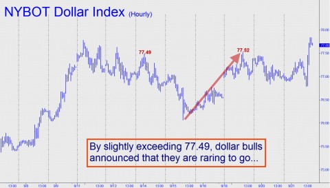
That doesn’t necessarily mean Gold and Silver cannot continue to rise against all currencies nonetheless, since the global monetary blowout that has caused them to ascend for more than a decade shows no sign of abating. However, whatever strength bullion musters in the weeks and months ahead will in dollar terms be tempered at least somewhat by a resurgent buck. We recently called subscribers’ attention to a possible nascent bull market in the dollar via a trading “tout” that recommended setting a chart alert at 78.87, about 0.6 percent above where the NYBOT Dollar Index was trading at the time. Yesterday, the Index spiked to within 3 cents of that benchmark, so officially the baby bull has not yet been born. However, during an online tutorial session that we conduct every Wednesday morning, we had a powerful sense of déjà vu yesterday while looking at an hourly chart of the Dollar Index.
The chart is reproduced above. The crucial piece of it, based on our proprietary Hidden Pivot Method, is the 77.52 peak achieved during Monday morning’s spike-up opening. Notice how that peak slightly exceeded an earlier one at 77.49, creating on the hourly chart what Hidden Pivot-eers call a bullish “impulse leg.” The implication is that any pullback such as the one that occurred yesterday represents a buying opportunity. As for our feeling of deja vu, the price pattern on the dollar’s hourly chart is strikingly similar to one from which the Dow Industrial Average emerged, in 2006, following what had looked like massive, six-year topping pattern. As bearish as we were on the economy at the time, the long-term bullish implications of the breakout could not be ignored. Now, the same holds true for the dollar even though the relevant pattern is occurring on a chart of much lower degree. What this says – very clearly – is that the Dollar Index is about to leap to at least 79.86 — about 2.7% above current levels. If so, it could be just the beginning of a much larger move, since a print at or near 79.86 would create a fresh “impulse leg” on charts of even higher degree).
I’ve been warning for weeks now that the Fed would disappoint with its September meeting. And boy did it.
Given gold’s stunning rise there are those who seem to think gold is in a bubble similar to the Nasdaq bubble of 1999-2000. Actually gold would have to be $3,200 an ounce, nearly double its current $1,800 if it was in the final stages of a bubble the way that the Nasdaq was at its top in March 2000. As you can see in the chart below:

-
I know Mike is a very solid investor and respect his opinions very much. So if he says pay attention to this or that - I will.
~ Dale G.
-
I've started managing my own investments so view Michael's site as a one-stop shop from which to get information and perspectives.
~ Dave E.
-
Michael offers easy reading, honest, common sense information that anyone can use in a practical manner.
~ der_al.
-
A sane voice in a scrambled investment world.
~ Ed R.
Inside Edge Pro Contributors

Greg Weldon

Josef Schachter

Tyler Bollhorn

Ryan Irvine

Paul Beattie

Martin Straith

Patrick Ceresna

Mark Leibovit

James Thorne

Victor Adair