

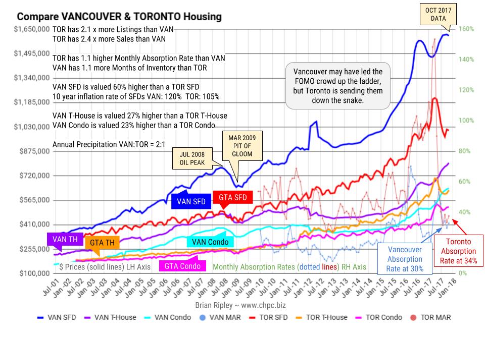
At the old Vancouver price peak in April 2012 before Torontonians joined the party, Vancouver metro SFDs were 64% more expensive than Toronto comparables. In July 2016 at the peak of Vancouver SFD prices, they were 65% more expensive.
The gap was closing quickly; it narrowed down to 33% in June 2017 but with the sudden late summer zeal to buy in Vancouver and sell in Toronto, the gap remains wide at 60%. Strata prices are also more expensive in Vancouver; 27% more for town-houses and 23% more for condos.
In March 2017 the Monthly Absorption Rate based on total inventory and total residential sales hit 154% in Toronto vs Vancouver at 47%. Vancouver may have led the FOMO crowd up the ladder, but Toronto is sending them down the snake.
Here is another attempt to visualize the distortions of the market where the fundamental requirement of a yield to attract sustainable investment in real estate has been replaced with the lure of capital gains.

CLICK CHART TO ENLARGE
|
|
This chart shows the relative values of STRATA units as a percentage of average single family dwellings in the 3 hot markets of Vancouver, Calgary and Toronto.
Calgarians are willing to trade 1 house for only 1.3 townhouses. Torontonians will settle for 1.6 townhouses and Vancouverites demand 2.
The “improvement” that sits on the land is a wasting asset. If serviced land is so valuable, shouldn’t the ratio be 1 house equals at least 3 townhouses?
If the numbers don’t make sense you can always rent. When MOI is low & MAR is high, developers and vendors have the edge.

CLICK CHART TO ENLARGE
|
IN THE LAST 10 YEARS
AVERAGE SFD Prices are up: 120% in Vancouver 21% in Calgary 105% in Toronto WHILE Employment Earnings are up: 24% in BC 30% in AB 23% in ON |


