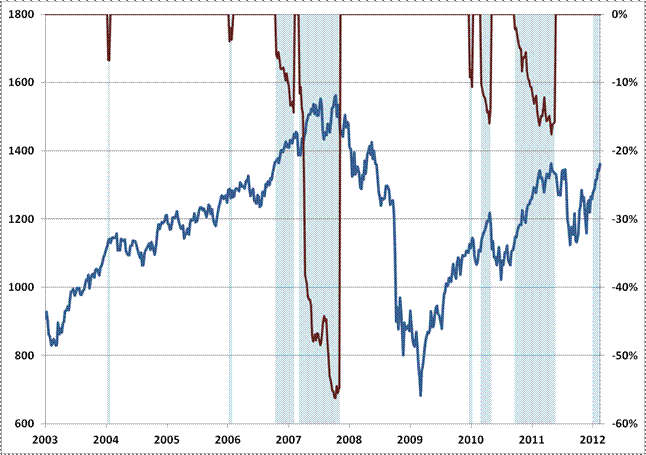
In order to estimate likely returns and risks in the financial markets, our general approach is to identify a set of historical instances that match current conditions on a broad range of important dimensions. In reviewing market conditions this week, what strikes me most is the pattern that emerges when we look across various horizons, from 2 weeks out to 18 months.
The chart below identifies periods in recent years where we reported market conditions as being at least “overvalued” and “overbought” in these weekly commentaries. Those two conditions alone aren’t enough, by themselves, to put the market in a “hard-negative” situation, but even those two tend to be enough to invite drawdown risk. The overvalued, overbought periods are shaded in blue on the chart below. The red lines indicate the deepest drawdown experienced by the market over the following 18 months (right scale), while the blue line charts the S&P 500 (left scale). Notably, even with weakly negative conditions – overvalued and overbought – the market has typically moved lower at some point in the next 18 months, wiping out all intervening gains. That surrender of intervening gains usually begins with a very hard and unexpected initial loss that takes out the bulk of upside progress within a period of a few days or weeks. This is a general pattern that we also see throughout market history.

….read the entire article (its well worth reading in ful)l:


