

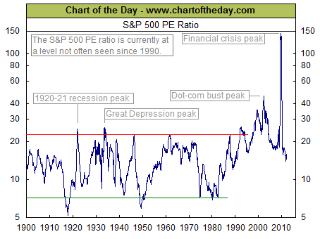
Today’s chart illustrates how the recent rise in earnings as well as recent stock market action has impacted the current valuation of the stock market as measured by the price to earnings ratio (PE ratio). Generally speaking, when the PE ratio is high, stocks are considered to be expensive. When the PE ratio is low, stocks are considered to be inexpensive. From 1900 into the mid-1990s, the PE ratio tended to peak in the low to mid-20s (red line) and trough somewhere around seven (green line). The price investors were willing to pay for a dollar of earnings increased during the dot-com boom (late 1990s), surged even higher during the dot-com bust (early 2000s), and spiked to extraordinary levels during the financial crisis (late 2000s). As a result of the continued surge in corporate earnings the PE ratio remains at a level not often seen since 1990 despite what has been a significant upward trend in stock prices so far this calendar year.
Notes:
Where’s the Dow headed? The answer may surprise you. Find out right now with the exclusive & Barron’s recommended charts of Chart of the Day Plus.
For Chart of the Day Homepage go HERE
Quote of the Day
“The value of a man should be seen in what he gives and not in what he is able to receive.” – Albert Einstein


