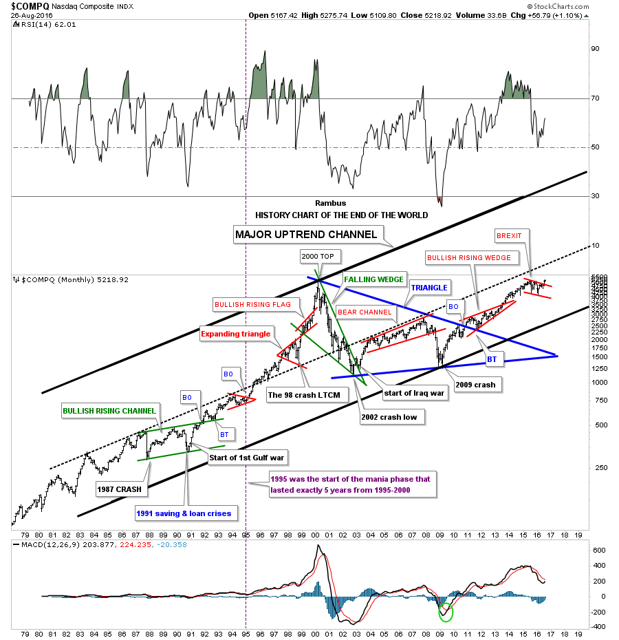
 I would like to show you a long term 40 year monthly chart for the $COMPQ which I call the history chart. Some of you were not even born when some of these significance events happened. At the time they seemed significant enough that most thought the end of the world as we knew it was near. Some of the older members will remember some of these events like they just happened yesterday.
I was personally involved in the stock market during each one of these times, and I can assure you it did feel like the world was coming to an end. When one observes some of these stock market events from a distance they hardly matter in the big picture. Perspective is everything.
Take the 1987 crash for instance. The $INDU was down over 500 points in a single day, but in 1987 that was over a 20% drop.The world didn’t come to an end and the markets began to rally off that historic low for several years. Then in 1991….continue reading HERE
….also Michael’s Featured Guest: Be Really Careful Here