

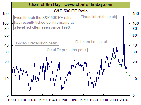
Today’s chart illustrates the price to earnings ratio (PE ratio) from 1900 to present. Generally speaking, when the PE ratio is high, stocks are considered to be expensive. When the PE ratio is low, stocks are considered to be inexpensive. From 1900 into the mid-1990s, the PE ratio tended to peak in the low to mid-20s (red line) and trough somewhere around seven (green line). The price investors were willing to pay for a dollar of earnings increased during the dot-com boom (late 1990s), surged even higher during the dot-com bust (early 2000s), and spiked to extraordinary levels during the financial crisis (late 2000s). Since the early 2000s, the PE ratio has been trending lower with the very significant but relatively brief exception that was the financial crisis. More recently, the PE ratio has moved slightly higher. It is worth noting, however, that even with this recent uptick, the PE ratio still remains at a level not often seen since 1990.
Notes:
Where should you invest? The answer may surprise you. Find out right now with the exclusive & Barron’s recommended charts of Chart of the Day Plus.
Quote of the Day
“Nowadays, people know the price of everything and the value of nothing.” – Oscar Wilde
Events of the Day
March 02, 2013 – Iditarod begins
March 09, 2013 – Daylight Saving Time begins (US)
Stocks of the Day
- Find out which stocks investors are focused on with the most active stocks today.
- Which stocks are making big money? Find out with the biggest stock gainers today.
- What are the largest companies? Find out with the largest companies by market cap.
- Which stocks are the biggest dividend payers? Find out with the highest dividend paying stocks.
- You can also quickly review the performance, dividend yield and market capitalization for each
- of the Dow Jones Industrial Average Companies as well as for each of the S&P 500 Companies.
Mailing List Info
Chart of the Day is FREE to anyone who subscribes. Just subscribe for FREE HERE
To ensure email delivery of Chart of the Day, add mailinglist@chartoftheday.com to your whitelist.


