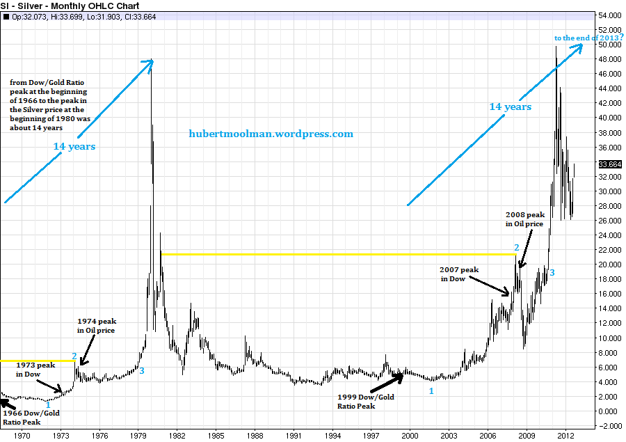
A reader asked me to update a previous long-term silver chart of mine. Below, is the updated long- term chart for silver:
silver chart analysis
Since the last chart, silver has broken out of the pennant formation (on the short-term chart), and is looking really good.
On the chart, I have highlighted two fractals (or patterns), marked 1 to 3, which appear similar. What makes these two fractals so special, is the similarity of the circumstances in which they exist.
There was a significant peak in the Dow (1973 and 2007) between point 1 and 2 of both fractals. Also, point 1 on both fractals represents a significant bottom for silver after the peak of the Dow/Gold ratio. After point 2, on both fractals, the oil price made a significant peak (1974 and 2008), about eight years after the peak in the Dow/Gold ratio.
Thanks to this similarity in events, as well as the similarity in sequence, I was able to identify the great possibility for significantly higher silver prices, back in October of 2010. This was a very clear signal that higher silver prices were coming, and that is exactly what we got, when silver moved to $49. However, this run is not over yet. The move from $17, when silver broke out of thetriangle (at point 3 of the second fractal) to $49 was just the first part of the move. In my opinion the biggest and best part of this move is still ahead. In my long-term fractal analysis report on silver, I have presented a lot of technical and fundamental evidence to support my opinion for higher silver prices over the coming years.