

For some perspective on the all-important US real estate market, the chart below illustrates the inflation-adjusted median price of a single-family home in the United States over the past 43 years. Not only did housing prices increase at a rapid rate from 1991 to 2005, the rate at which housing prices increased — increased. All those gains were given back during the following 6.5 years. Over the past three months, however, the median price of a single-family home has surged by over 10% — the second biggest three-month gain on record (the data goes back to 1968). Not surprisingly, this three-month surge has resulted in new post-financial crisis highs.

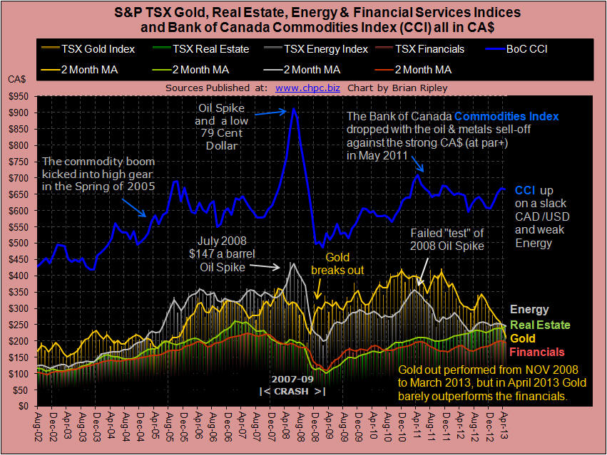
The chart below shows the S&P TSX Real Estate, Gold, Energy and Financial Services Indices as well as the Bank of Canada Commodities Index (CCI) all valued in CA$. In April 2013 Gold slumped again and for the first time since November 2008 it dropped decisively below the energy and real estate indexes barely above the financials. The Bank of Canada Commodities Index has been rising on a slumping CAD/USD pair as the U.S. Dollar rally puts pressure on a lot of orthodox positions. We should note that March 2013 is when the Eurozone introduced its bank “bail-in” template for Cypriot investors. In common parlance, bank accounts are akin to a Bernie Madoff deposit scheme. Will Canadian asset prices be jacked up via Eurozone capital flight as it has with the Asian carry? It is showing up at the whale level. On the other side, one feature of a massive global post bubble deflation is debt revulsion. In Japan during their decades long contraction, savings increased as investors repaired their balance sheets. These are volatile times.
Notes:
Does the real estate rally continue? The answer may surprise you. Find out now with the exclusive & highly regarded charts of Chart of the Day Plus.


