

At the epicenter of Canada’s housing bubble, which is now rated as the most overvalued in the world, is the west coast city of Vancouver. It’s there that low interest rates and foreign buying have fueled the average detached home price to a record of C$1.47 million, a 20% increase from the previous year.
While there are many measures of unaffordability, the government and federal agencies use one such measure frequently called the Shelter-cost to Income Ratio. It essentially compares the annual cost of an individual’s housing with the amount of income they have coming in each year. Federal agencies in Canada consider households that spend 30% or more of total before-tax household income on shelter expenses to have a “housing affordability” problem.
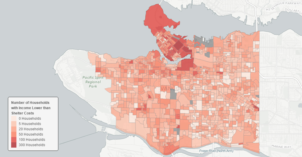
In Vancouver, however, the city has become so unaffordable that 25,000 households pay more for their shelter costs than their entire declared income. This works out to 9.5% of the households in the city – far higher than Greater Toronto (5.9%) or Montreal (5%).
We recently stumbled across a data mapping project by Jens von Bergmann, via the Hongcouver blog. Von Bergmann, who runs a data firm in Vancouver, has compiled a series of interactive maps that overlay census data onto the city. In Canada, the mandatory census happens every five years and creates a wealth of granular information.
Here’s the percent of people in each city block that pay more for housing than they take home in income:
….continue reading and viewing HERE


