
How he did it is explained below. It is an interesting technique, as well as pretty simple and easy to replicate as described in full below. There is an offer at the bottom that invites you to sign up for a free week of usage to test it out as a stock selector. I have to assume anyone who signs up for a Free Week of usage will be followed by an automatic charge should you select to make no attempt to cancel your Free Week on time. The do offer a money back guarantee however and thus interesting to anyone who is genuinely interested in a proven stock picking technique that is easy to do – Editor Money Talks
How Peter Lynch Earned 29% a Year for 13 years
When it comes to true investing legends, Peter Lynch is in a league of his own.
The former head of Fidelity’s flagship Magellan Fund produced an annualized rate of return of 29.2% over his 13-year stint at the helm. This track record secured his place as the best mutual fund manager of all time.
So how did he do it? It’s not as complicated as you think…
In his best selling book, One Up On Wall Street, Lynch revealed a powerful charting tool that greatly simplified his investment decisions.
Deemed the “Peter Lynch chart”, this simple graph plots the stock price against its “earnings line” – a theoretical price equal to 15 times the earnings per share.
When a stock traded well below it, he would buy. When it rose above it, he would sell.

Not exactly rocket science, is it?
The idea behind this technique is simple. Lynch (and most other successful money managers) believe that mature, stable companies are worth roughly 15 times their annual earnings. And over the last 135 years, this has proven to be the mean valuation of the S&P 500 index.
This is known as a the P/E ratio. It is merely the price of the stock divided by its earnings per share. The resulting multiple represents how many times you are paying for last year’s earnings at today’s stock price.
All things being equal, the lower the number the better. Low P/E ratios mean that you are getting more earnings for your investment dollar. And since most large cap stocks eventually trade for at least 15 times earnings, you are more likely to see your shares appreciate as they return to the 15 P/E level.
This simple idea was the basis of Lynch’s investment approach and the reason he created his now famous chart.
The chart consists of only two lines. The first is the stock price. The second is the hypothetical stock price if it were to trade at a P/E of 15 (the earnings line). As Peter Lynch explained,
“A quick was to tell if a stock is overpriced is to compare the price line to the earnings line. If you bought familiar growth companies – such as Shoney’s, The Limited, or Marriott – when the stock price fell well below the earnings line, and sold them when the stock price rose dramatically above it, the chances are you’d do pretty well.”
Take Walgreens (WAG) for example. The Peter Lynch chart below shows a 10-year history of the stock price and the earnings line.
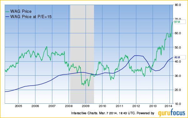
Most nvestors who bought the stock when it was trading above its earnings line experienced very small gains or even losses. However, buying Walgreens at any price below the earnings line led to sizable gains.
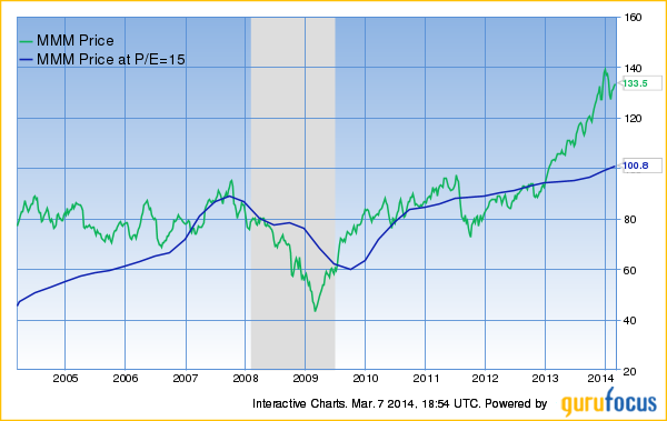
The same pattern can be found with almost any familiar US stock. Oracle (ORCL) and Wal-Mart (WMT) are all shown below:
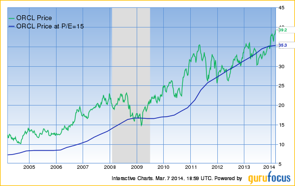
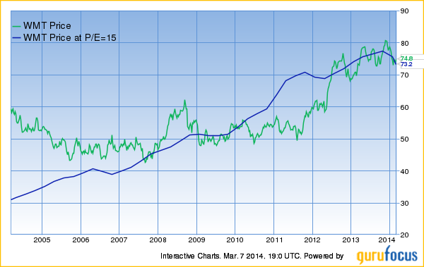
It is a well-known fact among investors that price follows earnings. Over multi-year periods, stock prices move in sync with changing company earnings.
But over the short term, stock prices are unpredictable. This creates valuable oportunities for savvy investors and turns the Peter Lynch Chart into PURE GOLD! Using the chart on any of the stocks above would have produced some very impressive gains.
GuruFocus is one of the only places to access this powerful tool.
Try it for FREE:
- Input a stock symbol in the search bar in the top left corner of the homepage.
- Select ‘Interactive Chart’ from the dropdown list.
- Just below the Interactive Chart tab is a ‘User Defined Chart’ menu.
- Select ‘Peter Lynch Chart’ and the rest is done automatically.
We encourage you to give it a try. Check your own stocks or look for new opportunities. Free members can chart up to 5 stocks at no charge.
Premium members receive UNLIMITED access to this tool along with countless other alerts, scanners, rankings and investment newsletters.
Given the potential cost of buying stocks at the wrong time, our $297 annual membership might be the safest investment you ever make.
CLICK HERE to Learn More about GuruFocus Premium Membership
GuruFocus.com Membership Services
Not a Member Yet?
Take a 7-day Free Trial of Premium Membership. It is risk FREE.
Satisfaction Guaranteed!
If you’re not 100% delighted with the Premium Membership, just let us know. There’s a money-back guarantee with this purchase!
GuruFocus.com Membership Services.


