

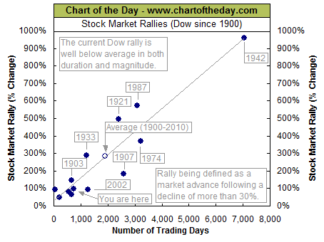
The Dow made another post-financial crisis rally high Thursday. To provide some further perspective to the current Dow rally and in response to several requests, all major market rallies of the last 111 years are plotted on today’s chart. Each dot represents a major stock market rally as measured by the Dow with the majority of rallies referred to by a label which states the year in which the rally began. The difference between today’s chart and last week’s chart is that for last week’s chart a rally was defined as an advance that followed a 15% correction (i.e. a major correction). For today’s chart, however, a rally is being defined as an advance that follows a 30% decline (i.e. a major bear market). As today’s chart illustrates, the Dow has begun a major rally 13 times over the past 111 years which equates to an average of one rally every 8.5 years. It is also interesting to note that the duration and magnitude of each rally correlated fairly well with the linear regression line (gray upward sloping line). As it stands right now, the current Dow rally that began in March 2009 (blue dot labeled you are here) would be classified as well below average in both duration and magnitude.
Notes:
Where’s the Dow headed? The answer may surprise you. Find out right now with the exclusive & Barron’s recommended charts of Chart of the Day Plus.


