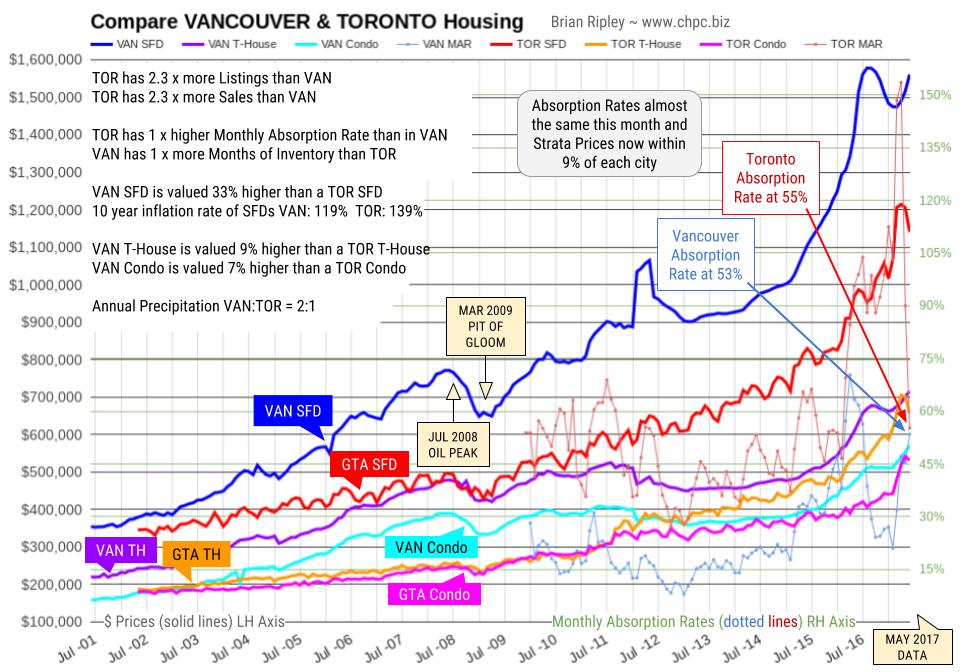
At the old Vancouver price peak in April 2012 before Torontonians joined the party, Vancouver metro SFDs were 64% more expensive than Toronto comparables. In July 2016 at the peak of Vancouver SFD prices, they were 65% more expensive. The gap is closing quickly; it’s narrowed down to 33%, and now strata prices are similar within 9% of each other.
In March 2017 the Monthly Absorption Rate based on total inventory and total residential sales hit 154% in Toronto vs Vancouver at 47%. Vancouver may have led the FOMO crowd up the ladder, but Toronto maybe sending them down the snake.
…click HERE to view attempt to visualize the distortions of the market


