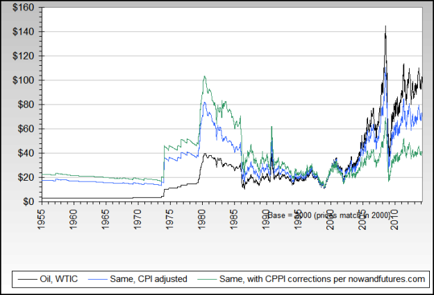
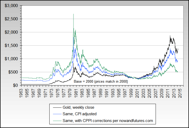
A 50 year look at commodities, their current prices & inflation adjusted prices. These 5 & 6 Decade charts provide a perspective that is not found easily. If nothing else, a quick scan is recommended – Editor Money Talks
get a lot of comments from various investors wondering why I am so bullish commodities, and in particular Agriculture. They claim that commodity prices are way too high and will collapse soon enough. Who knows… maybe these investors are right.
Having said that, today I thought I’d share with you some great long term charts from Now And Futures blog showing the nominal and inflation adjusted prices of various commodities. When I look at these charts, I wonder how on earth could some of these cheap commodities “collapse”? I mean, they are already so depressed… and so beaten down… relative to history… relative to inflation… relative to other asset classes.
I think a lot of investors are stuck with their annual charts, looking back only 365 days of the year. I think it is time to look back five to six decades of data to see where we truly are. Enjoy!
(2 examples of the 10 Commodities examined – Editor Money Talks)

….view all 10 Charts including the Agricultural Commodities HERE