

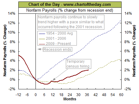
The latest jobs report came out today with the Labor Department reporting that nonfarm payrolls (jobs) increased by 163,000 in July. Today’s chart puts the latest data into perspective by comparing nonfarm payrolls following the end of the latest economic recession (i.e. the Great Recession — solid red line) to that of the prior recession (i.e. 2001 recession — dashed gold line) to that of the average post-recession from 1954-2000 (dashed blue line). As today’s chart illustrates, the current jobs recovery is much weaker than the average jobs recovery that follows the end of a recession. Today’s chart also illustrates that the jobs market continues to improve at a fairly steady pace — a pace very similar to what occurred following the recession of 2001.NA
Quote of the Day
“Four little words sum up what has lifted most successful individuals above the crowd: a little bit more. They did all that was expected of them and a little bit more.” – A. Lou Vickery
To Subscribe to Chart of the Day go HERE


