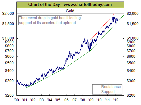
With gold more than $250 off its August 2011 peak, today’s chart provides some long-term perspective in regards to the gold market. Today’s chart provides an illustration of the bull market in gold that began back in 2001. As today’s chart illustrates, the pace of the 11-year bull market has increased over time. However, over the past seven months the price of an ounce of the shiny metal has declined more than at any point since 2008. This latest pullback has brought gold down to support (green line) for a second test of its three-year accelerated trend channel. So while the upward trend in gold is still intact, the accelerated trend is once again being tested.
Notes:
Does the gold rally continue? The answer may surprise you. Find out now with the exclusive & highly regarded charts of Chart of the Day Plus.