
Personal Finance
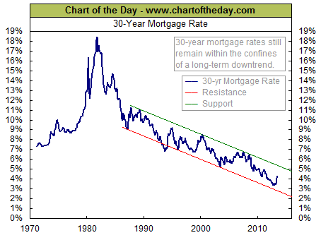
For some perspective on all-important long-term interest rates, today’s chart illustrates the 42-year trend of 30-year mortgage rates (thick blue line). As today’s chart illustrates, mortgage rates have been rising significantly as of late. This is largely due to improving US economy as well as the potential of the Fed to begin tapering its quantitative easing as early as September. In fact, the 30-year mortgage rate has increased over 80 basis points during the past three months — the largest three-month increase since 2004. While the 30-year mortgage rate still rests well within the confines of its 27-year downtrend channel, it’s worth noting that the last two times mortgage rates reached the top end of its downtrend channel (green line), the stock market followed with a major decline (i.e. dot-com bust and financial crisis).
Advertisment:
Where’s the Dow headed? The answer may surprise you. Find out right now with the exclusive & Barron’s recommended charts of Chart of the Day Plus.
Quote of the Day
“What experience and history teach is this–that people and governments never have learned anything from history, or acted on principles deduced from it.” – Georg Hegel
Events of the Day
July 14, 2013 – Bastille Day (France) – British Open golf tournament begins (ends July 21st)
July 16, 2013 – Baseball All-Star Game
Stocks of the Day
— Find out which stocks investors are focused on with the most active stocks today.
— Which stocks are making big money? Find out with the biggest stock gainers today.
— What are the largest companies? Find out with the largest companies by market cap.
— Which stocks are the biggest dividend payers? Find out with the highest dividend paying stocks.
— You can also quickly review the performance, dividend yield and market capitalization for each of theDow Jones Industrial Average Companies as well as for each of the S&P 500 Companies.
Mailing List Info
Chart of the Day is FREE to anyone who subscribes. Go HERE to subscribe
To ensure email delivery of Chart of the Day, add mailinglist@chartoftheday.com to your whitelist.
<a href=”http://www.chartoftheday.com/”>Chart of the Day</a>

 Dr. Marc Faber said it’s a good idea to take money out of the stock market.
“I don’t think there is a lot of upside potential, but I think there is considerable downside,” he said.
…..for the whole interview go HERE
More from Marc:
- Marc Faber Bullish on Crude Oil , Bearish on India…
- MARC FABER not too optimistic about India, & The R…
- Marc Faber likes the Company SIA Engineering Co. (…
Frank Holmes and his “friend and highly respected analyst, Gregory Weldon” take a look at Asian demand.
While the “West flees the precious metal, another set of gold buyers has come forward with the aim to preserve wealth”. As much as they are consuming “China may be devouring even more of the supply in the future if the price of gold remains subdued”
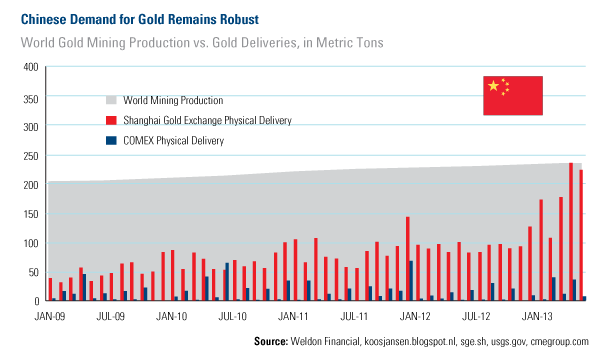
…..more analysis and charts HERE

 The New York Times had the definitive take on the vicious sell off in gold. To summarize one of their articles:
Two years ago gold bugs ran wild as the price of gold rose nearly six times. But since cresting two years ago it has steadily declined, almost by half, putting the gold bugs in flight. The most recent advisory from a leading Wall Street firm suggests that the price will continue to drift downward, and may ultimately settle 40% below current levels.
The rout says a lot about consumer confidence in the worldwide recovery. The sharply reduced rates of inflation combined with resurgence of other, more economically productive investments, such as stocks, real estate and bank savings have combined to eliminate gold’s allure.
Although the American economy has reduced its rapid rate of recovery, it is still on a firm expansionary course. The fear that dominated two years ago has largely vanished, replaced by a recovery that has turned the gold speculators’ dreams into a nightmare.
This analysis provides a good representation of the current conventional wisdom. The only twist here is that the article from which this summary is derived appeared in the August 29, 1976 edition of The New York Times. At that time gold was preparing to embark on a historic rally that would push it up more than 700% a little over three years later. Is it possible that history is about to repeat itself?
At the time The Times article was written, gold had fallen to $103 per ounce, a decline of nearly 50% from the roughly $200 it had sold for in the closing days of 1974. The $200 price had capped a furious three-year rally that began in August of 1971 when President Nixon “temporarily” closed the gold window and allowed gold to float freely. Prior to that decision gold had been fixed at $35 per ounce for nearly two generations. That initial three year 450% rally had validated the forecasts of the “gold bugs” who had predicted a rapid rise in gold prices should the dollar’s link to gold be severed. The accuracy of these formerly marginalized analysts proved to be a bitter pill for the mainstream voices in Washington and Wall Street who, for reasons of power, politics and profit, were anxious to confine the “barbarous relic” to the dustbin of history. Incredulous as it may seem now, with gold still priced at $35 per ounce, official forecasts of both the Secretary of the Treasury and the Chairman of the Federal Reserve were that demonetizing gold would undermine its value, and that its price would actually fall as a result.
Of course government experts could not have been more wrong. Once uncoupled from the dollar, gold’s initial ascent in the early 1970s was fueled by the highest inflation in generations and the deteriorating health of the U.S. economy that had been ravaged by the “guns and butter” policies of the 1960s. But the American economy stabilized during the mid-years of the 1970s and both inflation and unemployment fell. When gold reversed course in 1975 the voices of traditional power elite could not contain their glee. When the gold price approached $100 per ounce, a nearly 50% decline, the obituaries came fast and furious. Everyone assumed that the gold mania would never return.
Although the writer of The Times piece did not yet know it, the bottom for gold had been established four days before his article was published. Few realized at the time that the real economic pain of the 1970s had (to paraphrase The Carpenters 1970s hit) “Only Just Begun.” When inflation and recession came back with a vengeance in the late 1970s, gold took off (to quote another 1970s gem), like a skyrocket in flight. By January 1980, gold topped out at $850 an ounce. The second leg of the rally proved to be bigger than the first.
The parallel between the 1970s and the current period are even more striking when you look closely at the numbers. For example, from 1971 to 1974 gold prices rose by 458% from $35 to $195.25, which was then followed by a two-year correction of nearly 50%. This reduced total gains to just under 200%. The current bull market that began back in 2000 took a bit longer to evolve, but the percentage gains are very similar. (We should allow for a more compressed time frame in the 1970s because of the sudden untethering of gold after decades of restraint.) From its 1999 low to its 2011 peak, gold rose by about 650% from $253 to $1,895 per ounce, followed by a two year correction of approximately 37%, down to around $1,190 per ounce. The pullback has reduced the total rally to about 370%. The mainstream is saying now, as they did then, that the pullback has invalidated fears that rising U. S. budget deficits, overly accommodative monetary policy, and a weakening economy will combine to bring down the dollar and ignite inflation. But 1976 was not the end of the game. In all likelihood, 2013 will not be either.
The biggest difference between then and now is that until 1975 ordinary Americans were barred by law from buying and owning gold. About the only route available to participate in the earlier stage of the precious metal rally was by hording silver dimes, quarters and half dollars minted prior to 1965. My father indulged in this process himself by sifting through his change, the cash registers of any merchant who would allow him (exchanging new non-silver coins and bills for silver), and by sifting out silver coins from rolls he bought from banks. It was a time-consuming process, and most of his friends and family members thought he was crazy. After all, he had $10,000 worth of pocket change earning no interest. But the $10,000 face value worth of those coins he collected had a melt value of over $350,000 when silver hit its peak.
By the mid-1970s none of the problems that initially led to the recession in the early years of the decade had been solved. Contrary to the claims of the “experts” things got much worse in the years ahead. It took the much deeper recession of the late 1970s and early 1980s, which at the time was the worst economic down-turn since the great Depression, to finally purge the economy of all the excesses. The lower marginal tax rates and cuts in regulation implemented by President Reagan and tight money under Volcker helped get the economy back on track and create investment opportunities that drew money away from gold. As a result gold fell hard during the early 1980s. But even after the declines, gold maintained levels for the next 20 years that were three to four times as high as the 1976 lows.
Although the economy improved in the 1980s, the cure was not complete. Government spending, budget and trade deficits continued to take a heavy toll. The U.S. was transformed from the world’s largest creditor to its largest debtor. When the time came to face the music in 2001, the Fed kept the party going by opening the monetary spigots. Then when decades of monetary excess finally came to a head in 2008, the Fed open up its monetary spigots even wider, flooding the economy with even more cheap money.
Unfortunately just like 1976, a true economic recovery is not just around the corner. More likely we are in the eye of an economic storm that will blow much harder than the stagflation winds of the Jimmy Carter years. And once again the establishment is using the decline it the price of gold to validate its misguided policies and discredit its critics. But none of the problems that led me and other modern day gold bugs to buy gold ten years ago have been solved. In fact, monetary and fiscal policies have actually made them much worse. The sad truth is that as bad as things were back in 1976, they are much worse now. Whether as a nation we will be able to rise to the occasion, and actually finish the job that Ronald Reagan and Paul Volcker started remains to be seen. But I am confident that the price of gold will rise much higher, and that its final ascent will be that much more spectacular the longer we continue on our current policy path. Don’t believe the mainstream. Just as before, they will likely be wrong again.
About the Author
Peter Schiff is CEO of Euro Pacific Precious Metal and an internationally recognized economist specializing in the foreign equity, currency and gold markets. Schiff made his name as president and chief global strategist of Euro Pacific Capital. He frequently delivers lectures at major economic and investment conferences, and is quoted often in the print media. His broadcast credits include regular guest appearances on CNBC, Fox Business, CNN, MSNBC, and Fox News Channel, as well as hosting his own weekly radio show, Wall Street Unspun. He is also the author of the bestselling books: “Crash Proof,” “The Little Book of Bull Moves in Bear Markets,” and the recently released: “Crash Proof 2.0: How to Profit from the Economic Collapse.”

We have clearly been in a recent run of higher interest rates, with a looming “threat” that there might be less quantitative easing before the end of the year. It would appear now that Bernanke wants to leave his successor to implement what everyone knows must be coming at some point: a return to a normal interest-rate environment. While rising interest rates are bad for me personally (for another four months), a return to normalcy would be good for our future – though the transition is likely to be bumpy.
With this in mind, I offer this week’s Outside the Box from Louis and Charles Gave. In a brief essay entitled “Bad Omens,” they note:
… if the recent global equity market sell-off can be laid at the feet of the 100bp move higher in US bond yields, it is hard to know how another 50bp increase in real rates will be digested.
US investors might not have noticed, but there is carnage scattered here and there on the world’s markets, and not just the equity markets. The central banks of the world, in their furious attempts to promote stability through easy-money policies, have cooked up a witches’ brew of instability of unknown quantity and contents. There is no set formula for this concoction; they are making it up as they go along. Anything that seems to calm the storm momentarily becomes the order of the day. Bernanke hints at the mere possibility of less easing (not tightening, God forbid!), something that we all know must happen at some point, and the market throws up and half a dozen Fed governors go on the air to say “Not really … maybe … we are going to be cautious … we’ll go slow … no one wants to do anything rash” – etc. It was almost comical.
Thus we can expect a volatile summer (as the interns man the trading desks), and I think you will find the Gaves’ insights useful. – John Mauldin, Editor Outside the Box JohnMauldin@2000wave.com
Ed Note: Be sure to read the conclusion in the article “Bad Omens”
Bad Omens
By Louis Gave & Charles Gave
In late May we published a debate piece on the near-term outlook for equity markets. Since then, emerging markets have once again lived up to their name by proving themselves hard to emerge from during an emergency (in USD terms, Brazil is down –35% year to date while Chinese valuations are back to 2008-crisis levels); for their part, European and US equity markets have pulled back, while the only salvation has come from Japan (the one market where it’s possible to find attractive valuations, accelerating economic activity and liquidity growth feeding off a Tour de France vitamin cocktail). But is this a case of Japan being the best looking horse in the glue factory? In the following paper, we aim to review a number of signs from equity markets that look somewhat ominous. Needless to say, we welcome any feedback on the below.
The question at hand: is this a break-out?
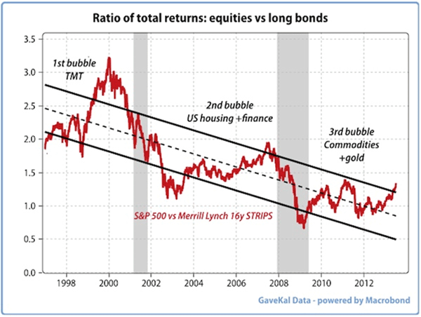
The chart over-leaf traces the relative performance of the S&P 500 against long-dated bonds since the Asian Crisis in 1997. Since then, the world has experienced a series of deflationary shocks, each of which has been met by more activism from the Fed and other central banks: i.e.: lower rates and higher monetary base growth. And each time, the excess money allowed for the rise in a few asset classes (TMT in the late 1990s, housing and financial intermediaries in the mid 2000s, commodities, fixed income instruments and emerging markets in the late 2000s…). But each time, the asset price rise was followed by an equity market bust; begging the question of whether the bust that seems to be unfolding in emerging markets is now the third iteration of a movie every investor has seen before (and which few have enjoyed)? Or whether the recent correlation between bonds and equities indicates that the repeated deflationary shocks are a thing of the past and nominal GDP g rowth will accelerate from now on? Could we be at a structural turning point?
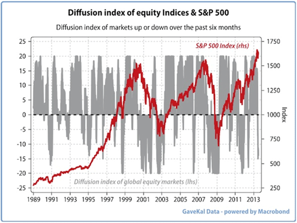
1– A first bad omen: fewer markets rising
In the chart below, we take the top twenty equity markets in the world and compile a diffusion index that shows how many rose in the previous six months, against how many fell. So when the grey bar is at +20, global equity investors have made money in every major market; when the index reads –20 they found nowhere to hide. And when the number is in negative territory, it simply means that more markets have fallen then risen in the previous six months. The red line is the performance of the S&P 500. Since 1992, we have had 14 occurrences in which more stock markets were falling than rising. In 10 of these 14 occurrences, the S&P500 fell by at least –10%. In the other 4, the S&P 500’s performance hovered between 0% and –10%. As things stand, the S&P 500 has recorded a double digit rise in the past six months, a major divergence.
2– Another bad omen: collapsing silver prices
Unfortunately, it’s not as if, lately, equity markets have been the only place to lose money. Indeed, as every gold bug has rediscovered in recent months, precious metals have again proven that they are anything but a safe-haven. Still, drops of 30% or more in silver prices do not happen that often: looking back at the past 100 years, such drops have only occurred 11 times. And interestingly, each one of these massive declines marked a significant change in the world financial system.
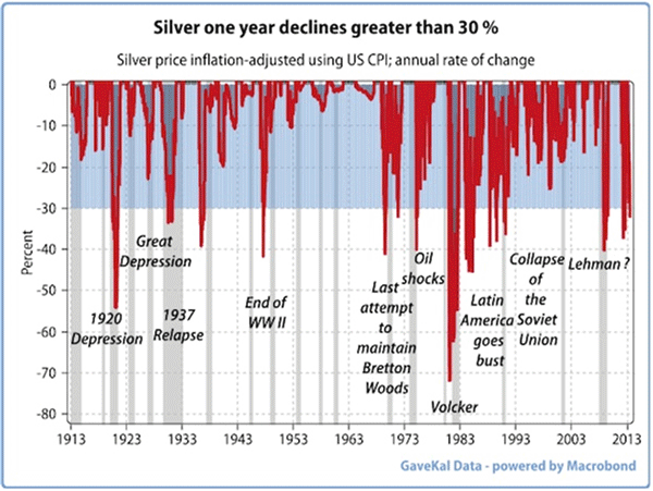
To cut a long story short, the investment rules after large declines in precious metals were almost always totally different from the rules which prevailed before the fall. More worryingly, each such decline was accompanied by a massive recession/depression somewhere in the world and almost every time by a recession in the US (grey shaded areas), the only exception being 1983-1984 when the Latin American depression did not trigger a US recession but instead a collapse in oil prices.
3– Beyond stocks and precious metals
Let us imagine a pension fund whose assets are invested conservatively with 40% in global fixed income, 40% in global equities, 10% in the world’s largest hedge funds (Bridgewater, Man-AHL, AQR…), 5% in gold and 5% in private equity. Leaving aside the private equity illiquid pocket, our pension fund will have basically lost between 5% and 15% of its assets across the board in just a few weeks.
Following these widespread losses, will our pension fund look to a) increase its risk and average down on the more beaten-up asset classes (i.e.: emerging market equities) or b) reduce its risk and use the recent rise in yield to immunize liabilities (or reduce its portfolio’s volatility)? In a world directed by VaR measures, CAPM models, and CYA boards, is that even a question?
4– Falling inflation expectations
Not that the imagined pension fund in question would automatically be wrong in increasing its fixed income allocation. After all, inflation expectations in the US (and almost everywhere) are falling like a stone, implying that fixed income instruments now offer a much higher real yield than the recent rise in nominal interest rates might imply:
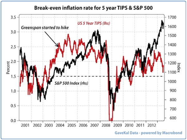
And these collapsing inflation expectations bring us to the chart above for, since the Asian Crisis, each time US inflation expectations fell below 1.5% (i.e.: a deflationary shock), US equities took a beating. That [doted] line in the sand is approaching fast. Just as worryingly, the collapse in inflation expectations, combined with the rise in nominal rates, means that the recent rise in US Baa real bond yields is the biggest one witnessed since the start of 2009—when bond markets were massively overbought.
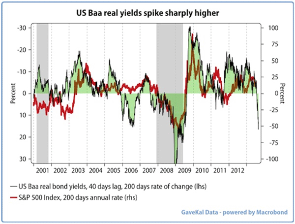
Of course, one could argue that the recent rise in yields is nothing to worry about; that it is just the side effect of the air coming out of the bond market bubble (see our Quarterly Strategy Chart Book 2Q12—The Global Bond Yield Conundrum). Unfortunately, recent weeks have shown that such an attitude may be too carefree as most assets have reacted badly to falling bond prices. Indeed, if the recent global equity market sell-off can be laid at the feet of the 100bp move higher in US bond yields, it is hard to know how another 50bp increase in real rates will be digested? Looking at the bond vs equity trade-off today, it is easy to imagine Woody Allen saying “we have reached a cross-road. One way (rising yields?) leads us to despair and annihilation, the other (falling yields?) to certain death. I hope we choose wisely.”
Conclusion
So here we are, with:
- China, the single biggest contributor to global growth over the past decade, slowing markedly.
- World trade now flirting with recession.
- OECD industrial production in negative territory YoY.
- Southern Europe showing renewed signs of political tensions (i.e.: Portugal, Greece, Italy…) as unemployment continues its relentless march higher and tax receipts continue to collapse.
- Short-term interest rates almost everywhere around the world that are unable to go any lower, even as real rates start to creep higher.
- Valuations on most equity markets that are nowhere near distressed (except perhaps for the BRICS?).
- A World MSCI that has now just dipped below its six month moving average.
- A diffusion index of global equity markets that is flashing dark amber.
- Margins in the US at record highs and likely to come under pressure, if only because of the rising dollar (most of the US margin expansion of the past decade has occurred thanks to foreign earnings—earnings that may now be challenging to sustain in the face of a weaker global trade growth and a stronger dollar).
Lackluster growth? Falling margins (outside of Japan)? Rising real rates? Unappealing valuations (outside of the BRICS)?… Perhaps these make up the wall of worry that global equities will climb successfully. After all, if the British and Irish Lions can win a rugby series in the Southern hemisphere, while a Scotsman wins Wimbledon, then nothing is impossible. Though perhaps the simpler explanation to the above growing list of bad omens was formulated by Claudius who said that “when sorrows come, they come not as single spies, but in battalions”.


-
I know Mike is a very solid investor and respect his opinions very much. So if he says pay attention to this or that - I will.
~ Dale G.
-
I've started managing my own investments so view Michael's site as a one-stop shop from which to get information and perspectives.
~ Dave E.
-
Michael offers easy reading, honest, common sense information that anyone can use in a practical manner.
~ der_al.
-
A sane voice in a scrambled investment world.
~ Ed R.
Inside Edge Pro Contributors

Greg Weldon

Josef Schachter

Tyler Bollhorn

Ryan Irvine

Paul Beattie

Martin Straith

Patrick Ceresna

Mark Leibovit

James Thorne

Victor Adair