
Personal Finance
Albert Einstein, a man who knew a thing or two about celestial mechanics, supposedly once called compound interest “the most powerful force in the universe.” While the remark was likely meant to be funny (astrophysicists can be hilarious), it sheds light on the often overlooked fact that small changes, over time, can yield enormous results. Over eons, small creeks can carve large canyons through solid rock. The same phenomenon may be at work in our economy. A minor, but persistent under bias in the inflation gauge used in the Gross Domestic Product (GDP) may have created a wildly distorted picture of our economic health.
It would be impossible to measure the economy without “backing out,” inflation. That is why economists are very careful to separate GDP reports into two categories: “nominal” (which are not adjusted for inflation), and real (which are). Only the real reports matter. The big question then becomes, how do we measure inflation? Just as I reported last week with respect to the biases baked into the government’s GDP revisions, the devil is in the details.
As it turns out there are a number of official inflation gauges that vie for supremacy. Most people tend to follow the Consumer Price Index (CPI) which is compiled by Bureau of Labor Statistics, a division of the Department of Labor. The CPI is regarded as the broadest measurement tool, but it has been changed many times over the years. Most famously, its formulas were loosened in the late 1990’s as a result of the “Boskin Commission” which said that the CPI overstated inflation by failing to account for changes in consumer behavior. I believe those changes seriously undermined the reliability of the index. But the CPI itself has to contend for relevance with its stripped down rival, the “Core CPI,” which factors out food and energy, which many believe are too volatile to be accurately counted. The core CPI is almost always lower than the “headline” number.
Another set of inflation data, the “GDP Deflator” is compiled by the Bureau of Economic Analysis (part of the Commerce Department), and is used by them to calculate GDP. The deflator differs from the CPI in that it has much more flexibility in weighting and swapping out items that are in its sample basket of goods and services. While the CPI attracts the lion’s share of the media and political attention, it is the deflator that is relevant when looking at economic growth.
On a quarterly basis the two numbers are usually close enough to escape scrutiny. (However, the most recent 2nd quarter GDP estimates relied on annualized inflation of a ridiculously low .7%!). But if you look at a broader time horizon a very clear pattern emerges that makes a great difference in how we perceive the economic landscape.
Available data sets for both the CPI and the GDP deflator go back to 1947. That 66 year period falls neatly into two phases. From 1947 to 1977 both yardsticks moved together almost identically, both rising 173% over that time. But in the ensuing 36 years (until 2013), the CPI is up almost three fold (292%) while the deflator is only up about two fold (209%). The CPI rising 40% more than the GDP deflator is an extremely significant factor. How did that happen? As it turns out, quarterly inflation assumptions have been, on average, .17% lower for the deflator than for the CPI since 1977. That is a small number. But as with compound interest small numbers add up to big numbers over time.
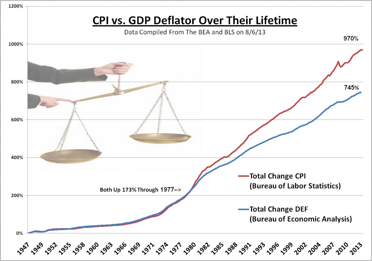
Annualized the .17% difference would shave off an additional .68% of annual GDP growth. This is about a quarter of the average 2.85% real growth rate since 1977 that the government has calculated using the deflator. Over 35 years this has likely made a huge difference in the how the economy actually feels and how we live, regardless of the nominal figures that are published. Even if you were to split the difference between the CPI and the deflator you would still get an economy that feels significantly smaller than it appears.
The $64,000 question ($188,000 adjusted by CPI inflation since 1977) is what happened in 1977 to make the CPI and the deflator diverge? Sadly, the details aren’t really made public. What we do know is that the BEA took over the task in 1972, and that the separation occurred a few years later when inflation really started to run out of control. We also know that the deflator is more flexible than the CPI and that the interests of the government are better served by reporting low inflation and higher growth. So in other words, the deflator is likely lower for the same reasons that dogs lick themselves in intimate places: because they want to and they can.
If we had been growing as quickly as the official GDP indicates, why would our labor force have contracted so significantly? Why are we continuously replacing middle class jobs with lower paying ones? Why would we be using 3 percent less energy nationally than we did 10 years ago despite an 8.8% growth in population? Why would Americans be spending a higher percentage of their disposable incomes on basic necessities than they were 10 years ago? These trends don’t conform to healthy GDP growth. So maybe the growth is largely an illusion?
When you take into consideration the likelihood that even the CPI drastically understates inflation, you get a much clearer picture of the true state of the U.S. economy. If you ever wondered how we went from being the world’s largest creditor to its biggest debtor despite all this economic growth, now you know. As the growth was merely a statistical illusion, we have been forced to borrow money to maintain a life style our economy can no longer support.
So the next time you see a GDP report remind yourself that the “deflator” should really be called the “distractor.” It’s there to distract you from the truth.
Peter Schiff is the CEO and Chief Global Strategist of Euro Pacific Capital, best-selling author and host of syndicated Peter Schiff Show.
Subscribe to Euro Pacific’s Weekly Digest: Receive all commentaries by Peter Schiff, John Browne, and other Euro Pacific commentators delivered to your inbox every Monday!
To order your copy of Peter Schiff’s latest book, The Real Crash: America’s Coming Bankruptcy – How to Save Yourself and Your Country, click here.
For in-depth analysis of this and other investment topics, subscribe to Peter Schiff’s Global Investor newsletter. CLICK HERE for your free subscription.

 I’ve made good money trading the stock market from the short side beginning in May…because of my bearish mindset I couldn’t do a 180 and buy the July rally so I just sat on the sidelines and Waited for the rally to run out of steam…I started shorting again the second week of August despite the “Dog Days of Summer” tone…with prices chopping around in narrow ranges on light volume…and without a real Confirmation that it was Time to trade from the short side…but Market Psychology seems to sense BIG changes brewing just below the surface…this past week things began to get really interesting across a number of markets…(see the Chart Section below)…I’m Anticipating BIG moves as we go into September.

 “The greatness of America lies not in being more enlightened than any other nation, but rather in her ability to repair her faults.”
– Alexis de Toqueville, Democracy in America, 1835
“We can always count on the Americans to do the right thing, after they have exhausted all the other possibilities.”
– Winston Churchill
With the first half of 2013 behind us, I’m writing to summarize market developments since the start of the year and to share my thoughts on positioning portfolios for the period ahead. First though, a quick recap of the first half of 2013…..

 »» Safe-haven government bonds sold off, and yields jumped to the highest levels in two years on improved European and U.S. economic reports.
»» New data show foreigners sold U.S. assets at nearly a record pace as markets reacted to the Fed’s tapering strategy. (page 3)
»» Global Roundup: Developments in Canada’s preferred share market; analysis of eurozone and U.K. economic surprises; earnings highlights in Asia. (pages 3-4)
For the complete Weekly Report as well as Daily Updates CLICK HERE.

-
I know Mike is a very solid investor and respect his opinions very much. So if he says pay attention to this or that - I will.
~ Dale G.
-
I've started managing my own investments so view Michael's site as a one-stop shop from which to get information and perspectives.
~ Dave E.
-
Michael offers easy reading, honest, common sense information that anyone can use in a practical manner.
~ der_al.
-
A sane voice in a scrambled investment world.
~ Ed R.
Inside Edge Pro Contributors

Greg Weldon

Josef Schachter

Tyler Bollhorn

Ryan Irvine

Paul Beattie

Martin Straith

Patrick Ceresna

Mark Leibovit

James Thorne

Victor Adair