
Gold & Precious Metals

 When President Obama nominated Janet Yellen to be the next Chair of the Federal Reserve Board the praise he offered was similar to what had already poured in from around the country. In their assessments of Ms. Yellen’s long career, Congressman, editors, and academics have underscored how her prescience and caution distinguish her from the reckless overconfidence that have plagued her male colleagues at the Federal Reserve. As proof of her wisdom supporters have pointed to speeches she delivered in 2005 and 2006 in which she supposedly issued clear warnings about the dangers then building in the frothy real estate markets. Without any attempt at reasonable fact checking, these claims have been parroted by the media.
However, a brief review of the speeches in question reveals that she issued no such warnings at that time. In a new video, Peter Schiff, the CEO of Euro Pacific Capital and a well-known author and economist, goes over the speeches in question and comes to the easy conclusion that the new leader at the Federal Reserve is just as incapable as her predecessors of recognizing a dangerous asset bubble. Worse yet, as a diehard believer in the power of expansive monetary policy, Ms. Yellen would be much less likely to attack an asset bubble even if she were ever to recognize one before it burst.
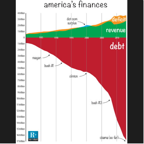
The D.C. press corps was giddy last night, declaring that the fiscal crisis had ended. Senators praised “honorable friends” from “great states,” congressmembers gave standing O’s to their stalwart leaders, and the president saluted bipartisanship while ridiculing Republicans, bloggers, activists and pretty much anyone else who dared oppose him.
If the whole thing seemed a bit surreal, it’s because the whole thing was a bit surreal. America’s fiscal crisis is not that our debt ceiling isn’t quite high enough — it’s that we have too much debt.

The Consumer Price Index (CPI) rose 1.1% in the 12 months to September, matching the increase in August.
The Bank of Canada’s core index rose 1.3% in the 12 months to September, matching the increase in August.
On a monthly basis, the seasonally adjusted core index rose 0.1% in September, after posting no change in the previous month.
As the CPI came in as expected the Canadian Dollar is unchanged on the day.
Drew Zimmerman
Investment & Commodities/Futures Advisor
604-664-2842 – Direct
604 664 2900 – Main
604 664 2666 – Fax
800 810 7022 – Toll Free

You are about to learn one of the biggest secrets in the history of the world…it’s a secret that has huge effects for everyone who lives on this planet. Most people can feel deep down that something isn’t quite right with the world economy, but few know what it is. Gone are the days where a family can survive on just one paycheck…every day it seems that things are more and more out of control, yet only one in a million understand why. You are about to discover the system that is ultimately responsible for most of the inequality in our world today. The powers that be DO NOT want you to know about this, as this system is what has kept them at the top of the financial food-chain for the last 100 years…
Learning this will change your life, because it will change the choices that you make. If enough people learn it, it will change the world…because it will change the system . For this is the biggest Hidden Secret Of Money. Never in human history have so many been plundered by so few, and it’s all accomplished through this…The Biggest Scam In The History Of Mankind.

-
I know Mike is a very solid investor and respect his opinions very much. So if he says pay attention to this or that - I will.
~ Dale G.
-
I've started managing my own investments so view Michael's site as a one-stop shop from which to get information and perspectives.
~ Dave E.
-
Michael offers easy reading, honest, common sense information that anyone can use in a practical manner.
~ der_al.
-
A sane voice in a scrambled investment world.
~ Ed R.
Inside Edge Pro Contributors

Greg Weldon

Josef Schachter

Tyler Bollhorn

Ryan Irvine

Paul Beattie

Martin Straith

Patrick Ceresna

Mark Leibovit

James Thorne

Victor Adair