
Bonds & Interest Rates
![]() Market Buzz – Pay Down Your Debt Canada
Market Buzz – Pay Down Your Debt Canada
The S&P/TSX Composite Index closed down 1.17% on the week and is up just over 5.5% in 2013 so far. Gains on Toronto’s main index year-to-date continue to pale in comparison to U.S. indexes where the S&P 500 is up just under 25% on the year.
A story that is receiving a good deal of attention North of the border involved the latest data from StatsCanada. The government number cruncher reported Friday that the level of household credit market debt to disposable income in Canada increased to 163.7% in the third quarter from 163.1% in the second quarter.
That means Canadians owe nearly $1.64 for every $1 in disposable income they earn in a year.
Policymakers and many international investors are fixated on the debt ratio in part because it was at above 160% that households in the United States and Britain ran into trouble about five years ago, contributing to defaults and the financial crisis that triggered the 2008-09 recession.
Before you start to assume that we are extrapolating a Canadian debt crisis, we will stop you right there. But as debt adverse investors, we do not believe the country is headed in the right direction and believe that many in this country should “give their heads a shake” and stop living beyond their means. It is not sustainable and often leads to a scenario where the responsible pay for and suffer for the irrational and selfish behaviour of the irresponsible.
Growing debt levels are a worrying trend and should truly be the focus of the report, but the collective media (both financial and not) is telling us there is some great news in this report. The sunshine comes from the fact that household net worth hit a record high of $7.5 trillion. That’s an increase of almost 2% quarter-over-quarter, thanks mostly to rising housing and equity prices. We immediately question if both the former and the latter are sustainable, but that is for another column.
|
KeyStone’s Latest Reports Section |
Disclaimer | ©2013 KeyStone Financial Publishing Corp.

Mike’s two Goofies from last weekends Money Talks that, well, Mike thinks will have you just shaking your heads in disbelief…. {mp3}mtgoofy3{/mp3}

The Gold and Silver Index (XAU) represents a group of precious metal mining stocks. It is in a major decline from the 2010 top.
We have watched the XAU form a massive head and shoulders pattern for over three years. The neckline was violated this year, and the technical downside target was somewhat below the horizontal support line drawn from the 2008 low, so it would seem that there is more downside to go before the target is reached.
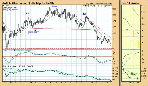
The following is an excerpt from the December 13th, 2013 blog for Decision Point subscribers.
….readl more HERE

The Amazing thing is people are already talking about this is aBUBBLE that is unsustainable. They are now claiming household income is down 4% yet the S&P 500 is up 70%. They are incapable of any real analysis. The RETAIL investor is NOT involved in this market. There is no wild speculative fever. They are obsessed with this being a bubble purely based on new highs with no regard for the pattern.
There has to be a Phase Transition for a Bubble. That requires a near doubling in the value within often the last year. We have new highs in the DAX as well. Why? Is the European economy doing well? No way!
Capital is fleeing from PUBLIC to PRIVATE. This is capital preservation – not wild speculation. Pension funds are moving into equities. Central banks are even putting out their reserves to be privately managed. The IMF is proposing taking 10% of all accounts in a bank in Europe. They are arguing for a SuperBank in Europe that will have the power to directly tax people in Europe and no nation can stop them.
HELLO! Just where is the wild speculation these people are yelling about that make up a bubble?
Ed Note: More articles from Martin Armstrong:
Greece To Default in 2014 – Cycles of War – Presidential Elections 2016
Understanding 2014
Seeing the Light
If credit expansion leads the stock market, the market is in trouble.
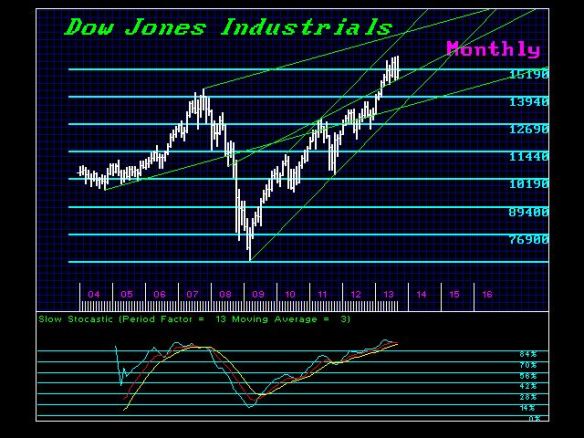
Before you buy the dip “because this Bull market will run until 2016,” please ponder this chart from our Chartist Friend From Pittsburgh of total credit and the Dow Jones Industrial Average (DJIA). Unsurprisingly, the stock market advances when credit is expanding and declines when credit growth slows.
Why is this unsurprising? Because ours is a debt-dependent consumer economy: everything from local government building projects to the purchase of vehicles to going to college requires borrowing money (i.e. credit expansion).

Source: The Dome Top Bears Have Been Given Their Stock Market Sell Signal
Here is Chartist Friend From Pittsburgh’s commentary:
Total Credit Market Debt (TCMD) growth is not confirming the new DJIA high at all.
The trend of TCMD growth clearly reversed lower in 2007 by making a new all time low. The uptrend of the DJIA appears to be up since it’s recently made new all-time highs.
The point is – there’s a serious disconnect/divergence/non-confirmation going on here and in the end credit growth is the more important of the two and determines the trend because people can’t make a move nowadays without taking out a loan (house, car, student, government spending, etc.).
I would add these points:
1. Notice that credit growth is rolling over, and that its recent peak was significantly lower than the 2007 peak. In other words, despite rescuing the Too Big To Fail Banks (TBTF) to the tune of $16 trillion and the creation of $3.2 trillion that it pumped into the financial system to goose housing and stocks, the Federal Reserve’s unprecedented campaign to reflate leverage and credit only managed a weak bounce from 2007 highs in credit growth.
This is known as diminishing returns: Our Era’s Definitive Dynamic: Diminishing Returns(November 11, 2013)
The Fatal Disease of the Status Quo: Diminishing Returns (May 1, 2013)
2. In a debt-dependent consumer economy beset with declining real income for the bottom 90%, the only way to expand credit is to blow asset bubbles that boost phantom assets long enough to leverage new debt:
…..go HERE to continue reading & viewing more charts

-
I know Mike is a very solid investor and respect his opinions very much. So if he says pay attention to this or that - I will.
~ Dale G.
-
I've started managing my own investments so view Michael's site as a one-stop shop from which to get information and perspectives.
~ Dave E.
-
Michael offers easy reading, honest, common sense information that anyone can use in a practical manner.
~ der_al.
-
A sane voice in a scrambled investment world.
~ Ed R.
Inside Edge Pro Contributors

Greg Weldon

Josef Schachter

Tyler Bollhorn

Ryan Irvine

Paul Beattie

Martin Straith

Patrick Ceresna

Mark Leibovit

James Thorne

Victor Adair