
Timing & trends
The press is demanding the attention of investors more than ever. Whether it was the recent jobs report or last week’s testimony from Janet Yellen, sorting through the market noise is no easy task. Since the world is so interconnected from Facebook to WhatsApp, a spark of news can ignite unfounded fear in an instant. What’s truly significant when it comes to your investments?

Twice a day, in the morning and at lunch, our investment team sits down together to discuss what’s important and what’s immaterial. Last week, in my opinion, the good outweighed the bad. Much of the economic news was a direct result of government policies, both fiscal and monetary. Here are my findings, which I hope will help you filter through the noise.

What are the challenges?
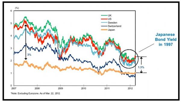
1) As you probably know by now, the Global Purchasing Managers’ Index (PMI) is one of the key metrics we pay attention to as a gauge of the global economy’s strength. In April the Global PMI fell from 52.1 to 52.0, and though the drop was small, investors who previously were encouraged by a synchronized growth cycle, lost some confidence. Japan’s services and manufacturing PMI readings dropped precipitously. The services PMI plunged to 46.4 in April and the manufacturing PMI fell to 49.4. Both numbers were above the 50 mark in the previous month.

The reason for Japan’s slump lies in the consumption tax rate hike, from 5 percent to 8 percent, imposed on the country on April 1. The tax increase was aimed at decreasing the country’s huge public debt, nearly 245 percent of GDP. Just when Japan was finding its economic foothold for recovery, the restrictive fiscal policy caused economic activity to stumble.

Why it matters: The reason for the fall in Global PMI is directly related to Japan’s fall in PMI. Japan has become a drag on global growth. It’s important to recognize the root cause – increased taxes just as monetary stimulus measures were seeing results. This is not good for economic growth and should serve as a cautionary tale for other countries.
2) Another challenging area of the market is China. China’s manufacturing PMI came in lower at 48.1 in April, contracting for the fourth month in a row, and the country also saw a decline of 0.3 percent in its consumer price index (CPI). Employment in the Asian nation is also at a seven-month low, adding growth concerns for the country.
Why it matters: This negative data means there is potential for fiscal policy easing, allowing the Chinese government to boost the economy in the coming months.
Focus on the strong points.
1) The rate of change of global industrial production (IP) was slowing until the close of 2013. Now, however, the global growth outlook is improving. You can see that an inflection point was hit in mid-2013, reaccelerating IP and coinciding with the global GDP outlook for 2014.
Europe is also doing well. The eurozone composite PMI, a good indication of growth, rose to 54.0 in April. In addition, Spain and the U.K. saw increases in GDP in the first quarter and Spanish banks are seeing a decline in bad debts.
Why it matters: When global IP moves up, this is a sign that momentum in the global economy has changed – for the better. This is good for commodities such as oil, gas and copper, but also for cyclical areas like energy and industrials. There is no doubt that people in every country want upward mobility for their families, and as the demand for better education, cars, etc. continues, commodities and cyclicals should benefit.
2) In a recent report, ISI also highlights that minimum wages are going up in the U.S., citing examples of multi-year wage increases for those who had not received pay increases for the last several years. Various groups who received no increase before will now see a 4 percent rise per year, a leading indicator of wage growth trends. Consumer net worth is also expected to rise by $7.1 trillion in the second quarter, taking it to $82.5 trillion.
Why it matters: Real incomes are expected to rise as wage increases outpace inflation. With the uptick in consumer net worth and steady job growth, consumers will feel more comfortable spending.
3) Bank loans have seen an increase of 10.4 percent annualized rate over the last 14 weeks. As you can see in the chart below, the number of loans continues to increase. According to the Wall Street Journal, one area where bank lending has accelerated is to commercial businesses.

Why it matters: This positive trend is a potential inflection point for the economy because it indicates economic acceleration. Not only are banks making it easier to borrow by relaxing lending standards, companies are confident enough about the economy to want more money to grow and invest. The WSJ goes on to say that earnings in April from the six largest banks in the U.S. pointed to an increase in commercial loans of 8.3 percent in the first quarter from last year.
Economic data around the globe continues to remain supportive. Even among challenges, there are opportunities to be found. For example, on Thursday we heard that the European Central Bank is likely to ease interest rates in June. This could be another catalyst for Europe, which is already showing improving economic activity.
Similarly, China’s inflation is at an 18-month low as of Thursday, which could increase the odds of a policy response, a positive stimulus for the economy. Japan is dealing with the same thing; the country committed to Abenomics and will likely respond with additional policy support to get back on the recovery track. Don’t let negative news overshadow good news and keep in mind that bad news tells you where the opportunities are.

Fund portfolios are actively managed, and holdings may change daily. Holdings are reported as of the most recent quarter-end. The following securities mentioned in the article were held by one or more of U.S. Global Investors Funds as of 03/31/2014: Facebook.
All opinions expressed and data provided are subject to change without notice. Some of these opinions may not be appropriate to every investor. By clicking the links above, you may be directed to third-party websites. U.S. Global Investors does not endorse all information supplied by these websites and is not responsible for their content.
The Consumer Price Index (CPI) is one of the most widely recognized price measures for tracking the price of a market basket of goods and services purchased by individuals. The weights of components are based on consumer spending patterns. The Purchasing Manager’s Index is an indicator of the economic health of the manufacturing sector. The PMI index is based on five major indicators: new orders, inventory levels, production, supplier deliveries and the employment environment. The J.P. Morgan Global Purchasing Manager’s Index is an indicator of the economic health of the global manufacturing sector. The PMI index is based on five major indicators: new orders, inventory levels, production, supplier deliveries and the employment environment.

Not so long ago, a reasonably-presentable American could live an hour outside of a city and commute in for a government or banking job, thus getting the best of both worlds: city-level wages and a 3,000 square foot house with a big yard for the kids.
But then municipal governments ran out of money and started laying off, while banks, traumatized by their 2009 near-death experience, cut back on mortgage and consumer lending and fired the related staff. The only other jobs available were in service industries like food and retail that paid next to nothing and didn’t offer benefits.
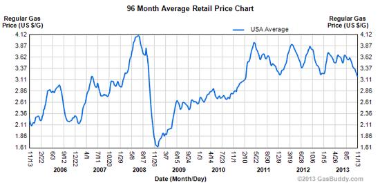
Meanwhile, the cost of living in and commuting from suburbia has been rising. The chart below shows the average price of a gallon of gas, a pretty good proxy for the cost of a daily commute, up by nearly 50% since 2005. At about $3.60 a gallon, the current national average price is 7 cents higher than it was a year ago, with no letup in sight.
All of a sudden our hypothetical suburbanites find themselves with barely enough income to cover their mortgage or rent, let alone their health care, food (which is also way up lately) and gas. And now the kids are about to go off to college…
The result: millions of formerly middle class families living in nice suburban houses or expensive apartments are slowly going broke. The New York Times just published a long, fascinating but very depressing article on the morphing of suburbia to ghetto in California’s Inland Empire. An excerpt follows; the full article is here:
“Hardship Makes a New Home in the Suburb
MORENO VALLEY, Calif. — The freeway exits around here are dotted with people asking for money, holding cardboard signs to tell their stories. The details vary only slightly and almost invariably include: Laid off. Need food. Young children.
Mary Carmen Acosta often passes the silent beggars as she enters parking lots to sell homemade ice pops, known as paletas, in an effort to make enough money to get food for her family of four. On a good day she can make $100, about double what she spends on ingredients. On a really good day, she pockets $120, the extra money offering some assurance that she will be able to pay the $800 monthly rent for her family’s three-bedroom apartment. Sometimes, usually on mornings too cold to sell icy treats, she imagines what it would be like to stand on an exit ramp herself.
“Everyone here knows they might have to be like that,” said Ms. Acosta, 40, neatly dressed in slacks and a chiffon blouse, as she waited for help from a local charity in this city an hour’s drive east of Los Angeles. Both she and her husband, Sebastian Plancarte, lost their jobs nearly three years ago. “Each time I see them I thank God for what we do have. We used to have a different kind of life, where we had nice things and did nice things. Now we just worry.”
Five decades after President Lyndon B. Johnson declared a war on poverty, the nation’s poor are more likely to be found in suburbs like this one than in cities or rural areas, and poverty in suburbs is rising faster than in any other setting in the country. By 2011, there were three million more people living in poverty in suburbs than in inner cities, according to a study released last year by the Brookings Institution. As a result, suburbs are grappling with problems that once seemed alien, issues compounded by a shortage of institutions helping the poor and distances that make it difficult for people to get to jobs and social services even if they can find them.
In no place is that more true than California, synonymous with the suburban good life and long a magnet for restless newcomers with big dreams. When taking into account the cost of living, including housing, child care and medical expenses, California has the highest poverty rate in the nation, according to a measure introduced by the Census Bureau in 2011 that considers both government benefits and living costs in different parts of the country. By that measure, roughly nine million people — nearly a quarter of the state’s residents — live in poverty.
Not long ago, the Inland Empire, as the sprawling suburban area east of Los Angeles is known, attracted people hoping to live out that good life. Before the recession, it was booming; housing developments were cropping up all the time, quickly followed by big box stores and strip malls to cater to the new residents.
The region was — and still is — the fastest growing in the state. But the jobs have never really followed the people who come here looking for cheaper housing. The median home value is $325,000 and the median rent is $1,690, according to the real estate database Zillow. That compares with $462,000 and $1,860 in Los Angeles.
For many, those costs are still unaffordable. Unemployment in the region hovers around 10 percent and nearly one-fifth of all residents live in poverty, the highest rate among the largest metropolitan areas in the country. By the official federal measure, nearly one-third of all children here are poor. The number of poor in San Bernardino and Riverside Counties nearly doubled over the last decade.
“This is where poor people live now, and this is where they are going to live,” said Alan Berube, an author of the Brookings Institution study. “When poverty moved out of the inner cities it didn’t just go next door, it went 30 miles away. But at the time those families might not have been poor — they were just chasing the middle-class dream. Then, boom, that evaporated.”
Some thoughts
The theme of this series (the previous articles are here) is that much of what affluent people in general and Americans in particular have come to take for granted is turning out to be a delusion bought with debt, unrealistic energy assumptions and fraudulent bookkeeping, and is evaporating as those, um, mistakes come to light. Entitlements like Social Security and Medicare, for instance, only exist in their current forms because so much of their real cost is hidden in largely-unreported “unfunded liabilities.” Cities have been able to offer good roads and quick police response because they pay their cops and road workers with the promise of wildly unrealistic future pensions.
The concept of suburbia, meanwhile, always depended on debt and cheap energy. For a typical American family to heat and cool four times the space of its counterparts in other countries — and to move two tons of metal 100 miles each day just to get to a job — is only possible as long as the rest of the world is kept poor and therefore unable to consume fossil fuels at the North American rate. But as China, India and Brazil get into the game, energy costs are rising. Combine this with the ongoing decline in finance/government jobs, and the unworkability of modern suburbia becomes obvious.
But calling suburbia’s demise inevitable doesn’t make it any less tragic for the victims. Anyone who’s lived in an affluent suburb knows they are (or at least used to be) home to perhaps the world’s highest concentration of innately happy, optimistic beings, namely kids, dogs and adults with big houses and good jobs, none of whom are guilty of anything more than a lack of attention to macroeconomic trends. So while schadenfreude is appropriate for, say, imploding law firms or investment banks, dying suburbs just deserve our pity.
\

….plus Market Insight: Small Caps Break Down by Chris Hunter
True Confessions of a Newsletter Guy…
When we turned the lights off on Friday, the Dow was hitting a new high. But US small caps and the tech-heavy Nasdaq are not faring so well. (More on that from Chris below…)
We gave you a rare recommendation on Friday: Buy Russian gas giant Gazprom OAO (PINK:OGZPY).
Who knows? But with a trailing 12-month price-earnings ratio of 2.7, it looked like a Mother’s Day gift to us. By contrast, the US Internet sector appears to be a kiss of doom – the kind of smooch that would make your face itch.
Last time we looked, Amazon.com – the “river of no returns” – was trading on a trailing 12-month price-earnings ratio of 454 and had earnings per share of just $0.64. Compare that with Gazprom, with its P/E of just 2.7 and earnings per share of 106 rubles – or $3.
Put one beside the other: Amazon.com is almost all P. Gazprom is almost all E. All things considered, we’d rather have the E.
But Amazon.com is not the only tech star to be all P and no E.
Our younger friends tell us Facebook has revolutionized the way they get information. They no longer go to newspapers or news sites; they get their news, opinions, and misinformation from Facebook.
Maybe so, but it looks more like a big time waster to us. And it’s trading at 76 times trailing 12-month earnings. Profits would have to go up 700% before the P/E ratio came down to a reasonable level. Or… the stock price would have to fall by 80%.
One of those two things will happen, sooner or later. Our guess is that shareholders won’t like it when it does.
And how about LinkedIn?
We used the service, briefly. It was supposed to be handy for making business connections. Did we give up too quickly? Maybe. But at 749 times earnings, it would have to get us an audience with the pope… or a date with Beyoncé… to justify the price.
At least Amazon.com, Facebook and LinkedIn have some earnings… however small. Many of these high-flying tech companies enjoy the incredible lightness of having no federal income tax to pay. Online business directory Yelp, for example, has a market cap of more than $4 billion. But it earns nothing after costs – zero… zilch… nada. It’s priced at about 18 times sales… and more than 1,000 times EBITDA. Real estate site Zillow trades at 16 times sales.
If the prices of these tech companies weren’t enough to scare you away, consider the control issue. Last week, the media reported that Twitter’s stock price has been cut in half this year because of “insider selling.”
Wait a minute. How come the insiders were selling? Didn’t they have faith in their own company? And how did they get so many shares in the first place?
Oh, dear reader, you can be so naïve sometimes.
Both government and Wall Street are run for the benefit of insiders. You should know that by now. What enterprise isn’t?
Our Best Shot
Here, we’ll offer a confession: We’ve been publishing financial research, insights and recommendations for 35 years. Many times people ask us: If you really knew what was going to happen, you wouldn’t sell your recommendations, would you?
Of course not! We’re not that smart. Or that dumb. And we’re no angels, either.
We research, we think, we study… and we take our best shot. Sometimes right. Often wrong. Always in doubt.
That’s our business model: Readers pay us to try to figure out how things work… and what’s ahead. We wake up in the middle of the night sweating over the Triffin paradox or the Bank of Japan’s monetary policy.
But if we really knew what was going to happen, we wouldn’t sell our advice for 99 lousy dollars… or give it away for free! We’d keep it to ourselves… stay mum… and place our bets quietly. Please keep this in mind as you read our advice, below…
And when Wall Street offers to sell you a share of Twitter or Zynga or Zillow when they IPO… do you really think it is for your benefit? Do you think they are giving you an opportunity to get in on a great investment?
Nah… not if they can avoid it!
You’re the retail buyer… what Wall Streeters like to call “cannon fodder.” Wall Streeters will only sell you shares they don’t want themselves. They’re no angels either.
And neither are the insiders who take these tech companies public. They typically keep large stockholdings… which they unload as soon as they are able. Most likely, after the initial enthusiasm wanes. And with some very public exceptions, there will always be more sellers than buyers.
The Great Capitalist Adventure
And if that weren’t enough, the insiders also make sure that they retain control of the money, no matter how many moms and pops own the shares.
Facebook insiders, for example, own Class B shares giving them 10 votes for every ballot cast by mom and pop. They will make sure they direct the company’s resources to themselves… one way or another.
Typically, the shareholders get no dividends… and will never get any substantial piece of the profits.
You think it’s a level playing field, smoothed and policed by the SEC? You think Wall Street is there to help you finance your retirement? You think that by buying a stock you are a real investor, participating equally and fairly in the Great Capitalist Adventure?
Well, think again!
Here’s a trade that will work – cross our heart, hope to die (well, just cross our heart). Sell those damned expensive US Internet stocks. Buy those cheap energy companies run by corrupt Russian oligarchs.
And if it doesn’t work out?
Here’s a true confession of a newsletter guy: It is our best shot. What more can we tell you? Give it a couple of years. If it doesn’t work, let’s both forget it. We won’t say anything if you won’t.
Regards,
Bill
Further Reading: Most individual investors end up as “cannon fodder” for Wall Street. And the shocking part is you’re probably among them. This means you’re likely to get poorer, not richer, by investing in the stock market. The system may be rigged against you. But there is one simple trick you can use to “opt out” of the system altogether and finally achieve financial freedom. To find out how, read on here.
Small Caps Break Down
From the desk of Chris Hunter, Editor-in-Chief, Bonner & Partners
As Bill reports, the DJIA is hitting new highs, as small caps and the Nasdaq are breaking down.
This doesn’t mean a crash is on its way… but it does signal a corrective phase in US stocks is underway.
You’ll see exactly what I mean in the following two charts…
The first, is of the Dow Industrials going back the last six months. As you can see, the blue-chip index remains in a solid uptrend. And it has tested and held support at its 50-day moving average multiple times.

But it’s a different story for the US small-cap Russell 2000 Index. As you can see from the chart below, it has broken below its 50-day and 200-day moving averages (meaning the current price is below the average price for the last 50- and 200-day trading days).

In other words, the US market looks healthy at first glance… but drill down a bit and another, less healthy, picture emerges.
If we see further weakness in the small caps, US blue chips may not be far behind.
P.S. Don’t forget to check out the latest report from our publisher, Will Bonner. It details how a small group of rogue globetrotting millionaires are opting out of the rigged system on Wall Street… and finding financial freedom in a highly unusual way. Read Will’s full write-up here.

In today’s post I’m going to make the case for stocks moving down into a sharp correction over the next 4 weeks and conclude with my thoughts on inflation.
To begin we need to examine the last two intermediate cycles. Normally an intermediate cycle will run roughly 22 weeks. Well in our case the last two cycles were both stretched to 32 weeks by the Fed’s QE3 programs. As you can see in the next chart both intermediate cycles had 4 smaller daily cycles embedded within them. This is pretty unusual as most intermediate cycles only have 2 or 3 daily cycles nested within. The market is now in desperate need of a short cycle to balance out these two long cycles.

Next let’s examine the larger yearly cycle. As you can see out of the last 4 years, the larger yearly cycle bottom has occurred in the summer 3 times. The odds are favorable that the 2014 yearly cycle low should also occur in the middle of summer.

If the current intermediate cycle bottoms with the ongoing 2nd daily cycle, then we would get our yearly cycle low in early June. Right when it is expected.
On the other hand if somehow the Fed manages to stretch this intermediate cycle also, then the yearly cycle wouldn’t arrive until the end of summer/early fall.

Obviously I don’t give this scenario very favorable odds as I don’t believe we will see three stretched intermediate cycles in a row, especially now that the Fed is withdrawing the fuel to generate another stretched cycle.
What appears to be happening is that stocks have entered a 4 month consolidation phase ever since the Fed started tapering.

A consolidation of that size is likely to produce a rather large move once the consolidation resolves one way or the other. I’m in the camp, based on my cyclical analysis that believes it will resolve downwards over the next 4-5 weeks. Go to that first chart again to see my expectations for what I think is about to play out.
THE INFLATION HAS BEGUN
Just like the topping process in 2007/08 the rotation of inflation out of the stock market and into the commodity markets has begun.
Notice that since the first taper in December the stock market has stagnated and gone basically nowhere for the last 4 months. During that period inflation has begun to leak into the commodity markets. This is the same process that occurred as stocks topped in 2007/08.

We should see a mild deflationary period over the next 4-8 weeks and all assets should take a hit. But once that correction has run its course stocks should continue the stagnation phase as the cyclical bull continues what I expect will be a multi-month topping process. As this progresses the inflation that has been stored in the stock market will leak faster and faster into the commodity markets during the second half of the year.


-
I know Mike is a very solid investor and respect his opinions very much. So if he says pay attention to this or that - I will.
~ Dale G.
-
I've started managing my own investments so view Michael's site as a one-stop shop from which to get information and perspectives.
~ Dave E.
-
Michael offers easy reading, honest, common sense information that anyone can use in a practical manner.
~ der_al.
-
A sane voice in a scrambled investment world.
~ Ed R.
Inside Edge Pro Contributors

Greg Weldon

Josef Schachter

Tyler Bollhorn

Ryan Irvine

Paul Beattie

Martin Straith

Patrick Ceresna

Mark Leibovit

James Thorne

Victor Adair