A friend on mine emailed a link to a Vox article on The Biggest Surprise of the Financial Crisis.
Let’s take a look HERE

U.S. Global Investors recently welcomed Doug Peta, an economist from BCA research, to our offices. He presented some interesting research regarding the Fed Funds Rate Cycle, and in turn, what that research could mean for gold. I wanted to share points from his presentation, as well as our own in-house research, to help you understand the positivity we see for the precious metal looking towards 2015.
Where are we now?
Below is a chart from BCA showing the Fed Funds Rate Cycle. In essence, this chart neatly illustrates what the interest rate cycle imposed by the U.S. Federal Reserve looks like. The red circle indicates where we are right now: Phase IV, also known as the “easing” phase of the monetary policy that was enacted in 2008 in the U.S., better known as quantitative easing (QE).
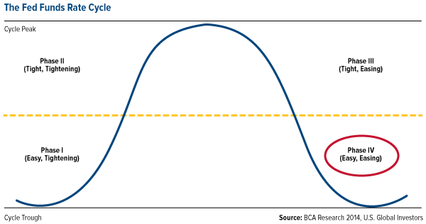
As we know, the Fed enacted QE to stimulate our nation’s economy. Right now we’re benefitting from our placement in Phase IV of this cycle because it is in this phase that the Fed is able to keep interest rates low, keep reserve requirements low and continue printing money. Similarly, when money is “easy,” businesses can find funding for projects and consumers have easier access to credit.
Historically, Phase IV (as well as the shift towards Phase I) are the best for equity investors because stocks usually rise during these two positions in the cycle.
Why these phases are good for gold, too.
We have been in Phase IV of the Fed Funds Rate Cycle for a few years now, and are expected to remain here into 2015. Eventually the Fed will have to start tightening again and raise rates, although the numbers should remain relatively low for a while. Once this begins, we will move into Phase I.
When it comes to the performance of gold and gold stocks, history indicates good times are ahead based on where we are in the cycle. Take a look at the tables below showing median returns during the cycle dating back to 1970 and 1971. You’ll see that for gold and gold stocks, Phase IV and Phase I both show the highest median returns.
| Spot Gold, From June 1971 | TSE Gold Miners, From July 1970 | ||
|---|---|---|---|
| Phase | Median | Phase | Median |
| Phase I (Easy, Hiking) | 11.8% | Phase I (Easy, Hiking) | 16.2% |
| Phase II (Tight, Hiking) | 2.2% | Phase II (Tight, Hiking) | -8.8% |
| Phase III (Tight, Cutting) | -4.3% | Phase III (Tight, Cutting) | -15.9% |
| Pase IV (Easy, Cutting) | 9.2% | Phase IV (Easy, Cutting) | 24.2% |
Note: Excluding the two-month Phase II period spanning the October ’87 stock market crash.
The reason for the high returns during these two phases is because of “easy money.” Tight money, which is what Phase II and III are based upon, is typically bad for gold investors. When money is tight, we don’t have inflation, and investors don’t need to turn to gold as a hedge against inflation. Without inflation there is no need to hedge.
Another reason we’ve traditionally seen gold investors benefitting during Phases IV and I of the cycle is that when money is easy, interest rates are low, meaning less opportunity cost for holding the precious metal. To help illustrate, imagine putting your money in a savings account and earning 5 percent on it. Well, the opportunity cost of keeping gold under your mattress would be giving up that 5 percent that you could be earning elsewhere. When your savings account yields next to nothing, some reason, why not just buy some gold?
This pattern is worldwide.
The trends we see in the Fed Funds Rate Cycle are not only U.S. specific. This same idea carries through to the stimulative policies of the European Central Bank and Japan. More countries around the world are applying monetary stimulus programs much like the U.S., while moving away from more restrictive policies. Remember that restrictive policies relate to tightening, which is bad for gold, and stimulative policies relate to easing, which is good for gold.
Right now, gold could use a pick-me-up, and here’s why. Over the last several years we’ve seen slowing money supply growth in many E7 countries. E7 refers to seven countries with emerging economies including China, India, Brazil, Mexico, Russia, Indonesia and Turkey. It’s these countries that drive the Love Trade for gold, primarily China and India, which purchase the metal for religious and cultural celebrations.
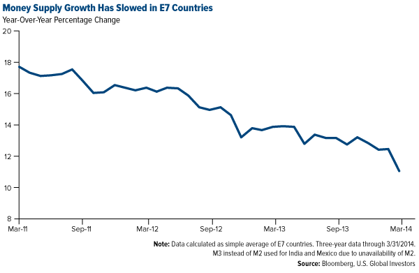
With less money being spent or borrowed, not only did the Love Trade begin to slow, global GDP growth also began to slow as you can see below.
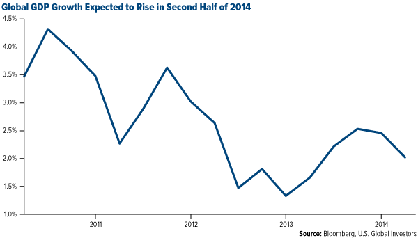
The good news is, as we see various countries applying monetary stimulus, including emerging markets, we can expect this to contribute to global GDP growth. In 2014, global GDP is expected to grow by 3.2 percent, according to the World Bank’s latest projections.
Similarly, the money supply of the United States has been a steady grower and the money supply in the E7 countries is also expected to reverse course; right now it is growing again but at a slower rate. The U.S. data suggests that a new easing cycle is starting in Europe, Japan and emerging markets. A pickup in economic activity in the E7, especially the big gold consumers, is yet another positive sign for the yellow metal.
Real interest rates are headed lower for most of the world as well. As money supply grows, countries eventually feel inflationary pressures. This will hold true in the U.S. as we move into 2015 and back into Phase I. All of these changes can lead to a declining confidence in paper money, yet another good sign for gold.
An interesting side note.
I have noticed that recent articles in both Money Magazine and the New York Times use an array of gold images to illustrate wealth. It seems that while some may debate whether gold is money, gold remains an enduring symbol of wealth.


The energy sector has surged during the last two months which can be seen by looking at the XLE Energy Select Sector Fund. If crude oil continues to climb to the $112 level, XLE will likely continue to rally for another few days or possibly week as energy stocks are considered a leveraged way to play energy price movements.
Another way to look at this info is through the USO United States Oil Fund. This tracks much closer to the price of oil. The only issue is that many ETFs that “try to track” an underlying commodity is in how the funds are built. They own multiple contracts further into the future which does not exactly provide us with the short term news/event driven price movements in the current front month contract as they should.
What does this mumbo jumbo mean? Well, it means funds like USO and the highly respected UNG, and VIX ETFs… (just joking about the highly respected part), fail to track the underlying commodity or index very well when it comes to short term price movements. This means, you can nail the timing of a trade, and the commodity or index will move in your favor, yet your fund loses money, or goes nowhere…
WTI crude oil has formed a bullish ascending triangle pattern from March to May of this year. The breakout to the upside is bullish and should be traded that way until the chart says otherwise. This breakout and first pullback must hold, or I will consider it a failed breakout. So if price dips and closes 2 days below the breakout level, it will be a major negative for oil in my opinion.
The range of the ascending triangle provides us with a measured move to the upside which is $112. Typically the first pullback after a breakout can be bought. The first short term target to scalp some gains would be $109, and at that point moving your stop to breakeven is a wise decision. Trading is all about managing capital and risk, if you don’t, then the market will take advantage of your lack in discipline.
Looking further back on the chart, you can see the double bottom formation also known as a “W” formation. Once the high of the “W” formation is broken the trend should be considered neural or up.
Also note that the RSI (relative strength) has been trending higher for some time now. This means money is rotating into this commodity. This is in line with my interview this week with Kerry Lutzand my recent article talking about the next bull market in commodities and the TSX (Toronto Stock Exchange).

In short, oil has some extra risk around it. The recent move has been partly fueled by news overseas. So at any time oil could get a lift or take a hit by news that hits the wires. I tent to trade news related events with much less capital than I normally do because of this risk.
Happy Trading!
Want More Trade Ideas? Get Them Here: Www.Goldandoilguy.Com

Any wage increase for Teachers above what has already been negotiated with the Nurses, BCGEU & CUPE, will automatically get passed along to those other Government Unions beccause of what are called “me to” clauses.
Thereby multiplying the cost to taxpayers. But I don’t see many people…..
{mp3}/mikesdailycomment/mcbuscom14june20{/mp3}


Chinese construction firms can 3-D print 10 low-cost houses a day with machines that add layer after layer of quick-drying cement in a process called “contour crafting”.
A private company in east China recently used a giant printer set to print out ten full-sized houses within just one day.
The stand-alone one-story houses in the Shanghai Hi-Tech Industrial Park look just like ordinary buildings. They were created using an intelligent printing array in east China’s city of Suzhou.
The array consists of four printers that are 10 meters wide and 6.6 meters high and use multi-directional automated sprays. The sprays emit a combination of cement and construction waste that is used to print building walls layer-by-layer.
Ma Yihe, the inventor of the printers, said he and his team are especially proud of their core technology of quick-drying cement. Ma said he hopes his printers can be used to build skyscrapers in the future.
This technology allows for the printed material to dry rapidly. Ma has been cautious not to reveal the secrets of this technology.
MarketWatch provides this image of the 33 foot wide by 22 foot tall building.

To label aesthetics as “unappealing” would be a huge understatement. But what do you expect for a house that costs $5,000?
2,500 Sq Ft Printed Home
Using similar technology, and larger printers, MSN notes 3D Printer Can Build 2,500 Square Foot House in 24 Hours.

The University of Southern California is testing a giant 3D printer that could be used to build a whole house in under 24 hours.
Professor Behrokh Khoshnevis has designed the giant robot that replaces construction workers with a nozzle on a gantry, this squirts out concrete and can quickly build a home according to a computer pattern. It is “basically scaling up 3D printing to the scale of building,” says Khoshnevis. The technology, known as Contour Crafting, could revolutionise the construction industry.
As Khoshnevis points out, if you look around you pretty much everything is made automatically these days – “your shoes, your clothes, home appliances, your car. The only thing that is still built by hand are these buildings.”

“It’s a CAD/CAM solution,” says Khoshnevis. The buildings are “designed on computer and built by a computer”. Contour Crafting hopes to generate “entire neighbourhoods built at a fraction of the cost, in a fraction of the time, far more safely, and with architectural flexibility that is unprecedented.”
The Contour Crafting solution also produces much stronger structures than traditional building methods. According to Contour Crafting the tested wall is a 10,000PSI (pounds per square inch) strength compared to an average of 3,000PSI for a regular wall.
They would not be as homogenous as the suburbs, says Khoshnevis, because “every [Contour Crafted] building can be different. They do not have to look like track houses because all you have to do is change a computer program” to get a completely different house.
Because the buildings are printed with a nozzle, they can also be far more creative than current constructions. “The walls can be curved” says Khoshnevis and “you can have very exotic architectural features without incurring additional costs.”
Will builders be out of work?
What the implications are for builders is, of course, a major concern. Building and construction has largely escaped the construction line automation of other industries and remains solid employment for millions worldwide. According to the International Labour Organisation construction employs nearly 110 million people worldwide and “plays a major role in combating the high levels of unemployment and in absorbing surplus labour from the rural areas.”
That’s a lot of people Contour Crafting could make redundant, which raises the question of whether the system could do more harm than good.
Contour Crafting
The idea that such technology would do more harm than good is of course preposterous. Falling prices and improved productivity should always be welcome. With this technology, we can easily build “affordable homes”.
Here is an interesting video on the “contour crafting” process
mprovements in technology inevitably raise standards of living. Curiously, people are concerned about it. Central banks will even attempt to fight it.
Mike “Mish” Shedlock
http://globaleconomicanalysis.blogspot.com
….mdore from Mike:
A friend on mine emailed a link to a Vox article on The Biggest Surprise of the Financial Crisis.
Let’s take a look HERE


I know Mike is a very solid investor and respect his opinions very much. So if he says pay attention to this or that - I will.
~ Dale G.
I've started managing my own investments so view Michael's site as a one-stop shop from which to get information and perspectives.
~ Dave E.
Michael offers easy reading, honest, common sense information that anyone can use in a practical manner.
~ der_al.
A sane voice in a scrambled investment world.
~ Ed R.

Greg Weldon

Josef Schachter

Tyler Bollhorn

Ryan Irvine

Paul Beattie

Martin Straith

Patrick Ceresna

Mark Leibovit

James Thorne

Victor Adair