
Personal Finance
The markets were ‘shockingly’ interesting last week. But what investing opportunities have been created by the recent ‘shock’?
The seriousness of last week’s shocking action in the market is shown by the volatility index, which posted its second highest reading since its inception in 1990. This is comparable to the great crash of 2008/9.

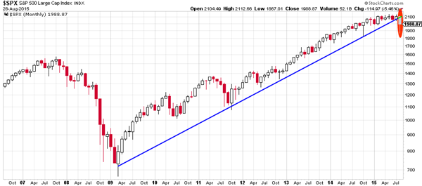
Ed Note: Charts like the one above are linked. Supposedly to a larger chart. Until corrected, the links present the chart in the same size.
There has been much discussion regarding technicals and charts. Instead, we prefer to focus on the trend, particularly the uptrend since 2012, without analysing the myriad of technical indicators. The weekly chart of the S&P 500 shows the uptrend is still intact (green dotted line below), although the S&P 500 arrived at a critical ‘make-or-break’ point. The weekly close on the trendline, only a couple of points above the 100 week moving average, suggests that all scenarios are still open.
However, the bad news for stock investors is that the 2009 uptrend is violated on the monthly chart, the most relevant chart type for secular trends. August is setting up for the first monthly close below the 2009 trendline. The odds now favor a continued decline, unless proven otherwise. Structural support comes in at the 2007 top, at 1600 points for the S&P 500, which is 19% below today’s levels.
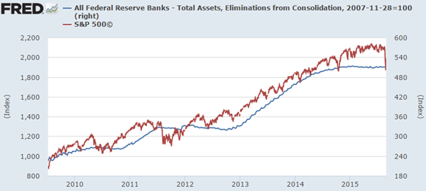
Our preferred indicator for the stock market is its correlation with the Federal Reserve balance sheet. Since 2009 it has been a very reliable indicator, as shown by the chart below. Uncoincidentally, the Fed’s balance sheet stabilized in late 2014, when the process of ‘Tapering’ was completed. Since then, the stock market has traded sideways following the Fed’s balance sheet.
That correlation suggests a weak future for stocks, unless the Fed intervenes with monetary stimulus, which was not what the Fed hinted during their recent announcements. Based on the Fed’s balance sheet and monetary decisions, one can assess whether U.S. stocks will offer opportunities or whether a cautious stance is preferable.
Global stock markets have fallen much more than in the U.S. In particular emerging markets are now down 39% since it peaked in June, triggered by the crash of the Shanghai stock exchange. How much more downside is likely? Based on the trend started in 2004, after a long consolidation period, we think the downside is another 10 to 15%. Knowing that this year’s correction in the emerging market index is already 22%, this could be an interesting space for opportunities in the coming months.

The correction in emerging markets is also reflected in copper’s spot price. As a leading indicator, Dr. Copper lost 18% of its value from its 2015 top until today. It is no coincidence that the secular trend on copper’s chart is similar to that of the emerging markets; even the percentage decline is comparable. Based on the secular trendline, the downside in copper is another 19% before it hits major support. We view this as a confirmation of the emerging markets forecast discussed above.

That brings our focus to commodities in general. Driven by the collapse of key commodities oil and copper, the damage in the commodity space has been huge. Since the 2011 top, the CRB index, a proxy for the commodity complex, has lost 45% of its value. Year-on-year, the index is 37% lower.

The good news for commodities is that they are hitting a secular bottom, as indicated by the red bar on the chart above. The 4 decade low is only 7% below today’s level. This seems like another area where opportunities will arise in the coming months.
What about gold? Is an opportunity developing? The most interesting trend on the longer term gold chart is the deceleration of gold’s decline. Although the trend remains down, with a clear formation of lower lows, the decline is slowing. Also note that the lows have occurred in an orderly manner, not comparable to the aggressive declines of April and June of 2013. This indicates selling pressure is fading and that gold is bottoming. The gold mining industry has been slaughtered, so the miners that survive this deep crisis will outperform once the tide turns in precious metals. Although a trend change takes time, we believe that opportunities are manifesting in gold, silver and miners.

Note on gold’s chart that the wedge is now ripe to change its trend. The quality of the wedge is high, with at least 3 tests at each side of the pattern. We wouldn’t be surprised at all if gold would start a secular breakout later this year. Mark our words!
We have purposely left currencies out of our analysis. Given the degree of central bank currency interventions, we believe the risk is too high for secular investors.
The conclusion regarding the markets is that the heavily sold emerging markets and some commodities will likely continue their decline, but they are setting up a major bottom in the not-too-distant future, potentially after more capitulation. Stocks in the U.S. are sitting at major support, so current price levels must be watched closely, as well as the monetary policy of the U.S. Fed, given the strong correlation between the Fed’s balance sheet and U.S. stock indices. Although gold is still declining, it is signaling an exhaustion of its decline and potentially an breakout from its downtrend.

At one point last week stocks were down 10% since May. Like many, I own some stocks and/or REITs, so scary days! Oil is down to $40 and likely to stay there for some time. So what are the implications for our main investment market – rental housing?
I phoned a few of our on-site building managers this week and asked them:
- Is the rent down 10% ? Answer: “No, it is flat and renovated suites are up”
- Did 10% of tenants leave? Answer: “No, why?”
- Are you sure the building vacancy hasn’t moved to 10% over the last 2-3 months? Answer: “No, of course not”
- Do competing landlords in the area offer incentives or are their rents down 10% or have they seen 10% vacancies? Answer: “No, they are like ours, all full and same rent, more or less”
I then phoned a few multi-family realtors in Texas, BC and Alberta (three of the markets we’d typically buy in today) and asked:
What is for sale with all this doom-and-gloom, $40 oil and the new orange NDP government in town now in Alberta ?
- Are building values coming down?
- Are there any deals ?
- We have money to invest and want to buy buildings 10% cheaper than a few months ago…
Answer, as you can imagine: “No! prices are still very strong and in MANY case actually have gone up as fearful investors leave the far more volatile industrial or office real estate space and look for safer heavens, let alone the spooked stock investors that lost 100’s of billions the last few weeks in various stock markets around the world.
Sorry, no deals. Many folks even de-listed as they don’t know where to put their cash after they sell their buildings”.
Some doom-and-gloom in the apartment building space!
You see, residential rental real estate behaves fairly predictably in good times AND very predictably in bad times!
That is THE key reason we have made so much money in that space over the last decade and a half, and continue to like them it.
- Even in a $40/barrel oil environment.
- Even in an anti-business, tax-hiking, spend, spend, spend, debt-creation NDP environment (that may soon spread to the whole of Canada).
- Even in a recession or a Dow Jones 1000 point in 2 day retraction environment.
The chart below shows that even in a completely flat market you can make 6-12% by just holding and paying down your mortgage. As in PLUS 6-12%. Not minus.
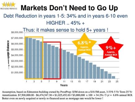
The numbers listed above are even better now as mortgage rates are ridiculously. For example consider this scenario:
$1M asset, $250,000 (or 25% down) invested, with a yield or CAP rate of 5% and a mortgage rate at 2.5% you make $25,000 every year or 10% on the actual cash invested, without any equity upside. Usually we re-invest the cash-flow and force rents up in upgraded units for higher value down the road.
Thomas Beyer is the President and Founder of Prestigious Properties – www.prestprop.com

My alternative Big Mac Index is screaming that these currencies are cheap
 Spoleto, Italy
August 31, 2015
If you’ve ever picked up a copy of The Economist magazine, you’ve probably heard of the Big Mac Index.
This is an interesting tool where a bunch of reporters from around the world are forced to go into McDonalds and find out the price of a Big Mac in local currency.
In Santiago, Chile, for example, a Big Mac runs 2,100 Chilean pesos, which is around $3. Meanwhile the average price for a Big Mac in the United States is $4.79.
This suggests that the US dollar is substantially overvalued against the Chilean peso.
It’s the same story across most of the world. In Russia, a Big Mac costs 107 rubles, which is just over $1.50.
The reason The Economist uses the Big Mac is because it’s basically the same product no matter where you go in the world.
There are some subtle differences, but McDonalds generally serves the same pink foam disguised as beef wherever you go. So in theory it should all cost the same.
When a Big Mac is too cheap or too expensive, this suggests that the currency is either undervalued or overvalued against the US dollar.
Now I’d like to add a new way of comparing currencies: airfare.
As I travel around the world, I often buy what are known as round-the-world tickets (RTW).
RTW tickets are issued by airline alliances like OneWorld or Star Alliance, and they’re typically very cost effective.
RTW is just like it sounds. You fly, for example, from London to Chicago to Shanghai to Dubai and back to London, all for one special fare.
It’s a cheap, easy way to see the world.
But I’ll let you in on a little secret that I’ve picked up over the years: the price of a RTW ticket varies dramatically depending on the city where you start.
As an example, I just researched a OneWorld RTW ticket with the following itinerary:
Los Angeles – Sydney – Bangkok – Hong Kong – Johannesburg – London – Los Angeles.
Six different cities around the world on five continents.
Now, if I start and stop that itinerary in Los Angeles, the price for a business class ticket is $14,164.60.
That’s not a bad price for a business class experience. But if we experiment a little bit, something interesting happens.
Starting and stopping the journey in Los Angeles means that OneWorld prices my ticket in US dollars.
But it’s also possible to fly the same route by shifting the cities. For example, instead of starting/stopping in LA, I can start/stop in Sydney.
So the route becomes Sydney- Bangkok – Hong Kong – Johannesburg – London – Los Angeles – Sydney.
It’s the same flights to the same six cities, I just start/stop in a different place.
Here’s what’s crazy: if I start/stop in Sydney instead, the price changes. Now instead of $14,164.60, it’s $15,272 Australian dollars, which is about $10,900 USD.
So the same six flights now cost you 23% less.
Note that the RTW ticket is always priced in the local currency of the city where you start.
And unlike the Big Mac Index where the results are skewed by the costs of ingredients, property, and labor, here you’re comparing the exact same product.
I did the same with each city on the list, and the most incredible difference came when I started and stopped the trip in Johannesburg.
Johannesburg – London – Los Angeles – Sydney – Bangkok – Hong Kong – Johannesburg.
Flying to the exact same cities, the price is now 81,395 South African Rand.
Based on current exchange rates, this is just barely over $6,000.
In other words, you pay over $14,000 by starting/stopping in LA, and just $6,000 to start/stop in South Africa, even though you’re visiting the exact same six cities on the exact same flights in the exact same business class cabin.
What’s even more amazing is that if you do the exact same itinerary from LA in economy class, the price is $7,545.
So that means that if someone flies from LA, they’ll pay more to fly in coach than someone starting in Johannesburg pays to fly in business.
Clearly, you’d be better off buying a separate ticket to South Africa and beginning your RTW journey from there.
Or you could spend about $200 and get a ticket to Vancouver, and start a RTW from Vancouver, which costs about $10,000 in business class and gives you a $4,000 savings.
Now, I’m not here to tell you about how to save money on airfare (though I hope you give it a try).
The bigger idea is that it’s clear that the US dollar is painfully overvalued against nearly every currency in the world.
Right now the dollar appears to be the “safe” place to put your money. However, this isn’t based on anything.
The fundamentals for the US dollar are terrible, but people keep dumping money into it like trained monkeys simply because nothing else in financial markets makes any sense.
To be clear, I fully expect the dollar to get even stronger as even more trained monkeys pile into US dollar assets.
But it’s important to show that this perception of ‘safety’ is based on a complete myth. Every credible fundamental suggests that the dollar is dangerously overvalued.
In the long run these things tend to equalize, and the dollar’s strength may end up being the biggest bubble of all.
Of course, it raises the question– if not the US dollar, then which currency is the safe haven? The euro is garbage, the Chinese are fighting a depression, Japan is a disaster.
And that’s precisely the point.
When every option in the financial system is grounded in absurdity, the only solution is to start looking for safety outside of it.

 But in come the cronies to tell us not to worry about it.
The “relief rally” continued yesterday (08/27/15) All over the world, stocks gained. So did oil and commodities. (More on that below in today’s Market Insight.) The Dow was up 369 points – a 2.3% move. Chinese stocks were up by about 5%. Why?
U.S. GDP numbers for the second quarter came out higher than expected. The economy grew by an annual rate of 3.7%. And influential New York Fed chief William Dudley said the argument for a rate increase in September was “less compelling.”
A Decline in Excess of 50%
Oh, ye of little faith… fear not! Things are happening just as they should. It is the end of summer. Markets are giving strong hints of things to come in the fall. Like Vesuvius, a plume of smoke rises… and a cloud of dust hangs over the markets. The economic earth rumbles… and animals take flight.
But in come the cronies to tell us not to worry about it.
And who knows what happens next?
Your editor is a fairly good plumber. He can put the pipes together and unclog the toilet. Alas, his record as a market soothsayer is spotty. He is rarely wrong, but often so early that by the time the event occurs even he has forgotten he ever predicted it.
But today we are encouraged and emboldened. We swagger ahead, like a reedy poet into a rough bar, confident in the knowledge that there are giants behind us. Yes, economist and money manager John Hussman’s forecast is similar to our own. From his most recent note for Hussman Fund clients:
If you roll a wheelbarrow of dynamite into a crowd of fire jugglers, there’s not much chance things will end well. The cause of the inevitable wreckage is not the dynamite, but the trigger is the guy who drops his torch.
Likewise, once extreme valuations are established as a result of yield-seeking speculation that is enabled (1997-2000), encouraged (2004-2007), or actively promoted (2010-2014) by the Federal Reserve, an eventual collapse is inevitable.
By starving investors of safe return, activist Fed policy has promoted repeated valuation bubbles, and inevitable collapses, in risky assets.
On the basis of valuation measures having the strongest correlation with actual subsequent market returns, we fully expect the S&P 500 to decline by 40% to 55% over the completion of the current market cycle. The only uncertainty has been the triggers.
A $12 Trillion Wealth Wipeout
A “decline in excess of 50%” within “less than three years” is our forecast.
We will stick with it, hoping to live long enough to see it proven correct, or in any case hoping to live long enough to see how it turns out.
But this forecast is for real (adjusted for inflation) prices, not nominal prices. Because we have a feeling that the feds will not stay in their seats as the government loses revenues, zombies rise in rebellion, and cronies and campaign contributors lose much of their net worth.
As of this May, the combined market cap of the companies listed on the New York Stock Exchange was $19.7 trillion. A 50% plunge would wipe out about $10 trillion in investor wealth, give or take a few billion dollars. More “reflationary” monetary policies are no doubt in the pipeline. Real estate would most likely go down, too – especially at the upper end.
The house in Florida on the market for $139 million that we reported on last week, for example, would have to be sold at auction. How much would it bring? $10 million? $50 million? Who knows?
Debt in Distress
The junkiest, riskiest part of the bond market would also be destroyed. When the going gets tough, the “spread” (or gap between yields) on junk bonds over U.S. Treasury bonds widens, as bond investors bail out of their riskier positions.
Whole sectors could go broke. Here’s Bloomberg with a report on debt in the oil patch:
At a time when the oil price is languishing at its lowest level in six years, producers need to find half a trillion dollars to repay debt. Some might not make it.The number of oil and gas company bonds with yields of 10% or more, a sign of distress, tripled in the past year, leaving 168 firms in North America, Europe, and Asia holding this debt, data compiled by Bloomberg show. The ratio of net debt to earnings is the highest in two decades.
If oil stays at about $40 a barrel, the shakeout could be profound.
Easy come. Easy go. It doesn’t take too much imagination to see the EZ money of the last seven years going back where it came from – to nowhere.
Forward – to Disaster
And then, what would Saint Janet do?
Even now, under less stressful conditions (let us assume that markets stay calm), will she raise rates next month as expected? Probably not…
Consumer prices, as officially measured, are stable, not rising. And inflation expectations have dropped to a five-year low. Unemployment and GDP numbers make it look as though the economy is running okay. But don’t look under the hood!
And with the stock market so fragile, would Saint Janet risk being the one to cause a worldwide panic? Nah… No rate increase in September.
Instead, when the crash resumes, we will see even EZ-ier money, not tighter money. We are on course for a “hormegeddon”-style outcome. (Hormegeddon is the term I coined in my latest book for “disaster by public policy.”) Backing up is not an option. We must go forward – to disaster. By Bill Bonner, Bonner & Partners
Markets bounced over the last few days. But is the bounce to be trusted? Read… “The Most Astounding Credit Binge in History”

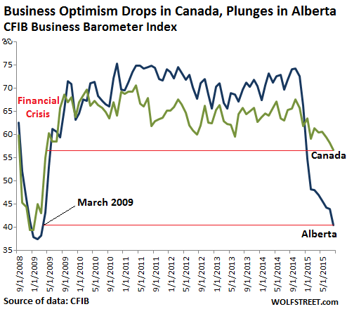
The Province of Alberta, the epicenter of the Canadian oil bust, may be sliding into something much worse than a plain-vanilla recession. And it’s not exactly perking up the rest of Canada.

-
I know Mike is a very solid investor and respect his opinions very much. So if he says pay attention to this or that - I will.
~ Dale G.
-
I've started managing my own investments so view Michael's site as a one-stop shop from which to get information and perspectives.
~ Dave E.
-
Michael offers easy reading, honest, common sense information that anyone can use in a practical manner.
~ der_al.
-
A sane voice in a scrambled investment world.
~ Ed R.
Inside Edge Pro Contributors

Greg Weldon

Josef Schachter

Tyler Bollhorn

Ryan Irvine

Paul Beattie

Martin Straith

Patrick Ceresna

Mark Leibovit

James Thorne

Victor Adair