
Currency
Into the Transformational Future
Where in the World Is Your Pension?
Rich City, Poor City, Beggar City, Thieves?
Toronto, New York, Chicago, Tucson, and the Barefoot Ranch
“The future is already here,” intoned William Gibson, one of my favorite cyberpunk science fiction authors, “it’s just not very evenly distributed.” Paraphrasing Gibson, the pension crisis is already here; it’s just not very evenly distributed. For the past two weeks we’ve been exploring the problems of state pension funds. This week we will conclude our look at pension plans for the nonce with a 30,000-foot overview of the states and then take a deeper dive into one city: mine. This will give you at least one version of how to do your own homework about your own hometown. But fair warning, depending on your locale, you may need medical help or significant quantities of an adult beverage after you finish your research. Then again you may be pleasantly surprised and congratulate yourself on choosing a particularly adept hometown. And be on notice that, no matter what your personal conclusion and how well-grounded your analysis is, there will be people who live in your neighborhood who think you are utterly full of, well, let’s just say “nonsensical matter” and leave it at that. This is a family letter.
Into the Transformational Future
First, a quick announcement. I am constantly asked where the future jobs will be, and I think hard about the answer to that very personal question (it’s crucial to those of us who have young kids). Will we see Gibson’s dystopian world or Ian Banks’ world of abundance? The answer is, of course, that secular growth in employment will come from the new, transformational technologies that are already being created all around us, truly new industries that will change everything and create opportunities for work that we can’t even imagine yet, in the same way the automobile or telecommunications or the McCormick reaper both took some jobs away and created even greater opportunities. The transition is the thing, though. It will be filled with opportunities for some and forced change for others, while we wait for the future to become more evenly distributed. In the next few weeks, you are going to get a letter from me that will tell you about the newest addi tion to Mauldin Economics, the Transformational Technologies Alert, written by my longtime friend Pat Cox, who is no stranger to readers of this letter. Pat and I have long wanted to work together, exploring the future and especially biotech. He is the best, and you will want to join us from the very beginning. We invite you to charge ahead into the future with us, exploring opportunities that will begin to change your own life right now. And now back to pensions…
Through the courtesy of one of your fellow readers I’ve been given a treasure trove of data on 702 city pension plans. I won’t say that I got lost in the data, but the search and rescue teams sent to find me had to go back for extra supplies. There were some very dark alleys that it took a while to find my way back out of. Not to mention some twists and turns that were totally surprising.
So first I need to say a big thank you to Gregg L. Bienstock and Justin Coombs of Lumesis for giving me access to their data. Gregg is a cofounder of Lumesis, and their signature software is called (appropriately enough, given the oceans of data they plumb) DIVER. They’ve compiled data on 54,000 issuers of municipal and state bonds from over 100 sources. They sent me an Excel file on the major pension plans of every state and the pension plans of cities with populations over 100,000. And Justin was kind enough to create multiple spreadsheets and graphs upon request and patiently explain their data. The bulk of the data in this letter is from http://www.lumesis.com. The opinions are my own and should not be attributed to Lumesis. From time to time we will also look at another fascinating study from the Pew Charitable Trusts on pensions and retiree healthcare in 61 cities.
As we have seen the last two weeks (here and here), the assumptions that states make about their future investment returns are fairly unrealistic and generally nothing like what they’ve achieved for the last 10 years. This makes their balance sheets look far better than they really are, and for some states the discrepancy is pretty stark. Witness Illinois, where unfunded pension liabilities run north of $280 billion, give or take. That is more than $20,000 for every man, woman, and child in the state. And the bill keeps rising every month as the state plows ever deeper in debt to its own future.
Keeping in mind the caveat that the percentages may actually be worse than reported, let’s look at a few graphs on a state-by-state basis. This first graph shows the funded ratio of state pension plans through 2012. (Note: on all the graphs the large “island” below Louisiana is a representation of Puerto Rico. To its left is Alaska, and both are obviously not to scale.)
The next graph shows actuarial required contributions (ARC). The ARC is simply the amount of money required to fund the pension plan given the return assumptions of the plan. The important thing to note here is the amount of blue in the graph. If you ask your local politicians how their pension plan is doing, they can probably tell you with a straight face (and because they don’t know any better) that their state’s pension is fully funded. I note with some alarm that “conservative” Texas doesn’t fare very well. While Texas claims funding above 80%, a more reasonable assumption on returns suggests it is no better than 43%. Can Rick Perry run for president as a conservative on that number? Then again, can New Jersey Republican governor uber-star Chris Christie run on his state’s funding level of 33%? Just asking.
Where in the World Is Your Pension?
The more appropriate question to ask is “What percentage of my state’s total future liability is unfunded?” And here the color pattern of the map changes. If you can look at this map and discern a political pattern, you are seeing something that I can’t find. “Red states” can be adequately funded or a disaster, and the same goes for “blue states.” This will also hold true when we look at cities. There is simply no rhyme or reason as to why some cities are paragons of virtue when it comes to funding pensions while others make drunken sailors look virtuous.

I asked Justin to give us one last chart, which is unfunded liability as a percentage of state GDP. This gives us an idea about the ability of a state to increase its level of funding if it needs to do so.
As we showed last week, the funded ratio represents a plan’s assets as a percentage of liabilities, or the amount of money owed in benefits. The funded ratio is one of the primary measurements of a pension plan’s overall funding health. It provides an additional layer of context that unfunded liabilities alone cannot. For example, California has a larger unfunded liability than Kansas does, but based on what these states currently know they will owe to retirees versus the amount of money they actually have, the funded ratio tells us that Kansas is in worse shape than California, with Kansas’ plans being 29% funded and those of the Golden State being 42% funded.
By this measure, the seven most poorly funded states are Illinois (24%), Connecticut (25%), Kentucky (27%), and Kansas (29%), along with Mississippi, New Hampshire, and Alaska, which are tied at 30% funded. At the other end of the spectrum, using a realistic assumption of future returns suggested by both Moody’s and GASB, Wisconsin, the most well-funded state in the country, has just a 57% funded ratio, followed by North Carolina (54%), South Dakota (52%), Tennessee (50%), and Washington (49%). This is in spite of their claiming a much higher ratio based on very aggressive assumptions. (Data is from a great report in which you can see how your state fares.)
Rich City, Poor City, Beggar City, Thieves?
I have struggled to find a way to convey the disparity among cities with regard to their pension programs. I suppose, given the realities of city politics, which can be the most vicious of all contact sports in America, the differences should not be surprising. Whether a city is rich or poor, the personal assassination and endemic corruption can be riddled through city politics like fat through bacon. It is a wonder that anyone would want to go into city politics.
All real estate prices are local, we are told, and the same is true of pension funding. Take Lexington, Kentucky, a town full of Southern charm with a genteel feel sprouting in the midst of Kentucky horse (and basketball) country. And for whatever reason, in Lexington they seem to feel they should almost over-fund the city employees’ pension fund, at a level of 91% (only outdone in the database by Gainesville, Florida).
And then go up the highway to their neighbor (and basketball archrival) Louisville. There must be something different in the water there, as they have decided to fund only 30% of their firefighters’ pensions, while assuming they will get 7.5% returns on their investments, an unduly optimistic assumption that will surely make the true level of their unfunded liabilities even more egregious.
We can go a little south to Nashville, Tennessee, one of my favorite cities, internationally known for its devotion to country music. Some of their pension programs are funded only to the tune of 20-25%. But their suburb Murfreesboro, a ZIP Code away, is 98% funded.
Arlington, Texas, home to the Texas Rangers and the Dallas Cowboys and where I used to live and own a home, is overfunded by 20%. And then there is Dallas, where I have just purchased an apartment. The database tells me the city employees’ pension fund is 86% funded and assumes an 8.25% future return on its investments. Not all that bad in the grand scheme of things but nothing to brag about. Oh wait, you also have to look at the Dallas police and fire pension fund, which is only 76% funded. And they are projecting an 8.5% annual return, which puts them at the top of the charts for optimism about the future. But those numbers tell only part of the story.
I randomly selected about eight cities and did further research on their pension funds. In almost every case there was far more than meets the eye, both good and bad. So rather than pick on Chicago (far too easy a target) or another random location, let’s look at my new (as of June) hometown of Dallas. I would encourage you to do the same type of analysis on your own town or city.
Let me first put on my Chamber of Commerce hat before I take off the gloves. Dallas is a thriving city with a history of very active and effective civic leaders. While some freeway is always under construction, it is relatively easy to get around the region. The Dallas-Fort Worth airport is a dream. There are very few places in the world that I can’t get to with just one layover. I can walk out of my apartment in downtown Dallas and be through airport security in less than 30 minutes. Try that in Chicago or New York. The area in general and Dallas in particular has fabulous restaurants that honestly rival those of any city I’ve been in. The area has more live-theater venues than any city but New York (who knew?). From time to time our local sports teams have been known to achieve some success. Admittedly, the schools range from being ranked among the top in the nation to being complete failures, but there are many options. Taxes are generally low, and the area is a great place to do business. The infrastructure works, and the labor force is educated and abundant. The women are legendarily beautiful, and all the children are above average. Given that I could live almost anywhere, Dallas is where I want to be.
And now, as Paul Harvey would say, here’s the rest of the story. Most of the world knows Dallas through the 1980s television series Dallas, starring Larry Hagman as a swaggering oilman. The show was replete with beautiful women with big hair, stereotypical men in big hats, and lots of family feuds and vendettas. The truth is a lot different, but there is a rhyme or two here or there. And that brings up a tale that will lead us into the Dallas pension story.
Back in 2007, some ambitious real estate developers decided to build a fabulous jewel of an apartment high-rise in the middle of what is known as the Arts District in downtown Dallas. Dallas civic leaders have chosen to develop its major museums, symphony hall and separate major opera hall, plus live-theater venues, in the center of town. They even built a massive (and very expensive) park over a freeway entirely with private money in the middle of the Arts District, which has become a gathering place for the citizens. And then came the financial crisis.
Not to be deterred, the city went forward with the building called the Museum Tower. And I will admit that it is one of the more beautiful buildings in Dallas. When I was searching for places to live, I did a little research on it and quite frankly decided not to even take a closer look. Let’s just say it was very aggressively priced. I ended up buying a very similar property only a few blocks away with great views for a fraction of their asking price. But there was another reason I didn’t look: there was a major lawsuit going on between the building and its next-door neighbor, the Nash Sculpture Center, which is a truly wonderful venue supported by all the don’t-cha-knows of Dallas. It seems the glass Museum Tower building reflects light onto the sculpture center, destroying the open-air ambience, or at least that’s what their lawyers claim. The story that it is melting the sculptures is apparently b ogus. It doesn’t help that a few “rogue” architects said during the planning sessions for the Museum Tower that the problem would occur. Who would want to buy a place when you don’t really know what the homeowners’ association fees are going to be?
So who funded this luxury high-rise building? As it turns out, the Dallas Police and Fire Pension Fund did. To the tune of $200 million. Leveraged. Six percent of the current value of the fund, give or take. Which is already underfunded by around $1.2 billion, assuming they meet their stated objective of 8.5% annual returns. Plus, they have other unstated commitments to what are known as DROP accounts, which could become a liability totaling hundreds of billions, by my back-of-the-napkin estimation.
Note: when you look at your city’s or county’s pension fund, don’t just look at the readily available public reports. Sometimes you have to dig for the other, “off-budget” commitments of the city. Some cities report pension and healthcare commitments separately. Of the 61 largest cities in the US, 22 face larger unpaid bills for healthcare than they do for their pension funds. An astonishingly large number of cities have reserved next to nothing to cover future healthcare promises. Without looking at the local politics, I can almost guarantee you that those cities will end up shifting their liabilities to “Obamacare,” that is, to federal taxpayers like you and me, in the very near future. It’s is the only rational thing to do. Just like Walgreens and IBM did. Sort of. Just saying.
I have to admit that when I first saw the data that suggested the city of Dallas expected to get 8.5% returns on their pension funds, I was aghast. That is the highest level of projected returns for any city I could find in the database. Here I have committed to paying taxes in Dallas, and I am looking at a personal major unfunded liability. But then I looked at the rest of the story.
As it turns out, the management of the Dallas Police and Fire Pension Fund has actually returned 8.5% for the last 10 years. They rank in the top 1% of all city pension funds in the United States. Last year they did 11.4%, and for the last three years they did 6.7%, although if you go back five years and include the Great Recession, the returns have only averaged 1%. Even so, a fabulous track record for a major fund. If any fund could make a case, based on past performance, that 8.5% future returns are possible, they could. So I began to wonder, how in the heck have they done so well? You clearly don’t do that through normal pension fund allocations. (Ask Illinois.)
And of course they didn’t. Fifty percent of the fund is in real estate – far above the normal allocation. And they manage the fund internally (which is both unusual and controversial). A fair amount of the fund is in luxury real estate (totaling $400 million or over 12% of the fund), some of which has been hammered. And they are saddled with lots of legal problems, which, not surprisingly, appear prominently in the local press. Why, the newspaper asks, is a supposedly safe police and fire pension fund invested in luxury homes in Hawaii, homes that haven’t sold for five years? Why has the fund spent $1 million flying its executives around the world to fabulous locations to look at real estate? Why wouldn’t they fix the building that is spoiling the ambience of the centerpiece of the Dallas Arts District? And why would they hire a local PR firm to create false Facebook posts (a ploy they claim no knowledge of, of course) and one of the most aggressive law firms in town to go after anyone who criticizes them?
And yet, somehow management figured out how to make 12% on its global fixed-income portfolio (while the Templeton Global Bond fund returned a mere 7.6% the past year) and 16% on its global private-equity portfolio (as of 3/31/13), for one year. On private equity 12% seems to be closer to the average. I couldn’t get details on the components of those returns or the specific funds involved, but the surface returns seem rather phenomenal. Wouldn’t we all like to earn 35% above our benchmarks? Talk about all the children being above average… Just saying.
And herein lies one of the instructive lessons. The Dallas fund has significantly outperformed its peers by choosing a course that is far from the norm. They have made what would be normally called “alternative investments” a core holding. Not unlike David Swenson’s approach at Yale, although he does it with a different mix of alternative investments. If I had the misfortune to be responsible for a large pension fund, I would be arguing for much a larger allocation to alternative investments. Real estate might not be my personal preference, but it is a good one nonetheless.
The second lesson is that if you do it (“over”-allocate to alternatives) you’re going to be heavily criticized, and you probably need skin thicker than the glass on the Museum Tower. And be just as able to reflect the glare of local criticism.
For all their overall success, the Dallas fund’s projections of future returns are still significantly higher than I consider to be prudent. And even given their projections, the fund is significantly underfunded, to the tune of $1.2 billion. Which is not small change, even in Dallas. If I were depending on that fund to be the source of my future retirement, I might well be asking the city of Dallas to pony up more than the $100 million they are contributing each year. And the city of Dallas might be thinking that the policemen and firemen should be offering to do a little more as well.
All that being said, the average Dallas police or fire department employee will not be getting rich on his or her retirement. This is not a California prison guard retirement fund. It is rather bare bones, from what I can see. And when you read all the social commentary surrounding the fund, you come away with a strong sense of the local angst involved. These are real people with real issues, both taxpayers and city employees and retirees. And those issues are not different than in any other city in any other state. If you start reading the stories on the bankruptcy of Detroit, the situation is quite heart-rending, and logic flies out the window. (Seehttp://mobile.nytimes.com/2013/09/20/us/residents-of-detroit-go-to-court-for-pensions.html.)
“There is no room for austerity,” said one Detroit resident. Somehow, those in charge should be made to come up with the money when they go bankrupt. But the politicians who made the decisions that led to the bankruptcy are long gone from the scene. Austerity is a consequence of prior decisions. If prudent decisions are not made in the present, the future shows up all too quickly. Some cities have made prudent decisions, others not so much.
Meredith Whitney is famous for telling 60 Minutes that 50 to 100 municipalities would default in 2011. I was quite skeptical when she said it, and she was clearly wrong. But looking at the data, there are far more than 50 to 100 cities in potential trouble. Will a wave of defaults happen next year? I highly doubt it, as cities have the ability to kick the can down the road at least as well as Europe countries do. But would I want to live in Houston or San Diego? Not based on their pension liabilities. Nor would I want to live in Nashville or Louisville or any number of otherwise wonderful cities.
Most cities and states that are in trouble still have the “luxury” of being able to deal with the problem in advance of being forced to buy the markets. They need to take the time they have to get their programs straightened out. Those cities and states that have been prudent are to be congratulated, but they might want to worry about being forced to fund their less prudent brethren from their own tax revenues. It can happen, as it did in Texas when the judiciary forced shared taxes for school districts even though voters and the legislature said no. Just when you think you are safe…
Municipal bond markets are going to become far more difficult places to make money in the future because of pension issues. Municipal bonds make sense for certain investors, but it is going to become very important to know who your municipal bond fund manager is. Can they discern between good credit and bad local management? A small change in ZIP Code can make a huge difference in returns.
Is this a national crisis? I don’t think so, but it can certainly be a local one. If I were you I would do little research. And maybe it would be prudent for both of us to get a little more involved with our local cities. I still have scars from getting involved in city politics in Arlington many years and a couple of lifetimes ago, but maybe I need to ask a few questions here and there. And perhaps you should, too.
Toronto, New York, Chicago, Tucson, and the Barefoot Ranch
I leave tomorrow for Toronto, where I will be speaking with my friend Louis Gave at his conference on Monday. Sunday night I get to have dinner with good friends David Rosenberg and Louis and Steve Cucchiaro (of Windhaven Funds). The night won’t be long enough to contain our conversation, but I know we will squeeze in as much as possible. I go from Toronto to New York City, where I will get to dine with my great friend Art Cashin and the usual suspects, plus a few new friends. I will be speaking at several events for Altegris Investments the following two days before returning to Dallas. Then it’s a quick trip to Chicago, again speaking for Altegris Investments, before I move on to Tucson to celebrate my birthday at the Casey Conference with a lot of good friends. When I come back, I will get ready to head out to Kyle Bass’s Barefoot Ranch to spend a few days with a number of investment types, discussing the issues of the day. I will report back.
If all that sounds somewhat exhausting but enormously fun, that’s because it actually is. I sometimes wake up wondering how it all happened and what I have to do to keep the magic going. That is on top of waking up and wondering what city I’m in. The exhaustion and exhilaration seem to go hand in hand. But I wouldn’t change any of it, at least not right now. I am having way too much fun.
It is time to hit the send button. In a few weeks I’ll start telling you about a new book that will come out in about a month. Yes, I actually finished something, as opposed to the books that I keep telling you I’m going to write about the future of work or what the world will look like in 20 years. Which are indeed still works in progress. But it doesn’t hurt to tell you about the things I keep thinking about and researching away on.
The future of work keeps getting brought home to me in very poignant ways through conversations with my kids. They get frustrated when they go looking for jobs and can’t find any that are more than part-time or that pay what you would think a college degree would be worth these days. I look at the data on employment and grow more concerned about the next generation. I vividly remember struggling when I was their age, sometimes waking up at two o’clock in the morning wondering whether I should pay the electric bill, my secretary, or the bank. Or where I could get money for just one more day. Some of my readers assume that life for me has always been the current bed of roses. It has been anything but. It’s what makes me appreciate the remarkable turn of events I have wandered into. And it’s what makes me appreciate you and sit down every week no matter where I am or what I’m doing to write to you about what I’m thinking. I am grateful that you in vest your most valuable commodity, your time, to consider my humble offerings.
Have a great week. Pick up the phone and call an old friend. It’ll make your day go better.
Your needing to fund my own pension analyst,

John Mauldin
subscribers@MauldinEconomics.com

According to Reuters, gold is often seen as an inflation hedge (while it is really a system hedge in our opinion) and this safe-haven investment, has fallen nearly 20% this year on fears of an end to easy central bank money, which had propelled it to record highs in 2011.
On Wednesday, after the Fed said it would stick to its stimulus plan for now, the yellow metal gained more than 4%, leading the rally in commodities. Yesterday, gold rose to a new one-week high and extended the previous session’s rally, lifted by technical buying and short-covering.
What happened with the US dollar?
The USD Index lost over 1% and declined slightly above the 80 level on Wednesday. It’s worth noting that this is its biggest one-day slide in more than 2 months. Additionally, we saw such low values in February, well before Fed Chief Ben Bernanke first floated the idea of tapering the stimulus back in May.
Today, gold slipped a bit, but is still trading around $1,360 an ounce. Can the yellow metal climb higher in the near term? Will the dollar recover quickly? Can we find any guidance in the charts?
In today’s essay we’ll examine the US Dollar Index (from many perspectives and the long-term gold chart to see if there’s anything on the horizon that could drive gold prices higher or lower in the near future. We’ll start with the USD Index very long-term chart to put the following gold chart into perspective (charts courtesy by http://stockcharts.com.)
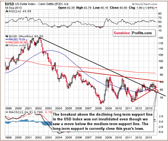
The situation in the long-term chart has changed (for the first time in several months), but the most important thing didn’t change. The long-term breakout above the declining long-term support line was not invalidated, even though the USD dropped heavily on Wednesday.
However, since the medium-term breakdown (below the support line marked with red) is visible from this perspective, we could see some short-term weakness anyway. Still, it seems that the long-term support line will stop the decline, so from the long-term perspective, it seems that the downside is quite limited.
Now, let’s examine the weekly chart.
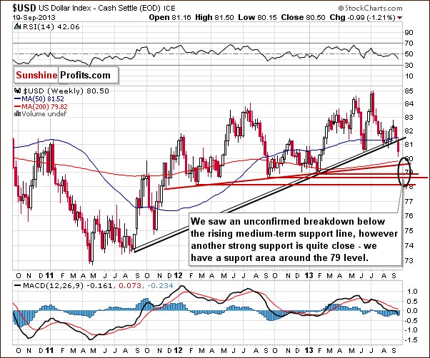
On the above chart, we see the breakdown more clearly. The breakdown is unconfirmed at this point, and we could still see a reversal back above the previously-broken support/resistance line. It would be a powerful bullish signal, but it seems more likely that we will see another move lower first. This is due to the size of Wednesday’s move without a visible intra-day pullback.
The target area is quite unclear because of the multiple support lines, including the long-term support line seen on the previous chart. It seems that we could see the US Dollar Index in the 78-79 range before the bottom is in.
Again the exact price target is unclear.
Let’s check the short-term outlook.
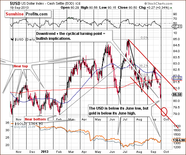
On the short-term chart, we see that the target area is close to the 79 level. The present cyclical turning point makes the situation extreme and difficult to trade as we could see a powerful pullback immediately even if the target area isn’t reached.
Additionally, please note that even though the USD Index has declined heavily in September, we also have gold visibly lower than it was at the beginning of the month.
Is another move lower on a very short-term basis likely? It is – based on the True Seasonals pattern that has been working very well in the past few months.
Let’s take a closer look at our new tool.
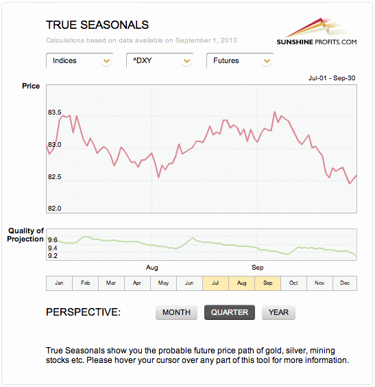
Please note that we saw a visible decline prior to the first part of August after which we saw an upswing which lasted until early September. This has been followed by a significant decline, which is precisely what the True Seasonal patterns were suggesting.
Right now, they are suggesting another small move lower in the final part of this month.
Taking the previously mentioned support levels into account, it seems that the move lower could be more significant, but it will be approximately in tune with the True Seasonals pattern.
Please note that the quality of the prediction (green line in the lower part of the above chart) declines in the final part of the month, which means that a deviation (in the form of a bigger decline) is not unlikely.
Consequently, even though the direct impact that the USD Index is likely to have on gold is rather unclear at this time, it seems more likely than not that the impact will be bullish in the very near term (in the next several days).
Once we know the current situation in the U.S currency and the True Seasonal patterns’ suggestions on future movements in the dollar, let’s find out what happened during the recent days and check the current situation in gold.
(Click for Larger View)

On the long-term gold chart, we see that Wednesday’s rally was not as bullish as it seemed at first sight. In spite of the strong daily upward move, which pushed gold above $1,360, the situation hasn’t changed much from this perspective.
As you see on the above chart, gold verified the breakdown below the long-term resistance line created by the July 2005 and the October 2008 bottoms (taking intraday bottoms into account). At this point, it’s worth noting that there was an invalidation of the breakout above the 38.2% Fibonacci retracement level based on the September 2012 – June 2013 decline earlier this month. This was a bearish sign.
From this point of view, it seems that even if gold increases once again in the coming days and reaches the above-mentioned levels once again, the medium-term outlook will continue to be bearish.
Please note that in 2008, when gold moved higher before plunging for the final time, there were several intra-week attempts to move higher after which gold finally declined. Therefore, a double top pattern should not surprise us here. The same goes for a triple top.
Summing up, on Wednesday, we saw a substantial price move on the gold’s and the dollar’s charts. However, these moves were significant only on a very short-term basis. Examination of the above charts reveals that they didn’t change the long-term and the medium-term tendencies. Despite Wednesday’s strength, the downward trend in gold remains in place even though we could see some short-term strength shortly. Taking into account the long-term breakout in the US dollar, the long-term outlook for the USD Index remains bullish, even though we could see additional weakness in the very short term., as indicated i.a. by the True Seasonal charts.
Thank you for reading. Have a great and profitable week!
Przemyslaw Radomski, CFA
Founder, Editor-in-chief
Gold Price Projection Website – Sunshine Profits
* * * * *
Disclaimer
All essays, research and information found above represent analyses and opinions of Przemyslaw Radomski, CFA and Sunshine Profits’ associates only. As such, it may prove wrong and be a subject to change without notice. Opinions and analyses were based on data available to authors of respective essays at the time of writing. Although the information provided above is based on careful research and sources that are believed to be accurate, Przemyslaw Radomski, CFA and his associates do not guarantee the accuracy or thoroughness of the data or information reported. The opinions published above are neither an offer nor a recommendation to purchase or sell any securities. Mr. Radomski is not a Registered Securities Advisor. By reading Przemyslaw Radomski’s, CFA reports you fully agree that he will not be held responsible or liable for any decisions you make regarding any information provided in these reports. Investing, trading and speculation in any financial markets may involve high risk of loss. Przemyslaw Radomski, CFA, Sunshine Profits’ employees and affiliates as well as members of their families may have a short or long position in any securities, including those mentioned in any of the reports or essays, and may make additional purchases and/or sales of those securities without notice.
 The Shanghai free-trade zone, China’s first, will officially open for business on September 29. Just about every China economy maven has been following the months-long saga regarding the establishment of the zone because in Shanghai the central government will punch a gaping hole in the country’s currency wall.
….read the whole article HERE

The dollar declined to almost a three-month low as the Federal Reserve announced it will refrain from reducing its $85 billion in monthly bond purchases and keep pumping money into the U.S. economy in an attempt to boost growth.
Spot gold last rose 3 percent to $1,347 an ounce after earlier being flat. It touched its lowest since Aug. 8 at $1,291.34 earlier.U.S. gold futures for December delivery edged higher jumped 1.9 percent near $1,334 an ounce.

 Looking for a hedge against the Federal Reserve? Try bitcoin. That at least is the view of Cameron and Tyler Winklevoss, who are heavily invested in the virtual currency.
Bitcoin, which is created through a cryptographic process rather than by a central bank, attracted attention earlier this year when its price swung wildly. The supply of bitcoins is set at 21 million, which has led to many comparisons between bitcoin and gold.
Indeed, the Winklevoss brothers, speaking at the Value Investing Congress in New York on Tuesday, mentioned the scarcity and durability of both assets as reasons for why people refer to bitcoin as digital gold or gold 2.0.
….go HERE fjor some of the highlights of their talk
9 Things The Winklevoss Twins Taught Me About Bitcoin
The most noteworthy Bitcoin facts imparted to an audience of investors at the Value Investing Congress are listed HERE


-
I know Mike is a very solid investor and respect his opinions very much. So if he says pay attention to this or that - I will.
~ Dale G.
-
I've started managing my own investments so view Michael's site as a one-stop shop from which to get information and perspectives.
~ Dave E.
-
Michael offers easy reading, honest, common sense information that anyone can use in a practical manner.
~ der_al.
-
A sane voice in a scrambled investment world.
~ Ed R.
Inside Edge Pro Contributors

Greg Weldon

Josef Schachter

Tyler Bollhorn

Ryan Irvine

Paul Beattie

Martin Straith

Patrick Ceresna

Mark Leibovit

James Thorne

Victor Adair