


- *Toronto GTA SFD prices began March 2009. Prior data are Combined Residential +24.5%.
- *Ottawa SFD prices began January 2009. Prior data are Combined Residential +6.9%.
- *Montreal SFD DATA changed from Average to Median in March 2007
- *Vancouver SFD data are HPI®, not Average.
In December 2017 Toronto metro SFD prices continued slipping and 9 months since the March 2017 spike and peak price, they have lost $217,895 or 18% (Plunge-O-Meter). Vancouver prices are still defying gravity; FOMO and speculative pricing is still on. Anyone owning a detached house in the scorching hot Vancouver market is sitting on an unredeemed lottery ticket with time running out as buyers hibernate into the seasonal decline. The Bank of Canada interest rate up-moves are thinning the crowd even more.
It remains interesting to note that the combined average sum price of a Vancouver, Calgary & Toronto condo is currently 56% (no typo) more expensive than a median priced Montreal SFD; it was 52% in OCT 2017; 51% in APR 2017, 49% in FEB 2017 and 41% in July 2016 at the Vancouver peak. Montreal has more listing inventory available for sale than any of the other 5 biggest metros in Canada and the lowest monthly absorption rate based on total listings and sales.
The Plunge-O-Meter tracks the dollar and percentage losses from the peak and projects when prices might find support. On the price chart in the spring of 2005 there was a 4-6 month plateau period while buyers and sellers twitched like a herd. When the credit spreads narrowed and the yield curve began its journey towards inversion, the commodity stampede began.
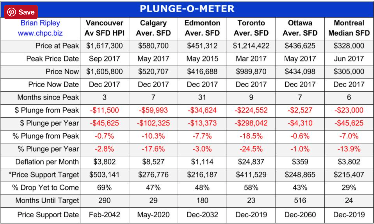
*The Price Support target represents prices at March 2005; the start of a 40 month period of ardent speculation in all commodities; then a full blown crash into the pit of gloom (March 2009); and then another 39 month rocket ship to the moon but then the crowd suddenly thinned out in April 2012. The revival of spirits erupted in 2013 as global money went short cash and long real estate on an inflation bet. Now we have a major sense of doubt about value in Toronto.
Plunge-O-Nomics
The Pit of Gloom
- ’07-’08 Average Vancouver SFD lost $122,900, or 15.9% in 8 months (2%/mo drop)
- ’07-’08 Average Calgary SFD lost $92,499, or 18.3% in 18 months (1%/mo drop)
- ’07-’08 Average Edmonton SFD lost $78,719, or 18.5% in 21 months (0.9%/mo drop)
- ’07-’08 Average Toronto SFD lost $63,867, or 13% in 13 months (1%/mo drop)
- ’07-’08 Average Ottawa Residence lost $25,664, or 8.6% in 6 months (1.4%/mo drop)
- ’07-’08 Median Montreal SFD lost $6,000, down 2.6% in 6 months (0.4%/mo drop)


